Finding a proper name and logo :)


Predicting an incoming 'Pyra-chan'.

More random:
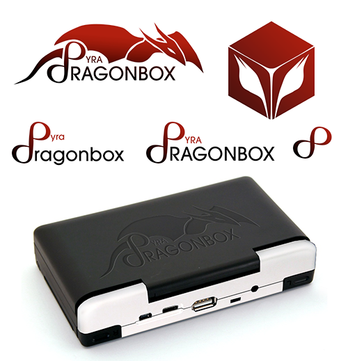
grad4.png


I'm still partial to the first design I posted that was derived from the Pandora icon though.
Really liking the dragon above the device name, all with that red/black gradient. :D And I think it looks nice on the device like that bottom image too.
 
Last edited by a moderator:
Using the infinity (hacker friendly, endless possibilities) symbol for the d and p and combining pd (public domain)

on an OpenSource device is a combination of very nice ideas.
 
Last edited by a moderator:
Nobody is seeing dp there... nobody? Please don't google it. Your Government probably hasn't finished filtering your internet for safety yet!

( The box with wings, derived from the Pandora logo is nice. )
 
The box in the upper right corner is a vector approximation of Løra's suggestion. I didn't get around to the actual wings, so those are just the shape that came from the eyes.
 
Nobody is seeing dp there... nobody? Please don't google it. Your Government probably hasn't finished filtering your internet for safety yet!
Yeah, it's somewhat unfortunate that it reads dp even though a HDMI-port is included instead of a DP-port.

No, seriously: I'd say that dp as abbreviation is common enough[1] and won't affect the Pyra's reputation because of the few negative meanings it has.
 
Nobody is seeing dp there... nobody? Please don't google it. Your Government probably hasn't finished filtering your internet for safety yet!

( The box with wings, derived from the Pandora logo is nice. )
I see it...  but I haven't a clue what you are associating it with...

(and there are quite a lot of possibilities: http://en.wikipedia.org/wiki/Dp )

- Neelix
 
Such citations! Okay, I'm willing to concede that dp is common enough to fly under the radar.

Time for some unnecessary over-artification of the Mobius concept, which I'm warming to!

pyra-mobius.png
 
I like that one, but the dP meaning could be somehow implied so it doesn't just look like a generic infinity logo :)
 
Last edited by a moderator:
Predicting an incoming 'Pyra-chan'.

More random:

grad4.png


I'm still partial to the first design I posted that was derived from the Pandora icon though.
This is everything I wanted to avoid:

Big complex logo.

Lots of letters.

But dammit, I like it.

:)
 
I like that one, but the dP meaning could be somehow implied so it doesn't just look like a generic infinity logo :)
Generic infinity is nice because it can be clean and simply. But you have a point! I have an idea!

I've committed far more time to this madness than I'd hoped- I got sucked in when the Revo K101 logo competition was running... and won a Revo, haha! Think I have a "challenge accepted" personality, which sucks because I have loads and loads of actual paid work to be doing.

Not even sure this works:

pyra-mobius-dp.png
 
Last edited by a moderator:
The large dragon image there, shown embossed on the case... is nice, but not sure how well it will scale down as it is not squared. Think that is a problem with rectangular logos.

I was thinking of something similar just this morning :) As I was sat behind a lorry this morning which had a log which was pretty similar, it was more 'ribbon' like though, had more flow to it. But it was a dragon, so caught my attention.

I thought it would've worked for this as it was a dragon, and also the ribbon flowing shapes it was made from looked a little like flames.

Anyway, that other one, with the cube and the flame styled dragon eyes in it, that is very nice
 
Covering the whole lid with a huge logo is really bold. I love it...

One tweak maybe. Make the RAGONBOX text smaller. I think it's too dominating.

I'd say same size as YRA or smaller.
 
I like that font better for the text "DragonBox". Also, I like the red. :)

-God Ginrai
Thanks. Sadly it's not a real font, I just didn't found one so I just drawn the letters basicly freehand in Photoshop. ^^" ED mentioned red as fav. Colour for the logo so I just used it. I guess he or we should start to define the "official" logo colours in hex at best so people can work with it. :)
Predicting an incoming 'Pyra-chan'.

More random:

grad4.png


I'm still partial to the first design I posted that was derived from the Pandora icon though.
This looks interesting but has one major problem: The words Dragonbox and Pyra are not seperated this way. If the Company "DRAGONBOX" has another product, let's call it "Haku", how do you want to solve this without altering the Company logo itself? Company name should be always separate from the actual product logo, even if they appear together. ;)
 
Last edited by a moderator:
That's a good point. Unless it was ensured that all future DragonBox devices will begin with the letter [P] :)

...then it'll work
 
Predicting an incoming 'Pyra-chan'.

More random:

grad4.png


I'm still partial to the first design I posted that was derived from the Pandora icon though.
Alright, so, I like these logo ideas. However, what I'm most fond of is the Cube with Eyes. I think that should be the logo. It's simple, easily recognized, and reminiscent of the Pandora logo. Plus, it will work a lot better in all sizes than resizing that dragon would.

-God Ginrai
 
Back
Top