You are using an out of date browser. It may not display this or other websites correctly.
You should upgrade or use an alternative browser.
You should upgrade or use an alternative browser.
Finding a proper name and logo :)
- Thread starter EvilDragon
- Start date
NoeleyC
Well-Known Member
- Joined
- Oct 23, 2008
- Messages
- 1,352
I like he bigger dragon logo of DPB's designs, it looks really eyecatching rendered onto the console, I think it'd be great to see that in something like embossed red metal on the case. Not sure about the font though, not blown away by the joint swooping D+P . I like LEOXD's last dark red dP combination, I think that might work well with them fullsize and the rest of the letters as smallcaps (not explaing myself well I know). that's my 2 cents for now! 
Granitehead
Advanced Member
- Joined
- Oct 16, 2009
- Messages
- 3,011
My problem is that I've got tons of experience and technical skill with Fireworks, but next to zero artistic talent or inspiration. Consuming me would be a waste of your time 

or if you prefer a subtle gradient:

NoeleyC
Well-Known Member
- Joined
- Oct 23, 2008
- Messages
- 1,352
Tenka
Snakes and Fish
- Joined
- Jan 28, 2012
- Messages
- 701
This makes me really really like this. Wow I like this, all of it. I mean maybe we could still work on the dragon a little and I can't think of where that great nose could go but I okay this and hope it receives support. I'll read the rest of the thread now and check.Predicting an incoming 'Pyra-chan'.
More random:

I'm still partial to the first design I posted that was derived from the Pandora icon though.
Edit: Now I have, oh I see. I like rectangles, I think the shape of modern televisions (and the Pandora) shows they work fine. I'm probably just not aware of the square shape reasoning though. The Pyra part of this logo could certainly do with becoming larger, but I think the word order looks perfect, misleading but still apparent when moving from left to right. I'm not perfectly attached to the dragon, but I'm happy it isn't a parody mutant or made of letters, and is instead a dragon. Perhaps the nose box could be a secondary imagine for small spaces, like the new Pandora button.
A few feel that connecting the words this way won't work because later Dragonbox products won't start with a P, let alone be called Pyra. What's the problem with writing it differently on those other products? I don't think that would break anything. They're going to have different names anyways, can their wording not also look different?
Last edited by a moderator:
God Ginrai
Godmaster
Those are eyes:[...] I can't think of where that great nose could go [...]
[...]
Perhaps the nose box could be [...]
-God GinraiThe box in the upper right corner is a vector approximation of Løra's suggestion. I didn't get around to the actual wings, so those are just the shape that came from the eyes.
Last edited by a moderator:
kuru
Je suis Charlie, #JusticePourQuentin
Fzero
Advanced Member
- Joined
- Mar 9, 2010
- Messages
- 4,702
This was probably my comment you're referring to....
Edit: Now I have, oh I see. I like rectangles, I think the shape of modern televisions (and the Pandora) shows they work fine. I'm probably just not aware of the square shape reasoning though.
...
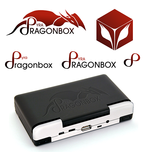
Don't get me wrong, I like this logo a lot too, especially as it is shown on the render of the Pyra there, taking up the entire lid, that embossed would look great I think.
I've even done a couple rectangular shaped logos myself, which would have this same issue.
The issue I meant by this was pointed out by some others previously, in that a good logo should be able to work in single colour and work well when scaled down.
I think the scaling down could be a problem, for rectangular logos at least. Square ones are fine.
However, for this use, we may not need it to be scaled down anyway? But if it was to be used on things like Twitter avatar, which are square, or FB [shudder!] where they display a company logo in a square area, or for icons, or any other use where it needs to fit into a square space - Like even on website designs, sometimes having an image/logo alongside some other element you might just have a squared image, whereas a rectangle one would create a lot of blank space around it.
Scaled down to a 96x06 icon size, this square one:

Works better than a rectangular one:

Where to fit in that width, you are causing a lot of waste in the height.
That was what I meant, but as I say, this might not really be a concern, depending on how it is planned to be used I guess, aside from on the actual Pyra device lid
One more version of the PYRA ambigram, this time with evil dragon horns (do dragons have horns? no idea) on the P or teeth on the A:

FZERO's icon test is a good idea. This is what the above looks like scaled to fit 96x96:

I am quite happy with it now. It is readable enough (imo, maybe I'm biased because I have been looking at it for too long), so it does not need extra text in a plain font (except for the "DragonBox" part, but that is optional), it says PYRA and does not suffer from the eYRa or pYhd problem. It's an ambigram but it does not look aggressive or tattoo-like, in fact it looks more like a mix of some art deco font and a comic book font. It has a certain elegance, the curved lines are appropriate for a female name, without looking girlish. And the P can be used stand-alone, thanks to the horns it is already recognizable without the rest of the letters.
I think this would look great embossed on the lid (I would make it larger than on the Pandora, using almost the entire height of the lid).

FZERO's icon test is a good idea. This is what the above looks like scaled to fit 96x96:

I am quite happy with it now. It is readable enough (imo, maybe I'm biased because I have been looking at it for too long), so it does not need extra text in a plain font (except for the "DragonBox" part, but that is optional), it says PYRA and does not suffer from the eYRa or pYhd problem. It's an ambigram but it does not look aggressive or tattoo-like, in fact it looks more like a mix of some art deco font and a comic book font. It has a certain elegance, the curved lines are appropriate for a female name, without looking girlish. And the P can be used stand-alone, thanks to the horns it is already recognizable without the rest of the letters.
I think this would look great embossed on the lid (I would make it larger than on the Pandora, using almost the entire height of the lid).
This is looking very good now. I have a small suggestion though, perhaps it would be an interesting variant if the "horns/fangs" (yes some dragons do have them) were made more into some thing more flame-like. Perhaps this would be more fitting for the Pyra and horns/fangs can have negative connotations.One more version of the PYRA ambigram, this time with evil dragon horns (do dragons have horns? no idea) on the P or teeth on the A:

I think this would look great embossed on the lid (I would make it larger than on the Pandora, using almost the entire height of the lid).
Very awesome design i think it would look great nice and big on the lid. If it were etched in perhaps the letter shaped voids could be filled with red acrylic or something, to make it really stand out (assuming the device itself is back/dark gray). You could even vary the depth of engraving and have the acrylic (or whatever) be translucent if you wanted to replicate the colour-fade from red to black shown above.
Last edited by a moderator:
DFP
Member
- Joined
- Aug 30, 2010
- Messages
- 58
Best work yet, other ones kind of reminded me of electric stove filaments.One more version of the PYRA ambigram, this time with evil dragon horns (do dragons have horns? no idea) on the P or teeth on the A:
Last edited by a moderator:
Granitehead
Advanced Member
- Joined
- Oct 16, 2009
- Messages
- 3,011
I really like the direction _wb_'s work is taking (but I have run out of likes /again/, so I need to post to tell it).
God Ginrai
Godmaster
holy--Lovely ambigrams. They're getting better and better.
I suppose all of you already know this one.

-God Ginrai
levi
Still fresh, damnit!
Brilliant! I liked your initial box-free design, but agreed that it looked a bit rough and ready. Trouble it needed to be that rough to disguise the fact you needed the trailing lines on the P to make the legs of the A. But turning those lines into horns and fangs fixed that problem so you can turn the rest of the letters into a more tidy font. Great!One more version of the PYRA ambigram, this time with evil dragon horns (do dragons have horns? no idea) on the P or teeth on the A:

Wrath Of Khan
Soul soother...
This is it.!! It looks great on the pyra mock-up too.Predicting an incoming 'Pyra-chan'.
More random:

I'm still partial to the first design I posted that was derived from the Pandora icon though.
Imo this shows a good understanding of shape and logo design.
The integration of the curves on the dragon with the fonts works very well. Neat and tidy.
Ed. You have your logo for the pyra.
Similar threads
- Replies
- 21
- Views
- 5K
- Replies
- 328
- Views
- 66K
- Replies
- 99
- Views
- 24K
- Replies
- 25
- Views
- 6K


