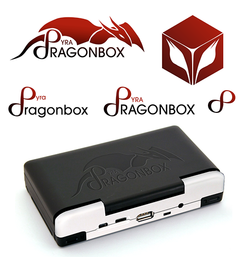
Thanks. Sadly it's not a real font, I just didn't found one so I just drawn the letters basicly freehand in Photoshop. ^^" ED mentioned red as fav. Colour for the logo so I just used it. I guess he or we should start to define the "official" logo colours in hex at best so people can work with it.I like that font better for the text "DragonBox". Also, I like the red.
-God Ginrai
This looks interesting but has one major problem: The words Dragonbox and Pyra are not seperated this way. If the Company "DRAGONBOX" has another product, let's call it "Haku", how do you want to solve this without altering the Company logo itself? Company name should be always separate from the actual product logo, even if they appear together.Predicting an incoming 'Pyra-chan'.
More random:

I'm still partial to the first design I posted that was derived from the Pandora icon though.
Easily solved.That's a good point. Unless it was ensured that all future DragonBox devices will begin with the letter [P]
...then it'll work
Make the Dragonbox starting with a regular D and smaller.
Make the d Part of the P more open so that it isn't a d any more but simply the lower part of a big P.
Increase size of yra.
That way Dragonbox stands on it's own and doesn't dominate that much.
Pyra on the other Side will be bigger the and also stand on it's own.


