Shouldn't it look more like a P?
This has become something of a... flame war. I, for one, am just arson about. *ducks*
You are using an out of date browser. It may not display this or other websites correctly.
You should upgrade or use an alternative browser.
You should upgrade or use an alternative browser.
Finding a proper name and logo :)
- Thread starter EvilDragon
- Start date
God Ginrai
Godmaster
Interesting.
The only one that reminds me of book burning is Fusion_Power's.I still like these a bit.. maybe the flames can be changed to look less book burny so God Ginrai can not get reminded of it.
-God Ginrai
Now with 78% more P.


fusion_power
Advanced Member
It is not mine, I just altered it a bit and some people like it.dThe only one that reminds me of book burning is Fusion_Power's.
-God Ginrai
And yours up there just looks boring, not even the font is interesting and the flame still looks weird no matter how much effects are aded. The 2D logo with the second outlined, more defined flame was better imho. I meant this:

The fonts (both) still need serious work but the idea is OK. However, we still can do better I'm sure.
This is still just a Spock-ear...Now with 78% more P.
Last edited by a moderator:
The back of the P can still have its curve.Now with 78% more P.

God Ginrai
Godmaster
First of all.... You have misquoted me.dThe only one that reminds me of book burning is Fusion_Power's.
-God Ginrai
Second, I was talking about your variation of the logo. The other variations of that logo don't remind me of book burning. Only yours.It is not mine, I just altered it a bit and some people like it.I would never burn books by the way, I usualy READ books.
And yours up there just looks boring, not even the font is interesting and the flame still looks weird no matter how much effects are aded. The 2D logo with the second outlined, more defined flame was better imho. I meant this:

The fonts (both) still need serious work but the idea is OK. However, we still can do better I'm sure.
Third, that logo you are attributing to me is only a variation of another user's logo to make it more readable and less blatantly Pandora-logo. You can't criticize me for flames I never added. Also, I think the flames in the original logo are much better than those in your variation.
-God Ginrai
Last edited by a moderator:

Slightly more dragon.
God Ginrai
Godmaster
You mean slighly more ear... Now it looks like it has a piercing. :\
Slightly more dragon.
-God Ginrai
fusion_power
Advanced Member
I know that you was talking about my alteration and not the original one and I actualy meant with "yours" only that kind of logo what you liked and quoted, sorry if I wrote this not clear enough.Second, I was talking about your variation of the logo. The other variations of that logo don't remind me of book burning. Only yours.
Third, that logo you are attributing to me is only a variation of another user's logo to make it more readable and less blatantly Pandora-logo. You can't criticize me for flames I never added. Also, I think the flames in the original logo are much better than those in your variation.
-God Ginrai
Like always, everyone has an opinion and it is likely at the end that ED will choose a completely different logo that nobody here had in mind.
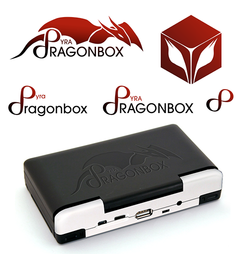
So, I thought about the "DRAGONBOX" Font that also needs some kind of recognizable font. I started with a more boxy font (no real font, just a Photoshop drawing:

Colour, proportions, thickness and size may vary. It could then look like this:

Last edited by a moderator:
Damn you! Cannot unsee.You mean slighly more ear... Now it looks like it has a piercing. :\
Slightly more dragon.
-God Ginrai
I would like to see the P on the left have the coloring of the right.
Slightly more elf.Slightly more dragon.

Even more elf... make them stop!
God Ginrai
Godmaster
I like that font better for the text "DragonBox". Also, I like the red.So, I thought about the "DRAGONBOX" Font that also needs some kind of recognizable font. I started with a more boxy font (no real font, just a Photoshop drawing:

Colour, proportions, thickness and size may vary. It could then look like this:

-God Ginrai
A version of the ambigram 2D box with more friendly curves. I hope this one is not too "Aggressive. Unfriendly. Brutal." 


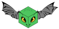
I like that, but I think that this would be more fitting for a mascot than a logo since it's, well, cute.Ok this was pretty much ignored last time, but someone mentioned a "literal dragonbox", is there really no way that ideas can't come from this one?16kyn0p.png
The box is angled so that it's supposed to look like a dragon's head too
Last edited by a moderator:
@LEOXD: Thank you  . And yep, perhaps you're right
Similar threads
- Replies
- 21
- Views
- 5K
- Replies
- 328
- Views
- 66K
- Replies
- 99
- Views
- 24K
- Replies
- 25
- Views
- 6K


