comradekingu
Glowing ember
Goal:
Make a logo for a successor to the pandora, the dragonbox pyra and the dragonbox shop. Good logos in general.
Learn gimp and from input by way of feedback, trial and error.
Simple, symmetry, european, dragons, magic, mystery.
View attachment 8060
This exists as a little gallery and a side discussion to the official logo and naming thread.
Very open for colour suggestions, alterations, names, anything, have fun.
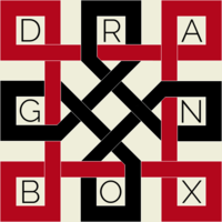
View attachment 7957
View attachment 7916
A modern space age cyrillic-ish one.
View attachment 8076
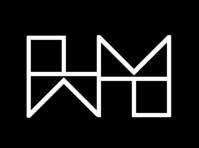
Pyra is fyr in my language, these are catered towards a more theoretical burning than flamme (flame)
View attachment 8093
Here be dragons, in boxen. Flame away.
View attachment 8245
Make a logo for a successor to the pandora, the dragonbox pyra and the dragonbox shop. Good logos in general.
Learn gimp and from input by way of feedback, trial and error.
Simple, symmetry, european, dragons, magic, mystery.
View attachment 8060
Name for device, "dragonode" which was a suggestion at a time no name had been selected.
View attachment 7780
I came up with a name when i was out walking.
It has dragon, it has node, and its an ode to the dragon, which is ED.
Ode is the same word in all major european languages, in spanish its oda. And it comes from ancient greek.
Node is also the same across the board, its geeky but not in a bad way, it translates nicely to computer device and it begs the question of what greater network (community) it belongs to. Its a device onto itself, but in a greater respect its about the community.
DR has a nice connotation. And DE is the language code for germany. NO is norway, and not only from me to ED, i think honour to his work is something we can all get behind.
Dragonode is available on every top-domain.
3-4 syllable that roll along nicely and play on each-other. They cut off where the word-play is. It is easy to spell, and it works in many languages, the dragonode, dragonoden, etc.
It sounds not overly complex, and its not embarrassing to say.
Also i think node comes from knot (said so on wikipedia), which goes nicely with the logo
Explaning the potential names
Dragonode (box) an ode to the dragon (ED) node for short
dragonin (box) shrödingers cat the dib or dibs for short
dragonaid (box) aid to or from the dragon an aid or naid for short
dragonodin (box) Valfadir oooooooodin
This exists as a little gallery and a side discussion to the official logo and naming thread.
Very open for colour suggestions, alterations, names, anything, have fun.
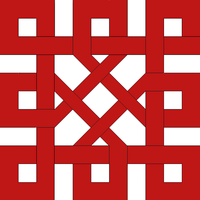
Inspiration from old european culture, in a style one might find carved into stone and wood.
It is dragons intertwined, found mainly in celtic/norse, but also paneuropean culture.
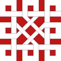
Less chaos edition
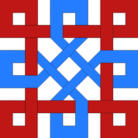
Norwegian edition (corrected some mistakes)
Edit: Idea, Maybe it can be made into a dragon/fenris wolf/midgard serpent in this fashion:
http://1.bp.blogspot.com/-1vdPB61tVfM/UXoGmstD7GI/AAAAAAAAAsM/_ArZsqUXcuE/s1600/Freya_small.jpg Usually these things bite their own tail and form complex structures. Celtic.
It is kept in it simplest form due to my gimp-skills
To pay homage to the german möebius mathemathician it could even twist around its own loop.
Möebios is a nice name.
Updates on versions, designs and ideas here in firstpost as time goes by.
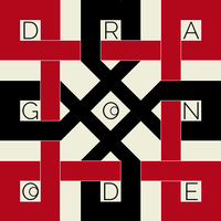
Colours are better, used bauhaus style colours. Added font to inside the gaps
Meh, for some reason the forum software always kills the colouring, the originals are a lot more bright
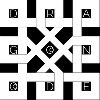
Less noise, more better.
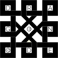
After some reconciliation feedback and thinking it became this.
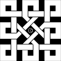
The plot thickens as it takes a twisty turn for the land of möbius.
View attachment 7857
It got twisted and complicated in möbius land, a wild monkfish appears
View attachment 7876
He cooks up a compelling preposition.
View attachment 7876
gimp is now friends with comradekingu, buttons are pressed
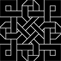
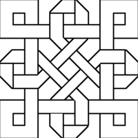
Some minute changes to cater to those seeing things outside of the box
View attachment 7886
View attachment 7887
Adding borders to the outside of inner circle and other small changes
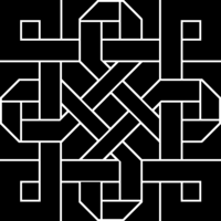
View attachment 7889
Small changes:
View attachment 7895
View attachment 7894
I see what you did there...
View attachment 7930
The masses called for lower entropy, and lower entropy they got
View attachment 7944
View attachment 7947
If this is the end, would that be a happy ending?
View attachment 7953
View attachment 7958
View attachment 7964
View attachment 7961
View attachment 8042
It is dragons intertwined, found mainly in celtic/norse, but also paneuropean culture.

Less chaos edition

Norwegian edition (corrected some mistakes)

Edit: Idea, Maybe it can be made into a dragon/fenris wolf/midgard serpent in this fashion:
http://1.bp.blogspot.com/-1vdPB61tVfM/UXoGmstD7GI/AAAAAAAAAsM/_ArZsqUXcuE/s1600/Freya_small.jpg Usually these things bite their own tail and form complex structures. Celtic.
It is kept in it simplest form due to my gimp-skills
To pay homage to the german möebius mathemathician it could even twist around its own loop.
Möebios is a nice name.
Updates on versions, designs and ideas here in firstpost as time goes by.

Colours are better, used bauhaus style colours. Added font to inside the gaps
Meh, for some reason the forum software always kills the colouring, the originals are a lot more bright

Less noise, more better.

After some reconciliation feedback and thinking it became this.

The plot thickens as it takes a twisty turn for the land of möbius.
View attachment 7857
It got twisted and complicated in möbius land, a wild monkfish appears
View attachment 7876
He cooks up a compelling preposition.
View attachment 7876
gimp is now friends with comradekingu, buttons are pressed


Some minute changes to cater to those seeing things outside of the box
View attachment 7886
View attachment 7887
Adding borders to the outside of inner circle and other small changes

View attachment 7889
Small changes:
View attachment 7895
View attachment 7894
I see what you did there...
View attachment 7930
The masses called for lower entropy, and lower entropy they got
View attachment 7944
View attachment 7947
If this is the end, would that be a happy ending?
View attachment 7953
View attachment 7958
View attachment 7964
View attachment 7961
View attachment 8042

View attachment 7957
View attachment 7916
A modern space age cyrillic-ish one.
View attachment 8076

Pyra is fyr in my language, these are catered towards a more theoretical burning than flamme (flame)
View attachment 8093
Here be dragons, in boxen. Flame away.
View attachment 8245
Last edited by a moderator:


