You are using an out of date browser. It may not display this or other websites correctly.
You should upgrade or use an alternative browser.
You should upgrade or use an alternative browser.
Finding a proper name and logo :)
- Thread starter EvilDragon
- Start date
I'm liking the last one. Clean, simple and clear, just how it should be.
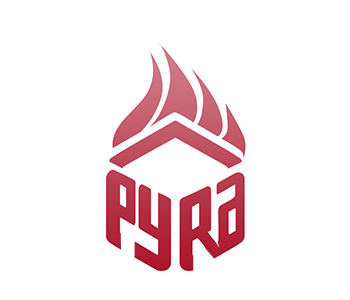
Something like this? Traced the flame quickly.
Right one looks like a diamond.
Something like this? Traced the flame quickly.
Nice one.
I really like it a lot.
Might be even better than the flame for the logo (yes, I really said this)
DragonBox Pyra. Ambigram Pyra in a 2D box with dragon wings.


bzar
A Commando
The first two are train-of-thought of how I got to the last one, slowly getting rid of the explicit cube entirely
Yeah :lol:slowly getting rid of the explicit cube entirely
bzar
A Commando
Not bad, but it looks a bit "too professional" and too generic to me. This logo looks like it could just as well be a logo for medication or accounting software
Maybe my most recent proposal goes a bit too far in the other direction
DragonBox Pyra. Ambigram Pyra in a 2D box with dragon wings.

Granitehead
Advanced Member
- Joined
- Oct 16, 2009
- Messages
- 3,011
_wb_: I don't like your one. Aggressive. Unfriendly. Brutal. Is what comes to my mind.
I would like something cute. Maybe also strong, but not the way yours or comradekingu's are strong.
I would like something cute. Maybe also strong, but not the way yours or comradekingu's are strong.
_wb_: I don't like your one. Aggressive. Unfriendly. Brutal. Is what comes to my mind.
I would like something cute. Maybe also strong, but not the way yours or comradekingu's are strong.

Please no, just no.
Last edited by a moderator:
i know what you mean it seems almost clinicalNot bad, but it looks a bit "too professional" and too generic to me. This logo looks like it could just as well be a logo for medication or accounting software.
God Ginrai
Godmaster
Honestly, I'm with everyone else. That looks like I'm about to hear someone drone on for 30 seconds about the benefits of "Prescription Pyra" and about how I should talk to my doctor to ask if Pyra is right for me.Actiually , I like B-ZaRs logo a lot. nothing wrong with professional . And I dont see the medication or accounting reference at all. To me it looks awesome.
-God Ginrai
- Joined
- Jan 18, 2010
- Messages
- 11,472
I still like these a bit.. maybe the flames can be changed to look less book burny so God Ginrai can not get reminded of it.Excellent development from this:


I like these (especially Fusion_Power's interpretation):


Nice work!

This has become something of a... flame war. I, for one, am just arson about. *ducks*
Agreed.I'm not sure what the semi-regular hexagon adds - the focus should be on the flame imagery (if that's what we want), and the curves seem to jar a little against the sharp vertices of the hexagon.

Null
Snug
This has become something of a... flame war. I, for one, am just arson about. *ducks*

Similar threads
- Replies
- 21
- Views
- 5K
- Replies
- 328
- Views
- 66K
- Replies
- 99
- Views
- 24K
- Replies
- 25
- Views
- 6K


