That looks nice! It's the first of the ambigrams that looks a bit like flames. Can you make them more flame-like?
You are using an out of date browser. It may not display this or other websites correctly.
You should upgrade or use an alternative browser.
You should upgrade or use an alternative browser.
Finding a proper name and logo :)
- Thread starter EvilDragon
- Start date
Neelix
Insecticidal Maniac
Binky's right... All I see in this series is Pyrd.
- Neelix
- Neelix
comradekingu
Glowing ember
Torpor: make the p synergize with where the flame begins. So that the p curves in nicely with where the flame begins. Also line width could be uniform, and follow the same curve as the style on the letter. If you want to finalize it more, i would make it into a torch like design, because that is what im seeing.
Fzero: I think it had the most potential before it got more wavy. Doing that would be a style option for last. On the versions above that, cut down on the use of line going through it, and instead introduce halfcircles everywhere. The lower end y is very good. What makes it work is that its at the same offset as the x letter hight is to the rest of the letter.
Only the pointy ends of the p and a do something, add a pointy flame at the top a inwards to get less pyrd. Balancing out with the next letter elliptical shape.
Last edited by a moderator:
- Joined
- Dec 8, 2005
- Messages
- 6,603
- Age
- 42
- Location
- UK
- Website
- pokeparadox.itch.io
- WEBSITE
- https://github.com/pokeparadox
- YOUTUBE
- pokeparadox
All I see is rudeness... (i.e. reminds me of the number 69...)Binky's right... All I see in this series is Pyrd.
- Neelix
Fzero
Advanced Member
- Joined
- Mar 9, 2010
- Messages
- 4,702
get over here http://www.specsavers.co.uk

It does look a bit '96' in the middle there I have to admit.
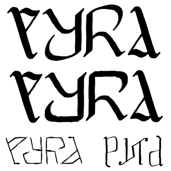
Tried without the straight cut out lines, just the circles, which I think loses the '96';

...At the bottom one there added little serif to the [P] [A] to try improve, I think the [A] looks ok, more [A] than [D]... but the [P] now has that "I'm an [E]" thing going on eh
With full circles;

With big angle cuts out the [Y] and [R]. which I think make them look more like the letter

It does look a bit '96' in the middle there I have to admit.
Tried without the straight cut out lines, just the circles, which I think loses the '96';

...At the bottom one there added little serif to the [P] [A] to try improve, I think the [A] looks ok, more [A] than [D]... but the [P] now has that "I'm an [E]" thing going on eh
With full circles;

With big angle cuts out the [Y] and [R]. which I think make them look more like the letter

God Ginrai
Godmaster
Now I'm just seeing "eyrd"
-God Ginrai
-God Ginrai
1960?
The Pyrd is strong with this one.
Binky's right... All I see in this series is Pyrd.
- Neelix
I see p96d...
Now I'm just seeing "eyrd"
-God Ginrai

Fzero
Advanced Member
- Joined
- Mar 9, 2010
- Messages
- 4,702
Nice. Sure there's few more than this though aint there, or those all in the thread with Kingu's ambigram cube logo?
I still like that one [bottom left] a lot. Was it _wb_ done it using that nice curved [P] letter flame shape from Binky?
That one is real nice.
A couple more, not done too cleanly, just playing with more ambigram ideas. They're not too easy


I still like that one [bottom left] a lot. Was it _wb_ done it using that nice curved [P] letter flame shape from Binky?
That one is real nice.
A couple more, not done too cleanly, just playing with more ambigram ideas. They're not too easy


God Ginrai
Godmaster
Nice. Sure there's few more than this though aint there, or those all in the thread with Kingu's ambigram cube logo?
I still like that one [bottom left] a lot. Was it _wb_ done it using that nice curved [P] letter flame shape from Binky?
That one is real nice.
A couple more, not done too cleanly, just playing with more ambigram ideas. They're not too easy


-God Ginrai
Nicely collatedI'd forgot all about a few of those...
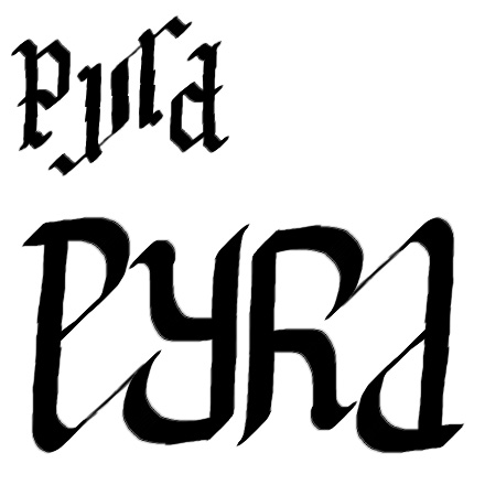
After all my favorite is this:

It would look very cool on the top of the Pyra. The P look like a P and the a shape is perfect, but because of letters sizes it look like a d, maybe it can be fixed by adding a hole.
Last edited by a moderator:
Similar threads
- Replies
- 21
- Views
- 5K
- Replies
- 328
- Views
- 66K
- Replies
- 99
- Views
- 24K
- Replies
- 25
- Views
- 6K


