Final Logo Poll

My favourite is...

  • Logo Nr. 1

    Votes: 147 55.3%
  • Logo Nr. 2

    Votes: 119 44.7%

  • Total voters
    266

Status
Not open for further replies.

EvilDragon

Administrator
Staff member
Joined
Mar 4, 2003
Messages
29,986
Age
47
Location
Ingolstadt
Well, as you could see in the first poll, there was a draw between two logos.

Now here's the final poll - to find a winner!
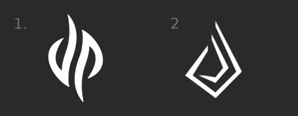
pyrafinal.png


Voting will end Wednesday 16th.

I've removed the typefaces as this will ONLY be a voting for the logo.

Keep in mind that the Logo might NOT be final - it could be it will be tweaked a bit. But it will be used as a base logo.
 
I actually prefered the original number 1 from the previous poll that kind of looked like a soft flame. Between these two, though, I guess I prefer number 2, this current number 1 looks WAY TOO MUCH like "tribal art". We shouldn't be trying to make Pyra look like the ideal of "super trendy" from X number of years ago, we are better than that...Pyra deserves better than that...
 
I think logo 1 looks like a barred spiral galaxy, or two comets glancing past each other.  The romantic visuals I can picture from logo 1 are exactly what I think the Pyra deserves.
 
I don't really 'get' #2 - it looks fiddlier*, and (to me at least) doesn't look like anything more than a bunch of lines.

I think the rotational symmetry of #1 is both aesthetically pleasing, and potentially useful

Either way, I was very impressed with how close these were in the previous poll.

*Is that a word? I meant "more fiddly" :)
 
Last edited by a moderator:
this current number 1 looks WAY TOO MUCH like "tribal art". We shouldn't be trying to make Pyra look like the ideal of "super trendy" from X number of years ago, we are better than that...Pyra deserves better than that...
I don't see how this can be likened to "tribal art". Number 1 isn't "super trendy", it just looks clean and recognizable. Plus, for anyone who looks deeper, it can mean dragonbox pyra with flame imagery.

EDIT:

@_wb_: Doesn't look like a flame anymore, and loses the beautiful aesthetic that the original has that way.

-God Ginrai
 
Last edited by a moderator:
I don't see how this can be likened to "tribal art". Number 1 isn't "super trendy", it just looks clean and recognizable. Plus, for anyone who looks deeper, it can mean dragonbox pyra with flame imagery.
Sorry, when I look at it "tribal art" is how it comes across to me as. Yeah, I know, I get the logo being a D & P and in that way it has a bit of meaning, but if that is what we are going for the D & P can be styled in so many other ways..that don't call to mind "tribal art", _wb_'s example in post #12 is one many great alternatives (more style, more class).
 
After reflection, I maintained my vote for the n°2. Even if n°1 is more timeless it is more banal: as we saw it looks like several logo once flipped and it looks like tribal tattoo. Also I don't want the ugly lowercase d to be used.
 
Last edited by a moderator:
Status
Not open for further replies.
Back
Top