Final Logo Poll

My favourite is...

  • Logo Nr. 1

    Votes: 147 55.3%
  • Logo Nr. 2

    Votes: 119 44.7%

  • Total voters
    266

Status
Not open for further replies.
@ ED:

Need to know:

The first logo. Will it be the two parts or only one "P".

I dislike both parts together on the device.

There 2 is a lot better.

It's only one "P" (the right side of the logo) then I'd prefer this one.

But why not make a compromise?

Use the second logo.

Use the Flame like "P" from the first logo for the "P" in Pyra (On the website and as writing below the logo if there will be such)

With that solution we can use both "logos" and already have a nice writing.

I would love that solution.
 
that don't call to mind "tribal art"
You keep saying this but don't explain why it calls that to mind. I could say that #2 comes across as "tribal art", and it would be just as valid.

-God Ginrai
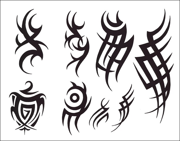
A quick google image search of "triabl art" brings up images that in my opinion have a similar style to number one:

rose-side-tattoos1.jpg


I think it has to do with the mixture of smooth and sharp. The lines are made up of smooth curves and all end in a point. There are also sharp angles between curves.
 
So that's tribal art.  Well, that looks really really cool, and reminds me of Endless Forest and Samuai Jack.  Is there any reason tribal art defaults to an insult or is someone just tired of it?
 
My girlfriend told me the same: number 1 looks like tribal tatoos. And I didn't suggest it to her. I only asked her which logo she liked better.
 
So that's tribal art.  Well, that looks really really cool, and reminds me of Endless Forest and Samuai Jack.  Is there any reason tribal art defaults to an insult or is someone just tired of it?
When I was a teenager, I definitely wanted a tribal tattoo. I later learned that, at least where I am from, tribal tattoos where assimilated by a subculture known around here as "douche." I think they are looked down on mainly due to the fact that the art was originaly used in polynesian culture, but was adopted by white muscle heads without any "tribal" heritage.

While it certainly is a really neat form of artwork with a long history, it unfortunately now carries a negative connotations here in North America, especially when it is not expressly linked to something with true "tribal" heritage.

That is probably why I decided not to choose No 1. I like the idea behind it, but it certainly does remind me of a subculture that I wouldn't go out of my way to associate with.

I'm sure a search of "tribal tattoo fad" or somethign like that would get you a better explanation.
 
  • Like
Reactions: moz
A quick google image search of "triabl art" brings up images that in my opinion have a similar style to number one:

rose-side-tattoos1.jpg


I think it has to do with the mixture of smooth and sharp. The lines are made up of smooth curves and all end in a point. There are also sharp angles between curves.
Yes, I know what tribal art looks like. My point is, #1 doesn't look like it.

The only similarities to what you posted are:

  • Black
  • Curves
You talk about "Sharp", but honestly, if you compare #1 to any of those images you posted, The tips of #1 are dull in comparison. Not to mention, all of this tribal art has numerous tips, as if they were representing barbs or thorns; #1 does not exhibit this.
-God Ginrai
 
So that's tribal art.  Well, that looks really really cool, and reminds me of Endless Forest and Samuai Jack.  Is there any reason tribal art defaults to an insult or is someone just tired of it?
When I was a teenager, I definitely wanted a tribal tattoo. I later learned that, at least where I am from, tribal tattoos where assimilated by a subculture known around here as "douche." I think they are looked down on mainly due to the fact that the art was originaly used in polynesian culture, but was adopted by white muscle heads without any "tribal" heritage.

While it certainly is a really neat form of artwork with a long history, it unfortunately now carries a negative connotations here in North America, especially when it is not expressly linked to something with true "tribal" heritage.

That is probably why I decided not to choose No 1. I like the idea behind it, but it certainly does remind me of a subculture that I wouldn't go out of my way to associate with.

I'm sure a search of "tribal tattoo fad" or somethign like that would get you a better explanation.
^This is exactly why I'm not a fan of design #1, well, except for the wanting a "tribal" tattoo - part, never personally wanted one myself.
 
Last edited by a moderator:
A quick google image search of "triabl art" brings up images that in my opinion have a similar style to number one:

rose-side-tattoos1.jpg


I think it has to do with the mixture of smooth and sharp. The lines are made up of smooth curves and all end in a point. There are also sharp angles between curves.
Yes, I know what tribal art looks like. My point is, #1 doesn't look like it.


The only similarities to what you posted are:

  • Black
  • Curves
You talk about "Sharp", but honestly, if you compare #1 to any of those images you posted, The tips of #1 are dull in comparison. Not to mention, all of this tribal art has numerous tips, as if they were representing barbs or thorns; #1 does not exhibit this.
-God Ginrai
I understand the logo doesn't necessarily follow the tribal format to the letter and agree that the points of the logo are slightly dulled.  I never said this was a logo specifically designed to be tattooed on a polynesian warrior. I do, however, see a resemblance due the the thick/curved lines that end in points (dulled points, but still points).

If you don't see the resemblance, that is just fine. I see the resemblance, as do others, and that is why I didn't vote for it. You still have every right to vote for it, and if it wins, I will still buy a Pyra. I may just cover up the logo with a sticker depending on how well it can be tweaked.
 
That is probably why I decided not to choose No 1. I like the idea behind it, but it certainly does remind me of a subculture that I wouldn't go out of my way to associate with.
I do, however, see a resemblance due the the thick/curved lines that end in points (dulled points, but still points).
japanese.jpg


OH MAN! How am I supposed to play Ocarina of Time now? Those Kanji and Katakana have thick/curved lines that end in points! It all remind me of douches and short-sighted people on forums that would allow their prejudices to decide what logo they should vote against!

-God Ginrai
 
Last edited by a moderator:
After reflection, I maintained my vote for the n°2. Even if n°1 is more timeless it is more banal: as we saw it looks like several logo once flipped and it looks like tribal tattoo. Also I don't want the ugly lowercase d to be used.
Same here, I voted #2 last time and still prefer it, that's just from a visual style angle too...


...the fact that #1 has been used by other companies already makes this not worth considering imo. Someone linked another instance of that design used for some company, and I've seen it on the side of a van myself, though at a 90degree angle, but still.


I do like that #1 comprises the device make and model initials, just think the logo used has to be unique
 
Well, now I'm set on voting for 2 just because it seems to get under your skin. :)
 That's your perogative. But that's still letting things other than design and aesthetics guide your decision for a logo.

generic.jpg

OH MAN! How am I supposed to help a certain someone understand a perfectly reasonable concern when they are being snarky and exaggerating beyond belief!
 You have no room to speak. You reiterated twice that it looked like "tribal art" but never explained your reasoning for why it looked like it even when asked. edgex004 ended up making an argument for you.

...the fact that #1 has been used by other companies already makes this not worth considering imo. Someone linked another instance of that design used for some company, and I've seen it on the side of a van myself, though at a 90degree angle, but still.

I do like that #1 comprises the device make and model initials, just think the logo used has to be unique
Didn't comradekingu already point out in the previous topic that #2 is just as similar to other company logos as #1 is?

-God Ginrai
 
Well, now I'm set on voting for 2 just because it seems to get under your skin. :)
 
That's your perogative. But that's still letting things other than design and aesthetics guide your decision for a logo.
Okay. :)   I do honestly like the design of 2 a lot, and it has been my favorite since it was first posted. The tribal looking logos haven't been my favorite, but that particular style doesn't automatically discount a logo for me. It certainlyplays a role, and I understand how it does for others as well.
 
When I first looked at all 4 logos I immediately liked #2 the most, so I'll stick with that. I had the feeling that it looks a bit like the Pandora logo transformed into a flame ... can't really explain why after looking at both logos again, but that was the first thing that popped into my mind seeing it. Also for some unknown reason it reminds me of the logos you could choose in the old Amiga&DOS Game "Syndicate" ... also not a bad thing for a handheld aiming at emulation and retro-games. I have a lot of good associations looking at #2 ...

Looking at #1 I still read "VP" all the time :p
 
Looking at #1 I still read "VP" all the time :p
I can see where you see that. I don't think it matters all that much, tho'. Also remember that these designs will be tweaked, so it may be possible to tweak out the "V" in logo #1.

-God Ginrai
 
7% difference isn't a huge margin. I hope we get a lot more votes which widen the gap, otherwise it's still going to be close.
 
Status
Not open for further replies.
Back
Top