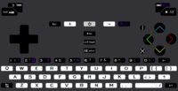
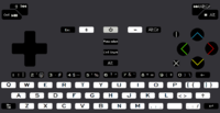
Explaining keyboard layout proposals. Fn hotkeys updated, language switching, powertoggles etc

Functional layout vs reduced layout


  • Total voters
    38

I dont have the problem when they look like they belong there. - and + didnt have the same thing about them.

Maybe its because the X is different from a pure x-cross. And that pipe isnt ever close to that area.

+ and - _could_ have been there as + and -, even though thats bad. I dont have the same thing about X and |.

Same as  <^v>, I just get where those are, it wouldnt be anything else.

With ABXY i get confused internally on the diamond cluster, and i get confused towards the keyboard, because i have played a lot of computer-games.

Edit: Almost forgot, I made a version with all symbols/text as default as possible wrt. regular keyboards.

nr67coloursfixins5-1text.png

The purist in me says that if select and start was printed on the case, like it should, then this would be a manageable tradeoff.

Edit: Just thought of something. Putting select on meta doesnt work, beause then pressing F-keys ingame is impossible.

Edit2: View attachment 11115

But now there is no clue as to why the alt symbol is select. So im stuck with text.

Stickers? ;)
 
Last edited by a moderator:
Don't < > ^ v look too much like dpad directions? Though perhaps slightly less elegant visually than your symbols, I kind of like my ⇤  ⇥  ⇞  ⇟, since those are actual symbols for Home/End/PgUp/PgDn (admittedly they are a bit obscure, but they do exist), and they can unambiguously be distinguished from the dpad directions and the actual < > ^ v symbols (as in less than, greater than, hat and letter 'v').

As for I and X: it will be very confusing that there are virtually three I and X buttons: there's the capital letter I, the pipe |, and action button Insert, and there's the capital letter X, the old Pandora action button X (which is V in your layout, but of course not the letter V), and then there's the action button Delete.

Anyway, in my layouts, I don't have Ins and Del at the action buttons, so I don't have the problem. + and - are nice labels. In my mind, Ins/Del don't really belong in the Home/End/PgUp/PgDn cluster (not that + and - really belong there, except for zooming), they're more like Backspace, Esc, and Tab. The right side of the top row feels like a natural location for Ins/Del, and that's also where lots of laptop keyboards put them.

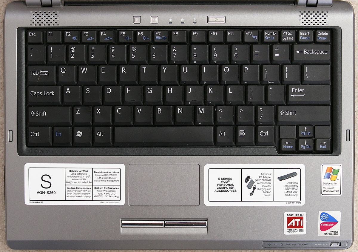
For example, look at this laptop keyboard:

laptop_20keyboard.jpg


It also has Home/End in a left/right arrangement, like we do (it is pretty natural, after all). Note how Ins and Del are quite far away from Home/End/PgUp/PgDn, and they're in the top right corner. I think that is a pretty natural location for Ins and Del.
 
↓↓→←↑ looks like d-pad directions.

If you want it more distinguishable, we are back to W3EM

There is an ISO-standard symbol for escape too, its ugly, being the reason why its obscure. Same with pageUp PageDn Home and end. I had a more visually telling way, but i scrapped it for visual sleekness. Clarity can only be a joint effort.

Insert and delete belongs in the "87"-key cluster, to the left of home/end/pageup/pageDn.  This is as close as it gets, and quite preferable considering function.

Laptops place them there because they dont have a choice, its also sometimes here and sometimes there. On real standard full keyboards they are always in the same place.

When its hacked onto the arrow-buttons, its not like right Ctrl was an option for delete.

I dont get the notion that those keys | I l or x X could be on the buttoncluster. I dont think + and - belongs there at all.+

Edit: I made a mistake and switched start and select around. Supposed to be select top with ctrl and start bottom with alt.
 
Last edited by a moderator:
↓↓→←↑ looks like d-pad directions.
Sure, but ← → ↑ ↓ is not the same as  ⇤  ⇥  ⇞  ⇟. It's similar, and that's a good thing, but it's clearly not the same, and that's also a good thing.

Laptops place them there because they dont have a choice, its also sometimes here and sometimes there. On real standard full keyboards they are always in the same place.
Laptop keyboard designers still have at least as much choice as we have, since they have more keys to work with. Still, they often choose to separate Ins/Del from Home/End/PgUp/PgDn.

We're not a standard keyboard, we can't put - + in their normal spot (which would be between 0 and Backspace or in the numpad), yet we have to put them somewhere. Having a dedicated key for - is quite nice (+ is less important), since it is a pretty important punctuation mark when writing language (it's a hyphen and a dash) and it's also used a lot in coding (not just as minus but also for command line parameters etc). My proposal shows that you can have both a dedicated - key (you get the dedicated + key for free) and dedicated Ins/Del keys.

At least laptop keyboard often put Ins/Del in the top right corner. You put AltGr over there. Neither laptop keyboard, nor standard full keyboards would do that. It is not an expected location for AltGr at all. Also a keyboard with four Alts is just weird, if you ask me. Two Shift keys, yes. Two Ctrl keys, yes. Two Meta keys, yes (see below). Two Alt keys, yes. One Alt key and one AltGr key, yes. But I haven't seen any keyboard yet which has two Alt keys and an AltGr key, and certainly not two Alt keys and two AltGr keys.

Keyboard-1.jpeg
 
<^v> is just as different from ←↑↓→ as  ⇤  ⇥  ⇞  ⇟, maybe even more so. Mainly two things differentiate the two.

<^v> is:

  • not ugly 
  • can be written easily.

If you want it to be spoken easily, then the white lines have to be added.

Depends on mechanical complexity, and also may or may not look like a ripoff of snes now. A trademark to nintendos name. Im not a lawyer, but i know how to avoid being an idiot.

I dont consider the standard-aspect of ⇤  ⇥  ⇞  ⇟ to be a thing, because of how few people know about it. With the meta symbol, same thing, but it isnt ugly, and its "some standard"

Putting Ins Del on buttoncluster +2 _is_ for case of argument a level of seperation away from <^v>.  But its irrelevant,

you are rationalizing doing something wrong (putting - and + not on the typewriter) by looking at what other people do wrong (laptops) rather than looking at what it is that is done.

Putting + and - on <^v>+2 is a big degree of seperation, one that isnt good.

You dont get + for free, you waste a key on people who want to argue Gnu+linux-semantics.

The orientation you put insert delete in, isnt the standard, thats something you get for free on <^v>+2

So if we assume top left is Esc, then you by doing insert delete on columnrow have one less hardware modifier. And its unsymmetrical.

Laptop makers dont have a whole free buttoncluster to work with. Much less two extra buttons next to it. They dont have the option not to get clever. Much broader audience. Much more reliance on familiarity since it has to sell with the general public. More keys in this case just means more expectations of doing it stock.

Also, its still a 10-finger board, there is little to no reason to do anything clever. And they _regularly_ fail at the little they do. Consider HPs powerbutton next to escape. Lenovos choices after x220 etc.

Directional home/end/pgUp/PgDn with same orientation insert and delete close by is just an obvious design-win.

+ and - is expected close to backspace on number row on US layout. In german its + there and - by right shift.

So lets say the user expects them numberrow, then they should be numberrow. It doesnt make sense to put them on the full layout keys, and thats only lets say half the users anyway, so what are the options.

A. Put both on the numberrow we have got, try to adhere with standards. (I halfway fail at the latter.)

B. Put them on game-buttons, in an orientation they arent in. Which means that _you cant type - when you are in a game that uses gamebuttons/all gamebuttons, depending on how its done.

Trying for A is not the same as putting them somewhere. That is just inter-argument-rationalization.

Given how the whole row that Ctrl  Alt  Space and AltGr isnt to be found, its not like there is an obvious option. True. But its not like calling it meta all of a sudden takes away from the fact that the placement isnt normal. Granted, it could be closer to "default", but that is also a question of _all of those choices_, not just the one.

Ctrl and alt are columnrow, AltGr is _to the right_ of that Alt.

One reason why my numberrow is less default, is so that you only need shift to use it. Easier for novice users. Less reliance on AltGr, because you can type natural language without it.

Which would you rather see?

A: Keyboard with more basic standard keys than you are used to, some of them redundant.

B: Keyboard with non-standard keys that conflict the above functionality on a basic level.

What about the general mass, and how do you and me fit into that demographic? Consider you are one level of abstraction away from me even.
 
Last edited by a moderator:
nr67coloursfixins5-1textfixaltGrpurple.png

nr67coloursfixins5-1textfixaltGrpurplebuttons.png

Added a Menu option, since its the same convention used on the two other column-buttons. And it completes the set.

The reason i dont like this is because you then have to take exclusive input from it in games. Which means meta wont work in your game. That isnt good.

The other reason i dont like it is because it is never used (apart from in minimenu) and it shouldnt be encouraged, since start select is the purist way.

The other one didnt go anywhere. Writing it in full is still a level of visual struggle thats harder to overcome than all the other buttons.

post-2326-0-38360200-1429846680.png


Feedback on this needed :)

Its just the shoulders i am not sure about now.  There could be alternative ways of doing it

Right now

L1 Shift                                    R1 AltGr                 Shift and AltGr modifiers in same position as on key. Ctrl+alt on a line. AltGr "to the right" of Alt

L2 Ctrl                                      R2 Alt

----------------------------------------------------------

L1 Shift                                    R1 Alt                     AltGr is then to the Right of Alt, but it also means its below shift. Also the Ctrl+alt on a line is broken.

L2 Ctrl                                      R2 AltGr

-------------------------------------------------------

                  Breaking Ctrl+alt on a line should be done only to get the same orientation as on the keyboard, even if that orientation is wierd.

-------------------------------------------------------------

L1 Alt                                  R1 AltGr                   Ctrl alt in same orientation as on keyboard. But then shift is to the right of AltGr, so we are back to scratch only now its worse.

L2 Ctrl                                 R2 Shift. 

-------------------------------------------------------

Edit:

-----------------------------------------------------------

L1 AltGr                               R1 Ctrl                     Shift is to the left of AltGr.   Ctrl is to the left of Alt.   AltGr is to the left of Alt. Ctrl+alt   and shift AltGr swapped from regular keyboard.

L2 Shift                                R2  Alt

----------------------------------------------------------

With the orientation of the symbols on the keys, and the placement of on-keyboard AltGr, i still prefer the first. Would be nice with some hands-on though.
 
Last edited by a moderator:
I just remembered why you need to lose something over implementing the german letters in the full layout area. Its because you cant still have shiftmod  and do small and bigg letter on the same key.

So you cant just AltGr in the regular german key by default.

So either those keys have to be just 1 per key, which isnt possible, or you need to do without untill you switch layout.  But a lot of people use german and code too, so then what.

Toggling the caps we dont have isnt an option, nor would it be.

You type dedicated ö and Ö,  then meta+    and shift+meta+   to get the regular symbols.  The reason it isnt altGr+ is that it already does something dead on those keys, that is a nice bonus.

This solution means there cant also be Fkeys on P+2

We assume here that people who need <>  [] {} are advanced enough to cope with meta+ and shift+meta+  as an option to switching language back and forth.
 
Last edited by a moderator:
To avoid having to switch language back and forth, the original prints on the p+2 and l+2 buttons can be reinstated with meta+ and shift+meta+ if you swap them out for something else primarily.

Since meta also triggers F-keys, F11 and F12 will have to be somewhere else for this to work. Like this

http://www.keyboard-layout-editor.com/#/layouts/07c2a5305bc82af3efbadc5a8880a8b0

In my view its better not to print them, since they are ugly, and easily remembered. If someone doesnt use F-keys and want something else on Q and W or  P+2, then they are more free to do so, without being "reminded" that it should be F-keys.

Went back to doing it the layout way, so that its easy to submit changes.

Changed ctrl/select to be compatible with pandora. Important to some, im sure.

Edit: http://www.keyboard-layout-editor.com/#/layouts/7bc1849de2214369dfae557aa231efe6

Makes a lot of sense, because you get more easy access to shoulders, with one hand. Will try to do something else too.

http://www.keyboard-layout-editor.com/#/layouts/32937f23b5b3a6ca77d895d116f451af

Regular US shift+ row, and still one dead-key diactric per key!

So the reasoning is dead-key users arent english only, and shoulders are more effective. But for casuals, the hold-combo to ' ? - is very useful.

http://www.keyboard-layout-editor.com/#/layouts/2460b1aa4620423d4fee0f3a2be66af3
 
Last edited by a moderator:
This is feedback for the layout at the bottom of your last post.

I am really happy to see the shifted nuber row like that.  Shift looks like it would be very hard to push and hold (it is surrounded on 3 sides, with the open side having a key above and below as well) while trying to hit another key, however this may not be the case on the real thing.  I would recommend moving shift to where you have tab, since shift is more important and needs to be pressed with other keys.  Tab can be in the Pandora location, which causes more problems since you have enter next to space and I have no recommendation for it.  Punctuation from space (which really bugs me) can be moved to where you have shift.  This will interfere with L+2, but the same is true of having shift there.

I don't think the markings on gaming buttons matter, and should be considered a part of the keyboard layout.  Just tell us what they do and keep the markings out of it for now.  If we get colors on those the marking won't matter since games can say "hit the red button".  If not then your markings aren't really any less confusing than the Pandors button letters.  I like that you have ins and del on the little buttons if they are still there, but I can't tell since I don't see Del mentioned.

As with all the layouts doing this, I don't like Esc way up there, but I can live with it.  Something about Meta is confusing to me.  I can't figure out what it is, but I get the feeling that it causes bigger problems or does something that gives me concerns.  Maybe it is because you have AltGr and Meta.  I also get the feeling that this would not be a keyboard I would want to try to use with the Pyra on a desk.  It is probably largely due to the Pandora-like Alt and Ctrl placement.  AltGr seems like it is in a bad place if it will be held down frequently, such as when doing some number row punctuation.

I just noticed something that may become irritating, and it is not about your layout, but the power button in general:  it is in a terrible place and might get pressed by accident all the time.  I will need to look at the prototype case pics again.

Will the keys to the left and right of power open menus?  You probably answered that somewhere else.  Meta just for F# and media buttons seems like a waste.  Did I miss something else it does?  Even if I don't like your choice of keys up there, I do like conserving keys, although I feel those should only be used for hardware purposes.

I want to punch the smiley on 9 everytime I see it.  Why no Super/Pyra? (On a real keyboard connected to a normal computer I use Super.)

I really like that most keys only have 1 thing on them.
 
Here is my take on comradekingu's latest proposal: http://www.keyboard-layout-editor.com/#/layouts/813d5e9f870160c8ef90ce32efd8a766

What I changed:

- made it clear that it is a single-width space key

- unified AltGr and Meta into one modifier (called Meta)

- took all AltGr symbols away from number row (would conflict with F-keys)

- put the following keys at P+2 and L+2: minus-underscore, equals-plus, quote-doublequote, and tab. They have no Meta label so if you put something else there (ÜÄÖß or something), the original keys can go under Meta

- put the remaining punctuations at Meta+IOPJKLNM,.
 
It was a doublewidth spacekey. I was trying to do as many changes to conform as possible, while still keeping the added value.

When you modified it, you broke:

Typing without slaloming

The more central location of space.

Efficient typing of oft used combinations.  comma space.  Dot space shift. Dot enter.

5 shift+ comboclicks

3 AltGr+ comboclicks

1 of the tradable buttons (the tab one, shift is duplicated on shoulders)

AltGr+all letterbuttons

AltGr+^

Shift+AltGr+^

AltGr deciding of hidden dead-keys (for the comma and dot key, they have more than one hidden dead-key)

Utilization of keyspace (2perkey is percentagewise worse than 3perkey)

The assumption that english users will find brackets in the same place.

Finding tab at the correct side of the keyboard.

1 diactric per key on non-tradable keys. (some of the numbers are now missing hidden dead-keys)

meta+ and shift+meta+ to reinstate trad(ed/)able keys. I think that was a better idea than the proposed change. The "extra" has the same freedoms as meta had, only without f-keys and mediabuttons. In return for having to deal with extra foreign concept.

Possible mismatch between already produced (?) casemolds and spacekey

Finding space a little easier the first time.

And this does work:

One more button that works exactly the same as the rest of the convention. (the space)

Pressing tab while using the other hand for dpad

Finding shift a little easier the first time

Dedicated pressing of =

-----------------------------------------------------

So all in all one good change that we may not have, and the rest i think detrimental.

----------------------------------------------------

rygD:

Similar to holding enter on the pandora i imagine, or holding L without hitting P, dont see a problem there. It would be really nice to have a dead-shift.

"hit the red button" doesnt work for colourblind people. Of which there are quite a few percentagewise. Red/green being of the more common ones.


If you make each button in the buttoncluster in one solid colour, in that arrangement, then that is the snes-trademark that nintendo owns.


Del/Ins     is buttoncluster+2, yes.


Meta is never a substitute for AltGr. My F-ing idea didnt really fly. I'd still buy the aftermarket replacement :)


Esc away means less accidental Esc. If you want to have a keyboardbutton+q for escape, then you are tying up both thumbs.


You can use ctrl+  and alt+  similar to how you press alt+tab with one hand on a desktop keyboard.

Powerbutton is in the exact same place everyone else place it in.


If they bring up a menu or toggle right away, the sun is for brightness/light things, and the ionizing arch is for power-things, like wifi 3g, usb etc


Meta only doing fkeys and mediakeys because that is as little meta you can get away with. With everything else being standard _and_ fully functional, what you are left with is more freedom to do meta things with.


No super because it does nothing in xfce, use meta. If its lxqt (never used it) i imagine the default shortcuts are similar to lxde https://daveden.wordpress.com/2012/09/21/lubuntu-keyboard-shortcuts-cheat-sheet/


meta+ left and right can change workspace

F2 or F3 can run

meta+d instead of super+d and similar for all others


I want to communicate that "this is the keyboard", it is so similar that you would expect the buttons to have been made for it/around it. Rather than "oh noes, this looks compromized, i wonder if i can use this" They both could go either way. One is a bonus or a expectancy. The other either lands on expectancy and may be what costs the sale.
 
Last edited by a moderator:
So the reasoning is dead-key users arent english only, and shoulders are more effective. But for casuals, the hold-combo to ' ? - is very useful.

http://www.keyboard-layout-editor.com/#/layouts/2460b1aa4620423d4fee0f3a2be66af3
Can you explain this "hold-combo" concept? Is this pressing the AltGr at the bottom of the center row between the nubs in conjunction with 5 6 7 ?

I don't think that is something that is easily done. I tried Pandora button + T or Y, and it's not a particularly comfortable thing to do with just one thumb.
 
It was a doublewidth spacekey. I was trying to do as many changes to conform as possible, while still keeping the added value.
It's not really a doublewidth spacekey if it does two different things depending on whether you hit it on the left or on the right.
 
Hitting space at the wrong end of the key is not the part im trying to conform with, nor does that work.

Its not really a doublewidth spacekey to begin with. The PCB registers presses at two different points, and it doesnt have stabelizers, so its one side or the other.

Importantly only the left side is valid for space, since it is the most central at all times. Its not a central space_bar_, so the only benefit is visual recognition.

Even so, my only concern is staying compatible with case-moulds if they have already been made, because they are expencive. You could say it costs more to re-do that its worth to do it right.

Decisions that arent mine, and are out of my control. I make do with what we got/are given. Clear guidelines wasnt one of those things.

If you changed the key to be single membrane, with stabilizers, and have one key area on the PCB, it is still a bad idea because of the implications:

This is a concept me and rygD came up with when ED made his keyboard thread that illustrates that http://www.keyboard-layout-editor.com/#/layouts/76ab0fa67861dd49ccd1f9d606c41206

I updated it now, but its still evident things gets ugly quick when you put the knife closer to the throat.

Detrimental effects:

Efficiency worse, elegance tarnished.

Pedantic user: That doesnt make any sense.

List of things that get better:

Novice user: Space is the long key.

<end of list>

Single-wide space is the better option for all reasons besides that. And its such a non-issue. As if any user would have a problem figuring that out. It _never_ was a problem for anyone i have shown a one-wide space layout to.

Non-stabilized doublesided space doing two things (of two) is second best.

Stabilized non-central doublespace doing one (of one) is wasteful and ugly and bad in practice.

Non-stabilized doublespace doing two things (of one) like on the pandora, falls between two chairs. Wastes a key, and pressing the middle feels wonky. Bad in practice.

Non-stabilized non-central doublespace doing one thing is wasteful feels wonky and is bad in practice.

Hold-combos are like pressing tab is on the pandora. It should have been a dedicated key, so the pandora doesnt really have any, but it is the same concept.

Hold one key, press another to get a different modus out of it.  

With either shift+  or AltGr+

Compared to the pandora the bottommost key on the pyra-column is closer to the letters, and also its situated right above 6, with equal distance to 5 and 7. Would be a terrible shame to waste that opportunity.

Because its closer to how a 105key board works with 10fingers, in that things are accessible.

Locking up your thumbs in non-ideal places to press things is diamentrally opposite, even if the modifier ctrl or alt is situated exactly where its available for the pinkey-finger on a regular keyboard.

All in all its 7 extra things that can be pressed as semi-dedicated.

Edit: For me its easiest to press pandorasuper+Y and U with right thumb, and pandorasuper+ T and R with the left thumb. It should be at least 3 things on the pyra, could be that its 5.
 
Last edited by a moderator:
The PCB registers presses at two different points
Last I heard it was going to be the same as on the Pandora, that both contacts were physically connected so pressing either side didn't make a difference.
Isn't this a necessity due to the keys not having a supporting structure inside (as comradekingu mentioned), thus there would be a chance to not register any keypress if you would hit the bar on the "wrong" side ?
 
Might be that and a software-treshold on doubleclicks to disregard "prell". 

The 33rd key is what made it so balanced. Take that away and it becomes just artificially short of something much better.
 
Regardless of whether it is technically possible, I don't like the idea of one key that does two things depending on where you hit it. That's just confusing, and it takes away the essence of what I like about physical keyboards: if you press the right key, the right thing happens, and there is no margin for error, it's a discrete thing, 1 or 0, no in-betweens.

A double-width double-action space bar is like a mini-touchscreen-keyboard. I don't like that at all.

A single-width space key is fine for me, a double-width single-action space key is less good but I can live with it if that's what ED wants. But please no double-width double-action.
 
I see where you are coming from, and i agree singlewide space is far better. However this isnt a one bar key as we know if from a keyboard.

Its a membrane key that will depress at each side instead of actuating perpendicularly.

That is quite ugly in itself. And the only rational consideration to make of it is that "it looks like a space from a 105key, because its a bar-key"

Im not sure ED is aware of the side-effects going down to 32 keys has. That is the real issue. Its just hands down worse.

It wasnt very hard to guess what would happen when ED picked Sabers layout.

It feels all too familiar to the logo design process. Back then the real guidelines were only disclosed a few days before the deadline. If only we could have that much this time around maybe we wont end up with a keyboard nobody wants. Including Saber.

I even got a sense of dejaVu from your re-design of my proposal above. And for the record, i still laugh at that joke from time to time.

Tried to ask ED about if space was fixed at double when i had a few months in it, that didnt go well.

I dont know why i do design, i do the best i can, and i put everything in it, only to be left at nothing before i do it again.

I'd like to think im improving, but then again what i think seems to be irrelevant to others any which way i present it.

Disliking what i do seems to be the norm but if it didnt end up so that i could be at peace with it, then Id stop.

The nature of this is that I have to be at peace, which is for case of argument neither rational nor irrational.

But its decidedly opposite of something, and if the alternative is not knowing who i am, then i am content with what I have.
 
Back
Top