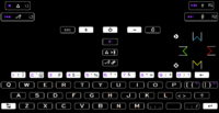
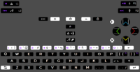
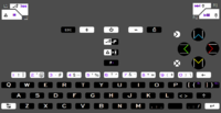
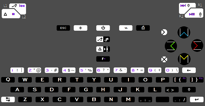
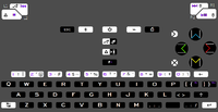
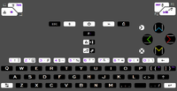
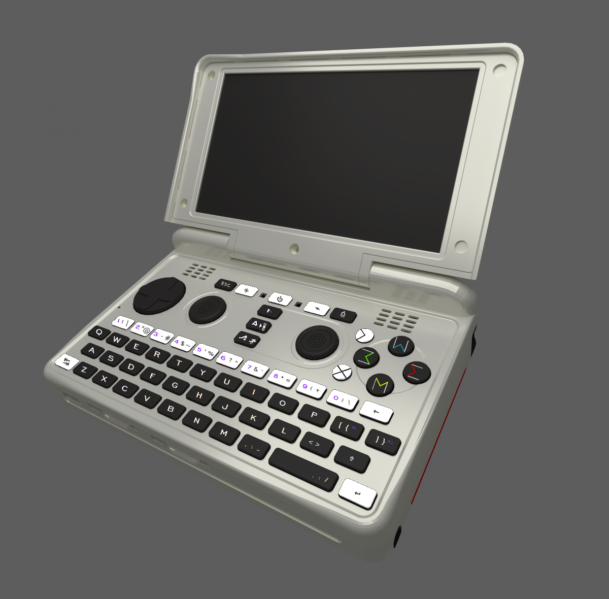
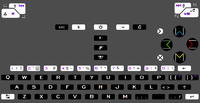
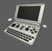
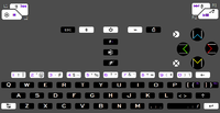
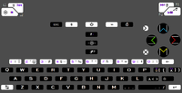
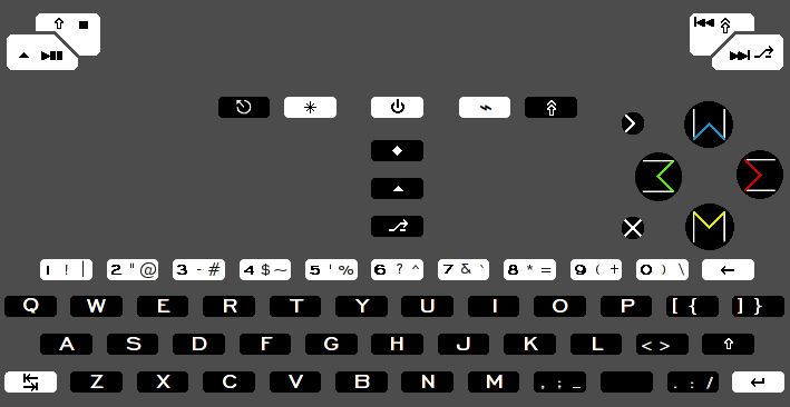
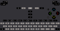
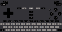
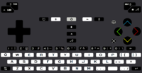
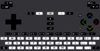
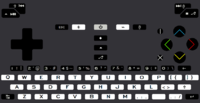
Explaining keyboard layout proposals. Fn hotkeys updated, language switching, powertoggles etc

Functional layout vs reduced layout


  • Total voters
    38

Last edited by a moderator:
http://www.brianhetrick.com/kb/

With Ctrl+alt being the only available standard invoker of dead-keys since AltGr is third level modifier, i have come to the conclusion that its better to move f-ing up top in the columnbuttons.

That way you get Ctrl+alt aigu retroflex and grave, in one press, even though its 3 buttons.  The alternative was a similar combo press to get F5 F6 F7, which isnt all that big.

Its now harder to type Ctrl+alt+F*keys, but thats more of a positive thing on modern linux. (switches ttys) It is in range of Ctrl+alt+f7 which is the standard though, so its somewhat interesting.

F-ing top makes F-ing+powerbutton a possibility. Maybe for suspend?
 
Last edited by a moderator:
I read through the threads, and wb is right in saying home end has a left - right connotation.

Since one skips to the beginning of the line, and one to the end.

Insert delete doesnt have the same left right connotation, and its different to pageup pagedown, since they share movement with home and end.

What it doesnt have is a right left connotation. Delete insert is a bit weird.

Moving them to the +2 buttons solves this.

That makes the arrangement.

      +1                ^

   [insert]     [PageUp]                                                                         

<      [Home]              [End]       >                                        

   [Delete]  [PageDown]

       +2               v

Problems are the symbols arent quite as nice, the android combo is lost, and i cant find a system to remember the colours. Though they are the snes-colours now.

The aforementioned change of F-keys to number row meant F-ing has no dead-key functionality there, and it shouldnt, because it isnt called compose, AltGr or anything similar. So then Ctrl+Alt is the dead-key invoker.

F-ing can still be a hack-key for pressing letters, if your choice of letters is only one extended-letter per key.

p+2 l+2 is still the right way, but not for french users.  This change means they get access to their aigu retroflex and grave in one combo-press.

nr48.png
 
Last edited by a moderator:
Since the distinction between buttons wasn't a problem on the non-backlit pandora, and the outline created complexity that didnt convey anything interesting, i removed it. It was interesting for a while, but it was what made the latest revisions uglier than the old ones. Not the realistic keys.
 

nr50.png

Currently working out the new shoulders from http://boards.openpandora.org/topic/17717-of-cases-and-batteries/#entry372617
 
Last edited by a moderator:
Edit: putting this here, since the post was deemed necessary to hide over at the http://boards.openpandora.org/topic/17742-case-sneak-peekthread

What is the technical reason for having a doublespace there?
? Technical reason?
A technical reason would be along the lines of something that makes sense. To me, the reasons for having a double space seem dubious and arbitrary.

There is a huge benefit to doing singlespace, and i cant think of a single technical reason not to.

The technical reasons most layouts feature singlespace are these.

Much better for international users, the difference between real and toy.

It is symmetrical, someone already noted the non-symmetrical SD-slots, that makes sense because of the PCB layout, so it doesnt bother me/cant be fixed, but this is a free design-win.

Better adaptability, not only can you do many languages other than english, it also means you can do alternative layouts if the demand is high enough.

Quite frankly, making layouts is hard. It took the team behind ergodox over half a year to make theirs. This breaks more new ground, and having the adaptability to have more freedom in the future is good. Locking down with non-sensical options is decidedly bad.

Same buttons everywhere, same mechanical functionality, no extra things that have to work. Rely on the things that have to be relied on, dont add points of failure.

The reasons for having doublespace have been quoted as "looks more like a space"

Which is the wrong way of drawing from a full desktop keyboard. The space is a bar key there because its then in reach of your thumbs.

Adding another field to the right of the singlespace that is less reachable doesn't do _anything_. It wastes a key. And it doesnt work like a space, try it, you will soon forget whatever ill-deviced logic you had in mind.

It would be a shame if there was a delay in adapting the case-design to 64 keys, just because the insight into what makes a layout final is found out the hard way.

With 63 keys, the sad part is something that could have to the right of space is either not there, or moved somewhere else. Where moving somewhere else is limited to even less keys. Nobody makes 64-key layouts with a key to spare, even if that was a required feature. Because the need for something useful is far greater. 64 is the exact minimum before it progressively gets very ugly. It all fits together, and all decisions have ramifications.

Moving stuff where it doesnt belong has real implications for every user, from the ones who know where things are, to the ones who know why. Power-users that are used to the efficiency real keys bring.

Finding the space is also mentioned, but its in any event easier than finding the power-button, I don't know who these people are that cant do either, but their use of the pyra is limited... The market for the pyra is already well above casual cellphone-user, and people could use T9 keyboards just fine.

I have shown all the layouts to a lot of people, from casuals and the hardest nerds I know. Nobody has issues finding the space, not a single one. I don't understand what problem making the space double-wide is trying to fix. I do however know how much it costs in usability.
 
Last edited by a moderator:
It seems centering the function-keys has been tried. Its viable enough to do it, but i dont think it has much merit.
Also read this http://www.joelonsoftware.com/uibook/chapters/fog0000000057.htmlwhich pretty much sums up expectations in terms of function.
It might be a good idea, but the reasons why it isnt outweighs the option.

beekeyboard2.jpg

 
Ortholinear keyboards seem to be the rage these days.  Maybe finally leaving 1870s paradgims for good http://people.smu.edu/eheise/consider_qwerty.htm
A discussion for another day.

I have a keyboard at work where home/end is in a horizontal arrangement. Other than how its in the way of other things on mine, it works well. This is an example:
wnm_keyboard_home_cluster2.jpg


Edit: Made a more realistic mockup. Got rid of the dual-coloured buttons.

post-2326-0-41907700-1427028696.png


previewkey4.png
 
Last edited by a moderator:
Cant remember the reasoning for doing  [ { on one key and ] } on the other, instead of the US standard   { [  and  } ]

On earlier versions its correct, i think its a mistake.

Edit: Nvm, it was correct.

Im thinking now that since F-ing is the 4th modifier on this button, you basically have one spare.  You can switch once and never have to go back and forth.

Regular press [      and

Shift press      {     and

AltGr press            open

F-ing press            F11

A very nice way to switch to german or other language (if you dont need the regional altGr+ symbols from your region) is to bump everything down. { }  is altGr in germany anyhow   (Altgr+7 and 0 on a german keyboard.)

Regular press           ü

Shift press                 [ 

AltGr press                {

F-ing press              F11
 
Last edited by a moderator:
nr56.png

previewkey5.png

Start / alt

Select / ctrl

I seem to remember that ^ only in a wider angle is an alternative ctrl sign...

Will update with another idea.

Edit: That was a bit too quick, now in the Select/Ctrl    Start/Alt orientation

nr57.png

Edit2:  Smaller select, easier to see the helm

Edit3: Now with correct ctrl symbol on shoulder

Edit4: Same with bigger space

nr61.png
 
Last edited by a moderator:
On 1-10, number-row. Actuate it with Fing+numbers Fing+4=F4 Any combo you just add Fing right before the F.button of choice Alt+Fing+4=Alt+F4

Edit  The strange thing is people seem to vote differently for where to put the F-row when the question has something to do with the implications of that choice.
 
Last edited by a moderator:
nr65.png

Been trying to get the combined Ctrl/select and Alt/start symbols right. Failing, failing, failing.

Even accidentally use the german one...
 
Last edited by a moderator:
Perhaps, on the side that is expected to be more accessible when the Pyra is in a pocket, the shoulder buttons should be BACK SKIP and FORWARD SKIP, with PAUSE/PLAY done by pressing both at the same time. That way, all three of the most important functions (as well as volume control, assuming it is on the same side) are accessible without reaching deeply into the pocket or removing the Pyra from the pocket.

EDIT: Personally, I am more likely to want to skip forwards and backwards than to play/pause. Also, if it is difficult to pause, one can simply remove the earphones from one's ears instead and hen skip backwards later to recover what has been missed.
 
Last edited by a moderator:
My idea is to answer a call pressing play, and declining it playing skip forwards. The headphone jack is at the right side in the back.

Will have to see how easily the shoulder-buttons are pressed.
 
Last edited by a moderator:
post-2326-0-86606300-1429173496.png


Discontent with having made something that looks like compromise was a factor from the get-go, i went back to the drawing bord, back to simple.

Less visual junk. Less ugly colours. Symbols only.

There are no F-keys, but as of late, everyone seems to have given up on catering to inerlingual needs in favour of cleaning the typewriter part, and letting people remember their hacks.

If you can remember extra keys, you can remember F-keys.

F-keys are new meta+1-10 and then P→1- and P→2-key for F11 and F12.

The meta and ctrl buttons can be remembered as select start.

Rearranged mediabuttons as per requested to make the most of this.

There is an AltGr key on the keyboard, meaning there is no printscreen. If you want to printscreen, press meta+p.

With there being an altGr key on the keyboard, much of the need for modified number-row goes away.

It is still beneficial to have one dead-diactric per key, but the US standard can be put in the shift position, will see how that pans out.
 
Last edited by a moderator:
The need for an insert that doesnt look like the home symbol became apparant.

Came up with nr67coloursfixins.png  just "looks" wrong...

nr67coloursfixins2.pngnr67coloursfixins3.png  Didnt go anywhere

nr67coloursfixins4.png  liking this
 
Last edited by a moderator:
I thought so too :)

Insert delete,  flat and crossed?

Im questioning the benefit to being able to call them WE3M. Mostly because doing two colours adds mechanical complexity, so it might not be possible.

If we can agree to doing it like that, then the people buying pyras can decide which layout they want. Im quite confident that a lot of people will go for the one i made, since ive shown it to a lot of novice people.

Escape symbol fails though. I cant design anything nicer, nor do i think Esc looks right anymore. Wait a minute, i think its because ive been doing ESC.

nr67coloursfixins5-2.png looks better than nr67coloursfixins5-1.png

Thinkin having no written F-keys means french people can get their custom mapping with meta+numbers. Then they can F-key on QWERTY-row
 
Last edited by a moderator:
Back
Top