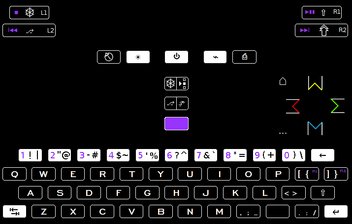
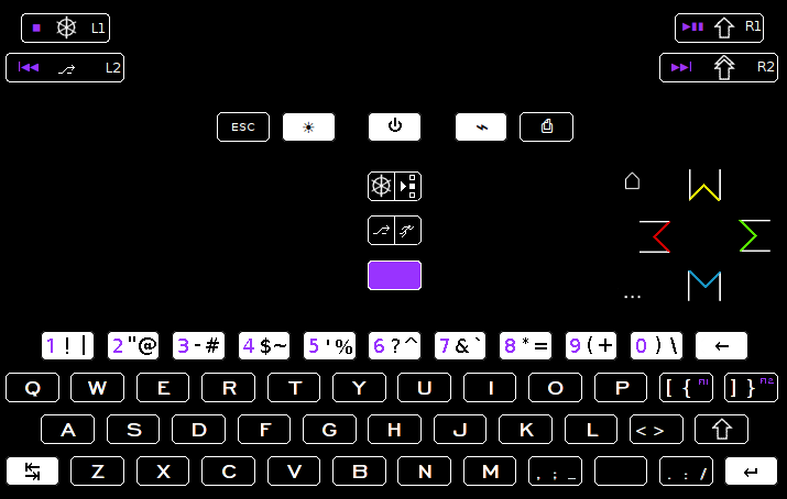
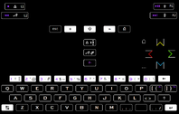
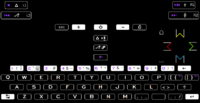
Explaining keyboard layout proposals. Fn hotkeys updated, language switching, powertoggles etc

Functional layout vs reduced layout


  • Total voters
    38

post-2326-0-79273500-1420882190.png


This is the full ISO set. from 9995-7 as can be seen here http://www.oqlf.gouv.qc.ca/images/ti/clavier.gif

Even flipped the alt back so that regular alt is the regular symbol.

Apart from the rightmost control should be a rightward arrow, but that doesnt make sense to me. Also because the columbutton ctrl is actually the right one, and its the "main" one.  Depending on how you see things. I dont think that poses any problems though, even though there is a difference between them. Dont want to force the issue though, since you can do as you please. Some like shoulders, some like column best.

Esc still doesnt convey more than esc did. And i think the unknown symbol scares away those new to it, where esc is business as usual.

I like the helm-control.

AltGr looks like a third level modifier, rather than another alt. Then again, it was never an alt nr2, and this is one of those keyboards that uses altGr as a modifier.

separation of ctrl/select and alt/start is good, it is possible with pictograms, and then each one can be on its own half, rather than ctrl taking up more space than half the button.

 Going with the requested symmetry option buttoncluster here. Some like to think of insert as a downward thing, whereas it could be horisontal. In any event this allows you to pick and chose without any imposed strict choice made.

zem tre ve emm  works vocally for buttoncluster. That way you can remember combos better.

Still dont think the bold numberrow looks sleek, but then again thats in 150% view. If you scale it down to what size it will really be then it becomes another issue.

Keeping with minimal visual clutter is extremely important. It is what makes it palatable for newcomers.

TL;DR Good changes in bold.

Edit: How about a big "F" on the purple button, and then just "11" and "12" instead of "F11" and "F12" ?

(that didnt work)

Edit2:
post-2326-0-75352700-1420896529.png


nr37isopictogram.png

nr40.png
 
Last edited by a moderator:
The only thought I get when looking at these is "wtf am I looking at?".

So ye, standards are nice and all. But symbols which apparently exist but aren't used anywhere in real common hardware don't help the enduser.
So you want to avoid the relatively subjective confusion with game buttons vs. keyboard keys, but shove in symbols no one has ever seen in the wild on certain keys. I wonder what would cause more confusion.
 
Which one of the symbols are you referring to? 

Shift enter tab are symbols anyway. Alt is common enough, used on macs among other things. As for powertoggle, on/off and brightness. Thats standard chromebook/modern style. Print screen is very self-explanatory in my opinion.

Seeing them is the issue. "Ctrl/select" is not good on the pandora, not up to par with the rest. With smaller buttons, more so.

After you grasp the meaning by scrutiny, you recognize the pattern. And small print letters arent good in that respect, so you are down to position. Position is key anyway, but we are trying to help.

Would you not be able to guess it was start and select?

Bringing things to different clusters helps with that, adding an overload of visual information doesn't. Dont print the manual on the keyboard, and keep the manual simple. That is the mantra.

A novice user gets by just fine without the use of ctrl or alt. Yes ctrl is the odd-ball, but its something more advanced users can overcome, or?

The only "invented here" symbols are start and select. Those were always not on the button, but rather printed on the case itself. And also in a different arrangement.

I dont have a set agenda on this. Trying it in the wild is what im doing, both for myself and to get feedback. I think some of the reason iso symbols arent more common is because iso wants you to pay for paper versions of their standards, quite expensive too.
 
Last edited by a moderator:
Has ED expressed any opinion on any of these ideas? Or actually adopted one yet?

D.
 
Only stuff that ive accounted for. All current designs are feasible and in accordance with the functional layout.

Your guess is as good as mine, which is how everyone tries to find fitting solutions for ED to consider.

I think ED voted in the general poll, as did many others, but its a general tendency to spot trends, its results cant be used directly to produce anything holistic.

He cant possibly use this much time on it, but we can present things that work once its all said and done. Then see how that goes.

Down to working on prints now, but any feedback is most welcome.

Edit:  What is the preferred  order?

option 1:

Ctrl   /  select

Alt   /   start

option 2:

Alt   / start

Ctrl / select
 
Last edited by a moderator:
You are changing quite a lot of shift-key combinations in a rather arbitrary way,

this requires me to retrain my muscle memory and will require overriding of keybindings

in applications if any of them is used somewhere.

Do you have some kind of a design principle for this?

- What are you trying to achieve?

- If based on usage frequency, what usage are you considering (and what are you ignoring)

do you have a reference showing those usage numbers or did you think these up yourself.

Some examples (I understand key order to be "regular press", "shifted", "altGr"):

2"@ should be 2@"

3-# should be 3#-

5'% should be 5%'

6?^ should be 6^?

I expect issues in applications like Dosbox where we also see that keycodes from the

host OS are not propagated correctly to dosbox and weird combinations occur.

For example, on a regular US/UK qwerty layout the key combination shift+% does not exist,

however shift+' does (which equals "). Therefore keeping these combinations as much the

same as "usual" avoids these problems.

A lot of symbols are confusing, what is the steeringwheel, running man, dots with arrow,

double shift, home, ldots, and power symbols? Where are the HDMI/WiFi buttons...

Other issues:

- I don't like the idea of having a modifier specific for function keys

- Is the double shift arrow capslock? Where is your AltGr?

- Why not reverse space and dot?

Sorry, but I'm not a fan of this layout.
 
Since the number row isnt wide enough to accomodate a regular set of learnt gestures, you end up having to re-do it.

Since the number row furthermore isnt default between the largest customer bases or regions, you end up having to do some of one or the other, or a mixture.

Rationale is in firstpost.  For every time you push something into the "this is how it should be" category, another thing leaves.

If by modifier for function keys you mean powertoggle and brightnesstoggle, then i dont understand what the alternative is.

"Double shift" is AltGr, since its used as third level modifier.

Space and dot arrangement is more effective since it covers all swipe-combos.

The helm is control.  Running man is start.     Arrow towards selected box is select.

You can pick layout in dosbox.conf, none of which can translate 1:1 to the functional layout of the pyra.

Edit: I dont like how the purple sticks out on F-ing.
 
Last edited by a moderator:
No problem, you are clearly optimizing other metrics than I would.

I like the idea of those swipe-combos. I had not thought of that.

Don't forget to also post a version of your layout on the sticky thread.
 
attachicon.gif
nr42.png

A more subtle  F-ing button.  And also reduced shift symbol.  I find filling up the button completely makes it looks overfilled, rather than increasing visibility.
You have two enter keys here, I think you accidentally replaced your backspace.
 
Last edited by a moderator:
Lately there has been support for a "legacy option" without considering that it was from a pandora, one of the few devices that shipped without a dedicated bottom row without letters.

Even a "legacy handheld" option is not a good idea considering the possible options. This confuses a lot of people. To illustrate the issue.

post-2326-0-67519900-1421871201.png


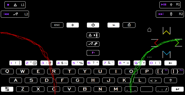
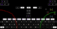
This is the most ideal pattern. Extend or shorten given length of thumbs and chosen grip. The most central heatmap is in the middle of each windsheil-wiper. But that has letters on it, so we cant have space there, and we dont have enough keys to put a gap in the keyboard here, so thats out.

post-2326-0-58759600-1421871296.png


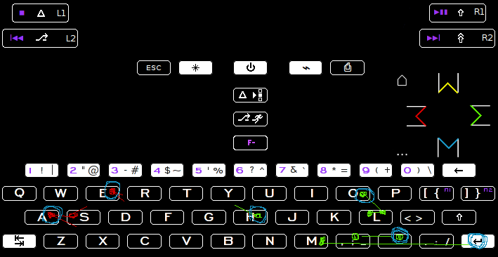
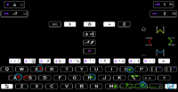
This is an exercise in writing "hello, sam." and then pressing enter. Comma-space is repeated for each commma. And dot-newline every time you want to start a new sentence on a new line. Dot-space is perhaps the most common, depending on how many commas you use when typing.

The red dots are the left hand, the green dots are the right hand.
The left hand is most effective on the left half, the right hand is covers the right half.


h (swap hands) e (swap hands) l - l - o - , - space - (swap hands) s - a (swap hands) m - enter.

Pay attention to how little extra distance is traveled for the variables here. Basically everything that goes on between comma dot enter and shift. qwerty we cant do anything about, so thats fixed.

The blue circles are the places where you "leave off" your thumb. Yes, you can move it while the other one picks its letters, but it is still left off at space a lot of the time.

If you wrote for example, "hello, lolla" you would have to travel from space to l.

From any point to space, you end up with a lot less distance if you put the space in the middle of the half rather than centrally located.

The reason one space is better than two seåerated ones, is because it permits the qwerty to be down bottom, with a dedicated number row. And also because there isnt much to gain from having a left space too.

You cant use the a space in the middle of the left side of the keyboard, because there isnt enough keys total for duplicating comma enter and shift there.
windsheild.png

connect dots.png
 
Last edited by a moderator:
Today I learnt that on a workstation dell laptop, (m3800 i think it was) Alt+F4 doesnt close a window, that is Alt+Fn+F4. The reason being F4 is "skip forwards", because the mediabuttons are primary.

We are moving away from direct input F-keys, well, overall.

These are the keyboard layouts given by customer base for a small laptop project:

  • Arabic
  • Belgian
  • Danish
  • Dutch
  • English (US)
  • French
  • German
  • Italian
  • Japanese
  • Norwegian
  • Portuguese
  • Russian
  • Spanish
  • Swedish
  • Swiss
Interesting to see Danish, Swedish and Norwegian, but it could be that these are all covered by "nordic" layout.
 
Last edited by a moderator:
Back
Top