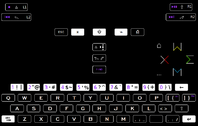
Lets assume each alphanumeric represents the same amount of visual info. With each button being of limited space, the only option to go beyond the default size per alphanumeric is to reduce their size, allowing more to be crammed in.
That looks ugly. To illustrate:
To have an even size, you have to put the cap somewhere. Made worse by the buttons having less Y axis this time around.
So putting two chars atop each-other is a straight no-no.
As we see on the pandora keyboard, 3 letters wide isnt the problem. Shiney key reflection and low contrast colours are. I can see letter in pos 1 and 2, the blue on nr3, not so much. On the pandora keyboard that is a mixed blessing. No i cant see them, but then again they are also out of the way of being noticed in places where they dont belong.
F11 and F12 on my design are the ugliest buttons, but they make sense in the greater perspective. They do stand out with their colour, which is the same on 1,2,3,4,5,6,7,8,9,0 so it does convey the idea of purple=f-keys, thus is purple 1 the F1. Not that i wouldnt have done it if it was just F1 to F10 to incorporate, but not having to print F F F F all over the place is a huge saving.
The most i've spent is 5 chars on F-ING, but its most significant attribute is that of being a purple coloured button when all other keyboard buttons are black/white, so we can pardon its verbosity. It could be a plain purple, but i find F-ING to be the emphasis needed to get the point across, it never gets old!
Sel/Ctl is still 7 chars, and it (atleast initially,) seems hacky, because its so obviously sub-optimal.
Coming back to see the last version of the design time and time again i dont feel the need to change anything, except for the columncluster.
So since 7 chars is out, it ends up having to be pictograms for ctrl/select and alt/start. Not at all a bad idea if done right.
Alt is already a pictogram in use that works
⎇. Knowing where alt is, ctrl being a similar button, is right next to it. Even with the aestetic being unfamiliar at first, over time a much better deal than the micro-textual context Ctrl would have been.
Keeping it simple is a great idea, also in not turning away those who loathe complexion. Casual users. For whom android is the popular choice, working for them, without the use of either.
Even if space-constraint spawned it, i think the triangle is a better idea than "Ctrl", regardless of buttonsize. I have no problems accepting the tinfoil hat
△ as a symbol of control.

Right now both ctrl and alt are different from the powercluster and purple in terms of colour. They cant be more distinct colour-wise seperating them from each-other would mean taking away from the colourscheme communication on <^v> and the purple. Since the colour-palette is limited to non black and white, which is max contrast dictated by visibility. Doing colours for ctrl and alt, unless somehow there is a colour for control and alternate, is a burden of learning that ends up being without value.
Start and select is something one expects to be in between d-pad and <^v>, i just think we need a way of arranging and designing pictograms that makes it easy enough to pick up.
△ →•
⎇ (runner)
On a
snes controller the arrangement is (dpad) select start (abxy), one could argue that the pandora is now the norm, right or wrong thats not a huge deal. In my head the following is less classical since the right thumb is farthest away from select in the earlier example, so that select, start, thumb is maintained.
⎇ (runner)
△ →•
However I do think Ctrl and alt should be first on the button, since you dont use the buttons that are used in conjunction with ctrl and alt, when you use start and select.
That is also the reason they can share buttons. So they are always(primary use) respectivly ctrl and alt, unless(secondary use) when used alone, which is when you are playing console-games.
Something that also fits well with the pyra more prominently than the pandora happening to be a mini-laptop. I think that is a point of capability made more clear by not only having the capability, but also focusing the design on it as a whole. Gamers see a dpad and buttoncluster and are already sold on that idea. There is a huge market to be had if "mini-laptop" can be conveyed through looking at it.


