This looks simple and great. With the dots you don't have to look at the buttons to know which on you need to press.How about keep the Pandora standard, but add directional dots physically on the button.. Much like what's shown on PNDManager, but physically. To me this is the best of both world, keeps what is standard, adds what you are looking for, there is already a library of images floating around that can be inserted into applications for reference and is also friendly to those with color blindness.

You are using an out of date browser. It may not display this or other websites correctly.
You should upgrade or use an alternative browser.
You should upgrade or use an alternative browser.
Explaining keyboard layout proposals. Fn hotkeys updated, language switching, powertoggles etc
- Thread starter comradekingu
- Start date
bzar
A Commando
The image collection is called "guihints", and is made by our Christoph.Krn.
comradekingu
Glowing ember
< ^ v > is the basic idea of guihints, only you can dechipher the individual buttons by referencing them uniquely.
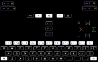
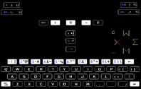
This is an idea of what it will look like in the dark, either in black or white colours.
Made some pictograms for start and select.
Dropped the solid colour for F-ing in favour of just coloured text, since uniform colours blend in better.
Left alt being normally an arrow to the right made the alt sign non-standard, hopefully someone has solved that somewhere.
Last edited by a moderator:
comradekingu
Glowing ember
There are two ways of doing ABXY, The nintendo way and the sega way


Since these differ in how they arrange the order of the two first, and the order of the two second buttons, there are two ways of dealing with there being two ways when you want to do them both on one controller.
You could mark the buttons with letters in one or the other arrangement, pick one. Lets say its sega.
Play a dreamcast game, everything is as expected.
Then you try to play a nintendo game, and it tells you to press A ingame. (There is no feasible way to change what it says, since the sprite ingame is hardcoded.)
You could press what says A on your controller. If you want this to work you are actually pressing something else than what you would on a snes controller.
This is the concept of primary and secondary (and tertiary and quartiary) we call these 1 2 3 4.
Ergonomically it makes sense to put the most used and reachable button as 1, then 2, and put the 3 and 4 in the least reachable positions in the diamond cluster. This is how gamepad mapping works.
We will leave history of why abxy came to be 1234 and 2134 for now, but it is as ergonomic as it sounds. If you want to have a most pleasant way of playing a game, make its primary function your 1 button.
Problems arise with this, having A always be A is good for beginners. But if your muscle memory is already there, which is what we are trying to achieve here, as we don't want to be looking at buttons, it is a problem. Because you learnt to play those games according to direction, thats how muchle memory works.
And by dealing with direction, we solve another problem. While A is sometimes B, right is always right (and wrong is always wrong damnit)
The pandora does ABXY not in a sega way, and not in the nintendo way. But instead in the gp2x way.
In the GP2X way it doesnt even work to always press A for A regardless of what direction that is orignially, because A is all the way over at the left, which is one of the two positions that are always 3 or 4 because they are the least ergonomic.
And i say always because there are no exclusive native games for the GP2X that are worth playing. When you port a game, nowadays its easier to change the ingame graphics, so you can change it to something that makes sense. The pandora was lazy and carried hardware compatibility with the wrongdoings of the gp2x by adopting its layout. And now, with the successor coming out, ill-deviced decisions means the game catalogue needs to be ported, for the most part manually or not at all. However way you want to see it, the gp2x layout surviving isnt a good thing. It wasnt good in itself, and it is bad for compatibility. Something that is extremely important on a device capable of emulating games from multiple consoles.
So how does one solve this. There is no perfect answer, since you lose compatibility by moving away from ABXY, and ABXY in itself is not intuitive. Ever since there were two ABXYs, which continue to be used, it gets ugly to go with one of them.
Instead we relate to what matters, direction. For the case of argument < is left ^ is up v is down and > is right. Easy enough to type and understand. ^ ishyphen caret, which is a bit unknown, but "the one that goes up" or similar, gets you a long way.
It does however need to be more unique than that, without the ugly connotations of most latin character strings.
X W M and Σ all share the arrow part of the earlier directional clarification. Σ is the sigma, but "the one that looks like an E" is unmistakably what the sigma is to someone who doesn't know.
So, the order alphabetically is E M W X. This is the same order as the A B X Y is. on a SNES controller they are obviously 1234, > v < ^
Direction will always work, because the diamond pattern never changes.
LAYOUT GP2X O O X X O O X O O O X O (this will beO X O as things are ported)
SNES X O O O O X X O O O X O
SEGA X O O X O O O O X O X O
PS O X O O X O O X O O X O
(O O X new pyra going forward)
Gp2X SNES SEGA DIRECTIONAL
HARDWARE
XOO This is directly confusing. A button that is called A is somewhere the controller has marked B, and B button is somewhere else etc. Or you reference something that is misleading.
OXO Neutral, its like playing a Playstation game on the pandora now.
OOX How it should be, what is on the controller matches what it is ingame.


Since these differ in how they arrange the order of the two first, and the order of the two second buttons, there are two ways of dealing with there being two ways when you want to do them both on one controller.
You could mark the buttons with letters in one or the other arrangement, pick one. Lets say its sega.
Play a dreamcast game, everything is as expected.
Then you try to play a nintendo game, and it tells you to press A ingame. (There is no feasible way to change what it says, since the sprite ingame is hardcoded.)
You could press what says A on your controller. If you want this to work you are actually pressing something else than what you would on a snes controller.
This is the concept of primary and secondary (and tertiary and quartiary) we call these 1 2 3 4.
Ergonomically it makes sense to put the most used and reachable button as 1, then 2, and put the 3 and 4 in the least reachable positions in the diamond cluster. This is how gamepad mapping works.
We will leave history of why abxy came to be 1234 and 2134 for now, but it is as ergonomic as it sounds. If you want to have a most pleasant way of playing a game, make its primary function your 1 button.
Problems arise with this, having A always be A is good for beginners. But if your muscle memory is already there, which is what we are trying to achieve here, as we don't want to be looking at buttons, it is a problem. Because you learnt to play those games according to direction, thats how muchle memory works.
And by dealing with direction, we solve another problem. While A is sometimes B, right is always right (and wrong is always wrong damnit)
The pandora does ABXY not in a sega way, and not in the nintendo way. But instead in the gp2x way.
In the GP2X way it doesnt even work to always press A for A regardless of what direction that is orignially, because A is all the way over at the left, which is one of the two positions that are always 3 or 4 because they are the least ergonomic.
And i say always because there are no exclusive native games for the GP2X that are worth playing. When you port a game, nowadays its easier to change the ingame graphics, so you can change it to something that makes sense. The pandora was lazy and carried hardware compatibility with the wrongdoings of the gp2x by adopting its layout. And now, with the successor coming out, ill-deviced decisions means the game catalogue needs to be ported, for the most part manually or not at all. However way you want to see it, the gp2x layout surviving isnt a good thing. It wasnt good in itself, and it is bad for compatibility. Something that is extremely important on a device capable of emulating games from multiple consoles.
So how does one solve this. There is no perfect answer, since you lose compatibility by moving away from ABXY, and ABXY in itself is not intuitive. Ever since there were two ABXYs, which continue to be used, it gets ugly to go with one of them.
Instead we relate to what matters, direction. For the case of argument < is left ^ is up v is down and > is right. Easy enough to type and understand. ^ is
It does however need to be more unique than that, without the ugly connotations of most latin character strings.
X W M and Σ all share the arrow part of the earlier directional clarification. Σ is the sigma, but "the one that looks like an E" is unmistakably what the sigma is to someone who doesn't know.
So, the order alphabetically is E M W X. This is the same order as the A B X Y is. on a SNES controller they are obviously 1234, > v < ^
Direction will always work, because the diamond pattern never changes.
LAYOUT GP2X O O X X O O X O O O X O (this will be
SNES X O O O O X X O O O X O
SEGA X O O X O O O O X O X O
PS O X O O X O O X O O X O
(O O X new pyra going forward)
Gp2X SNES SEGA DIRECTIONAL
HARDWARE
XOO This is directly confusing. A button that is called A is somewhere the controller has marked B, and B button is somewhere else etc. Or you reference something that is misleading.
OXO Neutral, its like playing a Playstation game on the pandora now.
OOX How it should be, what is on the controller matches what it is ingame.
Last edited by a moderator:
Glyph Reader
Member
- Joined
- Apr 27, 2014
- Messages
- 332
You know, I must be that special person, but I can adapt to just about any new layout. I'm real crazy like that. Whatever you guys agree upon, or whatever ED chooses, I'll live.
-Glyph Reader
-Glyph Reader
comradekingu
Glowing ember
Tenka
Snakes and Fish
- Joined
- Jan 28, 2012
- Messages
- 701
Am I the only one bothered because the left game button is the only one that isn't an M? The other three are, but one is different. That disturbs me. Wouldn't the also present < > v ^ symbols be enough in that idea? I agree with comradekingu concerning the GP2X layout though.
comradekingu
Glowing ember
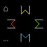
It loses the alphabetical order ABXY follows. I guess it could be designated as a 3. The white lines have sort of the same effect as the implied diamond/square has. Hmmmmm
Edit: If you rewerse the order to have the snes colours, you arent left with misleading symbols.
Before it was red _and_ a symbol for delete. But if green >into, then >implying red must be its opposite, remove and delete, and it does look more like back like that.
Position, colour, general appearance, it all ties together.
Last edited by a moderator:
rygD
Nihilistic Mystic
Why was it that you didn't want to just use the ^-like characters in a diamond with no additional stuff?
comradekingu
Glowing ember
Because of how that is the easiest way of representing a page (in the case of pageUp and pageDown) or an entity to insert something into or delete from.
With all the symbols having equal lines it accentuates the directions, they are the main focal point. Fighting style games often list things in combinations, and it should be as easy as possible to translate this to gestures, which is closer to metal.
The lines add the function of the button, but also gives a way of representing the buttons with WM3E for ^v<>
Last edited by a moderator:
ZXDunny
Deep avatar
- Joined
- Oct 12, 2010
- Messages
- 2,585
If the cursor keys are on the DPad, people would likely get confused.Why was it that you didn't want to just use the ^-like characters in a diamond with no additional stuff?
D.
comradekingu
Glowing ember
That is ←↓→ and its not on the dpad on the pandora. The pyra is set to use the same one.
If you want to represent it, you can type 3 M W Σ for < v^> Need something better for 3 < though, ᴟ is the only ive been able to find.
If you want to represent it, you can type 3 M W Σ for < v^> Need something better for 3 < though, ᴟ is the only ive been able to find.
comradekingu
Glowing ember
- Joined
- Jan 18, 2010
- Messages
- 11,474
It's still the same. Instead of remembering key placement of ABXY buttons, I'm now forced to imagine directional symbols embedded in the letters M and W, the number 3 and a summation symbol.. forcing me to do what I always do, revert to muscle memory. I mean it doesn't really matter, but I just don't see the overall benefit versus what is out there today.
comradekingu
Glowing ember
Muscle memory is there anyway, that is the goal. Both using the ones you have already, and learning new ones.
Directional markings, <^v> facilitate that. I think about 1/3 have trouble deciphering direction. For those people its letters.
Misleading letter names is confusing for everyone though. Making it only fit cases you arent, or dont need to, run into, is the worst option.
Colours is in some ways another matter, and in some parts to do with functionality. Here it would make sense to go with snes colours, other than how they have no system embedded in them.
Attention is drawn to colour, which is also how <^v> is more important than letters.
But they are protected. So if you want that you can flip buttons horizontally and vertically and you will have snes-colours with the arrows pointing inwards.
If all white lines are the same, the red could be to the right, in which case it would be insert left, right delete. Snes layout is the only one with red in this plane, and having red for delete is a must, it makes sense to follow suit with the other snes-colours.
I dont know about risking getting sued by nintendo though. Nor do i understand them.
Colours to me isnt important, they can change from one to the other without any loss, as nothing really refers to them. Its main purpose is to seperate between different buttons, and to look aesthetic.
Edit: An additonal argument against having red on the right is that it is a primary button, and that only works in japan.
With the < red > green ^ yellow v blue -arrangement, not only is it not protected legally, it also can be made into a system.
Last edited by a moderator:
comradekingu
Glowing ember


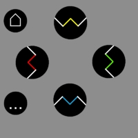
Some different uniformity options, non-symmetry in the horizontal axis isn't as aesthetic, but it is hard to do without the (delete) function it gives.
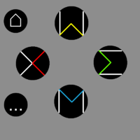
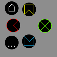
seemingly more aestetic, but really just shadows over the ugliness,and the letter designation is lost.
In the vertical axis, so long as its equal it doesn't seem off balance. See if you can spot the odd one out.

Working with buttons as pairs on each axis, (home up, end down. Page up ^ page down v delete <, insert > ) you can swap things around, pageUp and Down has to be vertical though, and delete cant be any of the AB/BA (primary) buttons
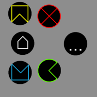
This is a little better, but it still makes 4+2 look like anything but 4+2
TL;DR
 looks the best, while carrying uniformity and functional significance.
- Delete doesnt look like delete
Doing it this way also means it doesnt look like X from playstation, which is v and not < like here, so thats a benefit.
- Insert delete isnt vertical like on a real keyboard.
- It isnt left to right either
Why this makes sense is the Android combo. Along with home and end (which looks like menu) you have a red button on the left, which is where back is on android, and its red, which is better than green in this case.
Edit: It would be sweet if the smaller newnubs could be used, since they look preferable. In terms of other consequences, they are a bit smaller, which could make room for
Select Start (this is the way it is on a traditional controller)
Ctrl Alt (this is the way it is on a 105keyboard)
F-ing Super
I know the functional layout is locked, but this is the last ugly part of the keyboard in my view.
Last edited by a moderator:
rygD
Nihilistic Mystic
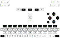
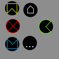
I haven't read this all yet, but the button color on the center left needs to be yellow because, uh...people will get confused if it isn't, or something. Actually, to help out, after making it yellow it might be good to mirror it right to left and put it as the bottom button. This is very important, and I don't think we can do these types of buttons unless that button is like that. Maybe fill the internal part with yellow, too.
Edit: Below is what the bottom row of buttons would look like in the dark with the buttons backlit.

Last edited by a moderator:
Saber
Advanced Member
- Joined
- Jan 23, 2012
- Messages
- 1,303
I'm in the camp which wants the face buttons to have a single color only for all four/six of them. ABXY in the Pandora standard of West, East, South, North pattern. I'm not opposed to the Famicon colors if a community poll leans toward them but I tend to use the directional orientation anyway and ignore the button hues.Muscle memory is there anyway, that is the goal. Both using the ones you have already, and learning new ones.
Directional markings, <^v> facilitate that. I think about 1/3 have trouble deciphering direction. For those people its letters.
Misleading letter names is confusing for everyone though. Making it only fit cases you arent, or dont need to, run into, is the worst option.
Colours is in some ways another matter, and in some parts to do with functionality. Here it would make sense to go with snes colours, other than how they have no system embedded in them.
Attention is drawn to colour, which is also how <^v> is more important than letters.
But they are protected. So if you want that you can flip buttons horizontally and vertically and you will have snes-colours with the arrows pointing inwards.
If all white lines are the same, the red could be to the right, in which case it would be insert left, right delete. Snes layout is the only one with red in this plane, and having red for delete is a must, it makes sense to follow suit with the other snes-colours.
I dont know about risking getting sued by nintendo though. Nor do i understand them.
Colours to me isnt important, they can change from one to the other without any loss, as nothing really refers to them. Its main purpose is to seperate between different buttons, and to look aesthetic.
Edit: An additonal argument against having red on the right is that it is a primary button, and that only works in japan.
With the < red > green ^ yellow v blue -arrangement, not only is it not protected legally, it also can be made into a system.
Similar threads
- Replies
- 208
- Views
- 43K
- Replies
- 99
- Views
- 24K


