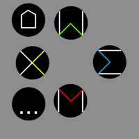
Explaining keyboard layout proposals. Fn hotkeys updated, language switching, powertoggles etc

Functional layout vs reduced layout


  • Total voters
    38

v60mini1.png
Evidence that del backspace and esc secondary is atleast an economically viable option.  (V60 Mini Mechanical Keyboard)
 
Last edited by a moderator:
Amongst people who want 60key boards, yes. They are likely to favour this arrangement.

Its not a good comparison because we use DPAD for games, and computergames use WASD. Also arrowkeys are most often used in sequence, and not in combination in my experience, so its not terribad.

Curiously del is duplicated to have it both in natural position and along with the cluster of keys it normally resides in.

No need to quote when you are directly below btw.

Edit: How about http://www.keyboard-layout-editor.com/#/layouts/e409245d64d8cc385006d880fba7ac8a

(nevermind the + - issue for now)

It has all the usable 87keys. Home is above End which is the standard orientation. I dont think Insert Del by neccesity has to be vertically aligned, i could be wrong, but not moreso than i was before, because i didnt have them at all. The leopold 60 has insert and del as keys of its own, and i think that is more professional.

Also Escape and PrintScreen are on the same row, like we find them on a 105key.

For symbols i think (will work on this)

Insert = ?

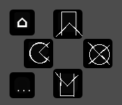
Delete = ring with x, trashcan, leftarrow with x  ⌫

Home = house  ⌂

End    = circle with arrow in it  ↺

PgUp = rectangle with arrowup

PgDn = rectangle with arrowdown

Escape = Zoidberg look of disapproval

Printscrn = the default pictogram

Edit2: something like this  http://www.keyboard-layout-editor.com/#/layouts/da03ce69943a7d071276130afbb90161
 
Last edited by a moderator:
I need arrow keys for text editing though. Having to use Fn+WASD would suck for me.

I like the horizontal Home/End of the Pandora. It makes much more sense than vertical, since in most cases, Home/End are horizontal concepts (beginning of line, end of line).

I like symmetrical icons for pairs like Home/End and Delete/Backspace.

PgUp = rectangle with arrowup PgDn = rectangle with arrowdown
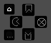
Sounds good, is there anything like that in Unicode?
 
⌂    ^
C<                
Gnosticism%20-%20Sun%20Cross.png

 ...    ∐

The C< doesnt look good unless the < is halfway into the C. I dont know how important things are, but these are what i consider

Correlation to function They should look like what they do
Reproducability It should be easy to write and say
Aestetics The whole cluster should look good as a unit
Direction Each symbol should ideally signify the direction its in.
PS-likeness Each symbol could look like any convetion of existing buttons. (im not able to do it without major loss to the others)

http://www.keyboard-layout-editor.com/#/layouts/0baf40ab7ca4abae596f6df920d4c6d9

87dpad2.png

The square formed by the <'s is the central theme

Edit: I was going to go to bed, _was going to_.

87dpad3.png
 
Last edited by a moderator:
nr5-2.png
Made the colour element solid, as that is a focal attention, and it being easier to fabricate.
nr8.png
Removed all unnecessary elements, but now the left and right sight are badly out of touch.
nr9.png
These look more welcoming to touch. Looking at the rectangle still has a imbalance on the right. Also ins del doesnt match pageup pagedn
nr10.png
Tried colouring them the same to fix it, there is still the same issue creating the effect though.
nr11.png
Now it matches, but delete still has that edge disturbing the rectangle.
nr12.png
I removed that, but went too far. Had another version with different cuts, but that just looked worse.
nr13.png
There we go, this is balanced. No cruft. Should have stayed with the small house on home though.
nr14.png
Going the other way of trying to add was a dead end.
nr14-2.png
Trying to salvage it is ok enough, but it changes pageup and pagedown too much.
nr15.png
Main problem here is that the rectangle looks off.
nr16.png
Adding focus to what was ugly didnt help. But i did see the problem again.
nr17.png
Finally i can give up on this trail of thought.
nr13-2.png
What bothers me is that PageUp and PageDn arent distinct, so i tried to do something about that. Dont think it worked, as it removes from understanding the pictogram.
nr11-2.png
Adding to Nr11 proves fruitful, dont know which one i prefer.
nr11-3.png
Adding what came of the back and forth to it.

nr11-4.png

Another try with addition
 
Last edited by a moderator:
 Edit:  I prefer the original one that was posted by itself the most.  I think it is how things go into the diamond.  I also think the ones with white around outside of the diamond are ok.  I prefer the "things" narrower, such as the round ones not along the edges, and more rectangle, less square.

If you do the yellow one solid yellow with a wedge missing you get pacman.  If you do the C with a blue wedge it is like you have to pacpeople about to eat each other, and the blue/black one may be reacting like the ghosts do when you get the big dot.   My ideas are dumb, so don't use them, but maybe others will get a smile from them.
 
Last edited by a moderator:
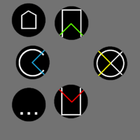
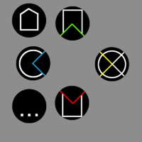
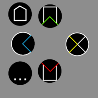
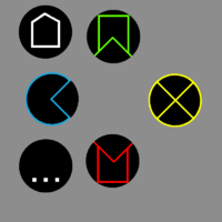
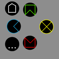
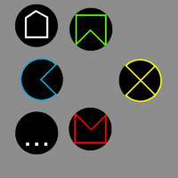
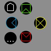
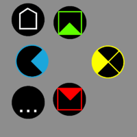
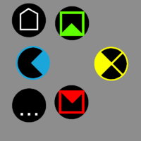
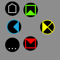
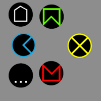
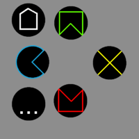
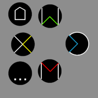
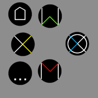
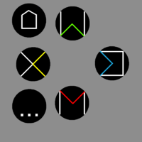
  • The different directions are notified by their angles. They can also be referenced with  < v ^ >.
  • Buttons signify what they do. Home end. PageUp, PageDn, Insert, Delete.
  • The three leftmost buttons double as HOME, BACK and MENU on android.
  • Colours are green for up, positive, and red for down, negative. The C letter is cyan, and yellow is its complementary colour, as red is to green.
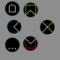
My intention is to not have it look elegant and professional, and not like a toy, yet distinctive. Colours and elements on the best versions are used sparingly.


The best versions are in my opinion the ones that have a matching quality. This and this
 
Last edited by a moderator:
I would think red on top, like a fire is burning, or a sunset, with green on the bottom like grass, or a fertile valley.  Elemental correspondences are cool too, though, however I do prefer the earlier versions.  I should sleep.  I will probably dream of pacpeople making out.
 
Colours are green for up, positive, and red for down, negative.
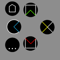
Relying on cultural connotations for colours is not something an interface designer should do unless you can localize your interface for different regions :)
It's done a lot, but that doesn't make it better.
 
Its an economic (green numbers is profit) (red numbers is when the bottom line is losing money) and geological connotation (magma down, green stuff above it) Im very open for ideas though.

Traffic lights have red top and green on the bottom.

Dreamcast-colours are the same as what ive got above, with the blue and yellow changed. I would love to know why that is, as my blue is arbitrary to cyan.

It could be this, which it is based on, but still feel that could have gone either way.  The N64 had yellow on the right, but those are probably going to be the <^v>+2 buttons, so it could go either way as far as my reasoning goes.

The snes is also in that arrangement, but rotated.

For the layouts where yellow is on top, thats mostly because its often the Y button.

nr19.pngnr20.pngnr18.png
 
Last edited by a moderator:
I quite like this with the simplistic colour splash for the middle diamond, like you have in that middle version there ^

But not so sure about the page up/down... I think it's something about those horizontal lines which seem to make it lose representation of a page up/down arrows to me... the page up button looks to me like a bookmark icon [typically shown as a ribbon a bit like that icon]
 
This is how I would do the page up/down arrows, based on your style here...

35bbfas.png


So keeping the 4 colour diamond shape which runs through those 4 buttons, but making it thinner so that much more subtle.

Likewise making the button icons smaller and more centered on the button, but still using those corners of the diamond.

...Just a rough one and the icons are not perfectly centered on the buttons here, but you can see what I mean
 
Last edited by a moderator:
B-zar: Any colour has more than one meaning even within the same culture. Its important to get directional and aesthetic quality out of the picks.

F-zero: Always nice to see you come in with the sleek designs when i struggle to line up even the most basic things.

When you do that, the right one sort of becomes < when its meant to be the >.

o ^ v <  for <^v>  isnt as good as   <^v> for <^v>   or ←↓→ if you will (dont know how to do upwardsarrow)

The solution is to swap insert and delete, which isnt the order it was on the pandora, nor on a 87key.  Pressing the insert on the most used button is better than delete tough.

nr21.png

I got rid of more cruft. Now its a subtle thing. Simplicity is more valuable than what the buttons are worth as 87key, so this is preferable to the original design since it takes into consideration the buttons are small.

Now ^ can be written W and   v can be writtem M    The < is X and  > is C (with some goodwill)    X and  C conflict with some layouts though

Now i think the > looks unbalanced again. I think a smaller circle or even straight horizontal lines could work.  The < could be the odd one out since its between two keys.
 
Last edited by a moderator:
Yeah perhaps the yellow arrow icon should be flipped horizontally, I was aiming it to the left so that it in conjunction with the inner diamond section of that same button; it made the cross [X] symbol which you'd been using.

I agree though, that if the green/yellow/red [top/right/bottom] are all using the arrow icons, that circle on the blue

is going to look a little out of place

:)


...I've skim read a lot of the k/board discussions tbh, as I left the board one night and came back next day and a couple threads had grown by a lot of pages already :)

...Am I right in thinking then, that;

Blue = Insert

Yellow = delete

Green = Page Up

Red = Page Down

 
Just flipping the > in the right icon doesnt really signify delete, because then its >> unless its flipped over on the other side

nr22.png

This is the smaller circle.

nr23.png

It is inserting something, but it isnt worth breaking things up for.

nr24.png

This is insert because it is on the side, so its the most you can communicate with the least, i like that. It could be mistaken for only stylistic choices, which is the goal.

> is X   ^ is W   v is M  and > is E (with some goodwill)  or a actually Σ (sigma), which must mean wb is onboard  ;)

If you want to go whole-hog on greek/math,  < is Χ (chi),  ^ is ω (omega) or Λ (lambda)  v is Μ "Mu"
 
Last edited by a moderator:
B-zar: Any colour has more than one meaning even within the same culture. Its important to get directional and aesthetic quality out of the picks.
Yes and it's OK to assign colors to functions. Just don't assume it's in any way intuitive based on its meaning in some cultures. Make an internal color->concept map and be consistent with it or localize to cater to each culture on their terms. By assuming people intuitively connect a color to a concept you're assuming a concept->color map.
Anyway, this is a tiny nitpick in this case. Use whatever colors you like :)
 
Last edited by a moderator:
Back
Top