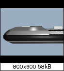
Yet another concept for the new Pyra


Another crazy idea. Put a camera on the hinge above the D-pad. If even possible.

Oh, and leds one the other side.

In a normal numeric keypad, the 0 (being the "spacebar for numbers") is as wide as 1 and 2 combined, and it is below those keys.
To be frank, I don't see the reason to make it one big button.
 
Last edited by a moderator:
.. The lid should be nothing but screen.
I agree with this also...big bezels will always look cheapish, moreso because the material will probably be cheap plastic...also it makes the whole thing look

like it is just a revision or small upgrade of the pandora...

it would also be nice to have the screen flush with the surface, without embossing, btw
 
Very bad idea, you'll cover the speakers with your fingers...
Hummm... well I m not sure about that.

If you just take you Pandora now and start playing through the DPad and the ABXY Buttons... would you really cover the concept speakers there ?

Usually I hit the Buttons with the fingertips of my thumbs.

Not covering the concept speakers in my case, but I guess this is a matter of the size of each hands as well

EDIT : which needs to be investigated ...
I don't cover that area with my fingers either, but earlier I suggest putting keys there and then someone said he would press them accidentally if they were there...

But actually feel free to put the speakers there if it can make the thing smaller, in my opinion. :)
 
This is the one I would go for now =D *hehe* :

n1ep.png
It will be hard to not accidently press both shoulder buttons. I prefer the side by side solution instead of this one. It may work on Gamepads but there are much bigger Shoulder Buttons possible so the vertical array is not a problem. But this will not work on a smapp handheld this way. I'm also for more rounded/sloped sides of the general case design, the Pandora is not really comfortable to hold, there is room for improvements.I did some quick renders, just sketches to show my ideas. Lid and bottom of the case are plastic parts or maybe metal, the black border in thee centre/top of the lower case could be some smooth rubber like material. Imagine all the sharp edges except the slopes sould be rounded (not shown in renders):


One pair shoulder buttons sits onto thee sloped area, the other pair under the hinge area side by side so you can't press both of them accidently. :)
 
.. The lid should be nothing but screen.
 I agree with this also...big bezels will always look cheapish, moreso because the material will probably be cheap plastic...also it makes the whole thing look

like it is just a revision or small upgrade of the pandora...

it would also be nice to have the screen flush with the surface, without embossing, btw
Resistive touchscreens need a bezel to give you a surface to stop your stylus. That's the reason the bezel exists on the Pandora, DS, 3DS, and all devices that use a resistive touchscreen.

-God Ginrai
 
Resistive touchscreens need a bezel to give you a surface to stop your stylus. That's the reason the bezel exists on the Pandora, DS, 3DS, and all devices that use a resistive touchscreen.
Why does the stylus need to be stopped? Personally I would like a flat surface better.
 
Resistive touchscreens need a bezel to give you a surface to stop your stylus. That's the reason the bezel exists on the Pandora, DS, 3DS, and all devices that use a resistive touchscreen.
Why does the stylus need to be stopped? Personally I would like a flat surface better.

I didn't know about this either, and don't really understand why it is a requirement either, I guess it could be useful but I don't often hit my bezel with my stylus on Pandora - not that I can recall anyway.

Just looking at some info about that, I see this; http://www.elotouch.com/Products/touchscreens/AccuTouch/default.asp

AccuTouch Five-Wire Resistive Touchscreens... You know about these? Might be worth looking at?

Zero-bezel configuration for seamless design eliminates the traditional bezel that can collect dust and dirt

  • Sleek, elegant "smartphone look" with proven resistive technology for seamless designs that eliminate the traditional bezel
 
I have modified the last setup a little ...

The LEDs have been moved to the front now since the old setup really didnt make any sense =)

Width of this device is 160 mm (~6,29 inch)

Depth of this device is 90 mm (~3,54 inch)

Height of this device is 25.5 mm (~1 inch)

Its still using the common 5 inch 16:9 LCD there. (Outside Dimensions : 120,7 x 75,8 x 3,1 mm)

Just for comparison :

Width of Orig. Pandora is 140,3 mm (~5,52 inch)

Depth of Orig. Pandora is 80,4 mm (~3,17 inch)

Height of Orig. Pandora is 29,5 mm ( ~1,16 inch)

Coming with a 4,3 inch 16:9 LCD (afaik)

5a5l.png


4me1.png


o0r1.png


zxuq.png


I have also played around with other stuff but only going to show this overall picture right now :

The one in the upper left shows a 6 inch screen with an aspect ratio of 21:9 (aka 7:3) ... I have not found that on in real yet =P

chu9.png


Just looking at some info about that, I see this; http://www.elotouch....uch/default.asp AccuTouch Five-Wire Resistive Touchscreens... You know about these? Might be worth looking at?
I have looked onto their webpage a little, not sure if they provide that one for every size of a sceen yet.

Also searched in their technical drawing database a little.

The only one I have found yet is a 6,4 inch version with an aspect ratio of 4:3

The other 16:9 competitive ones are much larger somehow

But I havent read myself much into their info material yet, so I might be wrong with that.
 
 
Last edited by a moderator:
Resistive touchscreens need a bezel to give you a surface to stop your stylus. That's the reason the bezel exists on the Pandora, DS, 3DS, and all devices that use a resistive touchscreen.
Why does the stylus need to be stopped? Personally I would like a flat surface better.
Personally, I would like whichever lets me get the best touchscreen. I don't care either way as long as some choice to have no bezel doesn't make us lose our chance at a multitouch resistive touchscreen.

-God Ginrai
 
Given that the number keys on the pandora are quite frustratingly hard to press without hitting the hinge, I'd prefer the bottom right of the above models.
 
Widen the bottom left one to fit all the numbers. Put the shoulder button placements as the same as top left one. Put a camera on the back. *cough* With flash *cough*. Put the LEDs in front. Battery cover clip on rather than screws.
 
It would be cool to have a rotateable camera on the left side like the microphone (or whatever it is) on the right.
 
FWIW the reason resistive touch screens almost all have a bezel and capacitative ones don't is that capacatitive ones work through glass/whatever, so you can have a continuous sheet over the screen and surrounding area, while resistive works by having a flexible plastic sheet in front of the screen. Unless you want the entire lid covered in flexible plastic, which would look cheap and nasty imo, you have to have a bezel. That said, there are ways to minimise it, and I think a thin bezel looks fine on my monitor/tv anyway.
 
just a thought: have you tried concepts where the hinge does not protrude above the main body, but is sunken into the body such that its rotation axis lies (slightly) below the plane of the

keypad? also maybe change the hinge arrangement, fixing the middle part on the mainbody and the outside hinge parts on the screen? (hopefully this makes sense ;) )
 
Back
Top