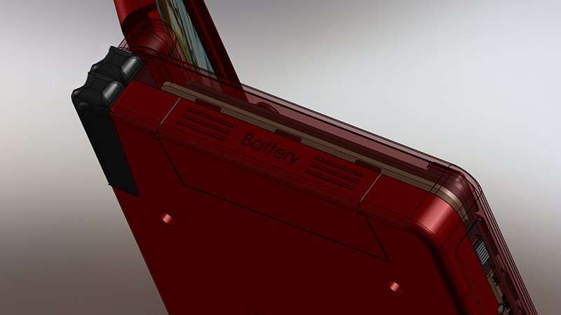
Yet another concept for the new Pyra


Loving these models and animation, really nice.

Regarding the screws, and the required screwdriver... Could the new Pyra Stylus include this? Like a Swiss-Army-Stylus if you like :)

The other end of the stylus [not the end that touches the screen] could have a twist/pull cap, to reveal a screwdriver.

Could then pop out the stylus and use it to open up the Pyra if needed, always with you then, and the storage us already accounted for.

I'd quite like that even if the Pyra didn't have screws, as I often need one to open up laptops with. I guess would mean that we'd need to have bespoke made stylus' [styli?] though rather than buy bulk from a firm who make them already
 
 Making the whole bottom a clip on like Samsung battery covers would be nice.
 
To prevent issues with battery size, the side cover could be a littel bit bigger to get the battery out easier. Quick Sketch:

sz0i66zav.png


I'm still not happy with the vertical shoulder button layout, at least the buttons should be a little bit bigger and provide better grip, also an quick idea in the picture. However, I'm still for side-by-side solution for the Shoulder Triggers.
 
Last edited by a moderator:
The vertical shoulder arrangement looks fine to me.  You don't have a lot of space to make bigger shoulder buttons.  This is way is better than what the vita is using now, the bottom touch as buttons (that's dumb from sony)
 
Last edited by a moderator:
Great and amazing drawings & animations - you're putting in pictures what so many of us can just say in words.

GAK - those shoulder buttons have turned into a nightmare.  They've gotten so gigantic that they look like they're made of Legos.  Shoulder buttons do NOT have to wrap the corner.  They do NOT have to be huge.  Having them -smaller- is an advantage.  Think about it people - you're never going to get two fingers on the back of a 14mm tall case.  It's like the people who think they're going to touch type on the result - simply not a reasonable expectation.  Having them stick out like that is begging for them to get broken.  The outer corners of this (any) device need to be case plastics not buttons.

A possible solution:  Think of a 10mm tall rocker switch.  Split it in the center so it's really two buttons - but retains the curvature of the rocker switch.  Use the -one- finger on the back of each side of the device to roll up for L1 or R1, roll down for L2 or R2, mash in for both at once.  One finger, two buttons/switches.  Smaller = better so  you can truly control both at once.

********************

Speakers & camera in the lid...  Those gotta go.  The lid needs to be JUST the 16:9 screen.  On the base, the gaming controls go in (fixed size), a pair of small speakers between the game pads and the hinge then scale down the keyboard until it fits in the space that remains.  The keys do not have to be square - rectangles work too.

********************

Fix for the concern around ejecting a swollen battery.  Put a 2mm hole in the opposite end of the case that can be used to push the battery out from behind using a thin stylus with the tip removed.

********************

Stylus - I prefer a heavier and slim (stainless steel or aluminum rod) stylus like the old Palm Pilots, Tapwave Zodiac and the Samsung Galaxy Note II.  It takes up less room, has a higher quality feel and feels more accurate.  Can we please stop using ones the size of giant toddler crayons?  This isn't a DS - we don't need to cater to clumsy children.  My favorite was the stainless steel Sculpted Stylus for the Tapwave Zodiac.  It was a thing of beauty.  Is there any compelling reason why we can't have a real, high quality, metal stylus on a Pyra?
 
Last edited by a moderator:
Couldn't the shoulder buttons be designed so that the plastic button material hit the rest of the case after making an electrical connection, but before the electrical contacts reached the end of their travel?
 
Oh wow =D

quite a lot of suggestions weve got there.

but thats great =D

I will look into this as soon as I find the time again.
 
It's a lot of fun seeing a lot of concept pictures, please keep it up.  I think Grench has the right idea about the split rocker switch LR/2 buttons, and I'm another who suggests the speakers be placed on the lower half of the case, above the D-pad and game buttons, not below, but I raise that the game buttons should remain at least as close to the keyboard as on the Pandora 1, so that we don't have to shift our grip on the device to press a nearby keyboard button while holding it for the game buttons.  This is to allow us or just me to comfortably use a few extra buttons as game buttons.

I would also feel happy for the headphone port (and all of the other ports) to be on the back of the case, and the SD slots to remain on the front, all alone like a king and queen.
 
A possible solution:  Think of a 10mm tall rocker switch.  Split it in the center so it's really two buttons - but retains the curvature of the rocker switch.  Use the -one- finger on the back of each side of the device to roll up for L1 or R1, roll down for L2 or R2, mash in for both at once.  One finger, two buttons/switches.  Smaller = better so  you can truly control both at once.
Interesting idea. I am a bit worried that it might be a slower input.
 
The vertical shoulder arrangement looks fine to me.  You don't have a lot of space to make bigger shoulder buttons.  This is way is better than what the vita is using now, the bottom touch as buttons (that's dumb from sony)
Actually, if we had actual buttons on the bottom rather than a touch sensor like the vita, then I think the bottom would be a great place to do it. Kind of like the buttons on the back of the Steam controller. You could rest your middle fingers on them and then push them in when you need to press them.

-God Ginrai
 
Its going to take some time until I can update this post again...

Lacking the time from now on again.

Just to let you all know =S
 
The vertical shoulder arrangement looks fine to me.  You don't have a lot of space to make bigger shoulder buttons.  This is way is better than what the vita is using now, the bottom touch as buttons (that's dumb from sony)
Actually, if we had actual buttons on the bottom rather than a touch sensor like the vita, then I think the bottom would be a great place to do it. Kind of like the buttons on the back of the Steam controller. You could rest your middle fingers on them and then push them in when you need to press them.

-God Ginrai
I don't think I would like that, at least, not as much as where the buttons are place now. I do agree that they can be a bit smaller and covered,
That sounds too compacted. Anyone w/ large hands will likely hate such a decision.

-God Ginrai
 
Perhaps, but what about side to side?
If you do that, then the inner shoulders will either be too far in, or you'll make them smaller to compensate, meaning that you'll arch your index fingers weirdly when trying to use the outer shoulders. I already get hand cramps if I play for very long on my 3DS, and I'm certain it's due to a combination of how thin the base is and how small the shoulders are in width.

-God Ginrai
 
If you do that, then the inner shoulders will either be too far in, or you'll make them smaller to compensate, meaning that you'll arch your index fingers weirdly when trying to use the outer shoulders. I already get hand cramps if I play for very long on my 3DS, and I'm certain it's due to a combination of how thin the base is and how small the shoulders are in width.
-God Ginrai
You know, after looking at it from another angle, they seem fine.
 
Last edited by a moderator:
If you do that, then the inner shoulders will either be too far in, or you'll make them smaller to compensate, meaning that you'll arch your index fingers weirdly when trying to use the outer shoulders. I already get hand cramps if I play for very long on my 3DS, and I'm certain it's due to a combination of how thin the base is and how small the shoulders are in width.

-God Ginrai
You know, after looking at it from another angle, they seem fine.
That's because without a frame of reference, everything looks large in those images.

-God Ginrai
 
Last edited by a moderator:
Back
Top