The Logo Poll

Your favourite logo is...

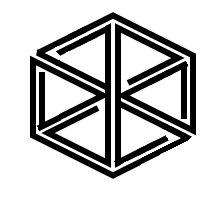
  • Logo Nr. 1

    Votes: 56 17.2%
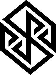
  • Logo Nr. 2

    Votes: 131 40.3%
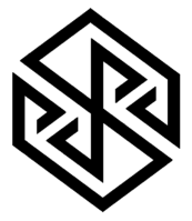
  • Logo Nr. 3

    Votes: 7 2.2%
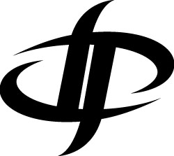
  • Logo Nr. 4

    Votes: 131 40.3%

  • Total voters
    325

Status
Not open for further replies.
Nvidia's clearly resembles an eye. There is no eye in no 2. IMO.
Instead, there's a nose.

-God Ginrai
UEdn95p.png


Sorry, couldn't resist.
Maybe Nvidia will sell us Tegra K1 in small numbers when they see this Pyra logo.
 
Last edited by a moderator:
Man, I don't care about your flipping shit, what I said in other thread don't concern this. You talked like I want to flip the logo, I told you that I never ask for it, so don't say that because you are wrong.
Then why keep pressing on it? Wrong side of...  lol I wasn't arguing, right or wrong. I was just trying to give you explanation. Anyway, you can't deny that you had some interest in flipping it over horizontal and then you show your disdain about vertical logos on the Pyra. How could I not assume that you still wanted horizontal logos out of these?


In fact, I already corrected myself from the get go.

So, you didn't ask. You actually just posted yourself.

Link
So, this shouldn't have even continue. 

So what? Does it mean that it's a nonsense? You could ask me why, but you can't say that it's a nonsense, you don't even understand it.
I said that because anyone can say the same thing about any of these symbols. It doesn't mean anything.

That logo isn't n°4. I talked about n°4.
Please note that these logos are not 100% final yet.


The font or emblem might still be tweaked a bit or worked on.
So, it makes sense that some others and I posted already made alternatives to the same logo.


I shown you a version you may like better. Yeah, I get voting on face value, but still showing


what it can become.

That's not my opinion, you shouldn't put (""), you should quote me instead of saying nonsense, I'm going to quote it for you. You can't tell me what I have to use as argument since you're not even able to understand a whole sentence.

The worst point is n°4 is verticale while Pyra will be horizontale, n°2 is also verticale but it isn't symmetric and sharp on both sides, it's like you can lay it on, while n°4 look like you cut the lid in two.
Yeah, I was commenting on that specifically. Anyway, As oppose to n°2 that sharp at each angle and look like it was made with a box cutter? :p


Also, the logo isn't taking up the whole lid and the P's aren't connected. It doesn't look like that at all.
 
Last edited by a moderator:
I voted 2. It looks like a diamond in the rough, and the font appeals to me.

4 looks like an onsen logo, 3 like a molar, 1 like a flame, but has this hook I do not like.
 
Traylorpark was busy with work right now, so he didn't have time to do something himself, though he mentioned the Logo from Hans (I think that's Nr. 2) would be pretty much like he imagined it as well.

I'll let him continue after the vote to work with that logo and tweak it.
 
I'm wondering if people would like this one better than #4 in terms of accusations of "aggressiveness", "tribal tattoo", "known trademark":

pyralogo20-sm-i.png


I'm also still in favor of the full word PYRA as an ambigram, e.g. like this:

pyralogo15.png


Or one of comradekingu's Escher-style cubes:

post-2326-0-77174300-1391438442.png


post-2326-0-89742300-1391104214.png
 
Traylorpark was busy with work right now, so he didn't have time to do something himself, though he mentioned the Logo from Hans (I think that's Nr. 2) would be pretty much like he imagined it as well.


I'll let him continue after the vote to work with that logo and tweak it.
Sexcellent. Traylorpark sounds like a swell guy eh?
 
I still like this one from comradekingu

40J5CZj.png
Please don't derail the thread like we did the other one. At least we are talking about the labels in this poll.
Did you conveniently forget derailing that thread made an impact that became decisivly important to how this poll is set up.


The design that came in after ED had picked his favs is also in the lead right now.


A thread derails for a reason, for good reason i might say.

Also the nr 2 option in this poll (dp) by binky came in after ED had picked a selection of, for lack of wanting to offend anyone, arent,

(with the exception of one), in this poll.

Option 1 here, the flame is a vastly different take on one of those earlier proposals, and came in later.
True, but how many threads that need to be derail before we go forward? :p
 
Last edited by a moderator:
Preferably/inherently  every thread until the popular options are at least acknowledged.

Also i don't think ED understands the pain in the process of being driven to perfection.

The only peace in the mind of the neurotic comes from achieving something that has no limits, that which gives it rest.

Nothing can stop that. Such is the nature of design.

We need all details on the table to vote, we need all the input to learn, we need to learn to decipher the input.

Its like sampling the rain that falls on a whole mountain-range into a river, and then standing there with a bucket to catch the purest water as the sum of its parts flies by.

Our numbers are great, and if there is any use to that, it comes from gauging interest and providing feedback.

A multiple choice checkbox vote where you don't see the status till the results are in, and then

a first second third preference voting based on those that are in the top.

To get a set of choices to vote on, one could propose the works of others. I think that is a just system.

I would like to nominate these: http://boards.openpandora.org/topic/15712-logo-discussion/page-2#entry317252 along with nr 2 from this poll. The font for that is based on http://openfontlibrary.org/en/font/xolonium which is GPL licensed, which means it can be used.

Edit: wb has quoted me for his cube, and also included the non-final firecube that i made above. The correct one is

pyraild39.png
 
Last edited by a moderator:
Number 2 bothers me.

  • Firstly it resembles the nvidia logo
  • Secondly, it seems too sharp - somehow
  • Thirdly, the "pyra" name is derived from fire (etc) - not pointy geometric solids
I voted #4

Looking at the poll's current status, it looks like we'll need a two-option poll between #2 ad #4
 
Last edited by a moderator:
Frankly No2 doesn't look a thing like the Nvidia logo IMO . I also do see fire in No2.

On the flip side the DP logo looks a lot like other DP logos like these two. 

113887_cgeu-8k-zI-DP-logotzs.jpg
 
dp_logo_big.png
 
Last edited by a moderator:
So what? Does it mean that it's a nonsense? You could ask me why, but you can't say that it's a nonsense, you don't even understand it.
I said that because anyone can say the same thing about any of these symbols. It doesn't mean anything.
This is my opinion, and that's mean a lot.

Also, the logo isn't taking up the whole lid and the P's aren't connected. It doesn't look like that at all.
Fine, that's your opinion, that's why a vote was made, because people have different opinion.

I'm wondering if people would like this one better than #4 in terms of accusations of "aggressiveness", "tribal tattoo", "known trademark":
That's better but less elegant. IMO a good version of that logo could be done.

113887_cgeu-8k-zI-DP-logotzs.jpg


Good work, very well balanced, way less agressive.

A tribute to the best ambigam:

140329030112337999.png
 
Last edited by a moderator:
^ That's the logo for a team by the name Double Penetration which DP is well known to mean in Porn. Actually its the first meaning that comes up in a google search for DP. At least it will be memorable I guess :p
 
Last edited by a moderator:
I like nr. 2 the most.

Linked this poll to a few people who have no particular interest in Pyra and they all told me "2 is the best". Nr 1 is OK too yet a little generic, nr 3 doesn't look good and nr 4 is OK but it's hard to see the "dp" if you don't know it imo and then looks like a tribal thing.
 
I liked the first one the most but then, it wouldn't look good upside down, which might be bad for a case. I liked 4 because it could be flipped and still look symmetrical.
 
For me I like 4 cos it looks like a flame each way, and as notes is flippable, which I think is important.  It does irritate me that when I pick up my laptop, the logo is upside down, although if we also need a label as well as the logo, that bit will still be upside down.

Anyway, just posting to note how close this poll has been all day - just one vote between number 2 and number 4.  Very excitiing!
 
Status
Not open for further replies.
Back
Top