The Logo Poll

Your favourite logo is...

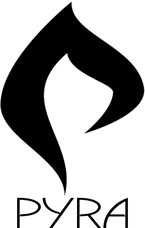
  • Logo Nr. 1

    Votes: 56 17.2%
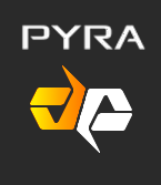
  • Logo Nr. 2

    Votes: 131 40.3%
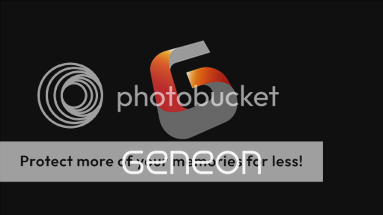
  • Logo Nr. 3

    Votes: 7 2.2%
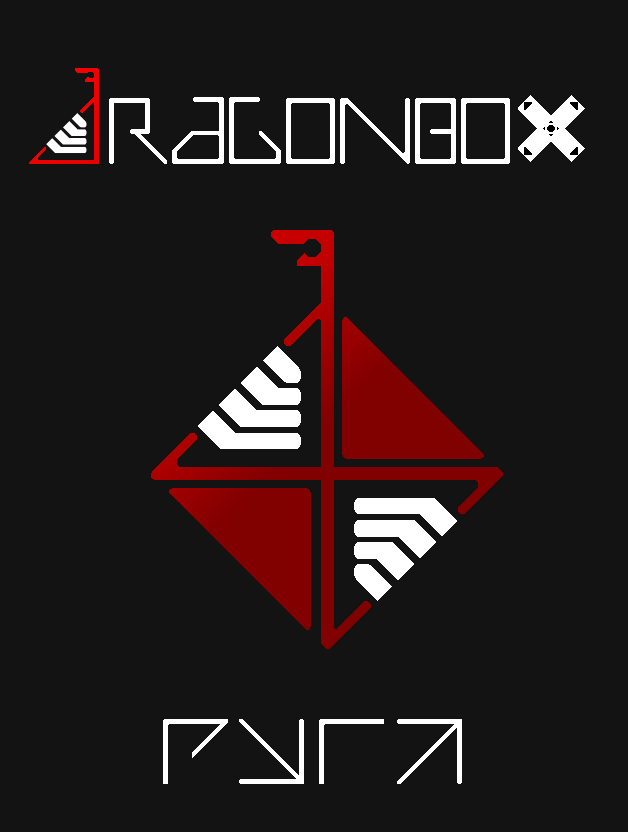
  • Logo Nr. 4

    Votes: 131 40.3%

  • Total voters
    325

Status
Not open for further replies.
Font 2 is actually GPL whereas others might not be. Also, nr 2 is a unique logo.

Whatever font the creator picks isn't random.
 Well, EvilDragon made it sound like he's the one who picked it, so he's not the logo creator, so it does seem random to me.

As mentioned, font and typeface are not final yet.

Just put some okay-looking ones there right now (haven't even checked about the font license).
 Second of all, EvilDragon specifically said:

Yep, mostly vote for the emblem, not the font type.
 So we should not be basing our votes off of the fonts, but off of the logo. The font could be completely different from what we see in the vote. The logo how ever, is likely not.

-God Ginrai
 
my new profile pic is my two cents on the venerable option number 2.

I like the angles of the original 2, and wanted to play with some negative space and pointiness.
photo-10970.png


The lowercase pyra fit well.

Its the logo of a bag company.  "Welcome, you can find all the backpacks you need here at Durapax.  We have all sorts of bags, you can get regular backpacks, sports bags, laptop bags and more."
I thought about a surfboard brand. But it is well made IMO.
I prefer the one ED posted. it's simpler and more interesting.
 
Logo is irrelevant really...( unless it`s a knob and bollox )

Voted 2 because of the font.
Then you should change your vote. It has been pointed out that the fonts have absolutely nothing to do with the logos and that you should not choose your logo based on the random fonts EvilDragon included below them.

-God Ginrai
Voted 1
 
Last edited by a moderator:
I like the fire design in 1 because it feels like a better fire shape than any of the others. Also the only logo that looks like a "P".

As for the font I like the one in 4 because it feels more retro-esque, but I understand that these are just place holders so I voted for 1.

After typing this out and looking at some of the comments I decided to take a stab at adjusting #1 in Illustrator and try to split the difference on the font.

pyra_logo_alpha2_by_therealalpha2-d7caktm.jpg


The font is an original drawing.
 
Last edited by a moderator:
1 looked dumb to me until Alpha2 drew that.  Their version looks like an awesome claw.  I even like their Pyra font, despite really not liking that ED included the word Pyra below the label at all.  Like the Pandora the lid should only have the picture, otherwise crazy people like me are forced to read it again and again and again like subtitles.
 
I'm torn between 1 and 4, so haven't voted yet. I like the concept behind 4, but am not happy with it as it stands... it needs adjustment.

1 is nice and clean but the only thing I don't like about it is you can't really look at it upside down... so I have hopes a variation of 4 can be made that ticks all the boxes.
 
I know that selecting a logo and then looking for a proper font which will fit to it is probably a good approach.


I have voted for #2 for two reasons.


1) It is most appealing to me. I admitt that I like the concept of 'flippable' logo, but neither #3 nor #4 are appealing to me.


2) I really like this font:

And in my opinion only #2 may come together with this font.
 
How come we haven't seen a design from traylorpark yet? I honestly don't feel good about voting on a logo knowing that traylorpark hasn't submitted a logo yet.

-God Ginrai

The first logo post made by EvilDragon was in November. It has been 6 months since then with many posts keeping at least one of several discussions near the top of the list. 6 months with no post from traylorpark. Maybe he just doesn't want to.
I'm sorry to be so quiet about all this guys! I've been really caught up in my new job, and more recently, knee deep in GDC stuff. I could not find the time to really sit down and focus on anything else. However, there are already some good designers hanging out in the community now! Many people have put together a lot of great concepts! (where is that dog one? ;) )  After the favorite logo is chosen, there will of course be some work that needs to be done after, like balancing the design a bit, fitting a good typeface to the logo etc. I'll try to help out wherever I can!
 
And in my opinion only #2 may come together with this font.
I really don't like this font.
I really don't what you guys see in number 2. It's pretty plain actually.
 
Last edited by a moderator:
Many people have put together a lot of great concepts! (where is that dog one? ;)
The Great Pyranese logo?  I would have voted for that one if it were in this poll.

Maybe ED shouldn't have left text below the logos at all, I know that only the people who don't read his post will vote according to their font preference, but that demographic probably makes a difference.
 
Also the only logo that looks like a "P".
I'm not sure how you don't see the P in #4, but I do agree that #2 and #3 don't really have an easily noticed P.

-God Ginrai
My bad, I should have said "Most like a P".

4 was actually my second choice but the double sided design felt a little redundant to me compared to a single graphic element that I felt could be improved just a bit.
 
Some of the posts on here make me laugh; it it hard to believe this is a Pandora/Pyra board, not an Apple one! There seems to be this weird idea that there is a correct choice (or at least an incorrect choice). Hey, people, it is subjective, people like different things, hence the poll!  :) For what it is worth I voted for #1, I took a look at each logo, started to analyse them, then stopped and just went to the one that I preferred from a quick glance.
 
Funnily enough I voted pretty much the same way,  though my preference was for  #2, as none of the others appeal to me.

- Neelix
 
Voting will end Friday 2014/04/04.
I don't think it's useful to wait until then; there are already more than enough votes in to be statistically relevant, the last 100 or so votes have not changed the result at all: a small 20% for proposal 1, about 40% each for proposal 2 and 4. Unlike, say, programming compo entries, this is not something that takes a long time to judge either.

Also it has become clear that people are voting based on the font (which would presumably not even be included in the lid version of the logo), not based on the logo itself. This somewhat invalidates the results. In particular, judging from the comments, the font used in proposal 4 is causing people to vote for something else, while the font used in proposal 2 is attracting votes from people who don't even particularly like that logo.
 
I voted for Logo 2, because I prefer the Fontstyle. But I have to say I would prefer the Font of Logo 2 with the simple, stylish Artwork of Logo 1.

Quick Mockup:

Pyra_logo_adapted.png
 
Voting will end Friday 2014/04/04.
I don't think it's useful to wait until then; there are already more than enough votes in to be statistically relevant, the last 100 or so votes have not changed the result at all: a small 20% for proposal 1, about 40% each for proposal 2 and 4. Unlike, say, programming compo entries, this is not something that takes a long time to judge either.

Also it has become clear that people are voting based on the font (which would presumably not even be included in the lid version of the logo), not based on the logo itself. This somewhat invalidates the results. In particular, judging from the comments, the font used in proposal 4 is causing people to vote for something else, while the font used in proposal 2 is attracting votes from people who don't even particularly like that logo.
Remove the font from each image and re-vote?
 
Status
Not open for further replies.
Back
Top