You are using an out of date browser. It may not display this or other websites correctly.
You should upgrade or use an alternative browser.
You should upgrade or use an alternative browser.
The case of the case.
- Thread starter EvilDragon
- Start date
Linux-SWAT
Forum Addict!
- Joined
- Feb 13, 2010
- Messages
- 9,290
Great !
The keyboard part, hand side, should be vertical rounded too (like the bottom part) to avoid some pain.
The keyboard part, hand side, should be vertical rounded too (like the bottom part) to avoid some pain.
Neelix
Insecticidal Maniac
Agreed.I think it's probably best to use a neutral color like black or dark gray -- everyone can live with that, and it's timeless.
That said, it occurs to me to wonder if ED would be able to get a deal from the case company that would allow him to offer a selection of colours, e.g in an order of 5000 cases he might get 500 dark red, 500 dark blue, 500 charcoal grey, 50 pink and 3450 black cases. (or some other combination of colours and quantities - this is just an example) In subsequent orders he could use the sales data to determine what ratio of colours to order for the next batch. Of course I have no idea if such a thing would be in any way practical, but I think it's a nice thought.
- Neelix
I personally would rather just get the battery clips to use my Pandora battery (got a spare) instead.What will be cool is to be able to chose between 4800 and 8000 since both would fit.Twice the battery capacity than Pandora is a bit overkill, IMO.
Just a few numbers I find interesting:
- At 8000mAh the charge time would be extended from Pandora's 3.5~4 hours to 7~8 hours by using the wall charger at around 1.2A.
- To use up all that charge during the remaining part of the day (ie. 16h) would require 2 Watts power consumption non-stop
Unless Pyra power consumption jumps 8~10 Watt range, I don't see the purpose of a 8000mAh battery.
Tenka
Snakes and Fish
- Joined
- Jan 28, 2012
- Messages
- 701
About the battery clips, can there be a tiny unused space for later case modders to drill a screw into, so as to connect the battery cover without clips? I plan to have a metal case made for mine down the line, which wouldn't be able to use flexible clips in the same way plastic can. This would also work if there were a lip on the bottom of the battery cover where it overlapped the rest of the case about a centimeter.
WizardStan
Mega GP Mania
- Joined
- May 24, 2008
- Messages
- 16,733
Me too. They're there within easy reach without getting in the way.At first I wanted to advocate trying to get them to either side of the top button (instead of above/below the left button) but I put some stickers on my Pandora and gave it a try and concluded that I didn't actually like the amount of travel my thumb needed to to to get to the upper right. The lower-left I found way better.I -like- the four normal + 2 small button arrangement for the 6 button layout. That is pretty much perfect.
kuru
Je suis Charlie, #JusticePourQuentin
- Joined
- Jan 18, 2010
- Messages
- 11,471
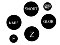
Maybe, but there is a support screw on the right side that would get in the way.Wouldnt a button layout like this make more sense anatomically?
Tenka
Snakes and Fish
- Joined
- Jan 28, 2012
- Messages
- 701
There isn't yet. And God Ginrai has something to say to you about that.Maybe, but there is a support screw on the right side that would get in the way.Wouldnt a button layout like this make more sense anatomically?
I wonder if every one of the people who have long thought and decided that they are definitely comfortable with the currently proposed 6 button layout are also people who wanted there to only be 4 buttons, and are just satisfied because this layout allows them to ignore the new buttons.
Last edited by a moderator:
DrHAX
T̶h̶e̶ ̶A̶u̶t̶h̶o̶r̶ The Artist
- Joined
- Sep 18, 2013
- Messages
- 850
How strong are these cases? My silver Pandora already has cracks on the hinge and top from daily use.. I hope the plastic on these cases are better the Pandora's
Sent from my Z665C using Tapatalk

Sent from my Z665C using Tapatalk
Sent from my Z665C using Tapatalk
I'd pay extra for a clear caseAgreed.I think it's probably best to use a neutral color like black or dark gray -- everyone can live with that, and it's timeless.
That said, it occurs to me to wonder if ED would be able to get a deal from the case company that would allow him to offer a selection of colours, e.g in an order of 5000 cases he might get 500 dark red, 500 dark blue, 500 charcoal grey, 50 pink and 3450 black cases. (or some other combination of colours and quantities - this is just an example) In subsequent orders he could use the sales data to determine what ratio of colours to order for the next batch. Of course I have no idea if such a thing would be in any way practical, but I think it's a nice thought.
- Neelix
Sent from my Z665C using Tapatalk
- Joined
- Jan 18, 2010
- Messages
- 11,471
They're not made yet, plastics are not chosen yet and it's a completely different manufacturer that is in Greek not China.. so ED can provide some feedback if issues arise.How strong are these cases? My silver Pandora already has cracks on the hinge and top from daily use.. I hope the plastic on these cases are better the Pandora's
Well currently in the design shown there is and I'll be awaiting God Ginrai rant.There isn't yet. And God Ginrai has something to say to you about that.
I'm in that camp, I would personally have just a four button layout than this configuration.. ED claimed the extra buttons wouldn't be in the way, so I can live with it.I wonder if every one of the people who have long thought and decided that they are definitely comfortable with the currently proposed 6 button layout are also people who wanted there to only be 4 buttons, and are just satisfied because this layout allows them to ignore the new buttons.
Last edited by a moderator:
gotwake424
Member
- Joined
- Apr 2, 2011
- Messages
- 380
ED how extensively is the WIFI going to be tested? I know that was one of my biggest gripes of the original Pandora, super slow wifi speeds
Sent from my Z10 using Tapatalk
Sent from my Z10 using Tapatalk
WizardStan
Mega GP Mania
- Joined
- May 24, 2008
- Messages
- 16,733
Like I said, I tried it on my Pandora and it required a lot more thumb travel than I was comfortable with. I found the proposed setup to be absolutely perfect, but feel free to get some dots and try it yourself as well, everyone's thumbs are different.Wouldnt a button layout like this make more sense anatomically?
Mine has this problem, I tried adding paper above the battery and the padding between battery lid and battery was too much and a tab of the battery lid broke off. Now held together with duct tape.I have three Pandoras and this isn't an issue on any of mine, you either have an issue with your battery or your unit. I heard of some units having this problem, but easily solved by adding some padding between the battery case cover and the battery.The way the contacts are positioned in the Pandora is terrible, every time I so much as tap the console, or set it down even remotely roughly it shuts off and I lose whatever I was doing.
The pyra definitely needs more reliable battery contact.
slaeshjag
¯\_(ツ)_/¯
ED added padding on the sides on new pandoras. This helps *a lot*.
God Ginrai
Godmaster
There is a screwhole in that general area, but that does not mean that all hope is lost for buttons being near that area.They're not made yet, plastics are not chosen yet and it's a completely different manufacturer that is in Greek not China.. so ED can provide some feedback if issues arise.
Well currently in the design shown there is and I'll be awaiting God Ginrai rant.There isn't yet. And God Ginrai has something to say to you about that.
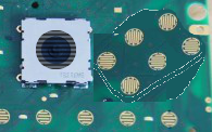
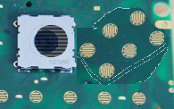
Here is the most recent mockups I've shared w/ EvilDragon (to alleviate concerns that the nub would hit the left button):


-God Ginrai
Last edited by a moderator:
God Ginrai
Godmaster
No need for thanks. I want this to happen, thus why I'm making mockups to show it is possible.Those mockup pictures make me feel so comfortable and hopeful. Thank you for your effort.
-God Ginrai
Grench
Forum Addict!
- Joined
- Oct 3, 2008
- Messages
- 6,629
I fiddled around with 'extra button' placements on my Pandora as well. The way it is in these molds is the best solution.Like I said, I tried it on my Pandora and it required a lot more thumb travel than I was comfortable with. I found the proposed setup to be absolutely perfect, but feel free to get some dots and try it yourself as well, everyone's thumbs are different.Wouldnt a button layout like this make more sense anatomically?
I suspect that those ignore case plastic mechanics entirely.There is a screwhole in that general area, but that does not mean that all hope is lost for buttons being near that area.
Here is the most recent mockups I've shared w/ EvilDragon (to alleviate concerns that the nub would hit the left button):
6buttonnub.png
6buttonnub_moved.png
-God Ginrai
The most leftward one appears to leave inadequate room for the case plastics between it and the nub.
The bottom most one appears to leave inadequate room between it and the key underneath it - notice that it is about -half- of the distance from that key than between the regular keyboard keys - that are separated from each other by minimal plastic widths.
Hard to tell, but I suspect that the topmost key in that layout may impinge on the speaker area.
To top it off, two rows of 3 as you have laid out is LESS efficient in use than the layout in the blue molds above.
Give it up please? Your 2 rows of 3 idea is a train wreck. The only way to do it that way is to make the buttons annoyingly small OR mechanically compromise everything
Last edited by a moderator:
- Joined
- Jan 18, 2010
- Messages
- 11,471
I have the same concerns as grench with the left most pad. Does't leave much for the supporting plastic of the button. Not saying something couldn't be managed.. just that picture doesn't give me an impression it could be done the way it shows it.
Similar threads
- Replies
- 152
- Views
- 43K


