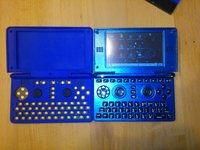
The case of the case.


Well, that is the problem. You are asking the user to press exactly at the right spot every time. I think that just won't happen, humans are inexact by nature.
No, I'm saying, they don't have to hit it exactly in the middle. I never said they wouldn't.
Judging by the nail marks around some of the buttons on my older console controllers, I do put my thumb in almost exactly the same place every time.
You mean where it would be the middle for the 6 buttons or the middle of the 4 buttons?


For GG.

How small are the 2 extra buttons or are they the same size as these.

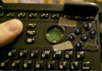
When pressing the middle-Y and A-Button together, I really often accidentally hit the lower X-Button as well.

But even when I try pressing the A button alone (without looking), I often accidentally hit the lower X-Button as well.
You seem to use the middle of you thumb rather than the side of it.
 
Last edited by a moderator:
Well, that is the problem. You are asking the user to press exactly at the right spot every time. I think that just won't happen, humans are inexact by nature.
No, I'm saying, they don't have to hit it exactly in the middle. I never said they wouldn't.
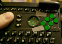
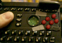
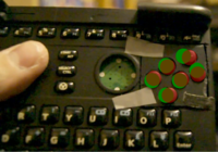
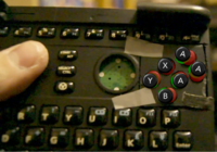
Then we had a misunderstanding. My GIF was trying to show that pressing a single button, the middle top, would be difficult.

Seems hitting it right on the middle would be the best way to avoid the buttons on either side (and bellow).
 
Then we had a misunderstanding. My GIF was trying to show that pressing a single button, the middle top, would be difficult.

Seems hitting it right on the middle would be the best way to avoid the buttons on either side (and bellow).
I think the misunderstanding continues. :p


Are you sure it would be best for hitting the middle rather than off to the side between these two buttons?
 
That video proves it. 6 buttons in 2 rows is a train wreck.

ED's original 4+2 button design for the win!

Done, settled. Moving on?
 
...

@ Saber:

Unfortunately there is no need to try your layout.

Did you see the Keymat design ED posted here?

Unfortunately there is no room to place Start and Select besides each other.

It's possible in Pandora as a hack but won't work with the Pyra.

The Nubs need much more room below the Housing than you can see.

EvilDragon wants to make a video later to demonstrate the hack.
Interesting but very odd.

If I were to imagine following a straight line North from the midpoint of the "7" key on the Pyra, it seems to be enough room for keys Select next to Start with some extra keymat border rubber to spare. I'm assuming the same rubber buffer distance between the two new action buttons, (+) and (-), applies for either side of the nubs.

In the latest Twitter picture/illustration of the keymat from ED, the two new action buttons are abutting the right nub square as is clear to see. If I were to use this as reference, Pyra's letter T and Y(aka Select and Start), if followed North wouldn't abut either nub square platform hole. Neither T nor Y is as close to a nub as the (+) and (-) keys on the right side to the right nub are. Here the midpoint line of the "7" is farther from the right nub, from it's West platform border, than the Western edges of either action button(new action buttons share roughly the same midpoint as the "O" letter key if you don't understand me).

Zpn6YxO.jpg


I hope when ED makes this video, it will have both hacks and please note also I used the midpoint of "7" key above to make a comprehensible point here but the actual edge of the center duo keys would fall short, be even farther, from the nubs which is why I'm even more sure about being unconvinced with the assessment.

Again, with the pic of the Pyra board above and the newer tweet with the illustration from ED, respectfully I have to disagree as it doesn't add up. It just doesn't. :mellow:   
 
The button size is no issue, but the space between the buttons does.
 There's a lot of space to be had just by putting the buttons in the correct place.

When pressing the middle-Y and A-Button together, I really often accidentally hit the lower X-Button as well.
This is because the middle Y is too close to the B button and the X button is too close to the A button.

But even when I try pressing the A button alone (without looking), I often accidentally hit the lower X-Button as well.
 Once again because the X button is out of position.

The space can't really be made bigget when using that 6-button layout - so it's not really possible at all.
While I have my doubts about whether it is impossible to make the space bigger, (it should be possible to move the nubs inward slightly with little problem) there are substantial gains to be had simply by putting the buttons in the correct places.

Judging by the nail marks around some of the buttons on my older console controllers, I do put my thumb in almost exactly the same place every time.
You mean where it would be the middle for the 6 buttons or the middle of the 4 buttons?
I think his point was that he already hits the buttons precisely, so Yoyobuae's point is moot. I'd have to agree, I don't think there are many people who press a button in a different way almost every time. You tend to just get used to where it is, and hit it exactly.

Using this, I have created an example of a more reasonable layout:

6b_Pyra_new_buttons.png

This creates an even gap between each button, which helps a lot in making it more usable.

Below, I have included images that show that the reference circles I used are fairly accurate in size as well as a second image that shows the difference between where the Buttons moved from and to. This helps to see the size differences of the button gaps between the two layouts.

6b_Pyra_new_buttons_size_proof.png

6b_Pyra_new_buttons_shift.png

-God Ginrai
 
Shouldn't. EvilDragon mentioned to me before that the same amount of vertical space was available between the speaker and the keys as was between the numrow and the keys.

Also, since I was curious, I went and grabbed the ABXY from an official DS Lite image, and scaled them to the same size they are in the image in an effort to see how well the distances matched. (I went ahead and used rotations of the B and A group to find out the optimal places to place the 2 extra keys)

6b_Pyra_DS_Lite_distances.png

I aligned the X button on the DS Lite layer with the middle green button on the top row in my example. As you can see from where the Green buttons peek out from the Y and A buttons, the difference in the distance between my suggested layout and the official distances of the DS Lite controls (a proven success) is less than the distance between the edge of the Y button and the Y character on it.

I think this more than shows that such a layout is possible, because this is just barely closer together than an already proven layout.

Also of note, if we have room to fit that DS Lite 6-button layout I'm using in this example, that would give us the same distances as the DS Lite.

-God Ginrai
 
Here's a picture of the back of the Pyra prototype case.

If the smaller action buttons, (+) and (-), are that close to the nub in the left side of the pic, then why wouldn't Select and Start(same alignment vertically of where letters Y and T or the two top hardware keys would be) fit in the center to the right of the nub? :unsure:

iJC6CbC.png
 
Last edited by a moderator:
I noticed that the image Natsu has given me has the Pandora tilted away slightly to the upper right. So I made a quick image of that 6-button DS Lite using the Perspective feature in GIMP to place the layer at the right angle so that the button sizes matched.

And what's cool, is that it shows that the DS Lite layout I previously pictured should even take up less room than it originally looked like. :D

6b_Pyra_DS_Lite_Perspective.png

-God Ginrai
 
The slight misalignment doesn't help, we tried that.

The buttons are just TOO cramped. You easily hit two at once, unless you move them farther away, which doesn't work with 6 buttons like that.

It's just not possible for comfortable gaming.

I noticed that the image Natsu has given me has the Pandora tilted away slightly to the upper right. So I made a quick image of that 6-button DS Lite using the Perspective feature in GIMP to place the layer at the right angle so that the button sizes matched.

And what's cool, is that it shows that the DS Lite layout I previously pictured should even take up less room than it originally looked like. :D

attachicon.gif
6b_Pyra_DS_Lite_Perspective.png

-God Ginrai
The lowest button is too close to the keyboard.

I didn't mention this with the video, as Askarus' mod wasn't too accurate and that button shouldn't be so close to the keyboard.

But with that, I hit the keyboard button below that button accidentally a few times.

So we can't go so low either.
 
Last edited:
Seems you guys will need to ship the modded pandora to GG so he can convince himself or something.  I doubt any amount of words or pictures or videos will end this discussion (which I had forgotten I'm no longer part of, my mistake :p ).
 
The slight misalignment doesn't help, we tried that.

The buttons are just TOO cramped. You easily hit two at once, unless you move them farther away, which doesn't work with 6 buttons like that.

It's just not possible for comfortable gaming.
Except they are not too cramped when you align them correctly. My layout has almost the exact same distances as the DS Lite, (and the most recent layout which I posted with the perspective applied uses the exact same distances as the DS Lite) which Nintendo has proven this with over 93.42 million sales (2011-06-30 units shipped, source: http://en.wikipedia.org/wiki/DS_Lite#Sales)

The lowest button is too close to the keyboard.

I didn't mention this with the video, as Askarus' mod wasn't too accurate and that button shouldn't be so close to the keyboard.

But with that, I hit the keyboard button below that button accidentally a few times.

So we can't go so low either.
This point is moot. Askarus's button is almost the exact same distance from the keyboard that the X button is in your current case prototype, as seen here:

pyra_above.jpg

In fact, I just realized that Saber's picture of the back illustrates it better than the image I just included.

-God Ginrai
 
Last edited by a moderator:
And what's cool, is that it shows that the DS Lite layout I previously pictured should even take up less room than it originally looked like. :D

attachicon.gif
6b_Pyra_DS_Lite_Perspective.png

-God Ginrai
I feel like it's mentionable, that these game buttons are now further apart from one another than any of the other buttons are on the Pyra, besides the fancy stuff going on in the very top row.  Can they be harder not to press together than the keys?  They certainly wouldn't feel too close together for me.  And them being close to the O and P keys is a positive thing for me.  I like that, and I think that most people will not have any reason to lift their thumb from the two positions between the first four button diamond or the second four button diamond.  Also the buttons in the 4+2 layout already printed do look to be just as close to the keyboard as this one's.
 
Last edited by a moderator:
I still don't understand how a dvorak keymap becomes impossible with the double-width spacebar. Standard dvorak works on the same keyboards that a standard QWERTY layout exists on, and it's possible to do a QWERTY layout on the Pandora and the Pyra, so I don't see how all of a sudden dvorak doesn't have enough keys.

-God Ginrai
Because on the Dvorak keymap the keys to the right of the location of the 'M' key (same location on Dvoark & QWERTY) are: 'w', 'v', and 'z', so 'w' and 'v' need to go in the space taken by the space bar.
 
It's just like the 3DS, but with 6 buttons. I agree with everything God Ginrai and Tenka is saying. I can see myself putting my

thumb in the middle spaces like I do with the 4 buttons.
 
Last edited by a moderator:
I still don't understand how a dvorak keymap becomes impossible with the double-width spacebar. Standard dvorak works on the same keyboards that a standard QWERTY layout exists on, and it's possible to do a QWERTY layout on the Pandora and the Pyra, so I don't see how all of a sudden dvorak doesn't have enough keys.

-God Ginrai
Because on the Dvorak keymap the keys to the right of the location of the 'M' key (same location on Dvoark & QWERTY) are: 'w', 'v', and 'z', so 'w' and 'v' need to go in the space taken by the space bar.
I still don't see it. From the Wikipedia Page (http://en.wikipedia.org/wiki/Dvorak_Simplified_Keyboard) it looks like the bottom row needs to have ';','Q','J','K','X','B','M','W','V', and 'Z'. That's 10 keys. The Pyra has 9 keys just to the left of the spacebar. If you just moved ';' somewhere else, it would fit without any other changes. That doesn't seem much different than the slight differences that the QWERTY layout on a Pandora has from a real QWERTY layout.

EDIT:

@Tenka: Good point. The keyboard keys have less distance between them than the button layouts I've suggested do. Anyone who couldn't use those buttons certainly couldn't use the keyboard.

-God Ginrai
 
Last edited by a moderator:
If you move ; and shift Q over it's no longer underneath O and E (rather A and O) so it alters the shape of the letter part of the keyboard. The Pandora (and Pyra, presumably) keyboard maintains the standard QWERTY shape (1/2 key offset notwithstanding), but moves other keys around this shape.
 
Ah... That's what you are getting at. Ok, now I see the dvorak problem. But couldn't you technically solve it by using the double-width key for Z? It may sound unattractive, but it puts Z in the right place. Also, where I suggested getting rid of the ; key on the left side of the bottom row could be replaced with space in the dvorak layout, so it is still easily reachable from the side.

-God Ginrai
 
Pyra has less vertical space than Pandora in that area:
D8i0yHR.gif

The speaker on Pyra takes up more vertical space than the top number row of keys on Pandora, and the top row of keys on Pyra bellow the buttons is (a little) higher than the UIOP row of keys on Pandora.
 
If this layout barely fits on Pandora then it won't fit on Pyra for sure.

@Tenka: Good point. The keyboard keys have less distance between them than the button layouts I've suggested do. Anyone who couldn't use those buttons certainly couldn't use the keyboard.
 
Anyone who wants a 6-button layout could just map them to keyboard keys instead, because aparently keyboard keys and gaming buttons are equivalent. ;)
 
Last edited by a moderator:
Back
Top