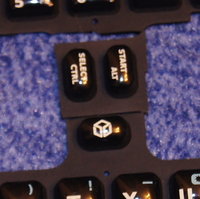
The case of the case.


Askarus's button mod is such a monster, it's hard to ignore my great respect for it for that reason.  You made that quickly!  Great job great job.  But I wonder if it could have felt a lot more comfortable if the perfect diamond was kept and the buttons were smaller, or if just the new buttons were smaller.  It's pretty easy to see that jungle being difficult to press individually.

This is almost unrelated, but I would also like ED's first layout a lot more if the new buttons were simply on the right of the diamond rather than the left.  That could be close enough to what we really want.
 
There's no room at the top right to place a button:
Xd5Rzo6.png


In red the area where the speaker and plastic screw pillar would be.
 
Shouldn't we have a button poll? Would be interesting to see where the tendency goes.
 
Askarus's button mod is such a monster, it's hard to ignore my great respect for it for that reason.  You made that quickly!  Great job great job.  But I wonder if it could have felt a lot more comfortable if the perfect diamond was kept and the buttons were smaller, or if just the new buttons were smaller.  It's pretty easy to see that jungle being difficult to press individually.

This is almost unrelated, but I would also like ED's first layout a lot more if the new buttons were simply on the right of the diamond rather than the left.  That could be close enough to what we really want.
I know it's not a perfect diamond.

I wanted to make one on a second run but it wouldn't have improved the situation a lot.

The buttons are so close to each other that it's feels uncomfortable even with perfect placed buttons.

For some buttons I would have to decrease the distance even more what would not improve the situation.

Look at the picture and you'll see I have made some plastic plate I can swap and replace to have as many tries as I need.

If there would be a chance to make it feel well I would have done it.

Smaller buttons wouldn't improve things.

The DS Light buttons feel tiny already.

If you wait for the video you all will understand.

The buttons are so small and the distance between the buttons is so low.

It won't work well.

Wait for ED's thumb and see how he covers 4 of those buttons at once.
 
Last edited by a moderator:
Askarus, do you have pictures of this button mod up somewhere? I assume Tenka is referring to something but I can't find anything..
 
Last edited by a moderator:
No offense, but I believe that you could have created more space between the buttons if you had positioned them better.

I don't know why you chose the positions you did - obviously there are problems with it.

Did you not make 6 paper disks the size of the buttons and shuffle them around until you had optimum placement? 
 
I did the Pandora 6 Button Modification.#
 Wow, so fast.

It's not a perfect design.

Distances are not 100% correct.
 Exactly why we should try a second run. :)

ED and I did test it and we both come to the conclusion that it doesn't work.
 I'm going to have to agree with FaeMinx here and point out that if you had positioned the X more to the left, you would have been able to move the A into a much better position.

I'm sorry, but if anything, this attempt at making a 6-button hack has convinced me that it is even more possible. Give me a top-down image of your hack, and I can show you where you need to place the buttons to make it lay out correctly.

Also, this is without even moving the nubs inward, which means that if we move the nubs inward (which EvilDragon's keymat image proves there is room to do) it's all but guaranteed.

Wait for ED's thumb and see how he covers 4 of those buttons at once.
I can cover all 4 ABXY buttons on the Xbox Duke controller, Nintendo DS, DS Lite, 3DS, and GP2X with my thumb and that has never once been a problem.

1: The buttons are too close.

It looks well on God Ginrai's picture but if you have a thumb besides the buttons it doesn't.
Yeah, not really understanding this point either.
bIvokwV.gif
Clear enough. :p

If not then wait for ED's video.

NOTE:  I used my own Pandora (and the one in the picture) as reference to match the scale of the picture I took of my thumb to the picture with GG's layout. So no excuses. ;)
Your thumb is bigger than the Pandora dpad? :-||

-God Ginrai
 
Last edited by a moderator:
^ The thumb in the picture looks slightly smaller than the D-Pad, just as mine is.
 
Well at least it'd be easy to hit all six buttons at the same time with just your thumb, right? That's good for those games that require that.
 True, please list them all. :D

 Not bad, ED really tries it. That look is also cool, that's what I would call a hardware HACK, the tape spices it up even more. ^_^ However, it's indeed dense and crowded, no way you can really play with that tiny layout, I have no kiddie thumbs.
 
Last edited by a moderator:
Not bad, ED really tries it. That look is also cool, that's what I would call a hardware HACK, the tape spices it up even more. ^_^ However, it's indeed dense and crowded, no way you can really play with that tiny layout, I have no kiddie thumbs.
The biggest reason it looks crowded is because the X forces the A into a bad position. He also left a gap between the top X and the Y that could have been better spaced.

-God Ginrai
 
Your thumb is bigger than the Pandora dpad? :-||

-God Ginrai
iahiZAO.gif


It's just a bit under dpad's size. And I have somewhat small hands, I can only imagine this button layout to be worst for someone with bigger hands (and thus fingers).

Anyway, you'll just see whatever you want to see (as usual).
 
I can cover all 4 ABXY buttons on the Xbox Duke controller, Nintendo DS, DS Lite, 3DS, and GP2X with my thumb and that has never once been a problem.
Maybe it can have a little adjustment, but otherwise, it looks fine to me.

I'm sorry, but if anything, this attempt at making a 6-button hack has convinced me that it is even more possible.
This.

However, it's indeed dense and crowded, no way you can really play with that tiny layout,
It's going be "dense and crowded" regardless of layout. Actually I can, since I have play with this spacing before.
 
I can cover all 4 ABXY buttons on the Xbox Duke controller, Nintendo DS, DS Lite, 3DS, and GP2X with my thumb and that has never once been a problem.
But thumb covering all 6 buttons will be a problem. With 4 buttons one can at least press each of the buttons with the edge of the finger, since there's always plenty of free space around each individual button.


But as demonstrated the above layout the two buttons on either side are at least half-covered by the thumb when trying to press the mid two buttons. Those two buttons on either side are also lined up along the width of the thumb, meaning they would be even harder to avoid.


Granted, this also happens even with ED's layout, but the more generous spacing and larger buttons mean that would be less of a problem:

Bn5ECY5.gif
 
I still don't see it as a problem VS ED's. Besides, you don't have to have your thumb exactly in the middle to hit those buttons.
 
Last edited by a moderator:
I still don't see it as a problem VS ED's. Besides, you don't have to have your thumb exactly in the middle to hit those buttons.
Well, that is the problem. You are asking the user to press exactly at the right spot every time. I think that just won't happen, humans are inexact by nature.
 
Last edited by a moderator:
Bn5ECY5.gif


I support the nubs being moved a tiny bit closer to the middle, there's a lot of space over there to use up.  It's fun making the buttons acceptable without any nub movement, but nub movement will certainly allow the buttons to be a more widely acceptable size.  And I don't have any problem with the two new buttons being smaller and shorter than the rest, so long as they're on the right side. Maybe naysayers wouldn't feel so much like they're going to accidentally press them that way.

Edit: Oh right I copied that picture for a reason.  Seeing both of those possibilities at once reassures me that there's a more functional "middle ground."  I'm pretty sure the original four buttons could remain about same size and distance apart as on the Pandora, if the nubs retract inward just a little and the two new buttons are as small as in ED's first layout.
 
Last edited by a moderator:
Well, the video doesn't show anything new compared to that awesome animated GIF :p

https://www.youtube.com/embed/r04UiHHyhlQ?feature=oembed

The button size is no issue, but the space between the buttons does.

When pressing the middle-Y and A-Button together, I really often accidentally hit the lower X-Button as well.

But even when I try pressing the A button alone (without looking), I often accidentally hit the lower X-Button as well.

The space can't really be made bigget when using that 6-button layout - so it's not really possible at all.


We also made this picture of the START and SELECT-Buttons:
 

startselect.JPG

As you can see, even if the buttons are small, they need a bit more width than one of the current buttons.

So putting START and SELECT beneath each other also doesn't work out.
 
Back
Top