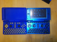
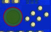
The case of the case.


That's why we just let ED handle all this stuff and don't confuse him with all this crazy discussions.  He sees the big picture that we don't. :)
These discussions are hardly crazy. Through discussion, we have a chance to come up with ideas that EvilDragon may not have thought about. Just because he can see the big picture doesn't mean he is able to come up with all the different ideas that are possible. One thing may seem obvious to one person that might never cross the mind of another. This is why it's best to have multiple people coming up with ideas.

-God Ginrai
And at some point it's best to accept that the person in charge of the project has already given an item great thought and come up with the best possible solution - even if that solution is not exactly what you want. At that point to continue to hammer on the 'idea' can result in valuable time being wasted by repeatedly having to say no - and re-supplying the same logic 'why not'.

No, you can't ruin the symmetry of the controls by shifting the 'cross' down and left.

No, you can't make the 4 buttons smaller.

No, you can't impinge on the nub, the keyboard OR the speaker box space.

Yes, ED found a very creative way to add the additional 2 buttons to the controller with everything else piled into this tiny computer - which is the equivalent of putting 10 pounds of shit in a 5 pound bag. Please feel welcome to join the rest of us in celebrating his success in this.

I'm -so- looking forward to the Pyra, despite not being fond of the chosen name, disappointed that it was impossible to evaluate an X86 alternative SoC and really wanting the shoulder buttons to be recessed -buttons- instead of big flapping paddles on the most abused corners of the device.

I still want to buy one - and would pre-order it today if ED would let me.
Oh give it a rest already. You actually make good arguments in other topics, but in this one all you do is keep repeating the same thing over again. The button configuration is important to us, which is why we are discussing it, and we aren't going to just stop discussing solutions just because you want us to.

Need I remind you that you were just as outspoken about x86?

-God Ginrai
 
Last edited by a moderator:
I don't remember EvilDragon ever telling us that "No, this is certainly the way the buttons will remain."  I can only remember him pointing out specific reasons why specific arrangements won't work under the current circumstances, and challenging readers to find something else that will.  Neither do I remember EvilDragon saying anything about the 'cross symmetry' buttons thing, let alone a "No I won't change this."
 
I still want to buy one - and would pre-order it today if ED would let me.
It's not because you want one bad right now that we should expedite the important questions and go with half baked solutions that will not be reworkable for another 4-5 years down the road.

I'm not saying that the button thingie is so important, but there are still points open for discussion as long as the case is not 100% fixed.  
 
Variation of ED's layout, but with small buttons:
pGR0OuQ.gif


Now combo press of the two new buttons becomes a bit more viable, with the left main button moved out of the way. The button layout becomes a lot more symetric also.
 
Last edited by a moderator:
Just seems like making the other buttons small for the sake of it.
 
Variation of ED's layout, but with small buttons:

pGR0OuQ.gif


Now combo press of the two new buttons becomes a bit more viable, with the left main button moved out of the way. The button layout becomes a lot more symetric also.
Well, it is an improvement, but I believe your other attempts were better layouts than this.

EDIT:

I had held off on suggesting any small-button layouts. However, now that Yoyobuae is suggesting them, I'll throw one together soon. I'm not abandoning my current 6-button suggestion, but I figure this will be another alternative we can consider.

-God Ginrai
 
Last edited by a moderator:
As I mentioned, here is a version of my proposed layout using smaller buttons:

pyra_above_small_buttons.png

The biggest benefits of this particular small button layout (aside from it being a standard 6-button style) are these 3 points:

  • Thanks to the size of the buttons, it is possible to shift it far enough away from the nub that it does not conflict with the nub's zone. See here:pyra_counterx2_argument3.png
  • More room between the buttons.
  • Since the buttons now occupy a smaller area, I moved the button group up so that B-Zar's problem with hitting the keyboard should be either less pronounced or non-existant. At the very least, it should be less likely that he would hit it than with EvilDragon's current layout.
-God Ginrai
 
Last edited by a moderator:
As I mentioned, here is a version of my proposed layout using smaller buttons:

attachicon.gif
pyra_above_small_buttons.png


The biggest benefits of this particular small button layout (aside from it being a standard 6-button style) are these 3 points:

  • Thanks to the size of the buttons, it is possible to shift it far enough away from the nub that it does not conflict with the nub's zone. See here:
    attachicon.gif
    pyra_counterx2_argument3.png
  • More room between the buttons.
  • Since the buttons now occupy a smaller area, I moved the button group up so that B-Zar's problem with hitting the keyboard should be either less pronounced or non-existant. At the very least, it should be less likely that he would hit it than with EvilDragon's current layout.
-God Ginrai
i definitely agree with this layout. it is more familiar in feel and grants the use of more control over games that use 6 button layouts. however. those two buttons on the upper right are alittle askewed more to the right by a few mm

i just now realised the removal of the whole f1-12 assembly from the original pandora case.

how will it be compatible with programs that rely on those function keys?
 
Last edited by a moderator:
i definitely agree with this layout. it is more familiar in feel and grants the use of more control over games that use 6 button layouts. however. those two buttons on the upper right are alittle askewed more to the right by a few mm
Fans of the original four could find a small comfort in the new buttons being spaced a tiny bit further from the rest than the original four are from one another, not enough to harm but enough for a statement.  I like alterations of pattern like that because it helps me to feel like I'm holding an organism rather than a grid, but God Ginrai is probably just further avoiding board conflicts.

I wouldn't say that shrinking the buttons to this size will make them any harder to use, in fact it could make it easier to feel them apart.  Moving them closer together might though, maybe.  I feel an appreciative comfort in them all being the same size, the same comfort that fans of the original four could feel even from me referring to them as the "original four."  I think this is an honorable compromise.

Still need to see what EvilDragon will say about shrinking the buttons a little.
 
While I would like a proper 6 button layout, if it turns out that Ed's current solution turns out to be the best option, what is wrong with remapping the keys in this way to allow the required dual button presses:


Sorry for the messy lines, did this in a couple of seconds.
 
i definitely agree with this layout. it is more familiar in feel and grants the use of more control over games that use 6 button layouts. however. those two buttons on the upper right are alittle askewed more to the right by a few mm
 Actually, if you look at the Sega Saturn layout, you will notice that the rows of 3 do have a gentle curve to them, which is what I was doing here.

While I would like a proper 6 button layout, if it turns out that Ed's current solution turns out to be the best option, what is wrong with remapping the keys in this way to allow the required dual button presses:


Sorry for the messy lines, did this in a couple of seconds.
Those aren't all the required dual-button presses. Aside from the diagonals you are missing, you are also forgetting all of the standard 2-button presses. (A+B, B+C, X+Y, or Y+Z) I pointed out earlier when Grench proposed a mapping that he believed solved the problem that such a mapping does not cover these possibilites. It was impossible to press B+C with Grench's mapping. I don't know which buttons in each group on the right is which button, so I can't tell you which combinations are impossible to press with your intended mapping, but I am sure there are ones.

Let's also not forget that some games even require you to press A+B+C.

-God Ginrai
 
While I would like a proper 6 button layout, if it turns out that Ed's current solution turns out to be the best option, what is wrong with remapping the keys in this way to allow the required dual button presses:


Sorry for the messy lines, did this in a couple of seconds.
Those aren't all the required dual-button presses. Aside from the diagonals you are missing, you are also forgetting all of the standard 2-button presses. (A+B, B+C, X+Y, or Y+Z) I pointed out earlier when Grench proposed a mapping that he believed solved the problem that such a mapping does not cover these possibilites. It was impossible to press B+C with Grench's mapping. I don't know which buttons in each group on the right is which button, so I can't tell you which combinations are impossible to press with your intended mapping, but I am sure there are ones.


Let's also not forget that some games even require you to press A+B+C.

-God Ginrai
FaeMinx remapping allows for:

  • verticals: X+A, Y+B, Z+C (shown in picture)
  • horizontals: A+B, B+C (uncomfortable), Y+Z
  • diagonals: X+B, Z+B
  • triple: A+B+C
Doesn't allow for:

  • horizontals: X+Y
  • diagonals: Y+A, Y+C
  • triple: X+Y+Z
My last version (with X,A mapped to new buttons and Y,Z,B,C to original 4):

pGR0OuQ.gif


Allows for:

  • verticals: X+A, Y+B, Z+C
  • horizontals: A+B, B+C, X+Y, Y+Z
  • diagonals: X+B, Y+C (uncomfortable), Z+B (uncomfortable)
  • triple: X+Y+Z, A+B+C (uncomfortable)
Doesn't allow for:

  • diagonals: Y+A
But if the Y+A diagonal is that important for a game then flip the mapping, with Z,C to the new buttons and Y,B,X,A to the original 4 (making Z+B diagonal impossible instead).
 
Yoyobuae, thanks for the detailed analysis. Your small button version does solve some of the problems of the original layout. However, if we are going to stick with small buttons, I feel it would be better to use the layout I suggested. All of the combinations are possible with my small-button layout, (with Y+C being the only one that may be difficult) and the rows follow the pivot of the thumb.

-God Ginrai
 
Last edited by a moderator:
Two things I see with your layout:

  • Buttons are a bit more packed together (even compared to my last layout)
  • The rightmost button (ie. C button) was moved up and to the right, but there's stuff already there in the PCB:
    HPJ9nU2.png

    And it was also moved closer to the edge of the PCB and therefore the edge of the keymat. So that might cause problems.
The #2 depends on those being real issues, let's see what ED says.

About #1, I personally think buttons should keep good spacings between them, otherwise accidental presses could happen (not to mention keymat issues).

When there's only 4 buttons the problem is not that bad (since theres nothing to press in 180º arc around each button), but in a 6 button layout that might be a bit more of a problem (since now two buttons which are "surrounded" by others).

ED's arrangement is a bit better in that respect (since the new buttons are completely out of the way of the thumb). In fact, I think on ED's layout the top left button might be a bit hard to press, since there's button in the way (and a big one at that).
 
Last edited by a moderator:
  • Buttons are a bit more packed together (even compared to my last layout)
The buttons are closer together than the edges of the larger buttons, yes, however, the actual distance between the button-facing edges is greater than in my previous layout. This allows more room between the buttons, which will lead to more accurate presses.

  • The rightmost button (ie. C button) was moved up and to the right, but there's stuff already there in the PCB:
    HPJ9nU2.png


    And it was also moved closer to the edge of the PCB and therefore the edge of the keymat. So that might cause problems.
Actually, that button has not moved at all. The right edge of it is in line with the right edge of the C button in my original layout. I used layers in Gimp to confirm this. Or if it did move at all, it moved to the left when I was tweaking the positioning of the extra buttons. I can confirm when I'm at home tonight. (I'll check the upward direction as well, but I'm pretty sure it's the same)

About #1, I personally think buttons should keep good spacings between them, otherwise accidental presses could happen (not to mention keymat issues).
This should be better spacing than the GP2X had, and I never had accidental presses with it.

When there's only 4 buttons the problem is not that bad (since theres nothing to press in 180º arc around each button), but in a 6 button layout that might be a bit more of a problem (since now two buttons which are "surrounded" by others).
 You are seeing a problem that isn't there. Your thumb approaches B from the bottom right. C is located in the top right. You would not be any more likely to hit C than you would be to hit A. The same applies to Y with Z. You would be more likely to accidentally hit B than to hit Z when attempting Y, since B is actually along your thumb's path to the button.

-God Ginrai
 
Last edited by a moderator:
Button size does play a role in how easily you'll accidentally hit buttons, not just spacing. I think this really has to be tested by a variety of people to see how well it works, but making actual keymats has got to be expensive :/
 
Back
Top