Some PCBs
Nikolaus grabbed some partly-populated PCBs last week (we had an automatic assembly for the parts that couldn't have been hand-soldererd easily):

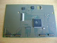
This is a PCB which can be connected to the OMAP5 EVM. It has a connector for a touchscreen and two different displays (the two 720p ones I have here for testing). It also has the Rotator chip from Solomon Technologies installed.

This is a display PCB which connects the LG FullHD LCD to the OMAP5 EVM. This is basically just for testing that the PCB works (as we got the driver for the FullHD one already).

This is how it looks like when everything is connected to the Display testing PCB

This is a very very very first version of the CPU PCB. You can see the two connectors for the main PCB already and also pads where the parts will be later. Additionally, there's a third connector (on the right side) where we can connect the OMAP5 EVM to.
So with that board, we can already test that we got enough space and that the connectors basically work and are reliable, even though it's not yet populated but used the OMAP5 EVM as CPU
Once that PCB is fully finished... well, then the hardware part of the Pyra will be mostly done
Nikolaus already finished populating the PCBs and made some quick hardware checks.
The hardware seems to be fine, now he needs to code the drivers.
As he is on a (well-deserved) holiday until next Saturday, nothing will happen this week, but hopefully we've got the LCDs working next week.
A new case revision
The designers finished a new case revision.
They added the transparent Pyra logo to the back of the lid and also a first version of four shoulder buttons (which I'd probably like to tweak a bit).
I've already ordered new 3D prints which I should receive within the next 10 days.
A new theme
Not sure if anyone already found out - but if you'd like the boards with a nice Pyra-themed look, you can use "Change Theme" on the bottom of the page and change it to "Pyra".
If you find any errors or have ideas for improved colors on the boards, let me know here
What's next?
Well, Nikolaus will work on the displays so I can test them and finally choose the best one.
After that, Nikolaus needs to finish the main PCB and work on the CPU and LCD PCB.
The display we choose needs to get a touchscreen as well, so I'll have to take care of that.
Testing the shoulder buttons and improving them will be another thing I have to do, as well as discuss the keymat with the two companies I narrowed down.
And I need to figure out where to best fit the LCD Cable.
Of course, the new battery is something we need to evaluate as well...
A lot of things happening at the same time, but slowly coming together.
Exciting times
Nikolaus grabbed some partly-populated PCBs last week (we had an automatic assembly for the parts that couldn't have been hand-soldererd easily):

This is a PCB which can be connected to the OMAP5 EVM. It has a connector for a touchscreen and two different displays (the two 720p ones I have here for testing). It also has the Rotator chip from Solomon Technologies installed.

This is a display PCB which connects the LG FullHD LCD to the OMAP5 EVM. This is basically just for testing that the PCB works (as we got the driver for the FullHD one already).

This is how it looks like when everything is connected to the Display testing PCB

This is a very very very first version of the CPU PCB. You can see the two connectors for the main PCB already and also pads where the parts will be later. Additionally, there's a third connector (on the right side) where we can connect the OMAP5 EVM to.
So with that board, we can already test that we got enough space and that the connectors basically work and are reliable, even though it's not yet populated but used the OMAP5 EVM as CPU
Once that PCB is fully finished... well, then the hardware part of the Pyra will be mostly done
Nikolaus already finished populating the PCBs and made some quick hardware checks.
The hardware seems to be fine, now he needs to code the drivers.
As he is on a (well-deserved) holiday until next Saturday, nothing will happen this week, but hopefully we've got the LCDs working next week.
A new case revision
The designers finished a new case revision.
They added the transparent Pyra logo to the back of the lid and also a first version of four shoulder buttons (which I'd probably like to tweak a bit).
I've already ordered new 3D prints which I should receive within the next 10 days.
A new theme
Not sure if anyone already found out - but if you'd like the boards with a nice Pyra-themed look, you can use "Change Theme" on the bottom of the page and change it to "Pyra".
If you find any errors or have ideas for improved colors on the boards, let me know here
What's next?
Well, Nikolaus will work on the displays so I can test them and finally choose the best one.
After that, Nikolaus needs to finish the main PCB and work on the CPU and LCD PCB.
The display we choose needs to get a touchscreen as well, so I'll have to take care of that.
Testing the shoulder buttons and improving them will be another thing I have to do, as well as discuss the keymat with the two companies I narrowed down.
And I need to figure out where to best fit the LCD Cable.
Of course, the new battery is something we need to evaluate as well...
A lot of things happening at the same time, but slowly coming together.
Exciting times

