It's the keyboard layout.


Saber: You made the logical error of just paying attention to weight-distribution between the sides. You have to consider actual use.

You can have 50/50 weight-distribution statistically, but still go from one side to the next for every single keypress.

Most english words start on something on the left too, so its better to have shift on the right. (Other than for A, provided the shift is next to a)

Neelix: You can disagree all you want, its a visual problem, and it looks different than any real keyboard. Since its a hack, bringing attention to it is bad.

Thats "a" key, not "the keys" You having owned something like that doesnt make it better.

You dont _have_ to rely on including hardcoded accented letters, you could just implement them as 1. Real keys. (2.Real AltGr) 3. real compose  4. Real dead-diactric.

The issue is putting real symbols behind shift+altGr, that puts it out of reach for a great majority of users.

The pandora isnt good. To the visual nature of the argument: Using bigger symbols means less squinting, and is more logical.

About 4-per-key: What is "right" in this sense? Atleast any combination thereof is wrong insofar as it isnt the norm, but please provide an example like i did.
 
Last edited by a moderator:
The issue is putting real symbols behind shift+altGr, that puts it out of reach for a great majority of users.
How?  Do you really think the majority of users are incapable of pressing two buttons at once when a single finger easily covers both?  Or do you think them so dim as to be incapable of comprehending the idea that you could use 2 modifiers at once?

- Neelix
 
Thats only how it works in your head.

You arent accounting for this:

Show someone a keyboard where a key has 4 prints, ask them to produce all 4 without help.  It fails at _regular_ AltGr.  Shift+AltGr, when that isnt even a standard keyboard-feature...  Try it.
You are presenting a straw-man argument. Users arent dim just because they arent keyboard-pros. I didnt say so, and you brought it up. I am taking the side of regular users, you are showing them in front of you.

Edit: Even if that _were_ the case, standard is better, on a multitude of levels.

Edit2: Lets say regular users were able to use shift+altGr for things shift+altGr isnt used for. It is still a risk to take to go there, considering no keyboard that is vastly different has ever been popular with the general mass. The pandora keyboard, isnt even popular with us, and thats less needlessly advanced than shift+altGr.

Shift+AltGr isnt actually better for anyone, but it is a whole lot worse for many people.
 
Last edited by a moderator:
Thats only how it works in your head.

You arent accounting for this:

Show someone a keyboard where a key has 4 prints, ask them to produce all 4 without help.  It fails at _regular_ AltGr.  Shift+AltGr, when that isnt even a standard keyboard-feature...  Try it.
That's where colour coding comes in.    It's fairly well established convention that the top symbol on a key is the shifted version.    It's also fairly a well established convention that if some symbols are printed in a different colour, you can access them by pressing the modifier key of that colour. (regardless of what the modifier is called) 

Between the two conventions if I see 4 symbols on a key, and the 2 symbols on the right are (for example) blue,  then I'm going to assume that I need to hold shift for the symbols on the top and the blue modifier for the symbols on the right.

- Neelix
 
You don't have to be a "keyboard-pro" to understand how modifiers work, if the labels are clear enough.

If you have a key labeled ⇧ Shift and another one labeled ◆ Meta, and then you find a key labeled like this:

ABCD

Then I think it is pretty much self-explanatory (or at least easy enough to remember once you figured it out) that the primary key does A, the shifted key does B, the Meta key does C and the Shift+Meta key does D.

Edit:

The labels could also be like this:

B D

A C

or like this:

B   D

A C

but I'm not sure there's room for that on the rectangular keys we'll have.
 
Last edited by a moderator:
As for whether Shift should be on the left or on the right side of the keyboard: it doesn't matter for most users, because they'll use the shoulder modifier anyway, not the keyboard one. I would put it on the left because that's where I would look first -- if there is only one Shift on a keyboard, I would expect it to be on the left, not on the right. But I have no strong preference. Putting Shift on the right implies putting , . on the left though (unless you 'cheat' like comradekingu and split up the space bar and/or left-align the qwerty row), which I think is a slightly bad idea (it's not their expected location), though I don't have a strong preference on that either.
 
Shift+AltGr, when that isnt even a standard keyboard-feature...
600px-KB_US-International.svg.png


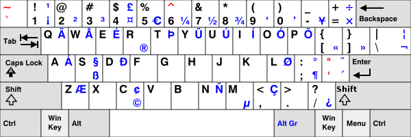
Oh... look at all those symbols/characters which are most easily accessed with AltGR+Shift... 

¡£÷ÄÅÉËÞÜÚÍÓÖ“”¦Á§ÐÏØ°ÆŒ¢ÑÇ 

There's quite a lot for something which apparently isn't a standard feature.

- Neelix
 
Last edited by a moderator:
Even if that _were_ the case, standard is better, on a multitude of levels.
See, this is the part that bothers me most about your arguments. You are already violating standards. I seriously don't know how else to put this. I'll try one last time, but that's it. I mean it this time.The Pyra does not have enough keys for a standard keyboard. This is obvious. Some compromises must be made entirely out of necessity. There will be parts of known standards we can follow exactly, there will be parts that will look kind of close, and there are parts that we must make completely different.

You have made your compromises, you have decided, for your keyboard layout, which standards are important while disregarding others. That has been your choice. Others have made different compromises, they have seen a different part of the standard which you have ignored as being more important and made their layout with that in mind. For you to come along and dismiss those layouts as "violating the standard" when they are, in fact, following the standard in a way that you have completely ignored is incredibly egocentric. You aren't just saying "the standard is better", you are saying "what I personally perceive as compromises to the standard is better and nothing else".

"shift"+";" is ":", that is standard. Your keyboard layout completely ignores that. If others think that following this part of the standard is more important than the (arguably falsely believed) standard of "no more than 3 characters per key" then that's their prerogative and is exactly why there are so many different layouts: everyone has different ideas about what is important and what is not, you cannot possibly speak for what "must be standard" when you yourself are required to violate several things that are standard, you are not in a position to dictate what standards are followed and which are ignored.
 
Any more than two colours on the keymat could make it quite expensive... Also limiting the number of symbols printed on a key means its likely to look less cluttered

What are these standards people keep making oblique references to... I'd love to read these standards....
 
It also makes it exceed ED's budget, pretty sure he said 3 colours at the most. Same as he said 3 prints each key as the most.

When its easy to make good arguments for these choices, why is it that some people break them without even touching on the logic behind it?
"People could be able to use Shift+AltGr" isnt dealing with the issue, its dealing with the issue created by going in that route.

Still dont see why 2 colours are better than 1, when even 1 is ugly.

WizardStan:Variations due to neccesity are very different from inventing something entirelly new. When you say "must make completely different" What is the extent of doing that?
Point out what you actually mean instead of just drawing up similarities which arent dealing with the issue.

Shift+; isnt : in "the standard", look at a german keyboard.

Instead of inventing an argument, you could make one. What is egocentric about designing a layout based on clear metrics? If i werent sharing them, then what is the point in discussion? All im asking is the exact same of others. I am very open to real arguments.

I am not dictating. I am defending the differences my layout has to any standards i have chosen to derive them from. With other layouts it sometimes seem (to me) as if standards are invented, so i feel it neccisary to ask, because i could be missing something.

When have i said "must be standard" what are you reffering to?

3per key isnt falsely derived. But do provide an argument as to why you think so. Its the amount of symbols you need to put on numbers before you start putting symbols on all letters (2-per key) Since it is possible at 3, there is no point in doing 4.
 

Saber: ... You have to consider actual use.
The only criteria I concerned myself with. From that core foundation where it was actualized in my layouts.
Which im sure ible did too, the reason he arrived at a different conclusion was he considered actual use, as in pressing the buttons, rather than a more widely derived aspect of typing. If you look into the argument you will notice how it supports one thing, but not the other. Actual use is definite proof.
 

Thats only how it works in your head.
 
You arent accounting for this:
 
Show someone a keyboard where a key has 4 prints, ask them to produce all 4 without help.  It fails at _regular_ AltGr.  Shift+AltGr, when that isnt even a standard keyboard-feature...  Try it.
 
That's where colour coding comes in.    It's fairly well established convention that the top symbol on a key is the shifted version.    It's also fairly a well established convention that if some symbols are printed in a different colour, you can access them by pressing the modifier key of that colour. (regardless of what the modifier is called) 
 
Between the two conventions if I see 4 symbols on a key, and the 2 symbols on the right are (for example) blue,  then I'm going to assume that I need to hold shift for the symbols on the top and the blue modifier for the symbols on the right.
 
- Neelix
Colour-codes are ugly. And non-standard. Colour-codes are always a hack for when other options couldnt be found. Two colour-codes are uglier than one. Position is what normal keyboards rely on, and that works.
Pretty well established, if we assume it to be true, is still worse than established. When i said try it, i meant on someone who isnt you. Preferably someone who only/if barely knows how to use a regular keyboard.
Which one of the blue ones is altGr, and which one is just AltGr?
 

Shift+AltGr, when that isnt even a standard keyboard-feature...
 
600px-KB_US-International.svg.png

 
Oh... look at all those symbols/characters which are most easily accessed with AltGR+Shift... 
 
¡£÷ÄÅÉËÞÜÚÍÓÖ“”¦Á§ÐÏØ°ÆŒ¢ÑÇ 
 
There's quite a lot for something which apparently isn't a standard feature.
 
- Neelix
The blue ones arent printed. If you tried to sell that to anyone, they would opt for the default instead. I think if they are on AltGr+shift, they should be. Changing it is bad, and relying on AltGr+shift is bad.
 
Last edited by a moderator:
Any more than two colours on the keymat could make it quite expensive... Also limiting the number of symbols printed on a key means its likely to look less cluttered
No one said anything about more than two colours. As has been explained it is entirely possible to print four characters with two colours and have them all understood. As for clutter, that's entirely subjective, what one person sees as "clutter" another sees as helpful guides and not cluttered at all. I already demonstrated with the cut-and-paste job that it doesn't take up any additional room, nothing needs to be made smaller than it already is on the Pandora which everyone seems to have agreed is acceptable.
What are these standards people keep making oblique references to... I'd love to read these standards....
Start here.Less specifically, there's also a nebulous understanding of what constitutes a "standard", things that just kind of are even if they aren't officially written down. This should have been obvious from context but I'm stating it explicitly in case it isn't.

I am not dictating. I am defending the differences my layout has to any standards i have chosen to derive them from. With other layouts it sometimes seem (to me) as if standards are invented, so i feel it neccisary to ask, because i could be missing something.
When someone asks you why you made a certain choice and you respond with information, that is defending.When you tell someone that they are wrong because they have done something you disagree with, and then when they explain they've merely followed the standard differently from you and you still reject that as "not making sense" is attacking.

No one asked you to explain yourself, you didn't have anything to defend, you simply stated that other people's layouts were wrong. That is attacking and dictating.
 
It also makes it exceed ED's budget, pretty sure he said 3 colours at the most. Same as he said 3 prints each key as the most.


When its easy to make good arguments for these choices, why is it that some people break them without even touching on the logic behind it?


"People could be able to use Shift+AltGr" isnt dealing with the issue, its dealing with the issue created by going in that route.


Still dont see why 2 colours are better than 1, when even 1 is ugly.


WizardStan:Variations due to neccesity are very different from inventing something entirelly new. When you say "must make completely different" What is the extent of doing that?


Point out what you actually mean instead of just drawing up similarities which arent dealing with the issue.


Shift+; isnt : in "the standard", look at a german keyboard.


Instead of inventing an argument, you could make one. What is egocentric about designing a layout based on clear metrics? If i werent sharing them, then what is the point in discussion? All im asking is the exact same of others. I am very open to real arguments.


I am not dictating. I am defending the differences my layout has to any standards i have chosen to derive them from. With other layouts it sometimes seem (to me) as if standards are invented, so i feel it neccisary to ask, because i could be missing something.


When have i said "must be standard" what are you reffering to?


3per key isnt falsely derived. But do provide an argument as to why you think so. Its the amount of symbols you need to put on numbers before you start putting symbols on all letters (2-per key) Since it is possible at 3, there is no point in doing 4.

Saber: ... You have to consider actual use.
The only criteria I concerned myself with. From that core foundation where it was actualized in my layouts.
Which im sure ible did too, the reason he arrived at a different conclusion was he considered actual use, as in pressing the buttons, rather than a more widely derived aspect of typing. If you look into the argument you will notice how it supports one thing, but not the other. Actual use is definite proof.

Thats only how it works in your head.


You arent accounting for this:


Show someone a keyboard where a key has 4 prints, ask them to produce all 4 without help.  It fails at _regular_ AltGr.  Shift+AltGr, when that isnt even a standard keyboard-feature...  Try it.
 
That's where colour coding comes in.    It's fairly well established convention that the top symbol on a key is the shifted version.    It's also fairly a well established convention that if some symbols are printed in a different colour, you can access them by pressing the modifier key of that colour. (regardless of what the modifier is called) 


Between the two conventions if I see 4 symbols on a key, and the 2 symbols on the right are (for example) blue,  then I'm going to assume that I need to hold shift for the symbols on the top and the blue modifier for the symbols on the right.


- Neelix
Colour-codes are ugly. And non-standard. Colour-codes are always a hack for when other options couldnt be found. Two colour-codes are uglier than one. Position is what normal keyboards rely on, and that works.


Pretty well established, if we assume it to be true, is still worse than established. When i said try it, i meant on someone who isnt you. Preferably someone who only/if barely knows how to use a regular keyboard.


Which one of the blue ones is altGr, and which one is just AltGr?

Shift+AltGr, when that isnt even a standard keyboard-feature...
 
600px-KB_US-International.svg.png


Oh... look at all those symbols/characters which are most easily accessed with AltGR+Shift... 


¡£÷ÄÅÉËÞÜÚÍÓÖ“”¦Á§ÐÏØ°ÆŒ¢ÑÇ 


There's quite a lot for something which apparently isn't a standard feature.


- Neelix
The blue ones arent printed. If you tried to sell that to anyone, they would opt for the default instead. I think if they are on AltGr+shift, they should be. Changing it is bad, and relying on AltGr+shift is bad.
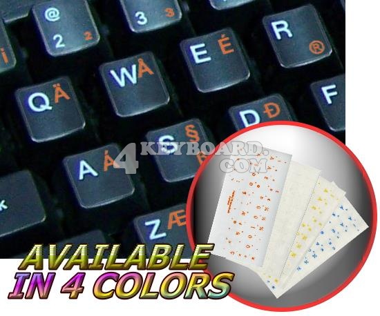
Actually they can be printed. And if they're not, you can get something like this:

http://www.4keyboard.com/english-us-international-transparent-keyboard-sticker-p-232.html

usinternat_trans_orange.jpg


I don't understand how anyone can use US-International without those labels, because except for the acute accented vowels, ñ, µ, Þ, Ð and ß, none of those symbols are in positions which make sense. Of course it's hard to make sense if you're trying to support all latin-based languages at the same time. For example, how are you supposed to know/remember that ¼ is at 6, and Ø is at L while the Polish Ł is just missing (cold war era keyboard layout, I guess) ?

About the colors: I think two colors are fine. Ideally, the location of the label on the key should already by enough to tell whether the symbol is primary, shifted, Fn/Meta/AltGr or shifted Fn/Meta/AltGr (if that fourth one needs a label). But having color too helps to make it easier and more intuitive. Different colors help to mentally visualize the different layers of symbols. As to the æsthetics: as usual, that's a matter of taste. You think one color looks better, I think two colors looks better. If everything would be the same color, it would look like an unstructured mess of symbols to me, while having two colors means that one part can look completely standard and familiar (the white labels) while the other part contains all the not-so-standard stuff (the auxiliary color labels).

By the way, only now do I understand why normal keyboard labels are in the top-left corner. It's because only the shifted letters are labeled, the lower case letters are left unlabeled!
 
People know how to use it because they remember the positions. Same was I use it. Note that Ø is always a dedicated key.

The blue ones arent printed, on real keyboards. Putting aftermarket stickers on them doesnt change that.

Are you fine with it being 1 more than ED can afford?

People have a certain treshold for too many colours, never seen complaints that regular keyboards arent colour-coded. Eki complained on keyboards looking like toys though.

That is the exact same reason why i have big letters, in the middle of the key. Regularpress being small letters, which is to the left. I prefer the aestetics and symmetry of having it in the middle.

Edit: I guess the orientation is

2  4

1  3                   however that is so little known, that it in my opinion makes more sense to divide it into the 3 spaces you get more visuals out of on the keys we have.
 
Last edited by a moderator:
http://en.wikipedia.org/wiki/ISO/IEC_9995is a standard for keyboards with 20+ more keys available than we have ...

There is no standard I know of for keyboards with just 41 or so keys

There is only so far you can go trying to shoehorn the function of 60 odd keys into the space of around 40 - rigid adherence to an unsuitable standard will make for poor compromises 

putting 4 symbols on a large number of the keys will look crowded and off putting making it very time consuming to "scan and peck", very off putting to new or prospective users.
 
Some of those keys are wasted modifiers. And luckily, if you look at visual ability, not all the visual symbols are useful.

Also a lot of things are duplicated on the alternate graphics level. So you dont specifically need all of them.

Every bit of additional keys and less wasted modifiers, and instead running standard ones, help. Because its not the things you enable with meta, its more about the things you forcibly hide. Which means you forcibly have to show them.

Its not a rigid adherance, its an affort in the direction of standard.


Standard keyboards have less than 50 symbols. What kind of symbols do we need implemented that arent those?  

I noticed there are a lot more in some layouts, how did that happen? Where does that need arise from?

ü ö ä because the keys are removed?  Re-implemented ways to type "¿ and ¡"   ?

I only see the need to start re-implementing when the default ways are no longer possible. And i dont see the re-implemented ways as more efficient.

Another reason to not start filling with "what was considered best at the time" is it leaves less adaptability. People already have different use-cases and expectations, but it really paints the keyboard into a corner for the future.
 
Last edited by a moderator:
There is no standard I know of for keyboards with just 41 or so keys
Yup, exactly. This is exactly what I've been trying to impress upon comradekingu, that we cannot follow the "standard" exactly, we need to make sacrifices and that different people have different ideas of what sacrifices need to be made: we can't do everything the user expects but we can at least do some stuff they expect. When Grench suggested the "fn"+"shift" combination it made sense as one of those trade-offs.
putting 4 symbols on a large number of the keys will look crowded and off putting making it very time consuming to "scan and peck", very off putting to new or prospective users.
Says you. I counter that it makes it more intuitive, less hunting and pecking, because users already have ":" encoded into their brain as "shift"+";" so you only need to remember where one punctuation mark is, not two.
 
So what _more_ of user-expectancy is it you bring to the table?


Its nice that your layout is usable for you wizard-stan. Have you tried it on regular people?

You took part of my alphabet, for what exactly?  Why is over half the community not important?

What part of taking away how typing works, muscle memory, enables less "hunt and pecking" and is "intuitive"?

What is it you need to hunt and peck with less things on less buttons?

Why does "looking crowded" get countered by "how people remember to use 4 modifiers or anything else you said? Is it more crowded only for people who dont have that connotation?

So i guess the same reason you think , < and . > is the "standard", is the same reason other people have , ;  and . : ingrained in their brains.  

What do you thinks makes more sense? Shoehorning <> in later because your functional layout lacks a button, (ANSI vs ISO) or going with colon→semi-colon  etc.

Here is that german keyboard where you can see that i didnt invent it.

You still have to remember where dot and comma is in any event. Thats where the logic is derived from.

And yes, I know how to type on both US/UK and German keyboards, with either layout, there is no "correct" way.
 
Last edited by a moderator:
So what _more_ of user-expectancy is it you bring to the table?
I've tried explaining it to you, very slowly, using walls of text, and with bullet points. You still don't get it. You just can't get it, I don't know what else to tell you.I'm just going to leave it at that. I know others have understood. They may disagree and have better ideas but at least they understood. Some understood and did agree. When the time comes we'll just have to see what wins out. I don't claim to have a perfect plan, but I am convinced that at least some of the ideas are good. If you still can't see that then I don't see why I should keep trying to explain it to you.
 
I'm not saying that US-QWERTY makes more sense than German QWERTZ or French AZERTY. It doesn't. None of the frequently used keyboard layouts really make sense. They just are what they are.

But I do think that it's better to try to follow just one of them (and I would argue it should be US-QWERTY), and follow it as closely as possible (within the constraints of having limited keys etc). I think it's a bad idea to do the letters like in the US, the shifted comma and period like in Germany and the shifted number row like something else again.
 
Back
Top