Finding a proper name and logo :)


Yeah the first one does have the most clearly defined [A] I think too.

But I do agree that those Blackletter styles are a bit too heavy metal or tattoo influenced, in my perception at least
 
Yes, but its consistent, its not pyRa.

This is how simple i could make it.

pyralaserbeams.png

Has a bit of 50s car, russian, new age feel.
 
Yes, but its consistent, its not pyRa.

This is how simple i could make it.


Has a bit of 50s car, russian, new age feel.
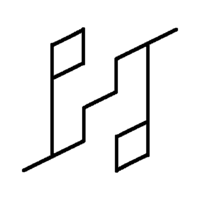
Interesting and nice as an "abstract" logo, but completely unreadable unless you already know what to look for.

It's not a big problem if the case is PYRa, that just emphasizes the "fire" element in the name.
 
Blackletter looks too much like a tattoo. I like the bottom one. Do the P and Y need to be fully connected? I think it would also work unconnected, and that would improve readability (it still needs a big serif to maintain the A, but 1/2 of the thin part of the stroke would be enough imo).

The important thing is to avoid Pyhd and be very readable as Pyra (also if you don't know what it is supposed to say), while looking as normal, "non-tattoo-like" as possible.
I agree - like I said, it looks nice, but doesn't suit a computer at all. The P and Y are only connected in that one I did, because I was imitating the basic shapes of Binky's logo. I did some earlier ones that have unconnected P-Y pairs:

http://boards.openpandora.org/topic/14915-finding-a-proper-name-and-logo/page-45#entry300635/URL]

FZERO: I like the stenciled one, has a bit of a retro feel to it. Also, for this one http://boards.openpandora.org/topic/14915-finding-a-proper-name-and-logo/page-46#entry300750/URL] try swapping the left end shapes of the Y, and right end shapes of the R - so the upper one is curved, and the lower is angled. I think it will read a lot better. There's no need for the upper part of the left hand side of the Y to be a (, a \ would work well, and it would look more like an R leg when flipped 180. Same for the tail of the Y and upper right ) of the R.

Also, have a happy holiday, and safe travels everyone!
 
Last edited by a moderator:
_wb_:eyra?

Is anyone else reminded of the font HP use in some of their adverts?
 
fullZZZZZZPRW080405085650PIC.jpg
fullZZZZZZPRW081129234322PIC.jpg
hp-personalagain_4968.gif


This is what it reminded me of - although less now that I look at them properly...
 
Last edited by a moderator:
Yeah I like the cubes too :)

Looking at the HP logo though, I got inspired with this ....

2w6s5yc.png


Inspired by:

hp_mb_logo.gif
 
Last edited by a moderator:
For the ambigram idea, what if you merged the P and the Y to form an A? Like this crappy drawing

pyra.jpg
(9000 hours in MS Paint)
 
ftenwg.jpg


Meh. Tried to go for something simpler and this came out.Very rough but you get the idea :)
 
Back
Top