You are using an out of date browser. It may not display this or other websites correctly.
You should upgrade or use an alternative browser.
You should upgrade or use an alternative browser.
Finding a proper name and logo :)
- Thread starter EvilDragon
- Start date
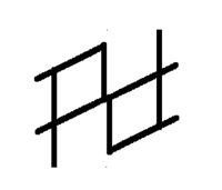
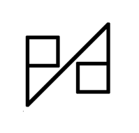
If we're trying to make a logo that spells out the name, it has to be readable.
The above ones just look like Pd - and you need to know that is says Pyra, and then look very carefully before you can see the y and r.
If we want an abstract logo (like those gamecubish ones), then there's no need to restrict ourselves to letter-like forms.
The above ones just look like Pd - and you need to know that is says Pyra, and then look very carefully before you can see the y and r.
If we want an abstract logo (like those gamecubish ones), then there's no need to restrict ourselves to letter-like forms.
Neelix
Insecticidal Maniac
Personally I still think a pictographic logo would work best...
While I appreciate that Ambigrams look really cool and clever, I don't actually think they are a good fit for what we are looking for, especially if whatever "Pyra" logo is chosen is going to be combined with a DragonBox logo.
I don't think abstract is a good way to go either.
We have a name which lends itself to a graphic representation. Given that, it seems ludicrous not to represent it graphically in the logo.
- Neelix
FaeMinx
Rainbow Liberation Instigation
... so a stylized flame? What did you have in mind?
comradekingu
Glowing ember
FaeMinx
Rainbow Liberation Instigation
And what exactly would you like to kill with fire? Careful what you ask for... All existence is a mirror.
Awesome!!!! I'm so impressed.
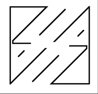
That model is very good: It look like an object because of the symmetry, but that's romanian letters. And symmetry is natural because of letters. It also look like runes and we know that Pyra is named after an ancient character.
That shape is perfect, it should be improved of course, but that's really awesome.
The _wb_'s one is my favorite but it should be less rough, more smooth, it has to take something of Binky's one.
Last edited by a moderator:
comradekingu
Glowing ember
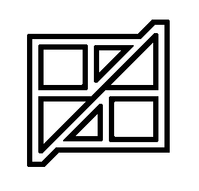
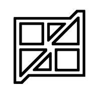
It kind of looks like a broken Windows logo. While I like that symbolism, your logo is not recognizable at all as having something to do with Pyra. You can only just barely recognize letters in it. If you can only read it if you already know what it's supposed to say, it doesn't work.
Looking at it again i wonder why i didnt do this the first time.
Think its done now
Sure, but the aim of the above logos was to find something that you can flip upside down and still work. Because we want to put it on the back of lid, and it would be cool if the logo there makes sense when the lid is opened and when it's closed.
Elegant, yet readable?
While that's a great idea, I can't imagine why that would be a positive in real world terms. simple 'normal' logo: readable half the time. Some obscure logo that works both ways: unreadable all the timeSure, but the aim of the above logos was to find something that you can flip upside down and still work. Because we want to put it on the back of lid, and it would be cool if the logo there makes sense when the lid is opened and when it's closed.
Edit: On second thoughts, minus Binkys efforts from that. That one looks great.
Last edited by a moderator:
comradekingu
Glowing ember
I think its very hard to have it read like normal text, both ways, and still be aesthetically pleasing. I favour unrestricted in terms of visual nature, its very easy for the end result to look forced if one forgoes the visuals for readability.
How about something like the sun logo?


How about something like the sun logo?


comradekingu
Glowing ember
Can we not steal both the name _and_ the design language please
Neelix
Insecticidal Maniac
No. A logo must identify the product or brand it represents. Making it look like someone else's logo defeats the purpose of the logo.
That said, there is one aspect of that logo that I do think we should be emulating. It consists of a logo for the brand, and stylised version of the name. I still think we should be focusing on the DragonBox brand for the logo, and then design the Pyra specific part to go with it.
@EvilDragon: We've seen a lot of concepts now, but we still have no indication what you are looking for in a logo. Given that the logo chosen is going to represent your business for a long time to come, I think we've reached the point where your guidance is needed.
- Neelix
Wrath Of Khan
Soul soother...
The blue and red colors in the dragonbox logo look like a good colour scheme for the word 'pyra'.
Then some clean angular lines about it.
Then some clean angular lines about it.
bzar
A Commando
Now that I see them near each other, that dragon graphic and roccat's panther-thing are really alike.
Similar threads
- Replies
- 21
- Views
- 5K
- Replies
- 328
- Views
- 67K
- Replies
- 99
- Views
- 24K
- Replies
- 25
- Views
- 6K


