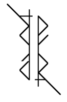
Finding a proper name and logo :)


Now that I see them near each other, that dragon graphic and roccat's panther-thing are really alike.
I also noticed that, but it is clearly an accidental "convergent evolution", not intentional plagiarism. But still, we may want to avoid looking too much alike.

The font the Roccat Pyra logo uses is a really masculine military robot style, very bold font. The background image indicates that their "pyra" derives from "pyramid", not from "Pyrrha". It's all very much targeted towards high-end male gamers who demand military grade robustness and precision for their gaming PC, in order to play current-gen multiplayer first person shooters and get the most frags.

We can make a difference by using something like Binky's logo: an elegant, feminine font with lots of graceful and subtle penstrokes, with an unexpected symmetry which adds mathematical beauty. It radiates sophistication and intelligence.
 
post-2326-0-80411700-1389645517.png
Looking at it again i wonder why i didnt do this the first time. Think its done now
post-2326-0-89893700-1389645918.png
I like both, the right is more beautiful, but it's more easy to read Pyra in the left, even if "a" is still a "d". If a logo without letters like the Pandora as to be chosen I would take this.

How about something like the sun logo?

800px-Sun-1_Badge.jpg
That's a perfect exemple of a good logo, to make use of the form of letters to do a geometric logo, remaining readable.

And theses logo do it well:


Last edited by a moderator:
How about a logo like " Dragonbox with one big "A" connecting the two?

                                    Pyra "
 
pyralogo.png


That one looks pretty nice I think
Sorry, but I really dislike this and similar ones. They just don't shout new tech to me. The next Disney Aladdin film yes. A high tech consumer product. No. I know it's an ambigram, but it's still bleurgh!
 
I was thinking if something along these lines would work. The red thing at the top would be interpretable as either flame from a dragon or the red hair of Pyrrha.

It's a 20 second doodle, but I suck at drawing anyway so why bother trying to make it look good :p . I think it conveys the general idea.

ubphnfn.png
 
Last edited by a moderator:
What about that: 

0afz.png
 
Last edited by a moderator:
It's just for the look because it is a logo :)

The idea was to make it rounder than this:

c8ul.png


and the tails make handwritten P and a.
 
Last edited by a moderator:
Personally I don't think we should be looking only at ambigrams.  While ambigrams have an undeniable cool factor,  there is more to choosing a logo than that, and since the concept came up the designs we've seen have been seriously limited in scope.

I also think that anything we come up with for Pyra needs to be able to go with a DragonBox logo,  so making Pyra by itself ambigrammatical seems less useful to me.

- Neelix
 
Another one, I wanted "tails" to be thicker, shorter, more curved, but I have not enough skills lol.

Finally, I really like it because the look which is more agressive sound like the name.

sbsa.png


Personally I don't think we should be looking only at ambigrams.  While ambigrams have an undeniable cool factor,  there is more to choosing a logo than that, and since the concept came up the designs we've seen have been seriously limited in scope.

I also think that anything we come up with for Pyra needs to be able to go with a DragonBox logo,  so making Pyra by itself ambigrammatical seems less useful to me.

- Neelix
In my opinion we can't get better logo than ambigram if the logo have to be letters. Are you really want to see the Dragonbox logo on the Pyra?
 
Last edited by a moderator:
In my opinion we can't get better logo than ambigram if the logo have to be letters. Are you really want to see the Dragonbox logo on the Pyra?
Why restrict ourselves to letters?

Also the device is to be called the DragonBox Pyra,  and is to be sold in the DragonBox shop, so It makes far more sense to base the logo the DragonBox brand.  That way the same logo (or a variation of it) can then be used in the future to market further products.

- Neelix
 
Neelix: I agree that we don't have to restrict ourselves to ambigrams and that there should be a variant with "DragonBox" included. However, the logo that goes on the backside of the lid should be simple and it would be cool if it works upside down too. So spelling out "DragonBox" in full on the lid seems like a bad idea. We could perhaps put an ambigram "Pyra" inside or next to a cube with wings and a tail though.

Also I think Kira's tail helps a bit to solve the eYRa problem. Perhaps the bottom part of the P (and the top part of the A) could also be more tail-like.
 

Code:
ASCII art ambigram:
 __       _    __
 /_) \_| |_\  __/
/_   \_| | \ (_/_
 
Neelix: I agree that we don't have to restrict ourselves to ambigrams and that there should be a variant with "DragonBox" included. However, the logo that goes on the backside of the lid should be simple and it would be cool if it works upside down too. So spelling out "DragonBox" in full on the lid seems like a bad idea. We could perhaps put an ambigram "Pyra" inside or next to a cube with wings and a tail though.
I think you missed my point. I think the lid logo should represent the DragonBox brand. It doesn't have to have to use the word DragonBox to do so. It might include the word Pyra as a Device specific variation (like the old Apple ][ logos) though in that case I can honestly say that I actually prefer the last iteration of the "flame text" font (from before everyone shifted their focus to ambigrams) to any of the ambigrammatical versions presented so far.

- Neelix
 
5446s.jpg


Craptastic flames! Cannot do them to save my life, it seems. Well, the general idea is there, simple is the way to go with a logo. I think that something like that would look really nice embossed on the back of the device.  Not an Ambigram thing but eh, you guys seem to have that covered already :)
Also really nice.

Grey flame.

Maybe a red one?
 
Last edited by a moderator:
Neelix: I agree that we don't have to restrict ourselves to ambigrams and that there should be a variant with "DragonBox" included. However, the logo that goes on the backside of the lid should be simple and it would be cool if it works upside down too. So spelling out "DragonBox" in full on the lid seems like a bad idea. We could perhaps put an ambigram "Pyra" inside or next to a cube with wings and a tail though.
I think you missed my point. I think the lid logo should represent the DragonBox brand. It doesn't have to have to use the word DragonBox to do so. It might include the word Pyra as a Device specific variation (like the old Apple ][ logos) though in that case I can honestly say that I actually prefer the last iteration of the "flame text" font (from before everyone shifted their focus to ambigrams) to any of the ambigrammatical versions presented so far.


- Neelix
I think I understood your point. I propose something like this:

db_pyra.png


That it is still readable upside-down is just a nice bonus.
 
Back
Top