Finding a proper name and logo :)


Pretending I did like all of it though, I'd suggest against sticking Pyra and Dragonbox things together into the same thing.
Any particular reason why?  We're looking for a logo for a product that's to be called the DragonBox Pyra.  Assuming that ED will be making other DragonBox products in the future it makes sense that there should be a logo to represent the Dragonbox brand, so it can be re-used later.  It also makes sense to then either make a modified product specific version of it, or design product specific logos to match it.

Perhaps it would be useful to get some direction from ED at this point?  I think it would help focus the efforts if he could outline what he is looking for in a logo.  It will after all represent his business for years to come.

- Neelix
 
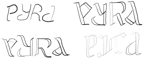
Had an idea last night - I wanted to play with the less abstract logo ideas (i.e. Binky's flame-like letters). But as always happens with clamshell devices, which way up do you put the logo? My answer: why should it matter?

PyraVersion1.jpg


Just a quick trace of the sketches I did last night. The upper left was the first sketch, just to see if it could be done - then I came across the uncial (greek) A letterform that works really well for both a P and A. Upper left and lower right both play with that idea, and I think are most readable of the four. I was thinking about making them a little more "flamey" feeling. I've not tried to see if a constant line weight would work for this type of logo yet, but it might. The blackletter (lower right) version was just for fun, to see if it'd work. Seems that it does! Feel free to run with the ideas; if I get the time, I'll work on it some more.
Something like this, with Binky's flame style, would make a great embossing on the device lid!

I like the bottom left one most.
Oh!  Pyra!  The kid edition!  Cool!  I'll grab 3 for my kids :)
 
I really like this and do like ambigrams.


The lower right one is my favourite.


Very good for logo
 
Nice ambigrams :)
Something like this, with Binky's flame style, would make a great embossing on the device lid!
I like the bottom left one most.
Oh!  Pyra!  The kid edition!  Cool!  I'll grab 3 for my kids :)
I really like this and do like ambigrams.


The lower right one is my favourite.


Very good for logo
Thanks for all the comments - and yes, I think I like the bottom left one most as well - I'd like to try iterating on that one, and the lower right could use another attempt. Upper left is clearly not as readable as some of the others, and the upper right is mostly just a tweak of the lower right, trying to make it more angular. It mostly just ended up looking more... old.

Shenmue: I am not sure I understand your comment?
 
some great ideas for lettering laserbeams, i'd be interested to see a less rough draft of the lower right one but i think so far bottom left is my favourite. id like to see it combined with FZero's dragonbox logo in this manner:

♥ 
2zsty11.png
 
Less flame, more caligraphic, much more ambigramatical (is that a word?)

pr2p.png
I'm not a fan of 'Pyra', but with that logo I could learn to like it.

Now - how about making that logo the entire size of the lid?  I.e. have it embossed into the lid so that the logo itself adds strength to the lid structure.

The logo, as you have it there shows up on my screen as 70mm tall and 155mm wide - just about the same as a DragonBox Pyra's lid...  I want that logo in that size embossed into the lid plastics.
 
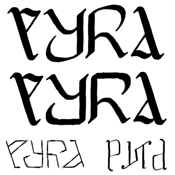
Further refinements and a slight variation on the lower left logo, plus some additional sketches - I am in no way passing these off as a finished product! (Still not sure if I like the calligraphic style yet)

PyraVersion2.jpg


Binky: I toyed with something like that a bit, but found that connecting the bottom of the P to the tail of the Y (to give the upper part of the A further definition) tended to make it read like "eyra" - other than that, looks pretty good! One further thought though - keeping the "brush size" and shape internally consistent on similar slope angles tends to read better, and feel better visually, due to how we perceive line weight. I'm guessing you're using Illustrator or Inkscape or something similar?
 
Last edited by a moderator:
I like the more germannic gothic straight edges. The mirror and flip PY-aspect is better than having the Y and R slightly different too imo.

Edit:

pyralindrome.png


It looks a bit cyrillic, undoubtedly it means "plow" in some finno-ugric language.

Also the box with wings is saying "devil sex toy" to me, or rather, thats what im saying about it, needs imo a rework based on the integral idea.
 
Last edited by a moderator:
I like this. But maybe the box doesn't have to be a cube? Can the box be shaped more like a handheld? Maybe slightly opened to make a "mouth"?

Also I think it needs more contrast, dark grey on grey is not enough.
How about a logo image that is just the shape of the new handheld itself, or a general Pandora handheld shape, but open slightly and with teeth and a tongue, as if the clam shell were a dragon mouth?  I think the teeth are more important of a feature than wings, I also think that a simple cube is boring and there's no reason to use that.
Thats a bit inceptious with it being printed on the actual device.
 
Back
Top