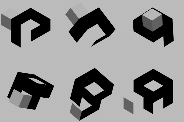
Finding a proper name and logo :)


I had to do this, wasted effort or not! Just wanted to see how it might look in motion :]

Pyra-Logo-Animation.gif


I like the last one before "one more" on http://boards.openpandora.org/topic/14915-finding-a-proper-name-and-logo/page-40#entry299199/URL]

Try bending the leg 45degrees outwards or see if changing the shading the other way around helps
The third one down here http://boards.openpandora.org/topic/14915-finding-a-proper-name-and-logo/page-40#entry299221/URL] is basically that - shading changed around, but I didn't bend the leg.
 
Last edited by a moderator:
Thanks for all the kind comments, and to FZERO for the original idea! (I'm still slightly concerned about the readability, but eeeh!)

Keep coming up with good ideas, everyone!

Going to go pass out now.
 
Last edited by a moderator:
Nice one :)

This tetromino style animation popped into my head;

ngbj0z.gif


I know I messed up with working out the rotating so they landed correct ... but you get the idea :)
 
Last edited by a moderator:
I don't think the whole name would look good on the back of the box anyway.

Maybe just some distinctive part of it - like a single 'cube'
I'm with Binky on this, just a single, angled, 3d looking cube with a white led light would look awesome. The curvy designs look nice, however I think the cubic shapes match the Dragonbox theme better.
 
FZERO, I was wondering, what would you think of a starting animation where all of the cubic letters were together in one cube, then it could show the cube rotating, like in that animation posted a while back(I can't find it anymore), and then the cube could sort of... unwravel, I guess? The sides of the cube will have been made of the 3d cubic letters of Pyra, and it could unfold and it would spell out Pyra or something. Sorry, it's hard to explain, that's just what I had in mind xD
 
I like the sound of that, think I get what you mean.


One single cube viewed from corner so seeing 2 faces showing the [P],


Which rotates 90degree to show the [Y],


...which in reality would be all 4 side faces of the cube...


But it then rotates another 90degree to show, what 'should' be the [P] again, but is actually now a [R],


Final rotation revealing the [A].


Like an impossible object, I think that would look a nice anim too yes.


I'll try give it a go later when my girls asleep :)
 
Exactly! I think it would match the cubic letter style as well, it could be pretty cool. Thanks, that's awesome :)
 
Ok I made an attempt, but it doesn't work ... too much crossover where on one letter it's solid and on the other it's gap.

I guess could do it with some off-axis rotating, so that when you have that face hidden for a second, it can be changed to as required when it comes back into view... that's the only way I can think of achieving that really.

Here shows the problem;

http://playpandora.com/temp/pyra/index.html

The green [P] letter ... the pink and purple sections would need to be green as part of the letter.

But then...

The yellow [Y] letter ... the pink would need to be gap, and the purple sections would be part of the letter.

Pink bit is the problem here.

But as I say, with some off-axis spinning so that the top face is hidden for a moment when rotating, you could change it then
 
You see at most three sides of the cube at once, so rotating it to show the opposite corner at the viewer will hide the previous letter completely. This would be the time those three invisible faces are replaced with the next letter.

So first showing sides ABC with letter P, turn to show sides DEF with letter Y, swap ABC to show R, turn to show ABC, swap DEF to A, turn to show DEF.
 
Managed to devise a shape that, when viewed from various angles, looks like each letter in succession, and requires only a 90 degree turn between sides. The shading is off, but you get the idea. A full 180 to view the opposite corner could be a lot cleaner, I might have to give that a try.

PyraCube.gif


Also, I just realised that my Y here is basically the same as one of FZERO's earlier ones, posted in those multicolor tests.
 
That looks pretty sweet :)

Could you somehow get the [A] to melt back into the [P]?

On a continuous loop that would look even better, very nice though.

...I'm thinking as well as the boot up anim, this would also make a perfect 'loading' anim.

You know Windows' egg timer or the spinning beach ball of OSX. Having this little block flipping around whilst waiting on loads
 
Tried a full 180 flip between letters, doesn't look quite as good IMO especially with the Y cube sticking out when it flips, but there's possibilities there. I have a few more ideas, but they can wait for now. Would be nice to get some more eyes, and more ideas! Think outside the box ;)

PyraCube2.gif
 
Last edited by a moderator:
Animations and shading are neat, but I still don't really think the letters look "right".

They're hard to read and rather clunky - and seem dominated by the need to make it fix onto a cube.

I can't even recognise the letters as they flip by in the above animation.

Have you considered fitting the characters onto a 3x3x3 cube instead? or a equilateral triangle grid?
 
I like it, I'd drop that cube sticking out the [Y] as you say, seeing as it's not in the other letters there.

Nice idea though
 
what if it is a blank cube that rolls to the right, leaving a trail of letters from when you can see the box as it turns? Could use twist for the wrench (Y)
 

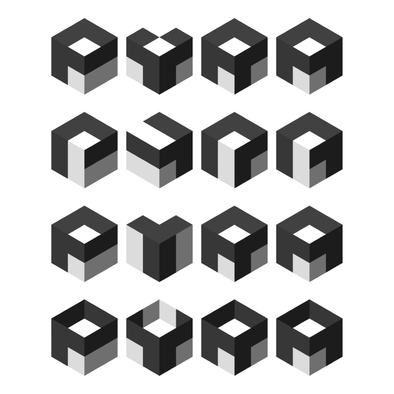
Pyra%20Logos%201.jpg

Comments, critiques, suggestions are all good!
the one on the bottom.

Twist 90 to the right from p to get y, the white cube could flip up to get the Y

180 to get the R

Then another 180 to get A
 
Last edited by a moderator:
The cube allows you to simplify the side design down to a 2x2 grid, yet still get that Y shape right. I quite like the way it reflects the leg of the R in the twisting rotation one, but I don't particularly like the non-symmetrical A in that one. Tricky...


Edit: @F-zero
 
Last edited by a moderator:
With the different shaded sides the letters seems to look more clear, especialy the "R" imho, good thing. :) But it will be hard to generate that look as unicolour logo if you use it as relief onto an surface of the device. However, nice to see how a logo is developed, I hope it will be used for the Device.
 
what is this. a 4bit OS? you keep talking about a 2x2 logo. yet i dont think it will appeal to the general audience. try a normal booting screen like ubisoft uses for their games. except on the pyra. try harder guys. 2x2 is not a good look for a obscure system logo.

the pandora only has a cube logo of 1x1. people however will think its clever and see the pandoras logo aswell as the pyra logo in contrast. "Like OMG it has more squares!!!!" <- and was never heard from again.  anyways. you should try making a startup logo worth looking at. just like when i first got my pandora in ohio.

Don't forget that the logo also has to work in monochrome.

So for example:

pyralogobox.png


or

pyralogoflames.png


Here's a combination of Binky's flame letters with (iirc) FZERO's dragon:

pyralogodragon.png
well... that definitely be worth looking at
 
Back
Top