You are using an out of date browser. It may not display this or other websites correctly.
You should upgrade or use an alternative browser.
You should upgrade or use an alternative browser.
Finding a proper name and logo :)
- Thread starter EvilDragon
- Start date
Neelix
Insecticidal Maniac
Given that the full name will be the "DragonBox Pyra" I think it kind of fits.Why boxes for a device named "Pyra"?
- Neelix
Fzero
Advanced Member
- Joined
- Mar 9, 2010
- Messages
- 4,702
My thinking of the boxes was pretty much as Neelix said, carried over from the Dragonbox, could even replace for Pandora logos as is a follow up device.What does it look like in two-tone black/white?
Why boxes for a device named "Pyra"?
There are two-tone versions done I think in this thread a couple page back or in the colour scheme ideas thread - I forget where exactly
This latest effort is playing around with colour, considered for website/flyer/boot anim type use. A bit more elaborate/flare.
For this one as a two-tone, like using as a embossing on the device lid and the likes, would probably use the more 'flat' looking versions upped earlier ... and not this more shaded version.
That said, I did think it would look nice using different levels of embossing and angled embossing to create this shade style... that could then give all these different shades easily by the way it would bounce light off it


Last edited by a moderator:
Hồng Thất Công
Đả Cẩu Bổng Pháp
I think we've had the meaning of the word "PYRA" down. But what is the significance of the 4 cubes. Let me see...each cube has 6 sides so we have 24 sides total. This means the PYRA will be so awesome that it will be used 24 hours straight  Or:
Or:
So the 4 cubes have meaning. The 6 sides of each cube have meaning. The number 24 means something. PERFECT!
Symbolism
- Represent the wheel of the rebirths, according to R. Allendy. It is the cyclic mechanism of the nature, 4, linked to the cosmic differentiation, 20, in the harmonious balance of the creation - 2 + 4 = 6.
- Represent the combination of the aware individuality and mistress of all his energies with the Cosmos developing its complete harmony, according to Warrain.
- Symbol of the double harmony of the sky and the earth.
- Saint Jerome sees in this number the multiplication of the four elements - the earth, the water, the air and the fire - by the six days of the creation.
So the 4 cubes have meaning. The 6 sides of each cube have meaning. The number 24 means something. PERFECT!
levi
Still fresh, damnit!
24 is also 1x2x3x4, although what relevance that has to anything is beyond me.
This looks pretty nice, but I doubt that so many shades of gray can be achieved using just embossing.My thinking of the boxes was pretty much as Neelix said, carried over from the Dragonbox, could even replace for Pandora logos as is a follow up device.What does it look like in two-tone black/white?
Why boxes for a device named "Pyra"?
There are two-tone versions done I think in this thread a couple page back or in the colour scheme ideas thread - I forget where exactly
This latest effort is playing around with colour, considered for website/flyer/boot anim type use. A bit more elaborate/flare.
For this one as a two-tone, like using as a embossing on the device lid and the likes, would probably use the more 'flat' looking versions upped earlier ... and not this more shaded version.
That said, I did think it would look nice using different levels of embossing and angled embossing to create this shade style... that could then give all these different shades easily by the way it would bounce light off it


I think the cube Escher kind of logo is best used for boot screens and websites etc. For situations where less colors and/or resolution is available, I prefer Binky's flame logo.
Fzero
Advanced Member
- Joined
- Mar 9, 2010
- Messages
- 4,702
If you engrave to different depths, you could probably achieve the look of different shades of grey.
Or could have the cubes done as just an outline, so look more flat and all 3 faces would be the same colour, defined only by the engraved lines.
Or, another thought, you could have the cubes done like those gel styled buttons, like on some car manufacture ignition keys, or like on the old original XBOX pad
rough example:

XBOX gel button:

Or another idea, the XBOX One with that nice LED button.
Would it be way too much effort to do something like that?
Could be nice, turn on when in use, or go crazy with some boot up animation effects even ... Probably way too costly though to fit whatever's needed into the lid of device
rough example:

XBOX One LED button:

Or could have the cubes done as just an outline, so look more flat and all 3 faces would be the same colour, defined only by the engraved lines.
Or, another thought, you could have the cubes done like those gel styled buttons, like on some car manufacture ignition keys, or like on the old original XBOX pad
rough example:

XBOX gel button:

Or another idea, the XBOX One with that nice LED button.
Would it be way too much effort to do something like that?
Could be nice, turn on when in use, or go crazy with some boot up animation effects even ... Probably way too costly though to fit whatever's needed into the lid of device
rough example:

XBOX One LED button:

Last edited by a moderator:
Perusa
Member
:blink:rough example:

I.....i.....i.....It's so awesome. I change my vote to pyra. NOW! even if that does nothing.
Fzero
Advanced Member
- Joined
- Mar 9, 2010
- Messages
- 4,702
I don't think the whole name would look good on the back of the box anyway.
Maybe just some distinctive part of it - like a single 'cube'
I'd agree with this...
Also think just using those curves on your [P] character that looks like a flame would be nice for the case emboss too. [top]
Either as the word PYRA or just that left-edge-line from each character, to look like dragons claws

comradekingu
Glowing ember
If its for the back of the device, just the wrench.
levi
Still fresh, damnit!
Which wrench? You mean the Y from F-Zero's design? Hmm, not a bad idea.
If we have a more complicated logo, we ought to consider which way up it goes. On most laptops, and even on the Pandora, the logo is upside down, so it's the right way up for people looking at the back of your unit in use.
If we have a more complicated logo, we ought to consider which way up it goes. On most laptops, and even on the Pandora, the logo is upside down, so it's the right way up for people looking at the back of your unit in use.
laserbeams
Member
- Joined
- May 23, 2010
- Messages
- 96
I felt the need to riff on FZERO's logos... that leg that doesn't "follow the box" on the R still bothers me for no apparent reason. Might be sacrificing a bit too much to stick to the box archetype, but I like how some of them look. Shading, coloration, letter patterns are all easily enough changeable, as it's a 3d file.
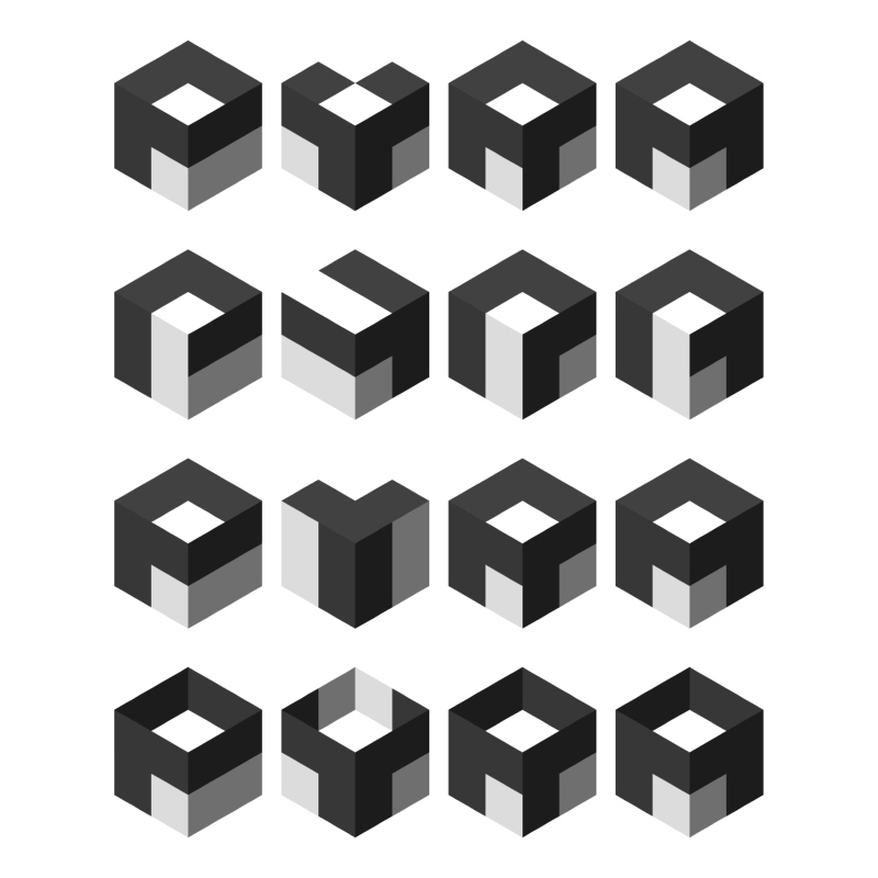
Edit: one more...

Comments, critiques, suggestions are all good!

Edit: one more...

Comments, critiques, suggestions are all good!
Last edited by a moderator:
moz
load *,8,1
I like the idea, and I think the fourth example looks best except for the fact that it looks like an empty box instead of a cube. Maybe drop the shading of the top left and keep the face a solid shade like the third three, and it'll look better 
Last edited by a moderator:
laserbeams
Member
- Joined
- May 23, 2010
- Messages
- 96
Wow, quick feedback! I kept playing with it, kind of ended up coming full circle, back to something like FZERO's original...
And yeah, that's because it kind of was an empty box. The third below is a modified version of the first, with a cube stacked on top to give the gap in the Y instead. FZERO: Yeah, I liked that Y too, too bad it doesn't look as good when turned upright! The fourth below is a mashup of the abstract 2nd from my first post, and the "wrenched cube" style Y:
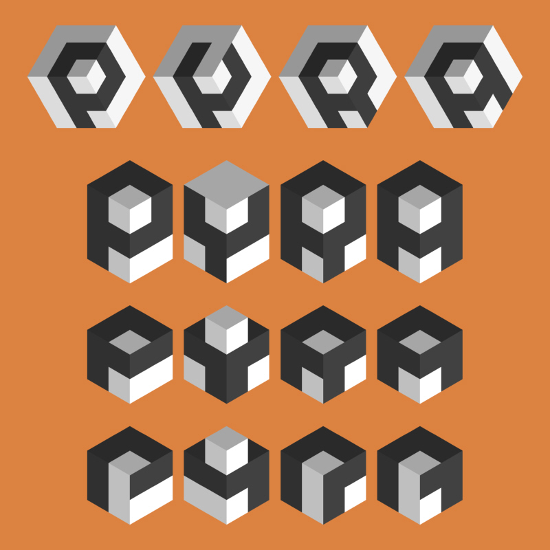
And yeah, that's because it kind of was an empty box. The third below is a modified version of the first, with a cube stacked on top to give the gap in the Y instead. FZERO: Yeah, I liked that Y too, too bad it doesn't look as good when turned upright! The fourth below is a mashup of the abstract 2nd from my first post, and the "wrenched cube" style Y:

Last edited by a moderator:
laserbeams
Member
- Joined
- May 23, 2010
- Messages
- 96
I think the top one just above might be a bit too gamecubey, but feel free to play with it! I wasn't happy with that Y either.
Here's how the fourth one above looks with the extra faces removed, as might be molded into a case, or printed in 2D (always a concern for logos):
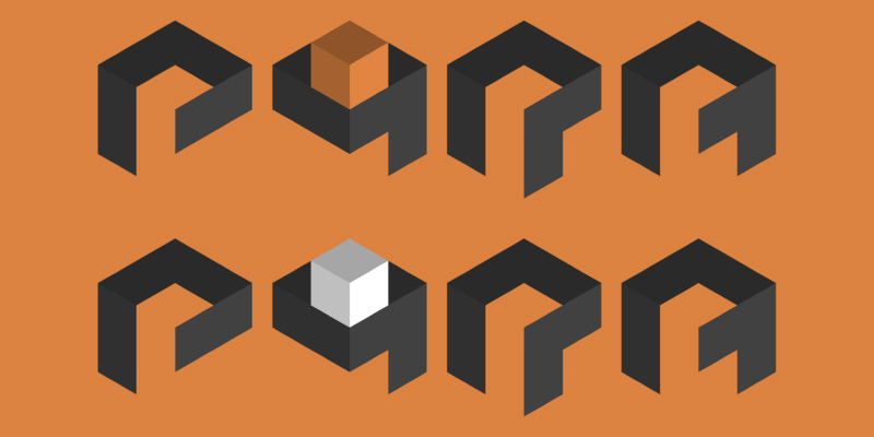
Edit: I like how the Y above looks like an outstretched hand presenting a cube.
Here's how the fourth one above looks with the extra faces removed, as might be molded into a case, or printed in 2D (always a concern for logos):

Edit: I like how the Y above looks like an outstretched hand presenting a cube.
Last edited by a moderator:
Don't forget that the logo also has to work in monochrome.
So for example:

or

Here's a combination of Binky's flame letters with (iirc) FZERO's dragon:

So for example:

or

Here's a combination of Binky's flame letters with (iirc) FZERO's dragon:

Similar threads
- Replies
- 21
- Views
- 5K
- Replies
- 328
- Views
- 66K
- Replies
- 99
- Views
- 24K
- Replies
- 25
- Views
- 6K

