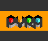
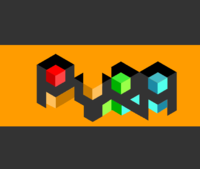
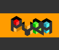
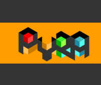
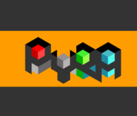
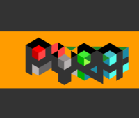
Finding a proper name and logo :)


Oi cheeky ... You knocking those colours?


The snes pad and Xbox pads used bold colours too :)


Seriously though, my personal preference of that logo style is the early ones, in grey/black and one colour, probably orange.


But for some usage it could be jazzed up a bit, like posters or web banners and such, that was just an example of mixing it up a little bit.


No harm in appealing to the kids or the fairer sex eh
 
I agree that colourful blocks do rather bring children's toys to mind...
 
Well, it is a games console as well as being a full computer, and the colours are quite reminscent of old 8-bit computers to me. Granted, they were aimed at kids mainly, but I don't mind that.

It's not like the colour version will be visible to anyone seeing you using the device anyway, assuming the logo is embossed like it is on the Pandora.
 
In being a full computer, (a PC if you will) it means that it isn't a games console.


....ancient runes style :)

24w6iwh.png
MMMMmm.... maybe if you're making a toy action figure for an 11 year old.
Grench, maybe if you weren't busy stealing the name of cucumber water and instead made a logo rendition of your own or suggested alterations someone would take your opinion somewhat seriously. FZERO is represented by full artwork, you by unconstructive critique.
-non 11-year old reasoning.

FZero, Maybe if a similar line of thinking was applied to the underside of the letters some interesting effects (MC escher) could be created.


Edit: (love the Y in the shape of a wrench btw, very DIY)
 
making a version now. There is a pixelfault on the downward sloping line of R with respect to the http://en.wikipedia.org/wiki/Counter_(typography)

The bottom left pillar on the A slants too much.

This is what i meant:
 
pyra2.png
 
Edit2: bonkers versions
 

pyra4.png
pyra5.png

pyra6.png
 
Maybe a metal gray type box in the wrench shaped Y to double as a nut? That breaks perspective yet again.
 

pyra7.png
 
Perspectivistic version
 
pyra9.png

Needs more bullet time

for that neo-cubism effect
 
Last edited by a moderator:
It's probably not a good idea to rely on subtle shading (such as on the faces of those cubes) in a logo....
 
Yeah, agreed, versions reflecting that change and others  in thread above.

The red steals too much attention in the opposite direction so on close range it competes with the lettering and main cubes.  If the P had the orange cube from the Y in the original logo the Perspectivistic version would not become a myriad (heh) of blockiness at a distance.  Possibly the P into the Y and get rid of it, because i do like that red, smashing.

A lot of ideas didnt work since the height of the letters are not in full blocks. Also maybe the shading should be towards the right, that was a reoccurring plague. Possibly it worked out just as often unnoticed it since it was this way though.
 
Last edited by a moderator:
...and here's my, completely different take on it:

gfw0.png
I like this one a lot, the flame is elegant and simple and appropriate. You could even have a dragon breathing that logo :)

The Y looks a bit too much like a V in my opinion. Also perhaps a slightly redder tint of orange?
 
Logo with one colour is fine, but please don't use if for the case or if the majority wants it at least don't make it too big. Thank you.

BTW orange/black logo is nice :)
 
Last edited by a moderator:
I'd agree with that b_o_b, though for the case itself I'd still prefer an emboss/engraved style logo which uses no colour, just light to form the graphic.

also the orange/black | orange/grey combo.

Kingu, couple of them cube additions are ok, a couple are ... as you said ... bit bonkers :)

I think it's lost the [R] though, where the left edge of that characters been lost. For us we see it, as we've seen the previous versions of it .. but if that was your first seeing of the logo, you might not notice that's an [R]

I done another, which again is multicoloured so more for use on webs, banners and such.

Top one just playing with some colour

Middle one adds some light to the bottom sections creating a bit more dimension and angles

Bottom one replaces the light with dark, to suit the top sections, which I think looks ok as it emphasises the cubes by having a them within a 'brighter' cube

2zeaue9.png
 
You could then, in time, once some mindshare and logo recognition was there .. perhaps use a simplified version of just the cubes;

14w4odh.png


For some things, like splashes or boot screens or whatever
 
I like the cubic look, at least for the P, the Y and the A.  How about taking the top version of your three but shading the body of the letters so the left side is darker than the right.  Is there a balance that could be acheived doing that while still keeping the characters bright and clear?

Edit: Making the right side less saturated might acheive the effect better, I haven't tried.
 
Last edited by a moderator:
Hey Levi ... why you no like the [R]? :)

I think I know what you saying there, I'll give it a go and up it here in a couple mins... and if I am thinking what you thinking, I see why the [R] was not mentioned there, it doesn't have that middle line does it...
 
Last edited by a moderator:
Hmm, if this is what you meant Levi, I think it's a really nice idea.

It makes the letters suit the cubes' shading, with the light source coming from the upper-right side. I like it myself

nlel2r.png


See what you noticed about the [R] though, I done like that as just seemed kind of right
 
Hmm, if this is what you meant Levi, I think it's a really nice idea.


It makes the letters suit the cubes' shading, with the light source coming from the upper-right side. I like it myself


nlel2r.png


See what you noticed about the [R] though, I done like that as just seemed kind of right
That's looking great, but the leg of the r needs the be shaded correctly to fit with the box perspective.
 
Yeah, I was originally thinking the leg of the R would be shaded like the right side too.  Might not work though - as a second option you could try the current shading groups, but switch the lighting to have come from top left, so the leg is brighter.
 
Thank you mate :) That nice shading touch was Levi's call though
 
I can just see that version in a boot animation...   starting with a top down view of the 'boxes' then panning down to reveal the name, which then moves to the lower part of the screen, and the DragonBox logo fades into view above it.  (whichever DragonBox logo is selected)

- Neelix
 
Back
Top