You are using an out of date browser. It may not display this or other websites correctly.
You should upgrade or use an alternative browser.
You should upgrade or use an alternative browser.
Finding a proper name and logo :)
- Thread starter EvilDragon
- Start date
Neelix
Insecticidal Maniac
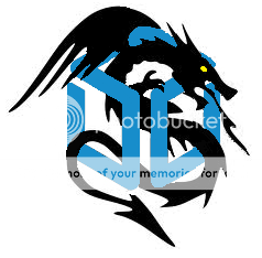
That was how I was thinking until I saw this logo from FZERO. (top logo quoted below)Haha, the flying box made me laugh.
As much as I like some these Dragonbox logos, I don't think it's a good name for the device, since it is already the name of the shop/manufacturer. You would have to call it the DragonBox DragonBox.
My first thought was 'DAMN that would look good embossed on the lid'.
Then something clicked. Logos are typically used to represent the Brand not the device itself. If there is a device specific logo it is usually a variation of the Brand logo to indicate the product name.
That being the case it suddenly makes sense to be looking for DragonBox logos, regardless of what we intend to call the device.
Imagine FZERO's first logo here, with Pyragon (in Binky's flame script) just below it, sized to fit the width of the box. (Or inset, the same way Dragonbox is inset at the top)
- Neelix
Neelix
Insecticidal Maniac
Partly but I meant you should keep the box/border around it, keep the dragonbox word at the top and put Pyragon on or below the bottom border.
- Neelix
- Neelix
Neelix
Insecticidal Maniac
Thanks.  That pretty much exactly matches one variation of the concept that I had considered.
I'd still like to see it with Pyragon below the border and fit to the width of the border though.
- Neelix
I'd still like to see it with Pyragon below the border and fit to the width of the border though.
- Neelix
Neelix
Insecticidal Maniac
Many thanks! 
 That's exactly what I was thinking of! I really like both the first and the last of those last 4.
So, now that my concept has been realised, Thoughts?
- Neelix
So, now that my concept has been realised, Thoughts?
- Neelix
Fzero
Advanced Member
- Joined
- Mar 9, 2010
- Messages
- 4,702
I like too, though probably 3rd/4th best ... then the 1st.
Think the 4th one is probably best, with the larger Pyragon text.
...As you were saying earlier up there, the 'dragonbox' text, 'db' text and the 'box' being more the brand ... with the 'Pyragon' text being the product [P2]
I could visualise that looking pretty decent embossed on a lid or packaging, yeah
I like this. It's an elegant logo.A cube squared is definitely a hypercube of some sort.
--
What did people think of this btw?

I can pretty it up with nice gradients and bubble effects if you want
I like the bottom one, but with the "Pyragon" slightly smaller and not overlapping with the box. I'm also not sure I like the outermost box style, maybe a simple rounded rectangle would suffice.
I like the P of Pyragon here, but not so much the rest of the word. It could be more readable, less in a hand-drawn cursive look.
mcobit
Advanced Member
- Joined
- Jul 28, 2008
- Messages
- 6,909
I like this a lot as it would also sell in japan
This pretty much takes everything that can differ about dragons in different cultures out of the game.
What everyone can agree on: Dragons should have wings and a tail.
Objection!This pretty much takes everything that can differ about dragons in different cultures out of the game.
What everyone can agree on: Dragons should have wings and a tail.

The original dragons had no wings but were more like giant serpents.
Fzero
Advanced Member
- Joined
- Mar 9, 2010
- Messages
- 4,702
I think the wings on SNESFAN's one are good myself, and as some have mentioned earlier about the difference between Asian and European dragons... I think if you took away those wings it would look more serpent like, but also a lot more like your traditional Chinese dragon - Or at least what some people, including myself, would consider a Chinese dragon.
Fzero
Advanced Member
- Joined
- Mar 9, 2010
- Messages
- 4,702
Well, you could stylize it even more and only give it a tail.
And is a different type of dragon tail

Similar threads
- Replies
- 21
- Views
- 5K
- Replies
- 328
- Views
- 67K
- Replies
- 99
- Views
- 24K
- Replies
- 25
- Views
- 6K


