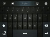
Explaining keyboard layout proposals. Fn hotkeys updated, language switching, powertoggles etc

Functional layout vs reduced layout


  • Total voters
    38

Unless coding ruby, or some other language unbeknownst to me, ' doesnt matter at all. For the case of ruby, _ matters a whole lot more, apparently.
Unless my eyes deceive me, ' is used in many languages (ranging from C to Haskell) for character literals, in all Lisps for quoting s-expressions, for alternate string delimiter (avoiding escaping double quotes) in many languages such as Python and Lua. Believe me, it is used a lot in programming depending on your language of choice.
 
Problem is i failed at balancing a layout with changes.  Allthough not a swipe-combo of F-ing, it is still functionally sound to have aigu retroflex and aigu together, since they are the most non-dedicated accentuations.

If your passoword is 12345qwerty  or some variant thereof, it wont align properly. There are however attacks targeted at this attack vector being a low-entropy solution, so it isnt clever to begin with.

Change will always bother someone, in this case its the case of the least change between two mutually exclusive options. It cant be both US and german number row layout.

More importantly, none of them fit a bigger picture, which is in this case, limited to the amount of keys we have.

B-Zar:  From source

Composite: e t a r i s n o l c d _ p u f m ( ) g h ; b , = . v x y * " k w - 0 / $ > { } 1 : ' \ 2 q [ ] j & + z < 3 | @ # 4 ! 8 5 6 9 7 % ? ~ ^ `
C:         e t r i n s a o _ c l d u p f m ) ( h g ; , b * x = v k y - 0 w / . > 1 " { } 2 & \ q [ ] z + 3 : 8 4 # < 6 ! ' 5 9 j 7 | % @ ? ^ ` ~ $
Java:      e t a i r n s o l c d p u . ( ) g m f ; _ h b v = w x y / k " , { } j * 0 - + 1 q ] [ z 2 3 ! < 5 : & | 4 > \ ' 6 9 8 7 @ ? % # ^ ` $ ~
Perl:      e s t r $ a i n l o f d c u p _ m ; ( ) = { } " h , y > b ' g - : 0 x v \ @ k w / 1 q . | ] [ # 2 & + * ? % ~ z ! ^ < 3 5 j 4 8 6 9 7 `
Ruby:      e t n s a o r i l d c _ p u m f " . , = h ' ( : ) g b v > y w < [ ] / 1 x @ q k 0 \ 2 | ? { } 3 - j 5 4 z 6 7 % 9 8 + ! * & $ ; # ^ ~ `

Everything is pretty much used at some point, having a functional cluster is however more important than 1key access to a rather arbitrary way to gauge actual efficiency.

I dont know if comments are counted into this, however ' and " are very functionally different from [] <> and {}

Our heatmap is strongest at the middle parts of each section of the keyboard, off-centering the least used things, albeit condensing them, will bring the efficiency up, and is as close to a commonly used standard it can get.

One notable exception to how QWERTY is irrevocably broken, is that space is by far the most used key. Since this key is moved anyway, a lot of benefit can be had from putting it in a more central position.

Not only is it used often, it is strung together with just about every other combination there is.
 
Last edited by a moderator:
Problem is i failed at balancing a layout with changes.  Allthough not a swipe-combo of F-ing, it is still functionally sound to have aigu retroflex and aigu together, since they are the most non-dedicated accentuations.

If your passoword is 12345qwerty  or some variant thereof, it wont align properly. There are however attacks targeted at this attack vector being a low-entropy solution, so it isnt clever to begin with.

Change will always bother someone, in this case its the case of the least change between two mutually exclusive options. It cant be both US and german number row layout.

More importantly, none of them fit a bigger picture, which is in this case, limited to the amount of keys we have.

B-Zar:  From source

Composite: e t a r i s n o l c d _ p u f m ( ) g h ; b , = . v x y * " k w - 0 / $ > { } 1 : ' \ 2 q [ ] j & + z < 3 | @ # 4 ! 8 5 6 9 7 % ? ~ ^ `


C:         e t r i n s a o _ c l d u p f m ) ( h g ; , b * x = v k y - 0 w / . > 1 " { } 2 & \ q [ ] z + 3 : 8 4 # < 6 ! ' 5 9 j 7 | % @ ? ^ ` ~ $


Java:      e t a i r n s o l c d p u . ( ) g m f ; _ h b v = w x y / k " , { } j * 0 - + 1 q ] [ z 2 3 ! < 5 : & | 4 > \ ' 6 9 8 7 @ ? % # ^ ` $ ~


Perl:      e s t r $ a i n l o f d c u p _ m ; ( ) = { } " h , y > b ' g - : 0 x v \ @ k w / 1 q . | ] [ # 2 & + * ? % ~ z ! ^ < 3 5 j 4 8 6 9 7 `


Ruby:      e t n s a o r i l d c _ p u m f " . , = h ' ( : ) g b v > y w < [ ] / 1 x @ q k 0 \ 2 | ? { } 3 - j 5 4 z 6 7 % 9 8 + ! * & $ ; # ^ ~ `

Everything is pretty much used at some point, having a functional cluster is however more important than 1key access to a rather arbitrary way to gauge actual efficiency.

I dont know if comments are counted into this, however ' and " are very functionally different from [] <> and {}

Our heatmap is strongest at the middle parts of each section of the keyboard, off-centering the least used things, albeit condensing them, will bring the efficiency up, and is as close to a commonly used standard it can get.

One notable exception to how QWERTY is irrevocably broken, is that space is by far the most used key. Since this key is moved anyway, a lot of benefit can be had from putting it in a more central position.

Not only is it used often, it is strung together with just about every other combination there is.
I wonder why _ got so high up in that list. Must be he's counting sources with lots_of_function_names_written_like_this or perhaps __standard_library_stuff_that_starts_with_underscores.

How often ' is used in code depends a lot on the kind of code (and of course the programming language), but " is universally used in all programming languages to delimit string literals, which is a pretty important thing (there's not much code that doesn't need a string every now and then). Having both ' and " in their expected location helps a lot for both coding and prose.

I don't think we should make our own attempt at making a more efficient layout, doing our own Dvorak or Colemak kind of thing. Sure, if you're willing to re-learn a lot of key positions, theoretically more efficient layouts are possible. But having to re-learn stuff is not much fun. I think it's better to have symbols where you would expect them to be, rather than at some completely different but theoretically slightly more efficient position.

I see no reason at all why having a non-standard set of (or order of) shifted number row symbols would be a good idea. It's just confusing. On a standard US-QWERTY keyboard, the order is % ^ & * for modulo bitwise-or bitwise-and product, if you mess with that by swapping symbols around and making some of them AltGr and others Shift, you're introducing confusion for no good reason. Or is there any reason why you can't just have !@#$%^&*() on Shift+numbers?
 
Its a case of what to expect, and what exists, no layout in itself, or compared to others, make much sense.

I don't understand this modulo arrangement, but the alterations are sound compared to what is the collectively accumulated standard, one where you don't limit yourself to a variant thereof.

Lets instead draw from it our own and make choices where they are to be made, as they matter. The US layout is backed up by more keys, since they don't use the +4 for letters. It also has some junk-choices (,<  .>) when it comes down to it. Overall it is good enough, sometimes better, sometimes worse than German. But without _all_ the extras, it is made severely limited. You then instantly notice where the shoe presses with regard to how lazy it really is. It shows.

Inputting language by regular-press and shift is the earliest convention of typewriters, that is _the_ standard.

" and ' are constructs of language primarily, because language matters most. Anything belonging to this realm needs be within (above) reason in terms of accessibility.

Germans expect " at 2, the US layout doesn't make much use of @, and the common ground is using altGr to get @ for everyone.

" is used together with another ", which takes its real use down towards half. ' is used between 0.7% and 0.1% at most in roughly english only, still more than some QZX letters, but it boils down to a question of what to expect where. One cannot rearrange or limit the alphabet keys, for any language.

<> [ ] { } are coding chars, but also not found in language, they should be removed from the rest so as not to interfere with what is the main focus of the keyboard. Far right is removed in our arrangement.

The brackets, between layouts, not only differ between US and the rest, they are an afterthought to the typewriter to begin with, so its unfair to judge layouts with this addition, as it is shoehorned in.

Just like F-keys came and went. If you disagree, note where F13-F26 ended up. Good ideas remain good, bad ideas weren't good to begin with.

The case could be made for doing QWERTY on the top row and having numbers at the very bottom, where there is a 12row, which means the F-keys can be printed in full.  The alternative is the shifty arrangement up top.

Numbers are rarely used, and not really in conjunction with placement in relation to letters on the keyboard, so long as they are sequential 1234567890 or in numpad configuration.

Yes dvorak and NEO is more effective, and that is good. For how it is good, it can be made possible. We arent clever enough to compete, but we are clever enough to make it possible.

The loss, is the one handed doublespace, which in itself makes zero functional sense.  A at far left isnt ideal with 10 fingers, 2 makes it worse, and going AZERTY doesnt even help. Ship qwerty and let functionalism be functional, thats the only feasible solution, and it concludes the matter.

A correction to the way things are expected, used, and possible, in that order, is what should be done generally. Then look at the results and see if it arrives at something balanced.

The focus is typing, naturally, for pun intended, and else-wise. Concepts of why or why not a keyboard works are subordinate so long as it is replaced by something that isn't vastly better.

An extended use of meta strikes me as one such adjustment/re-learning. I understand it for the benefit of 2perkey, but not if that is lost.
 
Last edited by a moderator:
On Shift+1234567890, there are the following symbols in the following standard QWERTY/QWERTZ/AZERTY layouts:

Belgian: 1234567890 (the unshifted symbols are & é " ' ( § è ! ç à)

Canadian French: ! " / $ % ?& * ( )

Canadian Multilingual: ! @ # $ % ? & * ( )

Czech: 1234567890   (the unshifted symbols are + ě š č ř ž ý á í é)

Danish = Estonian = Faroese = Finnish = Icelandic = Norwegian = Swedish: ! " # ¤ % & / ( ) =

Dutch (NL): ! " # $ % & _ ( ) '

French: 1234567890 (the unshifted symbols are & é " ' ( - è _ ç à)

German = Austrian: ! " § $ % & / ( ) =

Hebrew: ! @ # $ % ^ &* ) (

Hungary: ' " + ! % / = ( ) §  (note: 0 is on the left)

Irish = UK: ! " £ $ % ^ &* ( )

Italian: ! " £ $ % & / ( ) =

Japanese: ! " # $ % & ' ( )

Polish (official): § % ! ? + = : _ / "

Portuguese (Brazil): ! @ # $ % ¨ & * ( )

Portuguese (Portugal) = Slovenia = Serbia = Croatia = Bosnia-Herzegovina = Montenegro = Spanish (Latin America): ! " # $ % & / ( ) =

Romanian = Slovak = Polish (de facto) = US = US-International = Apple International = Dvorak = Colemak = Arabic = Korean = Chinese = Taiwan = Australia = India = South Africa: ! @ # $ % ^ &* ( )

Spanish (Spain): ! " · $ %  & / ( ) =

Swiss: + " * ç % & / ( ) =

Russian: ! " № ; % : ? * ( )

Turkish: ! ' ^ + % & / ( ) =

UK (Apple): ! @ £ $ % ^ & *( )

Vietnamese: Ă Â Ê Ô grave hook tilde acute dot-below Đ

So yes, it is pretty much a complete mess.

If we ignore the layouts that occur in only one country, then we can identify the following semi-standards:

US and pretty much the rest of the world: ! @ # $ % ^ &* ( )

Scandinavian: ! " # ¤ % & / ( ) =

Ibero-American + Balkan (except Spain and Brazil): ! " # $ % & / ( ) =

German: ! " § $ % & / ( ) =

UK: ! " £ $ % ^ &* ( )

If you taking population counts into account, the US layout is by far the most widely used.

Now, comradekingu's latest layout proposals have the following symbols on Shift+numbers:

! " - $ ' & ? * ( )

! " # $ ' & ? * ( )

! @ # $ [nothing] ^ / * ( )

I just don't see how that is supposed to make any more sense than just using standard US-QWERTY, which covers the majority of the world population. Inventing a new standard is rarely a good idea.

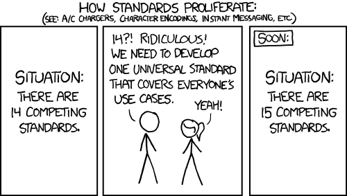
standards.png
 
! is common enough

" is the standard when it isnt @  and " is more important

# is ok to have since abxy+2 has redundant - and +

$ is coding input, expected to be found here

' is another important one, in the place of % which is not important

& is standard german

? is from russian, it is needed, displaces the & of us layout which has switched to 6

* is US standard 8

(

)  are brackets in standard position.

This isnt the whole thing though, there is one key to the left and two keys to the right by default. Again with some and some-not important functionality.

The whole thing has to give way to ordinary used and commonly found things. Also it is combined with 1 dead-key per key.

Its also a question about greater value, the whole layout has a balance.

Using a shoulder to get special letters on the number row sucks for those languages, but that is the problem, as a whole it makes a lot of sense, and it doesnt suck for anyone else.

Moving ' to where the dutch expect it means the ( ) brackets dont align with the [ ] and { } in my layout. Moving it to where the japanese expect it isnt a much much better preposition, but its a question of what context it is removed from.

Aigu '  retroflex ^ and grave ` on  5 6 7 makes sense because then you remember the 3 most important ones, where 6 is the standard ^ for US. On a german keyboard these three are on 3 different directions on the layout, which makes zero sense.

ä ë ï ö ü are also important, but they most often have their own dedicated keys in +4.   

It could be , ; /   and      . : _   to have 2 on each key, but   / is more common towards the end, and i think it ties in better with the cluster there.

, and .   is the default diactric on these keys anyway, unless you magically prioritize :  (and thats bad, unless its on the number row, because all of those only have 1. So you can ctrl+alt+number regardless of if the diacritic is in shift or altGr position)  Cant do  , _ ; or similar either, because it messes with convention of , ;   and   . :

Also, shift is the one key we have on keyboard, so it should have ; and : as they are language.  Arguably _ and / is advanced, so it ties in better with altGr.

Advanced users will use shoulders anyway, and shoulderaltGr is functionally equally valuable to shouldershift.   / and _ isnt going to be standard placement for a meaningfull portion of people.

So, to begin at the source, a coding cluster stems from [ ] commonly found in this area (reduced amount of letters) Adding to that with { } makes sense, altGr'ing it into the number row doesnt.

<> is the 105 key on ISO layout, it is added where the long leftshift was cut to make place for it.  Together with the other coding symbols is a much better place. Value move.

Reinstating keys with combos, no matter how logical, is still not standard, even if its altGr.  { } does not belong on the number row, but with the convention of altGr, for some people it does.

AltGr-ing it back to the same key, when you switch that key to something else, fails for people.

But here is the kicker, those are only international people, in the case they need coding, in which case they are advanced enough to do it.

In the voting people seem to be more inclined to give up [ ] { } < >, and thats either because switching is ok enough, or because some people dont need coding.

So to answer the question, yes there should have been ' and ", but it is by no means crucial. If something is to change, it needs to make more sense than the coding cluster.

Tried a few times, and I fail each time.  Same reason why changing conventions fails in the cases it does, it is removed from something that works.

If i go with , <  to have the 1 us diactric international per key, which is only possible like that, you can at most get : where spanish and french people have their corresponding key, or some other circumstantial evidence of why that is better, but it isn't.

I pick my battles and try to make sense with what i have. No, it isnt perfect, but that is beside the point. There could be a magical solution somewhere, but it would be so far removed from convention that it would be rendered useless in terms of sales.
 
Last edited by a moderator:
! is common enough

" is the standard when it isnt @  and " is more important

# is ok to have since abxy+2 has redundant - and +

$ is coding input, expected to be found here

' is another important one, in the place of % which is not important

& is standard german

? is from russian, it is needed, displaces the & of us layout which has switched to 6

* is US standard 8

(

)  are brackets in standard position.

This isnt the whole thing though,

[WALL OF TEXT]
So it's a mix of standard US, standard German, standard Russian, and ' instead of % because % is "not important" (even though ! and % are about the only symbols that have the same location in almost all layouts). Rrrrrrrrright.

I rest my case.
 
Not important in the sense that it is almost never used. It placed almost last on all the frequency charts. Which is to say there are very few instances and not a lot of the time you will be bothered by having to altGr it rather than shift+ it.

I had a US standard default to begin with, and i got rid of it, because i questioned the context it was from and in.

If you want the bigger picture i can also explain how the keyboard ties in with the shoulders and the rest. I see your point, but i dont think you appreciate the engulfing nature of the argument.

Unless there is some change for the better that i can make, or why that is more to do with the US layout, i dont get it.  Will research the modulo order.

Taking the US number row layout, out of a 13 key arrangement, into 10, into an arrangement that cant accomodate all the extras, nor without penalty, for the benefit of of english. I tried that, and couldnt do it, not because it wasnt worth exploring, but because it didnt lead anywhere.

It cant be US standard all over, because that has obvious flaws, some of which are luckily represented as fixed versions in other commonly used layouts. Deciding to take the best of both also extends to the number row.

I chose to do well in the areas that work, which is something that cant be done with 1 less key, so its striking a balance. There are reasons for having tab on the other side for example, but its there because you cant exclusively win without moving the dpad.

Got something with numbers on bottom, and +1+2, but a little too tired to work on it.
 
Last edited by a moderator:
Not important in the sense that it is almost never used. It placed almost last on all the frequency charts. Which is to say there are very few instances and not a lot of the time you will be bothered by having to altGr it rather than shift+ it.

I had a US standard default to begin with, and i got rid of it, because i questioned the context it was from and in.

If you want the bigger picture i can also explain how the keyboard ties in with the shoulders and the rest. I see your point, but i dont think you appreciate the engulfing nature of the argument.

Unless there is some change for the better that i can make, or why that is more to do with the US layout i dont get it.

Taking the US number row layout, out of a 13 key arrangement, into 10, into an arrangement that cant accomodate all the extras, nor without penalty, for the benefit of benefit of english. I tried that, and couldnt do it, not because it wasnt worth exploring, but because it didnt lead anywhere.
I see what you're trying to do, but if you're going to rearrange everything to make it make more sense, or more efficient, then why don't you use a Colemak layout etc?

Either you try to resemble some standard layout (US-QWERTY, German DIN T1, whatever) as closely as possible (obviously within the constraints of limited keys), or you try to make something completely new and Pyra-specific. Your proposal is somewhere strangely in between those two options. This is deceiving: people will think: oh I know this, this is like a standard QWERTY keyboard -- and then it turns out to be quite different after all.
 
Lets see if thats the case or not, the proof is real world use in testing.

Being friendly is a major goal, looking like something people can use is a self-forfilling goal.

I dont see a keyboard as either ISO or ANSI, or US or german, or any two arbitrary comparisons, i see it as primarily a typewriter, and one that has to work in the context given, _like_ a keyboard.

That means all of many thing that people expect to work.

(overall sense)

Clean layout, no clutter on the keys

Inputting full alphabet in standard location

second level modifier shift for all language

third level modifier AltGr for what AltGr does

Efficiency as a two-thumb device

dead keys

a button to add a F-row,

no hazardous presses to be made accidentally

Things to avoid:

Foreign concepts for any of the above

Looking like a 105key to trick the user

Things that arent simple

Things that arent divided into functional blocks

Thinking there are no tradeoffs or weakpoints.
 
Last edited by a moderator:
1409572850272.jpg

Picture related is something i found which also utilizes the idea of 2-thumb punctuation.

Have recently talked to the creator of the jollaphone external keyboard project and i want to bring attention to it

j8zCCmn.jpg
 
I like the look of both of those.  Pyra doesn't have enough keys for that, but I would be okay with something that resembles it.

Edit: I mean the Jolla stuff.
 
Last edited by a moderator:
Actually - we have plenty of keys to pull that off.  Particularly if we go with 'grouped characters' like in my off the wall idea - combine that with two modifier keys (like the Jolla example) and it could work quite smoothly.

Hmm...  I won't have time to build an example today.
 
Last edited by a moderator:
Two extra modifier keys means we have five main modifiers: Shift, Ctrl, Alt, Extra1 and Extra2. That means one of them can't be on a shoulder button. Given how much I miss Fn and Alt shoulder buttons on the Pandora, I think it's wiser to have only one extra layer. As long as we don't need to have Cyrillic on the keys like that Jolla keyboard, one layer should be enough.
 
Mixing the number row with colour and printing F11 F12 is as little clutter and "layering" i can produce. And from my showing it to people, it can be picked up like that right away. Worst case its the F-keys.

The alternative is worst case its all the symbols people miss out on.

Ctrl shift Alt AltGr are the most standard and basic things from a keyboard. For making F-row combos more cumbersome you gain being able to input them on keyboard only. In addition you avoid unforeseen shouldercombos, like ctrl+alt+F*   _and_   it makes it easier to have 4 mediabuttons on shoulders.

Yes, that means you dont need super, which is good and bad.  Good because thats one less key to learn. Bad because it might be needed.  And then i wonder, who needs super? Windows and unity isnt really the out of box experience i think is targeted.  And if they are needed,  is  columnkey such a bad option for hacking up hotkeys that use "meta" for super?

With F-keys on numbers,  all the supercombos i know of are possible.

Edit: the jollakeyboard has a full number row. 12 keys, (and one to the left of q)   If you remove cyrillics, make right chr into altGr. Move F1-F10 onto the number itself. And move 10 symbols up, you have coding letters

on p+1 and l+2

Its only the spacebar and combos to , . enter that needs work then.
 
Last edited by a moderator:
I propose 45 modifier keys and a single regular key. All buttons you could want to type are done by chording different modifiers and then hitting the single regular key. This gives a theoretical 35184372088832 number of key combinations. In practice we'd need to keep at least 3 of them out, probably 4 for easier use, and double them so we can have keyboard and shoulder keys, leaving just 37 modifiers, but that's still 137438953472 possible keys. This is obviously the best solution because it offers the highest number of overlaps, every existing key on every keyboard is at most 38 button presses away, and actually every single unicode character can have it's own keyboard chord.
 
Back
Top