Grench
Forum Addict!
- Joined
- Oct 3, 2008
- Messages
- 6,629
Check the first post for some pictures.
Did you happen to bring back enough of these somewhat funky lavender, gray and silvery gray cases to assemble some of the ptototypes?
Check the first post for some pictures.
I actualy wonder why the ESA doesn't have that level of merchandise.this nasa shirt is so cool!
Cool sun glasses!i have one picture ED doesnt have
Hmm... The shoulder buttons on the right (left of the image) look like they fit much better than the ones on the left. Is that an illusion?
That's what i said. I think. It's what I meant, anyway!Looks to me like the buttons on the left of image fit better than the right.
Yes, better for them to have a bit of play in them, than for them to bind against each other. And with a bit of play, how they sit in their sockets at any given moment probably depends on chance to some extent.But they're different for sure, I think the pivot on one of them is slightly off kilter, but to me as long as it works fine it's within tolerance in terms of the appearance.
Looks to me like the buttons on the left of image fit better than the right. But they're different for sure, I think the pivot on one of them is slightly off kilter, but to me as long as it works fine it's within tolerance in terms of the appearance.
Edit: And I guess how well they work depends on the board being fixed in place properly using pegs that go through the holes in the PCB. Can @EvilDragon confirm that issue has been sorted?
[doublepost=1563573879][/doublepost]Also, in this image I note two pips on one edge of the lid. Were the screws you were using to secure the lid slightly too long perchance?
"Oh !! You have a Nintendo DS !!"
"It's not a NDS, it's a computer"
"But it's the same as Nintendo DS !!"
"No, this has a keyboard... and just one display..."
"But it's the same !! THE SAME !!!"
"..."
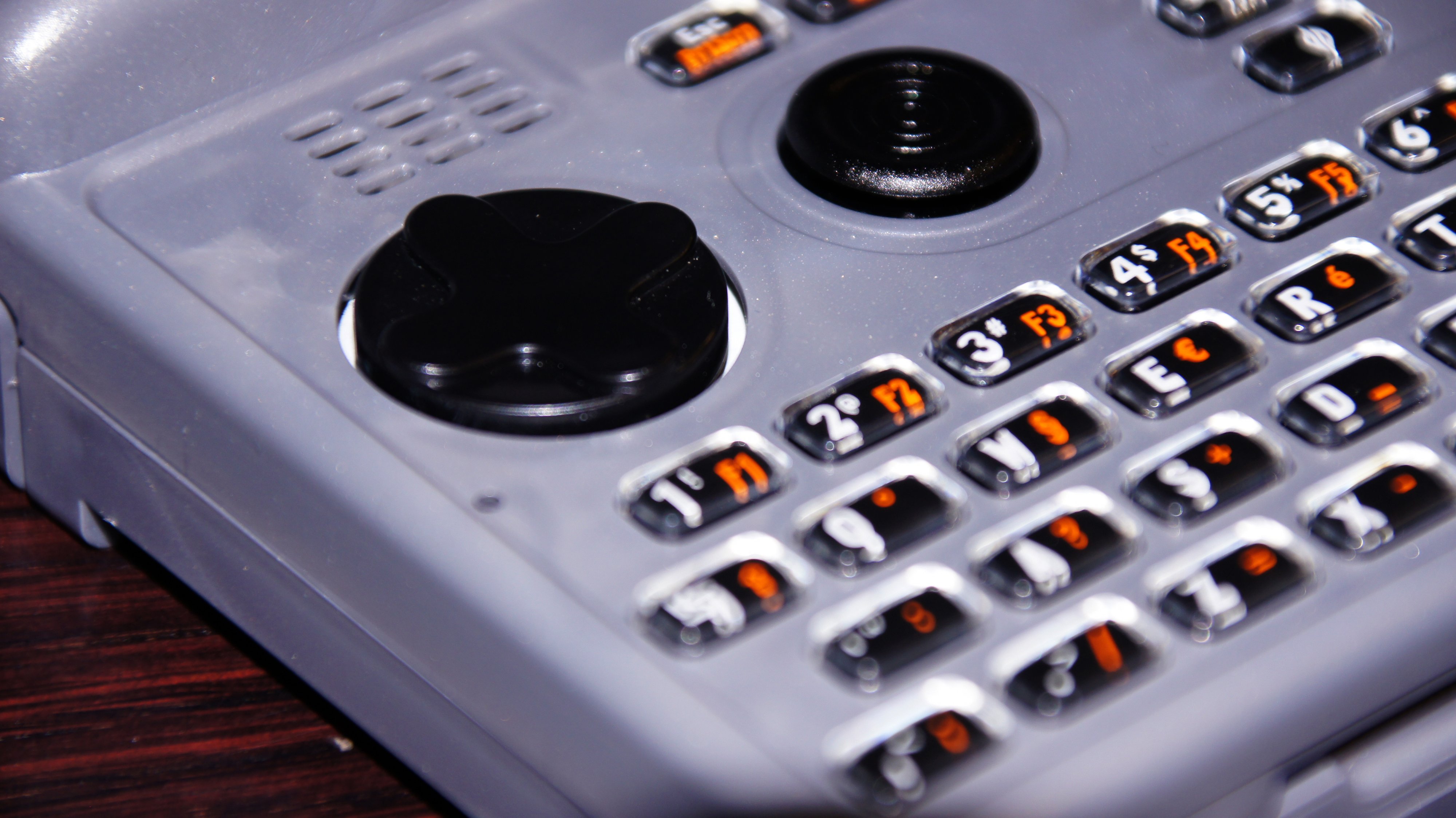
Certainly I took it to be the keymat showing through. I'm not sure the hole can be made much tighter around the d-pad otherwise it'll tend to jam in there as you tilt is side to side. Personally, I like the contrast of a white ring around a black d-pad, although I may have to revisit that appreciation when I see it in a darker case.What is that white space around D-Pad ? It looks like white keymat is showing it's face, is this due to mismatch between sizes of DPad and the hole in the case ?[/IMG]
Actually, that's the result of another fuckup... when receiving the first keymat samples, I noticed that the DPad is not centered but a bit off. And while using it, it kept touching one side of the hole.What is that white space around D-Pad ? It looks like white keymat is showing it's face, is this due to mismatch between sizes of DPad and the hole in the case ?

Have LEDs been added for that at some point? Since that was not the case for the unit and main board showcased at last year's Gamescom. I know that Pyra was far from the current revision at the time, but not sure about the board.And it's also illuminated when you switch on the backlight.
I wouldn't say I didn't. But knowing the keymat in that unit not being the current revision to begin with made me not question it. I don't think its DPAD worked that well either, iirc.(no one noticed that last year at Gamescom)
And some of you asked whether it will be possible to get the keymat only partly printed (without the letters).
And: Yes, that it possible! We will receive 100 of those blank keymats, so you can do your own experiments with them.
We'll also sell spare keycaps in case you lose one during disassembly
Just looked at the 3D photos (using a Valve Index) and whew, these actually look really good! The depth is a bit odd in DSCF4087 with the thingy on the left side and seems to be inverted entirely on DSCF4116.
The rest is fine though. I've used a Pyra a couple of times before, but these closeups with the intense depth effect are pretty cool to look at.
Wouldn't mind having more of these in the future to be honest.
I posted 3D pics of the Pyra years ago
Forgot where though... maybe I can find them.


