I have bought a keymat and thought I would roughly share how I applied a custom key layout onto it. The procedure requires a lot of patience and good precision. It took me a few days just to apply the key labels.
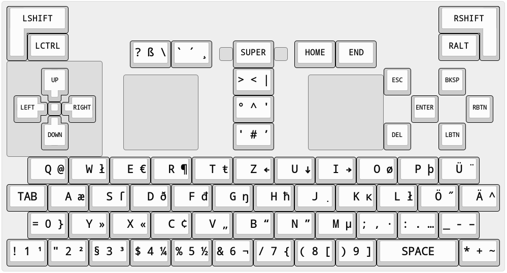
First off, I wanted a key layout that is basically a standard keyboard with reordered keys. I have had bad experience with emulators and remote software regarding special key layouts. [This is what I came up with][0]. I've moved the number row to the bottom so that I have bend my thumbs less when writing just letters (at least in theory and with probing using a transparent Pyra case). I'm not fully satisfied with the layout though, I would love to have something that is more suited for C programming. Missing Function keys are not too much of a problem for me but might look later at how I cram an Fn modifier into the layout to place them on the number row somehow. I wanted to have only basic modifiers on the shoulder buttons that do not interfere with the desktop environment. If I can't get these all working nicely, I will have to resort to automatic layout switching based on the active application which is what I also want to avoid.
Now that the layout is pretty much done they have to be printed. For this I used a Brother PT-700 label printer and TZe-131 black on transparent 12mm tape made by Labelwell. This specific combination is not strictly needed. This tape does have a protective layer on top of the print, maybe someone can use label cartridges without that layer to decrease possible glossy effects or darkening because the labels are protected by transparent keycaps anyway. At the time of writing this the PT-700 is not officially supported by Brother on Linux systems but [there is a CLI tool for it here][1] or you are lucky and you can install the same program with your package manager. It can print text for you but I needed a more fine grained solution. The label printer CLI tool allows for printing a 1 bit monochrome image file with a fixed image height depending on what tape you are using (for 12mm it is 72 pixels and there is a little bit of padding between the printing area and the edges of the label). Due to the 1 bit monochrome pixel format and the lower resolution, smoothed fonts are unlikely to work out well. I wanted to use Iosevka but this was not possible with the small keys.
To create the image, I have written a shell script (have a look one of the spoilers below) that uses just FFmpeg to render one that contains all the keys I need. Using GIMP for this was too fiddly for me as it sometimes changes the font as I mark the text. The script allows for configuring each key with left, center and right aligned text and each text can be (optionally) individually tweaked in font and text size but the key size is fixed. The script tries to use up less total label length by packing them in rows with as less columns as possible. It first previews the result and then writes the image to label.png in the current directory. The bugs known to me are that you have to configure more than one key and that there is an issue with some fonts where tiny letters like punctuation marks are centred vertically but there is a workaround that works with less side effects if used with monospaced font. Configuration has to be done at the end of the script. There are a few more minor settings not mentioned here. Once configured, just run the script (in a terminal to see some logs).
Once the image was rendered I tweaked a few things with GIMP to make it a bit more readable and drew symbols for the backspace and enter key.
This is how my first few tries went:
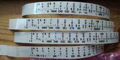
The lowest label was my first print with the transparent cartridge, as you can tell from the wobbly section on its left third. I checked how the text size went out and adjusted the text size afterwards. The two middle ones are identical prints, I just was very smart to reissue the last command on the wrong terminal and a second label went brrrr. With the top label I made further adjustments and that was finally the last major print. The padding on the left of each label is by nature of the label printer. Although it is wasted space, it is useful to at least have some space to hold the row when you have only a few keys are left.
The top label on a close up:

The blue color you see here are the activity lights of the C920 webcam. I don't have a proper camera because my previous mobile phones are broken. The C920 adds some weird sharpening/unsharpening filters that can't be turned off properly over v4l2 settings (I'm not referring to the unsharp area around the picture center as that is because of optics and thus the label being out of focus there.). But at least it allows me to adjust the focus manually.
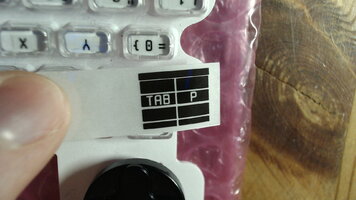
Next was preparing the label to slice them up into smaller pieces. Clean your tools to have as less dirt and adhesives getting in the way as possible. I then went for slicing them up by rows first and then going key for key for each row. But I should have separated the adhesive protective layer a bit beforehand.
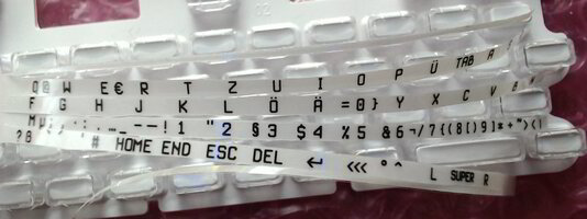
Although the rows are now splitted, the label is still in one part. This is to stop it from getting lost across the table, just in case. Only the current row I am working on will be on its own.
That brings a new issue: due to the rows being narrow, it is very hard to separate the adhesive protective layer from the label. Normally there are two of these protective layers next to each other, you can see the tiny gap in the closeup. When you bend the label, they separate themselves and you can peel them off more easily that way. But here we killed this advantage. I had to come up with some method although far from it being perfect.
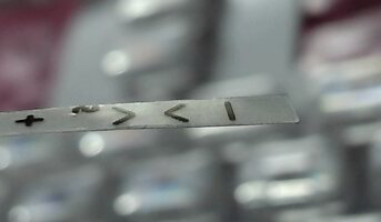
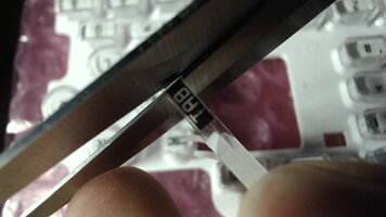
This is the rightmost edge of a row and this is where I want to start (in the picture I had done two label rows already). The protective layer is on the bottom side of course. Because there is a bit of excessive area anyway, I cut it off diagonally with a scissor, so that the adhesive protection layer is longer than the label itself (not done in the pictures I took but an idea I had later on). With cutting diagonally I mean that the label still is ending like this: ] but that its edge is bevelled diagonally.
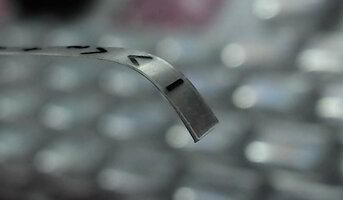
To further make the protection layer ending farther away, the end shall be bent down. Because the label is stiffer than the protective layer, it increases the chance of separating them from each other. Just don't fold it too much, a minimum bending radius of like 1mm or 2mm should be fine (as in don't go below that number).
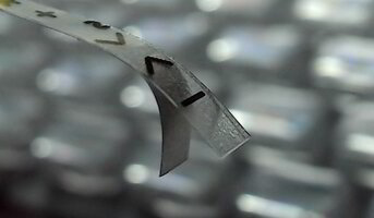
*layer peels off after minutes of cursing*
Remember the two adhesive protection layers I mentioned earlier. Do you see a dark unsharp line going down from the right of the pipe symbol? It is the other half of the protection layer. I was not aware that I cut along the gap and this has caused thin protection layers to stay on the labels. When I taped the key labels on the keys, I wondered why some edges were not sticking well - it was because of these thin protection layers. When I finally noticed it, I had all keys already applied so it was too late (I could still correct this but I am done for now. It is not too apparent).
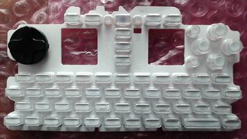
Now that we are ready to put our first key label, let's make sure that the keymat did not run away mysteriously.
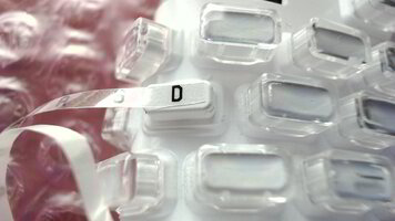
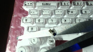
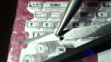
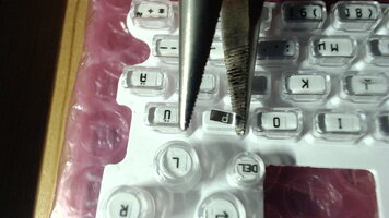
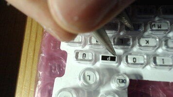
Let's remove the transparent key cap of our desired key. We may double check if heights and widths are fine. At first I thought 44x18 pixels were a bit too wide but I actually nailed it pretty good as I have found out later. I cut off right at the point were the key label starts on its left and where the next key starts. The key often sticked only on one side on the scissor and not fully, it allowed me to grab the key label easily with fine pliers and lay it down on the key. While the key label was not sticking, it allowed for adjustments to ensure that the character (not the cuttings) are straight and well centred.
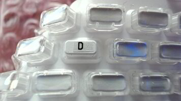
Once done, stroking spirals from the center to the outside of the key label surface lets the key label stick to the key.
Because I believed it was too wide, I've shortened the keys at first but as I said, eventually I did not need to do additional cutting at all.
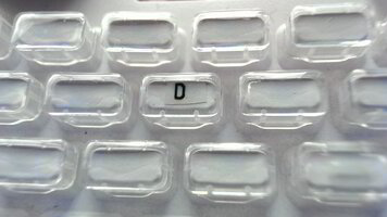
Plant the key cap.
I repeated this task for the rest of the keys.
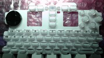
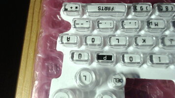
One label row is done. Now how would it look like if it was backlighted?
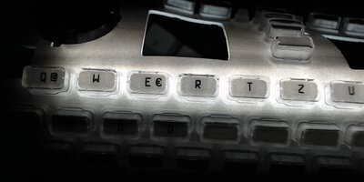
Nice.
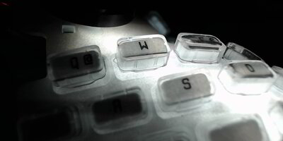
Awesome. Mmmm
Uh, alright. On a serious note it is a bit unfortunate that the keys are less brighter than the base of the keymat but the keys are still well readable. The key labels themselves barely swallow light.
As I've progressed I got better with applying the keys but there were a few key labels I had to redo because I crinkled one of them to death, two did not fit on the smaller round keys and one missed a backslash because of the string escape mechanism I built for FFmpeg. Yeah, even though I'm autistic I'm not autistic enough to spot the missing backslash before printing (yes, my username is meh but it is too cumbersome to change it across all services where I have registered with it, some don't even allow renaming). I fixed the escaping and also added something for the spacebar for some giggles.
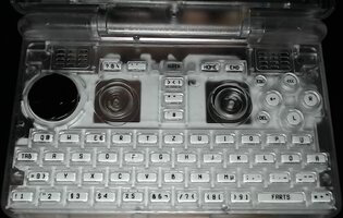
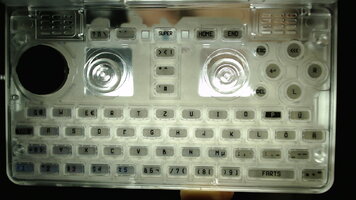
It's done. Surprise...
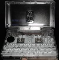
..., I don't have any Pyra electronics. I had to place the camera down and hold the Pyra upside down so that the keymat would not fall inside.
Now I only need to wait for the Pyra
First off, I wanted a key layout that is basically a standard keyboard with reordered keys. I have had bad experience with emulators and remote software regarding special key layouts. [This is what I came up with][0]. I've moved the number row to the bottom so that I have bend my thumbs less when writing just letters (at least in theory and with probing using a transparent Pyra case). I'm not fully satisfied with the layout though, I would love to have something that is more suited for C programming. Missing Function keys are not too much of a problem for me but might look later at how I cram an Fn modifier into the layout to place them on the number row somehow. I wanted to have only basic modifiers on the shoulder buttons that do not interfere with the desktop environment. If I can't get these all working nicely, I will have to resort to automatic layout switching based on the active application which is what I also want to avoid.
Now that the layout is pretty much done they have to be printed. For this I used a Brother PT-700 label printer and TZe-131 black on transparent 12mm tape made by Labelwell. This specific combination is not strictly needed. This tape does have a protective layer on top of the print, maybe someone can use label cartridges without that layer to decrease possible glossy effects or darkening because the labels are protected by transparent keycaps anyway. At the time of writing this the PT-700 is not officially supported by Brother on Linux systems but [there is a CLI tool for it here][1] or you are lucky and you can install the same program with your package manager. It can print text for you but I needed a more fine grained solution. The label printer CLI tool allows for printing a 1 bit monochrome image file with a fixed image height depending on what tape you are using (for 12mm it is 72 pixels and there is a little bit of padding between the printing area and the edges of the label). Due to the 1 bit monochrome pixel format and the lower resolution, smoothed fonts are unlikely to work out well. I wanted to use Iosevka but this was not possible with the small keys.
To create the image, I have written a shell script (have a look one of the spoilers below) that uses just FFmpeg to render one that contains all the keys I need. Using GIMP for this was too fiddly for me as it sometimes changes the font as I mark the text. The script allows for configuring each key with left, center and right aligned text and each text can be (optionally) individually tweaked in font and text size but the key size is fixed. The script tries to use up less total label length by packing them in rows with as less columns as possible. It first previews the result and then writes the image to label.png in the current directory. The bugs known to me are that you have to configure more than one key and that there is an issue with some fonts where tiny letters like punctuation marks are centred vertically but there is a workaround that works with less side effects if used with monospaced font. Configuration has to be done at the end of the script. There are a few more minor settings not mentioned here. Once configured, just run the script (in a terminal to see some logs).
[0]:
http://www.keyboard-layout-editor.com/##@_css=* { font-family/: monospace/; font-weight/: bold/; } ;&@_a:7&f:5&w:2.25&w2:0.75&h2:2;&=LSHIFT&_x:13.5&w:2.25&w2:0.75&h2:2&x2:1.5;&=RSHIFT;&@_x:0.75&w:1.5;&=LCTRL&_x:13.5&w:1.5;&=RALT;&@_y:-0.75&x:4.5&a:6&f:8&w:1.5;&=? \ ß&_w:1.5;&=` ¸ ´&_x:0.75&a:7&f:5&w:1.5;&=SUPER&_x:0.75&w:1.5;&=HOME&_w:1.5;&=END;&@_y:-0.75&x:7.75&g:true&f:3&w:0.5&h:0.5;&=&_x:1.5&w:0.5&h:0.5;&=;&@_y:-0.5&w:3.5&h:3.5;&=;&@_y:-0.75&x:1.25&g:false&w2:0.5&h2:1.25&x2:0.25;&=UP&_x:6&a:6&f:8&w:1.5;&=> | <&_x:4&a:7&f:3;&=ESC&_x:1;&=BKSP;&@_y:-0.75&x:4.25&g:true&w:2.75&h:2.75;&=&_x:4&w:2.75&h:2.75;&=;&@_y:-0.25&x:0.25&g:false&w2:1.25&h2:0.5&y2:0.25;&=LEFT&_x:1&w2:1.25&h2:0.5&x2:-0.25&y2:0.25;&=RIGHT&_x:5&a:6&f:8&w:1.5;&=° ′ ^&_x:5&a:7&f:3;&=ENTER&_x:1;&=RBTN;&@_y:-0.75&x:1.5&w:0.5&h:0.5;&=;&@_y:-0.25&x:1.25&w2:0.5&h2:1.25&x2:0.25&y2:-0.25;&=DOWN&_x:6&a:6&f:8&w:1.5;&=' ’ #&_x:4&a:7&f:3;&=DEL&_x:1;&=LBTN;&@_y:0.25&x:0.75&a:6&f:8&w:1.5;&= /@ Q&_w:1.5;&= ł W&_w:1.5;&= € E&_w:1.5;&= ¶ R&_w:1.5;&= ŧ T&_w:1.5;&= ← Z&_w:1.5;&= ↓ U&_w:1.5;&= → I&_w:1.5;&= ø O&_w:1.5;&= þ P&_w:1.5;&= ¨ Ü;&@_a:7&w:1.5;&=TAB&_a:6&w:1.5;&= æ A&_w:1.5;&= ſ S&_w:1.5;&= ð D&_w:1.5;&= đ F&_w:1.5;&= ŋ G&_w:1.5;&= ħ H&_w:1.5;&= ̣ J&_w:1.5;&= ĸ K&_w:1.5;&= ł L&_w:1.5;&= ˝ Ö&_w:1.5;&= ^ Ä;&@_x:0.75&w:1.5;&=/= } 0&_w:1.5;&= » Y&_w:1.5;&= « X&_w:1.5;&= ¢ C&_w:1.5;&= „ V&_w:1.5;&= “ B&_w:1.5;&= ” N&_w:1.5;&= µ M&_w:1.5;&=/; · ,&_w:1.5;&=/: … .&_w:1.5;&=/_ – -;&@_w:1.5;&=! ¹ 1&_w:1.5;&=" ² 2&_w:1.5;&=§ ³ 3&_w:1.5;&=$ ¼ 4&_w:1.5;&=% ½ 5&_w:1.5;&=/& ¬ 6&_w:1.5;&=// { 7&_w:1.5;&=( [ 8&_w:1.5;&=) ] 9&_a:7&w:3;&=SPACE&_a:6&w:1.5;&=* ~ +
[1]:

 github.com
http://www.keyboard-layout-editor.com/##@_css=* { font-family/: monospace/; font-weight/: bold/; } ;&@_a:7&f:5&w:2.25&w2:0.75&h2:2;&=LSHIFT&_x:13.5&w:2.25&w2:0.75&h2:2&x2:1.5;&=RSHIFT;&@_x:0.75&w:1.5;&=LCTRL&_x:13.5&w:1.5;&=RALT;&@_y:-0.75&x:4.5&a:6&f:8&w:1.5;&=? \ ß&_w:1.5;&=` ¸ ´&_x:0.75&a:7&f:5&w:1.5;&=SUPER&_x:0.75&w:1.5;&=HOME&_w:1.5;&=END;&@_y:-0.75&x:7.75&g:true&f:3&w:0.5&h:0.5;&=&_x:1.5&w:0.5&h:0.5;&=;&@_y:-0.5&w:3.5&h:3.5;&=;&@_y:-0.75&x:1.25&g:false&w2:0.5&h2:1.25&x2:0.25;&=UP&_x:6&a:6&f:8&w:1.5;&=> | <&_x:4&a:7&f:3;&=ESC&_x:1;&=BKSP;&@_y:-0.75&x:4.25&g:true&w:2.75&h:2.75;&=&_x:4&w:2.75&h:2.75;&=;&@_y:-0.25&x:0.25&g:false&w2:1.25&h2:0.5&y2:0.25;&=LEFT&_x:1&w2:1.25&h2:0.5&x2:-0.25&y2:0.25;&=RIGHT&_x:5&a:6&f:8&w:1.5;&=° ′ ^&_x:5&a:7&f:3;&=ENTER&_x:1;&=RBTN;&@_y:-0.75&x:1.5&w:0.5&h:0.5;&=;&@_y:-0.25&x:1.25&w2:0.5&h2:1.25&x2:0.25&y2:-0.25;&=DOWN&_x:6&a:6&f:8&w:1.5;&=' ’ #&_x:4&a:7&f:3;&=DEL&_x:1;&=LBTN;&@_y:0.25&x:0.75&a:6&f:8&w:1.5;&= /@ Q&_w:1.5;&= ł W&_w:1.5;&= € E&_w:1.5;&= ¶ R&_w:1.5;&= ŧ T&_w:1.5;&= ← Z&_w:1.5;&= ↓ U&_w:1.5;&= → I&_w:1.5;&= ø O&_w:1.5;&= þ P&_w:1.5;&= ¨ Ü;&@_a:7&w:1.5;&=TAB&_a:6&w:1.5;&= æ A&_w:1.5;&= ſ S&_w:1.5;&= ð D&_w:1.5;&= đ F&_w:1.5;&= ŋ G&_w:1.5;&= ħ H&_w:1.5;&= ̣ J&_w:1.5;&= ĸ K&_w:1.5;&= ł L&_w:1.5;&= ˝ Ö&_w:1.5;&= ^ Ä;&@_x:0.75&w:1.5;&=/= } 0&_w:1.5;&= » Y&_w:1.5;&= « X&_w:1.5;&= ¢ C&_w:1.5;&= „ V&_w:1.5;&= “ B&_w:1.5;&= ” N&_w:1.5;&= µ M&_w:1.5;&=/; · ,&_w:1.5;&=/: … .&_w:1.5;&=/_ – -;&@_w:1.5;&=! ¹ 1&_w:1.5;&=" ² 2&_w:1.5;&=§ ³ 3&_w:1.5;&=$ ¼ 4&_w:1.5;&=% ½ 5&_w:1.5;&=/& ¬ 6&_w:1.5;&=// { 7&_w:1.5;&=( [ 8&_w:1.5;&=) ] 9&_a:7&w:3;&=SPACE&_a:6&w:1.5;&=* ~ +
[1]:
GitHub - EtherGraf/ptouch-print: Print labels on Brother P-touch 2430PC printers on Linux
Print labels on Brother P-touch 2430PC printers on Linux - EtherGraf/ptouch-print
Just in case the keyboard-layout-editor website goes down.
Shell scripting is not my strength but I tried my best.
Tabs are assumed to be 8 characters long. They got replaced with 4 spaces each however so the formatting is a bit messed up unfortunately.
Edit 2023-08-20: On 2023-06-19 there have been some changes in FFmpeg regarding the drawtext filter that the script is using and the renderings may look different with the changes made. The drawtext filter seems to use the "libharfbuzz" library now. The last released FFmpeg Version before that change is is 6.0 (released on 2023-02-28). I haven't investigated how this will influence the script but I just wanted to let you know in case you are using it and wonder why things aren't working out. The rendering wasn't perfect anyway so hopefully the changes will improve on things or make the workarounds used in the script obsolete, may it be with fixes on the script or without.
Bash:
#!/bin/sh
# Scroll to the end for configuration.

# Escape FFmpeg filtergraph string values.
ffmpeg_filter_value_escape()
{
    printf '%s' \'"$(printf '%s' "$1" | sed --posix -E -e 's/(['\'\\':])/'\''\\\\\\\1'\''/g')"\'
}

# Construct a drawtext filter.
ffmpeg_filter_drawtext_construct()
{
    local_font_size="$3"
    local_font_name="$4"
    if test -n "$local_font_size" && test "$local_font_size" != "---" ; then
        :
    else
        local_font_size="$font_size"
    fi
    if test -n "$local_font_name" && test "$local_font_name" != "---" ; then
        :
    else
        local_font_name="$font_name"
    fi
    printf '%s' "drawtext=fontfile=$(ffmpeg_filter_value_escape "$local_font_name"):fontsize=$local_font_size:$1:text=$(ffmpeg_filter_value_escape "$2")"
}

# Append newlines to the text as a workaround for the vertical alignment issue.
append_newlines()
{
    if test "$vertical_alignment_workaround" = "1" ; then
        # This is 'nasty 'norc, but no other way is known at the time of
        # writing this...
        # The multiple continuous new line statements are to there to
        # render the additional characters offscreen.
        printf '%s\r\r\r\r\r\rÂ\rA\rg\ry\r'\''\r.\r,\r' "$1"
    else
        printf '%s' "$1"
    fi
}

# Construct drawtext filters for left, centered and right aligned text.
ffmpeg_filter_label_construct()
{
    a="$1"
    b="$2"
    c="$3"
    a_fs="$4"
    b_fs="$5"
    c_fs="$6"
    a_fn="$7"
    b_fn="$8"
    c_fn="$9"
    y='h/2-lh/2'
    if test "$a" = "---" ; then
        a=""
    else
        a="$(append_newlines "$a")"
    fi
    if test "$b" = "---" ; then
        b=""
    else
        b="$(append_newlines "$b")"
    fi
    if test "$c" = "---" ; then
        c=""
    else
        c="$(append_newlines "$c")"
    fi
    printf '%s%s%s' \
        "color=color=#ffffff:s=$key_width""x$key_height,$(ffmpeg_filter_drawtext_construct "x=1:y=$y" "$a" "$a_fs" "$a_fn")" \
        ",$(ffmpeg_filter_drawtext_construct "x=w/2-tw/2:y=$y" "$b" "$b_fs" "$b_fn")" \
        ",$(ffmpeg_filter_drawtext_construct "x=w-tw-1:y=$y" "$c" "$c_fs" "$c_fn")"
}

label_num=0
filters=""

# Build filters and assign an output filtergraph label for each key.
foreach_key()
{
    while true \
        && test -n "$1" \
        && test -n "$2" \
        && test -n "$3" \
        && test -n "$4" \
        && test -n "$5" \
        && test -n "$6" \
        && test -n "$7" \
        && test -n "$8" \
        && test -n "$9" \
    ; do
        filters="$filters$(ffmpeg_filter_label_construct "$1" "$2" "$3" "$4" "$5" "$6" "$7" "$8" "$9")[t$label_num];"
        : $((label_num=label_num+1))
        shift 9
    done
}

# Assemble all the filters together and run the filter expression.
render_keys()
{
    # Stack the generated keys together with FFmpeg's xstack filter.
    # Also try to organize them in rows and columns efficiently.
    filter_stack_in="[t0]"
    filter_stack_layout="0_0"
    filter_stack_layout_xoffset="+w0"
    filter_stack_layout_yoffset=""

    max_rows=$((max_printing_height / key_height))
    max_columns=$((label_num / max_rows + 1))
    current_row=1

    {
        i=1
        while test "$i" -lt "$label_num" ; do
            filter_stack_in="$filter_stack_in""[t$i]"
            filter_stack_layout="$filter_stack_layout|0$filter_stack_layout_xoffset""_0$filter_stack_layout_yoffset"
            filter_stack_layout_xoffset="$filter_stack_layout_xoffset+w$((i-1))"
            : $((current_row=current_row+1))
            if test "$current_row" -ge "$max_columns" ; then
                current_row=0
                filter_stack_layout_yoffset="$filter_stack_layout_yoffset+h$((i-1))"
                filter_stack_layout_xoffset=""
            fi
            : $((i=i+1))
        done
    }

    # Apply erosion filter if desired.
    # The 'null' default value is not specific to the shell scripting
    # language. It is an FFmpeg filter that outputs its input unmodified.
    filter_erode='null'
    if test ! "$erosion_pattern" = "0" ; then
        filter_erode="erosion=coordinates=$erosion_pattern"
    fi

    # Convert pixel format to mono if desired.
    pixel_format_mono_filter='null'
    if test ! "$pixel_format_mono" = "0" ; then
        pixel_format_mono_filter="split=4[mono_a][mono_b][mono_c][mono_d];color=#ffffff,colorlevels=romax=$threshold:gomax=$threshold:bomax=$threshold""[mono_tmp];[mono_tmp][mono_b]scale2ref[mono_b][mono_null];[mono_null]nullsink;color=#000000[mono_tmp];[mono_tmp][mono_c]scale2ref[mono_c][mono_null];[mono_null]nullsink;color=#ffffff[mono_tmp];[mono_tmp][mono_d]scale2ref[mono_d][mono_null];[mono_null]nullsink;[mono_a][mono_b][mono_c][mono_d]threshold,format=monow,format=monob"
    fi

    # Assemble the filters together to form a filtergraph.
    filter_expression="$filters$filter_stack_in""xstack=inputs=$label_num:layout=$filter_stack_layout:fill=#ffffff,$filter_erode,pad=w=iw:h=$max_printing_height:x=-1:y=-1:color=#ffffff,$pixel_format_mono_filter"

    # Pipe the filtergraph to FF* instead of placing it in arguments.
    printf '%s' "$filter_expression" | ffplay -f lavfi -graph_file pipe: -i aoeui
    if test ! -z "$output_path" ; then
        printf '%s' "$filter_expression" | ffmpeg -f lavfi -graph_file pipe: -i aoeui -frames:v 1 "$output_path"
    fi
}

# Start of configuration.

# This script renders a label image for custom key layouts.
# It first shows a preview. If quit with "q" on the window, it then renders
# the keys to a file. If it already exists, nothing is written.
# This script depends on FFmpeg and on libfreetype. For the font setting to
# work, libfontconfig is also required. FFmpeg also needs to be compiled with
# these libraries. This script was last known to be working with FFmpeg 4.3.1.

# Set the output path for the rendered image.
# Comment out to only show the preview.
output_path='./label.png'

# Set default font size in px. Some fonts (especially bitmap ones) only like
# certain font sizes. If you hit an invalid font size, FFmpeg will likely fail.
#font_size=16
font_size=18

# Set default font name. To use some specific style, append ":style=" and then
# one of Bold, Italic, Oblique, Light, Black, Bold Oblique, etc. depending on
# font support.
#font_name='Fixedsys Excelsior'
font_name='Terminus:style=Bold'

# Set key width and height in pixels.
key_width=44 # width of a normal Pyra key.
#key_width=60 # rough value for the spacebar (may be wider than this value).
key_height=18 # height of a normal Pyra key.

# Apply some workaround for fonts not aligning well vertically.
# Horizontal alignment might get lost, especially for variable width fonts.
# This is needed i.e. for the "Fixedsys Excelsior" font where small characters
# like punctuation end up being vertically center aligned.
# The workaround appends multiple newline sequences, inbetween are common
# characters which should force the increase of the line height.
# BUG: The bug is present in FFmpeg's drawtext filter, not in this script. I
# have to admit that the drawtext filter is probably not really suitable for
# this sort of thing than I have initially thought.
vertical_alignment_workaround=1

# Set the height for the resulting image. This is for labelwriters expecting
# fixed heights. The script tries to fit the keys with as less columns as
# possible across multiple rows. The stacked rows are then padded on the top and
# bottom to target the printing height. Obviously this value must not be smaller
# than the key height.
max_printing_height=72

# Convert the pixel format to 1-bit monochrome. Some printer software only work
# with 1-bit images. Smoothed fonts are likely to look messed up.
pixel_format_mono=1

# If monochrome conversion is enabled, the monochrome threshold can be set here.
# Values range from 0.0 (thinner contours) to 1.0 (thicker contours). For pixel
# perfect fonts this value should not affect the image (as long as it is not set
# to 0.0 or 1.0). If standard fonts are used and changing this value does not
# affect the image, consider checking font smoothing settings of your system.
threshold='0.6'

# Apply an erosion effect to add some bolding effect. Basically the current
# pixel is set to the darkest value out of the selected surrounding 8 pixels.
# Below are numbers for each surrounding pixel. Set the configuration value
# to the sum of the desired pixels. Set to 0 to disable this effect.
#  1  2   4
#  8  x  16
# 32 64 128
erosion_pattern=2

# Set the keys that should be rendered. Refer to the column description below
# the comment block. Shell scripting language rules apply.
# If a value is desired to be empty or some default value, set it to "---". The
# triple dashes will removed during the render.
# Because the drawtext filter inside FFmpeg can do some string formatting,
# characters like '*' or '%' have to be escaped so that FFmpeg sees two
# backslashes, i.e. 'test\*test' for use in apostrophe surrounded strings and
# "test\\*test" for strings surrounded by quotation marks. Labels containing
# whitespace need to be surrounded with apostrophes or quotation marks or
# escaped with a backslash, i.e. "A B", 'A B' or A\ B.
# Refer to the shell documentation for more details.
# BUG: Less than two keys will make the FFmpeg filtergraph invalid.
# TODO: Allow some way to allow one to actually render triple dashes.

# foreach_key may be replaced with a : to temporarily disable the list.

# Columns:
#_____________________________________________________________________________
#           Text          |        Font size        |        Font name        |
# left | centered | right | left | centered | right | left | centered | right |

foreach_key\
    ---    Q    @    ---    ---    ---    ---    ---    ---\
    ---    W    ---    ---    ---    ---    ---    ---    ---\
    ---    E    €    ---    ---    ---    ---    ---    ---\
    ---    R    ---    ---    ---    ---    ---    ---    ---\
    ---    T    ---    ---    ---    ---    ---    ---    ---\
    ---    Z    ---    ---    ---    ---    ---    ---    ---\
    ---    U    ---    ---    ---    ---    ---    ---    ---\
    ---    I    ---    ---    ---    ---    ---    ---    ---\
    ---    O    ---    ---    ---    ---    ---    ---    ---\
    ---    P    ---    ---    ---    ---    ---    ---    ---\
    ---    Ü    ---    ---    ---    ---    ---    ---    ---\
    ---    TAB    ---    ---    ---    ---    ---    ---    ---\
    ---    A    ---    ---    ---    ---    ---    ---    ---\
    ---    S    ---    ---    ---    ---    ---    ---    ---\
    ---    D    ---    ---    ---    ---    ---    ---    ---\
    ---    F    ---    ---    ---    ---    ---    ---    ---\
    ---    G    ---    ---    ---    ---    ---    ---    ---\
    ---    H    ---    ---    ---    ---    ---    ---    ---\
    ---    J    ---    ---    ---    ---    ---    ---    ---\
    ---    K    ---    ---    ---    ---    ---    ---    ---\
    ---    L    ---    ---    ---    ---    ---    ---    ---\
    ---    Ö    ---    ---    ---    ---    ---    ---    ---\
    ---    Ä    ---    ---    ---    ---    ---    ---    ---\
    =    0    '}'    ---    ---    ---    ---    ---    ---\
    ---    Y    ---    ---    ---    ---    ---    ---    ---\
    ---    X    ---    ---    ---    ---    ---    ---    ---\
    ---    C    ---    ---    ---    ---    ---    ---    ---\
    ---    V    ---    ---    ---    ---    ---    ---    ---\
    ---    B    ---    ---    ---    ---    ---    ---    ---\
    ---    N    ---    ---    ---    ---    ---    ---    ---\
    ---    M    µ    ---    ---    ---    ---    ---    ---\
    ';'    ,    '·'    ---    ---    ---    ---    ---    ---\
    ':'    .    '…'    ---    ---    ---    ---    ---    ---\
    '_'    -    '–'    ---    ---    ---    ---    ---    ---\
    '!'    1    ---    ---    ---    ---    ---    ---    ---\
    '"'    2    ---    ---    ---    ---    ---    ---    ---\
    '§'    3    ---    ---    ---    ---    ---    ---    ---\
    '$'    4    ---    ---    ---    ---    ---    ---    ---\
    '\%'    5    ---    ---    ---    ---    ---    ---    ---\
    '&'    6    '¬'    ---    ---    ---    ---    ---    ---\
    '/'    7    '{'    ---    ---    ---    ---    ---    ---\
    '('    8    '['    ---    ---    ---    ---    ---    ---\
    ')'    9    ']'    ---    ---    ---    ---    ---    ---\
    '\*'    +    '~'    ---    ---    ---    ---    ---    ---\
    '>'    '<'    '|'    ---    ---    ---    ---    ---    ---\
    '?'    'ß'    '\\'    ---    ---    ---    ---    ---    ---\
    '`'    '´'    ---    ---    ---    ---    ---    ---    ---\
    \'    '#'    ---    ---    ---    ---    ---    ---    ---\
    ---    HOME    ---    ---    ---    ---    ---    ---    ---\
    ---    END    ---    ---    ---    ---    ---    ---    ---\
    ---    ESC    ---    ---    14    ---    ---    ---    ---\
    ---    DEL    ---    ---    14    ---    ---    ---    ---\
    ---    ↵    ---    ---    24    ---    ---    ---    ---\
    ---    BS    ---    ---    ---    ---    ---    ---    ---\
    °    ^    ---    ---    ---    ---    ---    ---    ---\
    ---    L    ---    ---    ---    ---    ---    ---    ---\
    ---    SUPER    ---    ---    16    ---    ---    ---    ---\
    ---    R    ---    ---    ---    ---    ---    ---    ---\

# End of configuration.

render_keys
Once the image was rendered I tweaked a few things with GIMP to make it a bit more readable and drew symbols for the backspace and enter key.
This is how my first few tries went:

The lowest label was my first print with the transparent cartridge, as you can tell from the wobbly section on its left third. I checked how the text size went out and adjusted the text size afterwards. The two middle ones are identical prints, I just was very smart to reissue the last command on the wrong terminal and a second label went brrrr. With the top label I made further adjustments and that was finally the last major print. The padding on the left of each label is by nature of the label printer. Although it is wasted space, it is useful to at least have some space to hold the row when you have only a few keys are left.
The top label on a close up:

The blue color you see here are the activity lights of the C920 webcam. I don't have a proper camera because my previous mobile phones are broken. The C920 adds some weird sharpening/unsharpening filters that can't be turned off properly over v4l2 settings (I'm not referring to the unsharp area around the picture center as that is because of optics and thus the label being out of focus there.). But at least it allows me to adjust the focus manually.
Next was preparing the label to slice them up into smaller pieces. Clean your tools to have as less dirt and adhesives getting in the way as possible. I then went for slicing them up by rows first and then going key for key for each row. But I should have separated the adhesive protective layer a bit beforehand.

Although the rows are now splitted, the label is still in one part. This is to stop it from getting lost across the table, just in case. Only the current row I am working on will be on its own.
That brings a new issue: due to the rows being narrow, it is very hard to separate the adhesive protective layer from the label. Normally there are two of these protective layers next to each other, you can see the tiny gap in the closeup. When you bend the label, they separate themselves and you can peel them off more easily that way. But here we killed this advantage. I had to come up with some method although far from it being perfect.

This is the rightmost edge of a row and this is where I want to start (in the picture I had done two label rows already). The protective layer is on the bottom side of course. Because there is a bit of excessive area anyway, I cut it off diagonally with a scissor, so that the adhesive protection layer is longer than the label itself (not done in the pictures I took but an idea I had later on). With cutting diagonally I mean that the label still is ending like this: ] but that its edge is bevelled diagonally.

To further make the protection layer ending farther away, the end shall be bent down. Because the label is stiffer than the protective layer, it increases the chance of separating them from each other. Just don't fold it too much, a minimum bending radius of like 1mm or 2mm should be fine (as in don't go below that number).

*layer peels off after minutes of cursing*
Remember the two adhesive protection layers I mentioned earlier. Do you see a dark unsharp line going down from the right of the pipe symbol? It is the other half of the protection layer. I was not aware that I cut along the gap and this has caused thin protection layers to stay on the labels. When I taped the key labels on the keys, I wondered why some edges were not sticking well - it was because of these thin protection layers. When I finally noticed it, I had all keys already applied so it was too late (I could still correct this but I am done for now. It is not too apparent).

Now that we are ready to put our first key label, let's make sure that the keymat did not run away mysteriously.

Let's remove the transparent key cap of our desired key. We may double check if heights and widths are fine. At first I thought 44x18 pixels were a bit too wide but I actually nailed it pretty good as I have found out later. I cut off right at the point were the key label starts on its left and where the next key starts. The key often sticked only on one side on the scissor and not fully, it allowed me to grab the key label easily with fine pliers and lay it down on the key. While the key label was not sticking, it allowed for adjustments to ensure that the character (not the cuttings) are straight and well centred.

Once done, stroking spirals from the center to the outside of the key label surface lets the key label stick to the key.
Because I believed it was too wide, I've shortened the keys at first but as I said, eventually I did not need to do additional cutting at all.

Plant the key cap.
I repeated this task for the rest of the keys.

One label row is done. Now how would it look like if it was backlighted?

Nice.

Awesome. Mmmm
Uh, alright. On a serious note it is a bit unfortunate that the keys are less brighter than the base of the keymat but the keys are still well readable. The key labels themselves barely swallow light.
As I've progressed I got better with applying the keys but there were a few key labels I had to redo because I crinkled one of them to death, two did not fit on the smaller round keys and one missed a backslash because of the string escape mechanism I built for FFmpeg. Yeah, even though I'm autistic I'm not autistic enough to spot the missing backslash before printing (yes, my username is meh but it is too cumbersome to change it across all services where I have registered with it, some don't even allow renaming). I fixed the escaping and also added something for the spacebar for some giggles.

It's done. Surprise...

..., I don't have any Pyra electronics. I had to place the camera down and hold the Pyra upside down so that the keymat would not fall inside.
Now I only need to wait for the Pyra
Last edited:


