comradekingu
Glowing ember
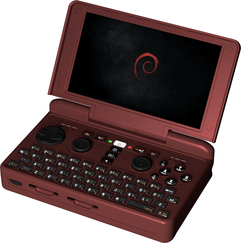
The currently used picture on the mainpage has a screen that looks scratched. Colour is a bit undesirable, sort of dark bronze looking.


Here we have a Sparkly Dark Blue, and a Sparkly Dark Red.
View attachment 12626
View attachment 12627
-Neelix
Only Ed can make it stop with a pic of the final case and colors!
Transparent(refraction) and reflective objects will only look good (as your reference) if a lot of work is put on the lights, that is, lighting it in a way that the incident angle makes the core transparent while keeping the ´borders´ light green.
Since it takes a lot of time, I can´t do it. But I did a quick test just to check it out, I hope that fits what you are looking for.
Nice, I think it would be fine for a prototype or for people that enjoy case modding thought a glow in the dark is probably a higher cost material and for how long would it hold its ability?

