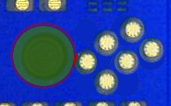
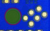
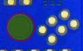
The case of the case.


My mistake. Still, I do think the problem is less pronounced in ED's configuration.
The keys are basically the same angle away in the 2 layouts, it should be almost exactly the same AFAICT.

Glad to be of service :) . I always wondered how people used multiple buttons on the genesis gamepad and you provided an example of a grip that achieves that, however alien it sounds to me :D .
Most Genesis games were made to use "A+B" or "B+C", so you normally just needed to place your thumb on the edges of each to press them together. However, for those that needed A+C, I would use that layout.

-God Ginrai
 
@Caine: Visual Chaos removed:

attachicon.gif
pyra_above2.png
That laylout would be perfect imho. I like it a lot! Nice work!
 
Last edited by a moderator:
Most Genesis games were made to use "A+B" or "B+C", so you normally just needed to place your thumb on the edges of each to press them together. However, for those that needed A+C, I would use that layout.

-God Ginrai
I also remember some Start+A (or B ) combos to get more actions onto the limited buttons. Start button was basicly above A and B so this was a compared easy combo.
That laylout would be perfect imho. I like it a lot! Nice work!
To get even more space for the 6 Action Buttons, the Nubs could be placed a little bit closer to the middle, I see enough room there. :) The 2 additional buttons still could be a little bit smaller if there is not enough room for this layout.
 
Last edited by a moderator:
I also remember some Start+A (or B ) combos to get more actions onto the limited buttons. Start button was basicly above A and B so this was a compared easy combo.
That actually depended on the controller you used. My Genesis controllers had the start button in the center. (while I am aware that some existed with the start button above the A) I don't remember playing any games myself that used Start-A, however.

-God Ginrai
 
Last edited by a moderator:
It moves the four main buttons too far inward (same as GGs layout).


The main priority should be to comfortably keep the four-buttons layout and add the two additional buttons in a way that has no negative impact on the four-button-layout.
So it's OK, as long as it doesn't cause any significant, if at all, discomforted by bringing it


inward?

I don't like Natsu's last picture as it adds two tiny buttons right next to the existing B and Y buttons, close enough to compromise those buttons' support and make it harder to press those buttons in isolation.
The extra two buttons is about,if not exactly,the same space as ED layout and GGs layout of all 6 buttons and since it smaller, the small buttons will be less likely to be hit. Mine keeps the big cross as well.

Note: Not against GG layout. Against the certain layout. For GG or my layout.


More or less.
 
Last edited by a moderator:
The genesis also had a 3 and a 6 button controller, so the layout would proposed would fit the genesis 6 button controller, sega saturn and the n64 button controller part.
Although the N64 had 2 larger buttons so you could feel the difference between the group of 4 and the other 2, the genesis had 3 large and 3 smaller ones.

But most controllers just use 2 or 4 buttons, so I can imagine ED wants those to be perfect.
If you would add 2 addition buttons wouldn't it be logical to have them be the same size as the rest?
Probably that wouldn't fit, so the current designed (left) side sounds logical to me, but they do look oddly placed compared to the mock-up.
 
The genesis also had a 3 and a 6 button controller, so the layout would proposed would fit the genesis 6 button controller, sega saturn and the n64 button controller part. Although the N64 had 2 larger buttons so you could feel the difference between the group of 4 and the other 2, the genesis had 3 large and 3 smaller ones. But most controllers just use 2 or 4 buttons, so I can imagine ED wants those to be perfect.
I think that the main "problem" regarding the layout of the action buttons is not the layout itself but the background where people come from. People who grew up with the SNES are mostly likely used to the SNES controller layout and will prefer that one. People who mainly played Genesis or Arcade stuff will most likely prefer that layout. For my part: my first and only consoles for a long time were the Gameboy and the Gamegear, so most controllers with more than 2 Action Buttons confuse my slow old brain. ;-) Just kidding... I also played lots of Amiga games using a 3 Button Genesis gamepad (Yay!). So the best option would be to make the action buttons a interchangable module, too. ;-)

And if we drive the "modular" concept to the max, we will get the world's first completely modular handheld console since there are so many discussions about various details of the pyra going on. Yay! :-D
 
Last edited by a moderator:
Sound expensive but maybe that could work. The keyboard should be a modular item anyway, so it could be possible to have complete pcbs with different controller lay-outs. Don't think it will happen though.
 
The genesis also had a 3 and a 6 button controller, so the layout would proposed would fit the genesis 6 button controller, sega saturn and the n64 button controller part. Although the N64 had 2 larger buttons so you could feel the difference between the group of 4 and the other 2, the genesis had 3 large and 3 smaller ones. But most controllers just use 2 or 4 buttons, so I can imagine ED wants those to be perfect. If you would add 2 addition buttons wouldn't it be logical to have them be the same size as the rest? Probably that wouldn't fit, so the current designed (left) side sounds logical to me, but they do look oddly placed compared to the mock-up.
It does fit. I have already shown this.

-God Ginrai
 
Well, I've made an overlay with the old Pandora and GodGinrais proposed new layout.
 
overlay.png

So, if you take your Pandora into your hands, you can see that the leftmost button is actually where the small bump around the nubs is.

While it wouldn't hit the nub while moving, it seems already like an issue to me.

My thumbs are not the biggest ones, but I already am afraid hitting the nub disc while trying to press the button.

With someone who's got even bigger thumbs, this will almost ALWAYS happen.

However, that's not the only issue...

nubissue.png

While the nub disc is only 1,4cm wide, the disc below the case is 2,0cm wide (marked in green).

The nub itself can move 1,1mm in each direction - and it this case, it would hit the button when you move the nub to the right.

Movement area is transparent red, the area where it hits the button is fully red.

So we already are hitting the button.

BUT! 

The keymat actually has to be a bit wider than the button as well, otherwise it's not stable... so the button needs to be even further away from the nub.

Now, GodGinrai mentioned that he kept the area with the buttons the same as in my current layout.

However:

nubed.png

As the nub moves in circles, my proposed layout with the two additional smaller buttons won't cause that issue.
 
Sorry, but what purpose does it serve to use the Pandora as reference when the Pyra is wider?

Also, what about my newest layout?
 
Sorry, but what purpose does it serve to use the Pandora as reference when the Pyra is wider?
Um... it isn't?

The Pyra has the exact same width as the Pandora...?

But even if it would be wider, it would still be hit by the nub disc ;)

Also, what about my newest layout?
Those are too close to the normal buttons, in my opinion.

Really something you easily would hit accidentally.
 
Um... it isn't?


The Pyra has the exact same width as the Pandora...?


But even if it would be wider, it would still be hit by the nub disc ;)
Someone said it was, but I guess we were mistaking.


I'll let GG argue that next point.

Those are too close to the normal buttons, in my opinion.


Really something you easily would hit accidentally.
The normal buttons themselves are closer to each other and the button can be


move slightly, if needed.
 
Last edited by a moderator:
I thank you for the constructive criticism, EvilDragon. You have raised some very interesting points.

Well, I've made an overlay with the old Pandora and GodGinrais proposed new layout.

attachicon.gif
overlay.png

So, if you take your Pandora into your hands, you can see that the leftmost button is actually where the small bump around the nubs is.

While it wouldn't hit the nub while moving, it seems already like an issue to me.

My thumbs are not the biggest ones, but I already am afraid hitting the nub disc while trying to press the button.

With someone who's got even bigger thumbs, this will almost ALWAYS happen.
 There is no reason to press the A button with anything other than the tip of your thumb. I don't see how this would touch the nub. On the Pandora, when I press down in the area that the A button is in my layout, I have a whole button-width between the left side of my thumb and the right edge of the centered nub. My thumbs are not large, but they are probably close to a medium thumb size. I'm pretty sure that even with larger thumbs this wouldn't be a problem.

However, that's not the only issue...

attachicon.gif
nubissue.png

While the nub disc is only 1,4cm wide, the disc below the case is 2,0cm wide (marked in green).

The nub itself can move 1,1mm in each direction - and it this case, it would hit the button when you move the nub to the right.

Movement area is transparent red, the area where it hits the button is fully red.
 Why is the bottom disc 0.6cm wider? I realize that it is larger so that the nub doesn't fall out of the case, however, can the distance wider not be closer to 0.3cm?

If we do that, then we get something like this:

pyra_counterx2_argument.png

This clears the issue where the nub would conflict with the buttons. Then, the only concern left would be the one you brought up about the keymat. However, if you move the nub inwards just a tiny bit:

pyra_counterx2_argument2.png

That problem is solved, too.

-God Ginrai
 
Last edited by a moderator:
Well, I've made an overlay with the old Pandora and GodGinrais proposed new layout.

attachicon.gif
overlay.png

So, if you take your Pandora into your hands, you can see that the leftmost button is actually where the small bump around the nubs is.

While it wouldn't hit the nub while moving, it seems already like an issue to me.

My thumbs are not the biggest ones, but I already am afraid hitting the nub disc while trying to press the button.

With someone who's got even bigger thumbs, this will almost ALWAYS happen.

However, that's not the only issue...

attachicon.gif
nubissue.png

While the nub disc is only 1,4cm wide, the disc below the case is 2,0cm wide (marked in green).

The nub itself can move 1,1mm in each direction - and it this case, it would hit the button when you move the nub to the right.

Movement area is transparent red, the area where it hits the button is fully red.

So we already are hitting the button.

BUT! 

The keymat actually has to be a bit wider than the button as well, otherwise it's not stable... so the button needs to be even further away from the nub.

Now, GodGinrai mentioned that he kept the area with the buttons the same as in my current layout.

However:

attachicon.gif
nubed.png

As the nub moves in circles, my proposed layout with the two additional smaller buttons won't cause that issue.
You have it right with your existing layout. Stick to it. It's perfect. Can you patent the layout?
 
Last edited by a moderator:
Why would you want to contribute to the already-growing pool of only-just-valid patents?
Especially seeing that there's nothing "novel" in putting buttons in this kind of configuration. It would be regarded as "obvious derivative work of existing stuff".

And there's really no point in patenting it unless you expect competitors to copy it. Which would be extremely unlikely, if anything they'd probably go for other configurations anyway.  
 
It would be regarded as "obvious derivative work of existing stuff".
That's a lot of faith in the patent system you have there. It'd be a shame if someone were to post a list of obvious patents that should have been rejected. :p But broken patent system aside (or directly related to) the only reason I can see ED wanting a patent on the button layout is so someone else doesn't patent it and then make life miserable for him.
 
But broken patent system aside (or directly related to) the only reason I can see ED wanting a patent on the button layout is so someone else doesn't patent it and then make life miserable for him.
You can't patent what's already out there. "Prior art" would be what's shown in this forum. This has already worked several time in the past to debunk silly patent cases. 

That's a lot of faith in the patent system you have there. It'd be a shame if someone were to post a list of obvious patents that should have been rejected.
I know the patent system is mostly broken, but I'm just thinking you would have to really twist your story to make this kind of button placement acceptable to the patent office though.  
 
Back
Top