You are using an out of date browser. It may not display this or other websites correctly.
You should upgrade or use an alternative browser.
You should upgrade or use an alternative browser.
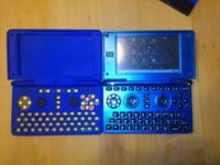
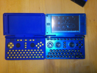
The case of the case.
- Thread starter EvilDragon
- Start date
Hồng Thất Công
Đả Cẩu Bổng Pháp
You just don't give up do you? I like your persistenceHere's a mockup using EvilDragon's top-down picture that he posted on Twitter. I left the red areas to show that the new layout does not go out of the boundaries that the old layout existed within.
pyra_above.png
-God Ginrai
Last edited by a moderator:
levi
Still fresh, damnit!
At least he has some new evidence this time. I like the look of that layout, although the buttons are a little close together. I'll leave it to someone with more experience to say whether they're too close together or not. FWIW I'm not against smaller buttons as per the Nintendo 3DS, it doesn't bother me.
Caine
Hardcore Member
To me that looks more likely to lead to accidental key presses than the current layout.I think the regular four buttons have worse accessibility this way. It also looks like a visual chaos.Here's a mockup using EvilDragon's top-down picture that he posted on Twitter. I left the red areas to show that the new layout does not go out of the boundaries that the old layout existed within.
While I like the idea of 3x2 buttons, in my opinion this mockup pleads more against it than for.
Caine
Hardcore Member
Hard to describe. It looks messy and unorganized to me.Visual chaos? What exactly do you mean?
It is a bit cluttered and somehow goes against the flow of the design of the entire unit.
Yes, vague...I know.
<edit>All lines of the unit (esp. the buttons) are straight and run horizontal/vertical
and here there is this sudden diagonal curve.... It just looks like it doesn't belong.</edit>
Last edited by a moderator:
TeDaDeS
Forum Addict!
btw. About the speakers (again, yes).
Looks like (with some tweaks) it could sound almost as loud closed as open.
Could come in handy when listening to music from the speakers, but now with the lid closed.
ED, will you be around all of the days on gamescom? I might be there on thu/fri.
Looks like (with some tweaks) it could sound almost as loud closed as open.
Could come in handy when listening to music from the speakers, but now with the lid closed.
ED, will you be around all of the days on gamescom? I might be there on thu/fri.
Pretty hard. As soon as you don't follow the specs guide from the manufacturer and make holes sideways, then the sound will be terrible.Looks like (with some tweaks) it could sound almost as loud closed as open.
There are exact specifications for a good sound - otherwise, it wouldn't be possible to have such good sound.
Yes.ED, will you be around all of the days on gamescom? I might be there on thu/fri.
You are going to have to record.ED, will you be around all of the days on gamescom? I might be there on thu/fri.
Last edited by a moderator:
TeDaDeS
Forum Addict!
I will make pictures/video, but it will be a while (august) before it happens. Sure ED will have updated us already, but never hurst to have more pics.
comradekingu
Glowing ember
If you have the screen only a little bit open it will be superloud 
Last edited by a moderator:
God Ginrai
Godmaster
The buttons are closer together than they are on the Pandora, yes. They should be about as close together as the GP2X buttons were. I also am not against smaller buttons, but EvilDragon seemed to be against this, so I have not made any suggestions using smaller buttons.At least he has some new evidence this time. I like the look of that layout, although the buttons are a little close together. I'll leave it to someone with more experience to say whether they're too close together or not. FWIW I'm not against smaller buttons as per the Nintendo 3DS, it doesn't bother me.
The buttons aren't any closer together than those on the GP2X are to each other. You should have no problem hitting the right button.To me that looks more likely to lead to accidental key presses than the current layout.
Trust me, they are not. All it does is move the cross to a different, equally accessible position. If the cross is any harder for you to reach at this position, then you would not even be able to reach the nub with your thumb.I think the regular four buttons have worse accessibility this way.
The visual chaos you see is due to the colored sections I left to show that the layout doesn't move outside of the area that the current layout does. I'll make a new image sometime tonight or tomorrow that colors in those sections so you can see the difference.It also looks like a visual chaos.
-God Ginrai
bzar
A Commando
GG, tried quickly to position my fingers according to your layout on my pandora. By keeping my thumb on A-X (tip on A, joint on X) pressing X with the joint caused the P button's corner get caught in it and register a press. Going through the rest of the buttons the layout somehow feels cramped, though it looks OK in your diagram.
The difference between a button and a nub is that for the nub you arch your thumb so only the tip touches the device. For the buttons you rest the thumb on several buttons, causing the keyboard being uncomfortably under the thumb while keeping it in game buttons' "home position" (A-X on pandora).
After trying this one, I vote for ED's current design.
ssokolow
Member
For the record, I'm not in favour of the smaller buttons God Ginrai's mockup would necessitate.
Grench
Forum Addict!
- Joined
- Oct 3, 2008
- Messages
- 6,629
The big thing that turns me off of the GG 6 button layout is that he has casually made the left/right controls asymmetrical.
The center of the standard 4 button game cross on the right side needs to be at a mirror-equal position to the gamepad on the left. Squishing it down and left into the nub & keyboard space is unacceptable. Having them mirror-equal allows your thumbs to naturally rest on the cross & the gamepad without thought. GG's design breaks this natural feel.
ED's design is BETTER than the 2 rows of 3 GG design. GG will never admit it - but that does not make it any less true.
Grench
Forum Addict!
- Joined
- Oct 3, 2008
- Messages
- 6,629
Same issue - you've shifted the center of the cross in the 4 buttons on the right side to be asymmetrical to the center of the game pad on the left. Granted it doesn't squish low and left as badly as GG's design does, but it's still offset.Hmm... What about mines?
God Ginrai
Godmaster
ekianjo
Hardcore Member
GG's suggestion is not bad, and I agree it would probably be better than having the weird 4 big buttons + 2 small ones as on the current prototype. But the space between buttons would be reduced, and that may be an issue for the case strength itself, so the plastic depth may need to be re-inforced and that may be a problem with the board below it.
If the nubs could be moved slightly more towards the center of the unit and make a little more space for the buttons, it may be possible to have 6 buttons as per GG's layout and slightly more space between buttons.
I see one concern, however: this breaks the "symetrical" design of the layout. Not sure how people feel about that, but it would certainly look a little off to the eyes when everything else in the pandora layout is properly aligned and positioned.
Similar threads
- Replies
- 152
- Views
- 43K


