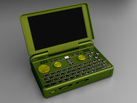
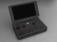
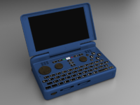
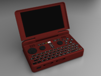
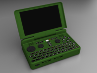
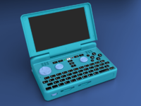
Pyra Blender File


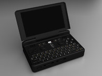
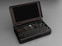
A black Pyra, a bit more work on the textures here and there, but without looking close at a reference, it is hard to guess.

The original object does not have the actual inside of the ports, I will take some from a gcw object I once did and add here, as well as both sd cards.

View attachment 12500

My_precious_gollum_lord_or_the_rings_oh_yes_mine_all_mine_go_away.gif
 
Right, here is how you play with it, anyone can do.

If you are total noob on Gimp and fear it to the point of hiding yourself to use, here the easiest part:

- Open the image. You should see an empty canvas.

- You should see a ´LAYERS´ window with a bunch of layers. Turn the visibility of all of them ON, it is the eye icon, the left quad on the layer name.

- Select either ´COLOR:Body´ or ´COLOR:Controls´. Change its mode to GRAIN MERGE on the top part of the layer´s window

- On the main image window, select ´COLORS´ menu and then, ´Colorize...' and messing with the parameters should change the part color.

In case you are moderate to advanced user, or you just feel the thrills of color/material modding, then check the material layers, changing their transparency changes the material behavior.

For example:

- Specular: changes the intensity of the bright light bounce on the object, if you use levels on it, you can get the highlights smaller.

- Reflection: changes the amount of reflections on the material.

- Surface and Diffuse: will change the object´s shading intensity.

- Refraction: this is about the keyboard, don´t bother.

- Background: Here you can mess with the background should you want it lighter or none at all.

For the sake of comparison between our attempts, it is best to leave the background as it is, Now let´s see what people can come up with it.

Apart from fine taste examples, I dare you post your most hideous attempt! 

As of my own tastes, I prefer the Pyra on the black and white side of things, and I would let the leds and backlights do the color shows:

- Total black everything, for those who super value the image and will be using it a lot indoors and at low light (like me).

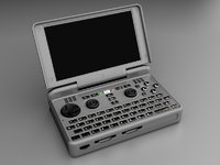
- Grey silver style as the Pandora, for a general-for-everyone in and out doors use while still not interfering much with the LCD and in case it is left under the sun, it won´t toast.

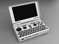
- White, for the more delicate sensitive user :p, fast to find it inside a purse or maybe you are a doctor and you use it at your medical place.

View attachment 12508

edit: Updated instructions for Blender, I was using photoshop names before...
 
Last edited by a moderator:
I will boot the game, come on guys, let´s see what you are up to on the color fronts!

Black, gray and white, with slightly different material settings each.

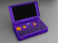
I also did a purple+orange just because!

ERICO-black.jpg

ERICO-grey.jpg

ERICO-white.jpg

ERICO-weird.jpg
 
For editing the files, it would be a lot nicer if they were in a lossless format like PNG or something
 
Nice ones! Don´t forget to mess with the material layers, those can produce some very nice results for some of the colors.

Don´t forget to change both COLOR layer´s mode to GRAIN MERGE on Gimp or LINEAR LIGHT on photoshop.

I also have a nice front angle and a back angle with closed lid that just needs render to this kind of composed file.
 
If you want stronger materials, you can simply duplicate the material´s layer by pressing right button over it and selecting ´duplicate layer', now you have an additional control layer to work with, but if you overdo, things will get grainy. If you must go crazy into the realm of impossible materials, you could even paint the reflections or the speculars into different colors.
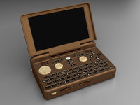
Here a Crazy Coffee Pyra:

coffe.jpg
 
Here the c64, forgot to change the angle a bit.

If feels strange with the action parts at one color not matching the keyboard overlay background.

View attachment 12506

Thanks. Though seeing your render of it puts me off. Maybe if it was all a bit darker, but never mind, I doubt that'll be an option regardless
 
If you want stronger materials, you can simply duplicate the material´s layer by pressing right button over it and selecting ´duplicate layer', now you have an additional control layer to work with, but if you overdo, things will get grainy. If you must go crazy into the realm of impossible materials, you could even paint the reflections or the speculars into different colors.
Here a Crazy Coffee Pyra:

View attachment 12520

Oh wow I really like this!

Classy colors! I'd buy this color without hesitating!

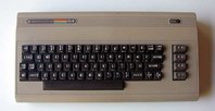
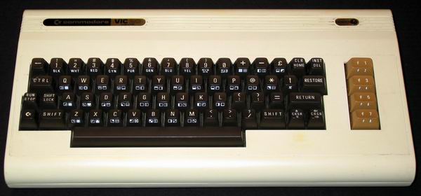
The C64 themed Pyra is a bit too Champagne-ish, more like a VIC-20 I think.

My bread bins are way darker more beige like. Also maybe the brown nubs of the coffee themed pyra would suit better.

Tbh a C64's dull color makes it look like it's made of recycled plastics. It's probably chosen to not stand out in any household / living room. ;)  

C64

Commodore64-Frontview.jpg

Vic20

vic20.jpg
 
Last edited by a moderator:
Black/Yellow "DANGER" stripes maybe? :D

Yep, something like that.

All in all it should be a dark color because everything looks better when you don't see every dirty detail. XD

Usually I would agree, however there are some things where I appreciate the wear and filth.  I doubt the Pyra will be one of them.  I have a yellow DMG Game Boy that still looks good, although that is a darker yellow, and it hasn't had a chance or reason to get really dirty.  White and very light colors will show age and dirt from normal use worse than that yellow.  Clear would be one, and I might like that, however the logo and other LEDs will probably look like shit.

I can't tell if the brown and orange is Grench's request.  It reminds me of Donkey Kong.  I had assumed the volume wheel would remain black since it probably comes as one piece.  I don't remember seeing anything from ED that would suggest anything different.

The C64 one still looks decent.  I think Eight Bit is right, and beige of all sorts was used on early computers to help them fit in with their environment.  I think grey was chosen because it stands out a bit but still works in a lot of places.  Bright colors (red, green, blue, pink) may have seemed too childish, or made them look like toys to some people, however these colors were used on other "serious productivity tools", just a bit before these computers.  Bright colors still seem common with hand tools.  Colors aside, I just don't like the super smooth glossy fingerprint magnet cases of some electronics.  That seems to give a cheaper and more toylike quality to the appearance than a properly chosen fun color.

That orange almost winds up looking Bakelite brown.  I wonder what happens if the buttons are all turned dark bronze or flat black on it.

Then that blank spot on the front edge to the right of the SD slots is just begging for a copper/bronze DragonBox label/sticker.

Steampunk influenced?

So - that got me thinking - which is always a dangerous thing.

What if the shoulder buttons, D pad overlay, nub tops and stylus (with replaceable nylon tip) were all molded/cast in actual bronze metal?

Hmmm...
I´m sure going to try the fabled aluminium case!

These sound good.  How about some titanium or stainless steel?  Don't waste your time making them, they are just other fun metals to think about (unless the steel rusts).  I am very fond of copper, however it may be too soft.

Medium grey and olive green look nice, as does ible's dark grey, minus the dpad/nubs/etc.  The icy blue by FelixNemis is really nice, but not for me.

erico, thanks for giving us a way to test colors ourselves.  I probably won't have time to try any out for a month or two.
 
Hey RygD, the time you took making that last post should be enough to knock out a dozen colors, it is really easy and quick to do, and quite fun.

Materials like that coffee version actually exists but may come a bit expensive, you´d have a base color (black in that case) and a reflective coat that paints its highlights into another color, like the brown/red coffee. I´m not sure how feasible using such would be, but in my opinion, it brings the possibility to have a color Pyra that dosen´t look like a lego toy.
 
Yep, transparencies and reflections need environment, current object with both together like the acrylic also takes the render from 1 min to 1 hour and hogs the station.

The blender file is impossible since I took everything into lightwave for the realtime render.

Gimp will be the most accessible way.

Lightwave? CHEATER! :D No wonder the renderings look that good. ;)

I didn't knew it is possible to make such realistic colour switching with an 2D GIMP image. I have no clue about GIMP but it seems you have alot, respect. I only know a little bit Photoshop to be honest.
 
While other tools can knock fabulous renders, I just can´t stand the horrible time they take to do so.

Photoshop and Gimp are pretty much the same stuff, and there are some fronts that I´d prefer Gimp. The trick is the composed layers forming the object.

Imagine a render takes 10h and then the client comes about and asks red to be blue and no reflections... :(

Using this way, you can have some non destructive controls on the final output without having to re-render (specially if each layer is 16bit per color channel).
 
Oh, it was an .psd file, vey nice. :D   Impressive how you were able to separate all these layers like reflections and surfaces, no clue how to do this or how to compose it back in a 2D image so that it works. ^^"

I tried to make an "silk" like surface, just played around with brightness/contrast of the light and reflection layers.
 

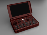
Pyra  winered.png
 
Last edited by a moderator:
i really like erico's black, gray, and white versions -- they look very professional -- as well as the dark coffee/chocolate one which has a bit more flavor ;).  most of the colors are trying to be cool (mine included), but i think erico's yellow one really has spunk.

i'm not going to try anything fancy with my gimp (just colorizing), but here's another beige:

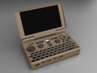
PyraBeige.png
 
Back
Top