Pyra Blender File


Oh, it was an .psd file, vey nice. :D   Impressive how you were able to separate all these layers like reflections and surfaces, no clue how to do this or how to compose it back in a 2D image so that it works. ^^"

I tried to make an "silk" like surface, just played around with brightness/contrast of the light and reflection layers.
 

View attachment 12525

I really like that base color.  Kind of a smoldering coal red.  From a practical perspective, though, maybe go with black for the nubs & etc?
 
This silk Pyra would go great inside a victorian house with its victorian furniture...

There, being cool standing on a table by the side of a red velvet chair! 

That latest beige looks nice by itself, but it would be hard to mix it with other peripherals.
 
Last edited by a moderator:
Another purple pyra:

PurplePyra.png

can we get a website up with all of the colors so far?  we might be able to community rank them somehow, though without one of these fixed polls...
 
Last edited by a moderator:
It could work, or maybe just getting the files and instructions together on a single thread. But I don´t know.

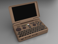
I will also upload 2 different angle files so we get a different view on our color choices.

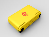
It will be similar to the one already uploaded, with difference that the last will have an extra color layer for the logo.

You can take a setting you did on one file and do on the others if you want it to look the same (at least consistently, because light does a bit of variation according to camera).
 
Last edited by a moderator:
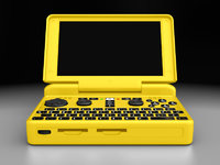
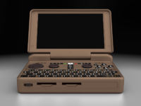
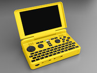
i really like erico's black, gray, and white versions -- they look very professional -- as well as the dark coffee/chocolate one which has a bit more flavor ;).  most of the colors are trying to be cool (mine included), but i think erico's yellow one really has spunk.

i'm not going to try anything fancy with my gimp (just colorizing), but here's another beige:

View attachment 12524
This looks really good, completely uninteresting yet very much so.

The way I like it.

Though.... that coffee theme.....
 
Would be also nice to have some alternative surface types like the "grainy" finish that ED showed in some of the 3D prints (also like classic Gameboy surface) or some slight "metallic" effects like some 3DS models have. "Plain", flat plastic like the Pandora had may be a little bit boring. ^^
 
Last edited by a moderator:
You can increase or double the reflection layer, note that all material layers but refraction is set to %50, so just raising that to %100 should add some spice.

Here is a zipped file containing all 3 different angles, use it the same as you all have been doing, don´t forget to change the mode on the color layers to grain merge.

I did the yellow Pyra with all angles and it is just a mater of doing the same modification on all 3 files.

Somehow, with gears, I prefer functionality over looks, hence I like the blocky cobra mkIII design of the pyra/pandora, specially if you take the price of doing this kind of work into account.
Therefore, apart from the black and white ones, and things like the coffee one (small mods on the black/white), I do like the yellow one for it stands.

Should you be doing server work on a full room of computers, I´m sure this color is going to be spot on within everything around.

View attachment Pyra_colors.zip

ERICO-yellow A.jpg

ERICO-yellow B.jpg

ERICO-yellow C.jpg
 
Would be also nice to have some alternative surface types like "grainy" finish ED showed in some of the 3D prints (also like classic Gameboy surface) or some slight "metallic" effects like some 3DS models have. "Plain", flat plastic like the Pandora had may be a little bit boring. ^^

It could be, I certainly would like to see a wood case. But such a small object made of wood would be impractical IMHO.
While different materials are cool, I read somewhere that the material used is going to be plastic with a slight pinch of reflection (glossy).
 
That flat spot to the right of the SD card slots still needs a manufacturer's name plate or something.  Yes - it crosses over a case seam so it would have to be a stick-on of some form.
 
from the outside, the yellow Pyra seems a bit too pikachu.

will investigate the other angles now...
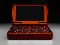
 
That flat spot to the right of the SD card slots still needs a manufacturer's name plate or something.  Yes - it crosses over a case seam so it would have to be a stick-on of some form.

I have been thinking about it, but extra logos and names would be too much to me with the already logo on the top.

Maybe a little stick plate with the unit number? Like the Caanoo?

from the outside, the yellow Pyra seems a bit too pikachu.

will investigate the other angles now...

It depends, if the pyra is coming out of the pocket of a kid wearing blue jeans and a red hat around the woods I´d certainly agree.

But if it is coming out of a guy´s cargo pants with full constructor costume around a skyscraper construction site, then it would rock!
 
One last bit, if you want to add some sort of grain texture, you can do so by adding some fractal texture to the texture channels.

Other then trying for the colors, if you´d like some fun, you can go for an impossible looks.

Here a rusted post-apocaliptyc pyra, fractal noise going only on the speculars, but lots of material change.

rusty.jpg
 
Thanks for the PSD files Erico.   I decided to have a play. :)

I wanted to see some dark blues and purples. The first one was actually an accident with regards to the controls,  but I figured it kind of worked, so I saved it.

PYRA_DarkBlue_LightBlue.png

PYRA_DarkBlue_Black.png

PYRA_DarkPurple_Black.png

-Neelix
 
The middle dark blue one is very university styled!

I´d wish to see someone posting a pyra color from a picture of your Pandora doing it, can I have that request please?

edit: no faking dowloading a pic! Show it with the gimp interface and just how you did it.
 
Last edited by a moderator:
Looking good. :) Interesting that you don't print this piece flat. But as long as it works it seems OK.

My first attempt was flat but it only makes contact with the bed in a couple of places, the rest is suspended which meant it needed to build up support and then print the case on that support.  The problem with that is support is meant to be easily pulled off, just there to make sure things like overhangs don't droop, it's not really meant to support the entire thing.  So as it finished the support and started printing the actual case it accidentally pulled away at one corner.  Printing it on the edge like this it has full bed contact, and required much less support.
Have you used BuildTak?

Mine was bonding better than a mechanical perfboard grip!

I was holding thin pieces.
 
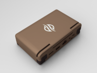
here's the beige one from different angles, though probably with a bit different colors than before:

in GIMP, I've put the modes to "Hard Light" and done colorize [26, 20, -13] to the case, and [10, 16, -47] and [0, 11, -1] to the controls (or maybe [11, 15, -51] and then [0, 11, -1]).  who knows what the LED is:
BeigePyraBack.png.2624e1242871643a4cc9e0a3edc015d8.png

BeigePyraFront.pngBeigePyraBase.png

and here's the purple one from other angles.

here for the case i used [279, 17, -52] on colorize, and for the controls i used [-82, 66] for brightness/contrast and then [229, 11, 3] on colorize.
View attachment 12540View attachment 12541View attachment 12542
 
Last edited by a moderator:
Back
Top