Pyra Blender File


OK, installed new Blender but still the same Problem: no materials, can't render anything, WTF? Is there no default material at least? And adding more lights stil ldoes nothing, hm, weird. How did you get an solid 3D Model?
EDIT: Ok, the file was messed up, from saving it in 2.49 version. It seems old Blend files are no longer compatible.
EDIT2: what a weird setup, the render only works with cycles (it#s an animation), not with the default renderer, no wonder the image looks strange. Hm, no clue how to make a "simple" renderer, the setup is to complex for my basic Blender knowledge.
EDIT3: Ok, since cycles Renderer is totaly different from "classic" renderer I had to take a look to the Interwebs to find some tips. Found this: http://blender.stackexchange.com/questions/18304/how-to-reduce-noise-in-cycles-render 
"Use Clamp" and adding more cycles did the trick it seems. Pic is with 24 cycles, people with more beefy PC's can do more of course. You should get better results with that. I only added one cheap light over the Pyra, not great but it seems to be OK. Reflections (buttons) are garbage of course, to get better results it would need some serious light setups plus environmental mapping etc...
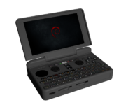
Pyra_grau.png
 
Last edited by a moderator:
Well, Cycle renderer is the one that allows more realistic lightings and materials, that's why I used it :D
It's the same Blender file I used to create the nearly photorealistic renderings of the Pyra before, btw :)
 
Why do you guys render it with such a glitter texture?

The grainyness is due to a low number of samples for raytracing, my render had 60 samples which removed most of the grainyness, but it takes considerably longer to render, the default in blender seems to be 15
You can try to increase the Anti Aliasing in the Render settings (F10) or try another AA method.
Ah, is that how that works. I just let it do it's thing and usually I scaled the screenshot down 60% which got rid of some of the grains... Hmm, F10 didn't do anything for me...
 

Im thinking the volume-wheel will always be black. So it can only match if dpad-ery is also black.

Does it have to be?

Here's a two-tone though all red..

twotonered.png

twotone_v2.png
 
Last edited by a moderator:
I meant the volume wheel is a part of the potentiometer, it comes in black. Making the dpad and nubs the same colour makes it match not only that, but also the keyboard.

Otherwise you run into something like the above, which is a good reason to keep the two parts the same.

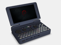
Black hand controls on dark gray makes it a little bit stylish, and also points out where things are.
 
Well, Cycle renderer is the one that allows more realistic lightings and materials, that's why I used it :D
It's the same Blender file I used to create the nearly photorealistic renderings of the Pyra before, btw :)

It looks indeed good, I just have 0 experience with that. ^^"
It seems it handles Materials and light sources different than the normal renderer. Lack of direct Anti Aliasing settings is also a little bit confusing at first but at  least there are workarounds. Biggest Problem is, I have a old PC, the rendering takes ages. :D  and I have not found the old rendering preview function yet. 0 Experience with the new Blender, I first have to study some tutorials.

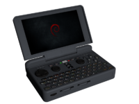
EDIT: I like the Anthracite Colour that Kiga posted. I'm sure this colour can look even better in reality, have to find some materials for Blender. I rendered it with a little bit more "roughness" than the default setting.

Pyra_Anthrazit.png
 
Last edited by a moderator:
Nubs, game pad, shoulders and stylus should all be black to match the volume wheel and keyboard background.  It's neat to experiment with alternatives, but the reality here is that the color for those parts should be black.  An advantage of this - black works/matches/fits with any main case color.

For the main case color - I do like that grey example with black controls above.

I'm curious - what is the actual color code used for the Fn layer on the keyboard?  It changes depending on the monitor/browser I use to view it on.  What would it look like to use THAT color, or a much darker version of it, as a case?  Might be too orange, but it's hard to tell on the renders.
 
I like the orange idea. Could someone make an International Orange (Aerospace) as well ? It's #FF4F00. Maybe for an Halloween Roadwork batch :lol:

I think that if we do black buttons, it should be matte. A very dark grey would be best I think. Just bright enough for us to find them in the dark when lit by the screen only.
 
I REALLY dig the C64 brown/beige colour. The utilitarian/militaristic feel it gives is so satisfying and I like that it is an uncommon colour.
I also liked the dark grey colour.


It is a shame that we may have to stick with black controls and stylus.


I like the orange idea. Could someone make an International Orange (Aerospace) as well ? It's #FF4F00. Maybe for an Halloween Roadwork batch :lol:

I think that if we do black buttons, it should be matte. A very dark grey would be best I think. Just bright enough for us to find them in the dark when lit by the screen only.

Or maybe darken it up a bit/lot?
https://www.colorcodehex.com/7e2700/
https://www.colorcodehex.com/661f00/

I'm fond of the very dark not quite black colors.

I still haven't figured out what color the Fn markings are - depending on which computer/monitor/phone I use it varies between burnt orange and an orange tinged red.
 
Last edited by a moderator:
The color on the keymat texture is #F39200, however helpful that is to you. I see it as a pretty normal orange, maybe with a bit more of yellow in it.
 
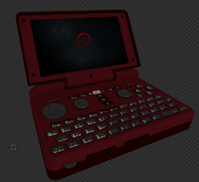
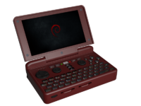
Another red Pyra, I tried a different (plastic) material from http://blendermada.com/materials/ with a wine-red tone. Looks a little bit like the 3DS XL or so. ^^" 
Well, I personaly still prefer black/dark charcoal grey/anthracite color but since many people seems to like redish Pyras, why not give it a try. This one here I could accept, maybe even a little bit darker.


Pyra_weinrot.png
 
I like the orange idea. Could someone make an International Orange (Aerospace) as well ? It's #FF4F00. Maybe for an Halloween Roadwork batch :lol:

I think that if we do black buttons, it should be matte. A very dark grey would be best I think. Just bright enough for us to find them in the dark when lit by the screen only.

Or maybe darken it up a bit/lot?
https://www.colorcodehex.com/7e2700/
https://www.colorcodehex.com/661f00/

I'm fond of the very dark not quite black colors.

I still haven't figured out what color the Fn markings are - depending on which computer/monitor/phone I use it varies between burnt orange and an orange tinged red.
I am with you on the really dark grey, and am fine with black.

As for the Fn markings, I think ED said it is based on the markings on some of Motorola's last smartphones with a keyboard.  If it is the color I think it is, looking at it right now it appears to be a yellowish orange when backlit.  When not backlit I get the same kind of changes under different lighting conditions as when switching displays and looking at the Pyra pics.  I don't think it would make a good choice for the case (a bit too yellow for my taste).


Fusion_Power, I would probably like something a little darker than that red.
 
Last edited by a moderator:
I think that if we do black buttons, it should be matte. A very dark grey would be best I think. Just bright enough for us to find them in the dark when lit by the screen only.

The only controllers I own with matte d-pads on are my Atari Jaguar controllers.  Everything else either came with a glossy d-pad or has worn that way over the years.

The glowing logo on the back of the lid should be enough to spot a live pyra in the dark.  Or the keypad lights (next to the power button) which I think will always be lit even if keypad backlight is set to off/black, even if the lid is open but screen off.
 
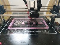
Say, EvilDragon, do you know if the model needs to be scaled at all?  I just exported it directly and started printing one part and it is significantly larger than the Pandora, like maybe 4-5cm wider.  Once it's done I'll take a proper measurement and find out the right scaling factor I guess, and then either start over or continue with my ginormous case.
 
I like the orange idea. Could someone make an International Orange (Aerospace) as well ? It's #FF4F00. Maybe for an Halloween Roadwork batch :lol: I think that if we do black buttons, it should be matte. A very dark grey would be best I think. Just bright enough for us to find them in the dark when lit by the screen only.

Or maybe darken it up a bit/lot?
https://www.colorcodehex.com/7e2700/
https://www.colorcodehex.com/661f00/

I'm fond of the very dark not quite black colors.

I still haven't figured out what color the Fn markings are - depending on which computer/monitor/phone I use it varies between burnt orange and an orange tinged red.
[COLOR= rgb(89, 89, 89)]What if the buttons and nubs matched the Fn script colors and the case were a very dark complimentary shade?[/COLOR]
Could one of you blender geniuses render up one with:
#661F00 case color  (It's a very dark orange)
[COLOR= rgb(89, 89, 89)]#FF4F00 buttons/nubs color (same orange as Fn label colors)[/COLOR]

I was considering requesting that combination on a prototype, but it may be just too much orange.
 
 
Say, EvilDragon, do you know if the model needs to be scaled at all?  I just exported it directly and started printing one part and it is significantly larger than the Pandora, like maybe 4-5cm wider.  Once it's done I'll take a proper measurement and find out the right scaling factor I guess, and then either start over or continue with my ginormous case.

Will you post a photo of your print? What colour are you printing in?
 
I unfortunately had to kill the print. I'm doing the most difficult part first, involving a lot of support, and sadly the one side warped a little and lifted off the support structure.  I need to change the supports a little in order to get it to work better.
And as long as I'm waiting I may as well wait until I can confirm the measurements before starting over.

IMG_20151020_172548.jpg
 
Back
Top