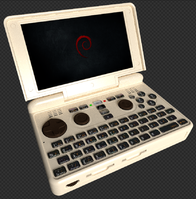
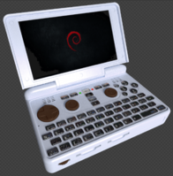
Pyra Blender File


Damn, it really sems to not work correctly with old blender 2.49, I only get the wireframe must investigate more.
Well nice renderings guys but please: add more lights! :D
http://wiki.blender.org/index.php/Attic:Old/Manual/PartV/Pseudo-Global_Illumination
Use global illumination (ambient occlusion) or fake it (in Blender, you have to fake alot) there is an GI option in the world settings somewhere, it need high res and more AA to look not to noisy but it works. Not sure where this option is in the new Blender versions. But you also can have good results with 3 lights, up and front, back lights.

Heh, I couldn't work out how to add lights (though to be fair, I didn't spend too long looking)
 
add-->lamp or so, in old blender it was space bar then choose the type of light. ^^  But with Ambient Occlusion it should be fine to have some "global" lights. ^^"  
Problem is, the newer Bledner is completely different from the old versions, new GUI, new hotkeys, different buttons and functions. More beginner friendly of course but if you only know the old Blender, it's really confusing. :D
 
 
Last edited by a moderator:

That color is retro :D For a thick and not so pretty device, it is quite a good fit ! I could see myself with that Pyra, being sure nobody will try to steal it from me.
i like this color, and the following:


really nice red, dark-gray, and green, though i'd prefer a bit darker on green (but the hue seems nice).  here's my attempt at darkening it using brightness in Gimp: pyragreen.png
 
Last edited by a moderator:
So far, I like marine blue, greys and the first dark red the best, in that order.
I like the C64 color, but could you lighten it a bit/lot ? Try papaya whip (#FFEFD5) for example.
I'd rather have the buttons in dark grey. Color would be a bit weird and black would look cheap... if you ever can look at it in the dark.

Personally, I think that colour is too light, but here you go

snapshot2.png
 
Part of me is shuddering in disgust...   another part is thinking this is definitely a colour that ED should be offering,  as long as there are some tasteful options as well. :)   (like one of the dark blues or greys shown in the other renders)

Out of interest,  is there any chance of seeing some renders that have the top/back of the lid and the bottom of the base in black and the bezel and top of the base in a dark blue?  (and also the other way around) 

-Neelix
 
Part of me is shuddering in disgust...   another part is thinking this is definitely a colour that ED should be offering,  as long as there are some tasteful options as well.

:)   (like one of the dark blues or greys shown in the other renders)

Ugh, all of me shivered in disgust, and a part of me died when it rendered on the screen for the first time
 
Out of interest,  is there any chance of seeing some renders that have the top/back of the lid and the bottom of the base in black and the bezel and top of the base in a dark blue?  (and also the other way around)

I'll see what I can do tomorrow. You do know that unless ED does two mould runs in different colours, this won't be an option.
Still, I'll see if I can figure out how to do it.
 
Why do you guys render it with such a glitter texture?
 
Why do you guys render it with such a glitter texture?

The grainyness is due to a low number of samples for raytracing, my render had 60 samples which removed most of the grainyness, but it takes considerably longer to render, the default in blender seems to be 15
 
Out of interest,  is there any chance of seeing some renders that have the top/back of the lid and the bottom of the base in black and the bezel and top of the base in a dark blue?  (and also the other way around)
I'll see what I can do tomorrow. You do know that unless ED does two mould runs in different colours, this won't be an option.

Still, I'll see if I can figure out how to do it.

Yeah,  I know, and given what ED has said that doesn't seem likely.  But until he specifically says that multiple runs in different colours aren't an option I'm going to hold out hope.  :)      It also occurred to me that if he did say (for example) 2500 cases in dark grey or black,  1250 in dark red, and 1250 in dark blue,  he could offer choices of:
* Dark red
* Dark red, with grey/black interior
* Grey/Black with dark red interior
* Grey/Black
* Grey/Black with dark blue interior
* Dark Blue with grey/black interior
* Dark Blue

Thanks in any case. :)

-Neelix
 
The back/underside render result above shows a potential error in the case plastics.  It still has the cutout for the combination eSATA & USB port instead of the USB only form factor.  It could leave a gap on the edges.  Is that intentional?

Good to see that the lanyard hole is still there - and a bit towards the left where it 'should be'.

Nobody has gone completely 'dark dark red' yet.  Darker - like nearly black.  Maybe in the #450000 to #500000 range?  Please show it with an intense off-set light source so we can see how highly lit vs off-lit sides show the color differential?

Thank you!


That doesn't look right if the game buttons are not chocolate colour, too.
 
So far, I like marine blue, greys and the first dark red the best, in that order.
I like the C64 color, but could you lighten it a bit/lot ? Try papaya whip (#FFEFD5) for example.
I'd rather have the buttons in dark grey. Color would be a bit weird and black would look cheap... if you ever can look at it in the dark.

Personally, I think that colour is too light, but here you go

View attachment 12373
Yay for massive banana cases ! :)
Okay, I overdid it. But something in-between, a bit darker and less saturated would be nice I think.
 
Why do you guys render it with such a glitter texture?

The grainyness is due to a low number of samples for raytracing, my render had 60 samples which removed most of the grainyness, but it takes considerably longer to render, the default in blender seems to be 15
You can try to increase the Anti Aliasing in the Render settings (F10) or try another AA method.
 
Here's Red, Blue, Purple, and C64-ish :)   (For somebody who doesn't use Blender, it's not exactly user/beginner friendly!)

View attachment 12352

Oh man, I really like this. It suits the bulky shape of the device very well!
The only thing missing are the grill lines that can be seen on top of each c64, running from 1 speaker to the other on the Pyra. :wub:
I like this far better than any of the bright color renders as can be seen above and less ordinary/dull than black or grey. It does not look like a toy at all like this imo. More like some military device or something.
Anyway, unlike clear plastic or some bright color, this I would not be ashamed of being seen with.
Do we have a new runner up to red and black and solid black?  I like the look of this one more than I thought.  I also felt it had more of a military look, probably because of the color choices and possibly due to "lighting" in the pic.  Although I would absolutely get an Extreme Green (translucent Nintendo color) I too prefer less in your face bright colors with dark red being the only fun color I think we should be considering.


Anthracite looks nice.  It seems slightly blue, and is about as blue as I would want to go.

On the pink, it isn't really the right pink for me, but I bet there are many that would love it.  If that was the color it was made in I would still buy it.


Why do you guys render it with such a glitter texture?

Maybe they aren't doing it and the Pyra is just that awesome.


D'oh!  missed the new page...
 
 
Last edited by a moderator:
Back
Top