PGS Windows 10 gaming handheld - GPD WIN competitor


Ooh, I've just noticed that enter is on FN1 and right arrow, while shift is FN2+ALT! You'd better hope either FN2 or SHIFT is sticky or you're going to need three thumbs for any capital letter and four thumbs to press shift+enter or shift+FN key
 
hello its bean a couple of days. pgs lite keyboard looks like its a touch keyboard too me. ps also i noticed a lot of u are italian I'm too but my dad is american.
 
ps also i noticed a lot of u are italian I'm too but my dad is american.
The site's location thing is a bug, seems that it randomly changes location or changes everyone to the same location depending on how it's mis-behaving.
 
huh
[doublepost=1473254508,1473254336][/doublepost]i think the layout on the pgs is worst than my first phone
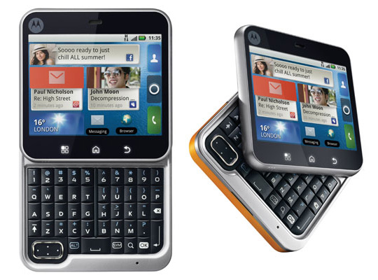
motorola-flipout.jpg
 
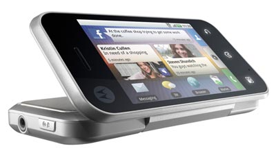
The Motorola Flip was one of the last time a phone manufacturer tried to do something else than a brick. I kinda wish it had worked better for these different form factors, maybe it could have led to interesting designs instead of bricks, bricks and bigger bricks.
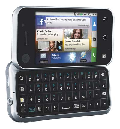
 
I liked the Samsung Alias series honestly, only if it had a good OS and a more powerful SoC.
 
The PGS & GPD Win keyboard designs are proof that the keyboard threads (keyboard wars) here were not a waste of time. It is rare to have such overwhelming examples of failure to prove how good another outcome is.

That PGS layout though, wow - I thought I had some wild and crazy layout designs. That one is simply bizzare. It's as if someone wanted to make it as difficult as possible to use. Both the PGS and the GPD keyboards have that bizzare unintegrated approach of trying to completely separate the keyboard and the game controller key functions to the point of redundant capabilities in the foreground (arrow keys and d-pad).

At first I thought that the PGS keyboard had gone all 1930s typewriter and dual tasked O as 0. After all, who would want to do math on the thing? Of course, since their device is in theory also a phone, nobody would ever want to easily put in a 0 as a part of a string of numbers... like dialing a phone... oh, wait... um... wtf were they thinking?
 
Just saw a interview with Nadir from a week ago.
http://www.thenerdmachine.com/introducing-the-portable-gaming-system-by-portable-solutions/
Pretty much all fluff and nothing substantial unsurprisingly.
Still claiming March 2017.
I guess PGS has preorders in Japan now.

http://vsmedia.info/2016/09/02/pgs-lite/
株式会社ドゥモアが、同社が運営するキュレーションセールスの「ヴェルテ」にてPGS Lab社製ポータブルPCゲームコンソール「PGS Lite」の取扱を開始すると発表した。

「PGS」は、発表直後から超人気でクラウドファンディングプラットフォーム「Kickstarter」で40万ドルを集めながら、「無茶だ」「困難だ」との指摘のアンチ大合唱に自らキャンセルし、自力で開発に漕ぎ着けた世界で注目されている携帯ゲーム機プロジェクト。Windows 10とAndroid 6.0を搭載しており、ポケットに入る程度のサイズならがハイスペックなPC向けゲームもプレイできる性能を有している。なお、ドゥモアでは既に「PGS Lite」の上位機種「PGS Hardcore」の国内販売も行うことを先月発表している(過去記事はこちら)。「PGS Lite」の商品および販売概要は以下のとおり。
Dumoa Co., Ltd. is the company "Verte" in the curation sales, which operates PGS Lab announced that it will start the handling of manufactured portable PC game console "PGS Lite".
Lite
http://welte.jp/ca3/33/p-r-s/
Hardcore
http://welte.jp/ca3/26/p-r3-s/

Anyone know anything about Welte?
 
Last edited:
i know i loved that phone it was just 80 euros its in my collection of gadgets:D
its also very small its called motorola flipout again epic phone from 2012
[doublepost=1473280245,1473279970][/doublepost]omg just saw the alias series they look epic
 
Except they'd only make a loss by selling GPD Wins for the prices they're trying to sell PGS devices for.

No problem, their investors agreed to cover any and all expenses.

zero is there, it's on Fn1 9.

because it's a great idea to have two function keys...

but "function 19" does sound like the name of a good sci fi thriller.

Yeah I know it's "there", just not as a first class citizen but some lesser function of another key. It is, frankly, humiliating.
 
To be fair on the GPD WIN, it's negatives are a left aligned KB with keys that are close to each other. As for specifically the layout , that's something entirely different, it's a standard layout, and to be fair, a positive the WIN has above the others. All the keys are there and in the standard positions.
As a side note, all GPD had to do to centre the letter keys, was to switch both columns on the right to the left, and the KB letter keys would have then been perfectly centered. I still don't know why they didn't do that at least, especially considering all the other changes they made. The keys would have been close together still, but the biggest negative IMO would have been corrected.

The Pyra has well spaced keys and centered letter keys. To achieve the spacing, it went with a reduced key KB sacrificing a full key layout, which means a number of punctuation and symbol keys are scattered to the wind. It's the trade off that had to be made to get the key spacing. And to be fair , I think most people would agree that it's the right trade off to make. But still , there was a price for that

As for the PGS, hmmm, as others have said , there is a number of issues. They would have to change it IMO to include domed keys, another coluoum so P isn't where it is and f10 and 0 can be added to the top line and also enter added. I'm sure they will make lots of changes to that though, if it ever comes out.
 
huh
[doublepost=1473254508,1473254336][/doublepost]i think the layout on the pgs is worst than my first phone
View attachment 29174

The Motorola Flip was one of the last time a phone manufacturer tried to do something else than a brick. I kinda wish it had worked better for these different form factors, maybe it could have led to interesting designs instead of bricks, bricks and bigger bricks.

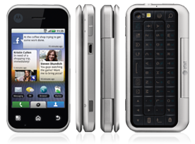
My first Android was a Motorola Backflip:
moto-backflip-att-frontface_angle-400.jpg

It would close up like this with the keyboard on the outside:
7313-hero.png


Spec-wise, it was in the ballpark of the original G1 Android phone but circa 2010. So it was very low-end, but it was the first that AT&T carried. The thing is, I loved the formfactor even if I hated the performance. The keyboard was a single piece of soft plastic that would flex and the buttons were underneath and had a nice click to them. It was fairly rugged, actually. The camera being on the flip out keyboard could be used forward-facing for video chats. And the keyboard could be used as it's own stand and it could be put into a desk mode of sorts:
moto-backflip-att-flipped-400.jpg

I actually had it worked out that I could insert it into the phone cubby in the dashboard of my car with the screen poking out and run Google Maps on it. It was super handy.

To be honest, I always wished that someone would take this kind of approach, but with an integrated gamepad instead of the keyboard. Even a cell phone case would have been nice, even if it blocked the camera. I remember that the iControlPad2 reminded me a lot of this design.
 
The Pyra has well spaced keys and centered letter keys. To achieve the spacing, it went with a reduced key KB sacrificing a full key layout, which means a number of punctuation and symbol keys are scattered to the wind. It's the trade off that had to be made to get the key spacing. And to be fair , I think most people would agree that it's the right trade off to make. But still , there was a price for that

Scattered to the wind? Then you clearly haven't looked closely enough. Yes, a lot of the punctuation symbols had to move to the Fn layer. However, sets of punctuation keys were maintained and symbol pairs that normally existed on one key were retained over/under their respective pair within the Fn layer. There was nothing random about the symbol placement on the Pyra layout. Placement rules and ease of use were given a -lot- of thought.
 
@Grench

Lets see

1) the fullstop normally on the right of the M key on the right side. Is now on the left of the Z key on the other side of the keyboard.

2) the comma normally on the right of the M key on the right side. Is now on the left of the Z key on the other side of the keyboard

3) the "<" normally on the right of the M key on the right side. Is now on the left of the Z key on the other side of the keyboard

4) the ">" normally on the right of the M key on the right side. Is now on the left of the Z key on the other side of the keyboard

5) the "/" normally on the right of the M key on the right side. Is now on the left of the Z key on the other side of the keyboard

6) the ";" normally on the right of the M key on the right side. Is now on the left of the Z key on the other side of the keyboard

7) "=" and "-" where on the top row of keys on the right side next to "0", now they are on the bottom row on the left side oin the Z and X keys.

8) "?" is on the A key rather than on the right side of the keyboard rather than next to shift on the right side, It's also on a different row than normal

9) the ' and " keys, again on the opposite side of the keyboard to where they are meant to be

10) the + key normally on the top row , on the far right. Is now on the left side on the S key.

etc etc

And so on and so forth. Sure, if there are pairs they are generally together but they are nowhere near their proper placement. The placement of the punctuation and symbol keys are all in non standard and often completely opposite positions - the exception being the symbols etc on the number keys. If you use a standard keyboard and then use the Pyra KB, then a large number of the symbol and punctuation keys are not anywhere near where they are meant to be. Which is the issue I'm referring to. As I said, I understand why that is and except the trade off for why it was done. But it is still a negative.
 
Last edited:
But it is still a negative.
Compared to the Pandora, the Pyra's keys look at least somewhat organized. And in the end the Pandora wasn't at all too difficult to get used to after a bit of use.

It entertains me greatly how much these keyboard discussions end up. Someone complains about the location, they say the keys would be better elsewhere, but they have to shift a ton of other keys to get it to where it is, then some other person comes in and complains why some other keys are the way they are and it's one endless argument...
 
Last edited:
Back
Top