Panjoust - A New Simple Platformer


Or this demon as a lava creature:

348mtt0.png


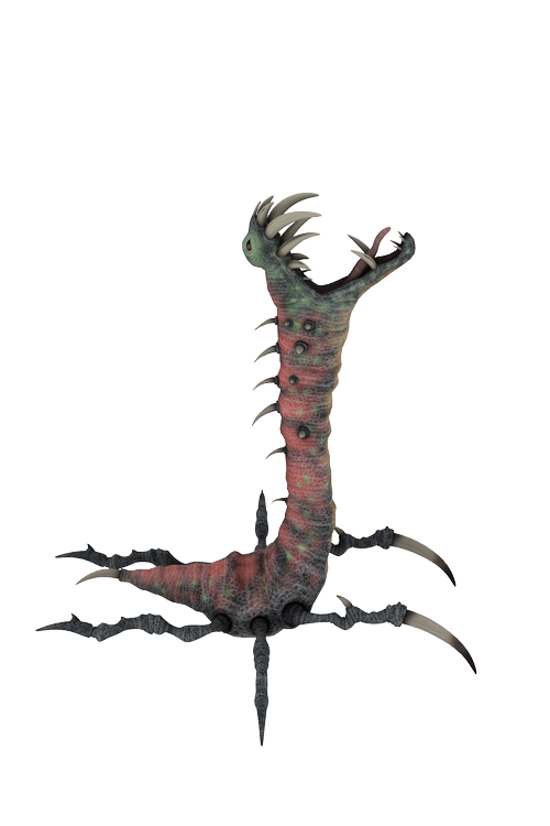
Or maybe this guy could skuttle along the ground on one level, thusting his head up into the air every now and then in an attempt to catch prey:

22yef9.png


I dunno. Most of it would take more work than I can PROMISE, as most of it requires new animating rather than reusing old animation data. Still - see if any of that sounds interesting and we'll see if I can at least render some of it up.
 
These 3D renderers look to good I think. :lol:

the realistic style would not match with the Player Sprite, which is actualy simple Pixel art. And actualy it doesn't match with the background, which is hand drawn. I don't know if you can render in a "hand drawn style", some kind of cell-shading or "look like painted", "Cartoon-Filter" etc...
maybe at the end, we also need a complete new Player Sprite. ;)

The Animation of the dragon is great, maybe even to many frames. I don't think we need much frames or many Animations. Flying, powerful fire-breath and the diving should be good. I would add red Eyes or at least visible eyes for the Dragon.

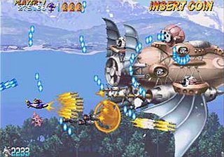
During a level, the Dragon could be far in the Background, while you advancing through the end of the Level, the dragon comes closer and at the end, it is the Levelboss right before you. :D I have this Idea from "Progear", a Shooter, where you see a huge Airship far far away in the distance and at the end you have to fight it.

EDIT: hey, your Dragon still looks good with only 16 Colours, not bad. :)
23vzvyf.png
 
Like the Wyvern so far, and perhaps the dragon or ground crawling creature could be made into boss characters (less realistic rendered ofcourse). Troll is not for this game i think.

I dont really have time to try things tonight, but tomorrow i will!

Cheers!

Edit: Now that im thinking, a troll (matching current graphics) throwing stones, that you could catch, or that could kill you, would be kinda cool
 
fusion_power said:
These 3D renderers look to good I think. :lol:

LOL I know what you mean - I'm starting from a fairly defaultish kind of look and instead of doing my norm (which is to try and INCREASE the appearance of realism) I'm trying to simplify the look a bit. I was quite pleased with the "white" version in as much as it seemed closer to the right look to me, but I went too far :(

Getting "the look" right is important more than anything else - probably more than how many images there are in the animation (I've been showing 15, which is half the number in my actual sequence), certainly more important than which critter I'm using. Because once I actually understand how to get "the look" for this game, producing an extra character is much simpler, for me.

fusion_power said:
I don't know if you can render in a "hand drawn style", some kind of cell-shading or "look like painted", "Cartoon-Filter" etc...
maybe at the end, we also need a complete new Player Sprite. ;)

I can render in all sorts of styles, and we can post-process various effects too. I can use different software for the renders - in fact, I might try that on the "Wyvern" today, if I unexpectedly get the chance to. I am keen not to replace stuff. At any moment my workload can go "whoosh" and you'll get nothing more from me - so it's far, far better if I can try to tweak my graphics (or someone else can use my frames as a guide to repaint from) than to start wholesale upgrades of what you've got.

fusion_power said:
The Animation of the dragon is great, maybe even to many frames. I don't think we need much frames or many Animations. Flying, powerful fire-breath and the diving should be good. I would add red Eyes or at least visible eyes for the Dragon.

If I get a re-render later, I'll probably try a different style and fewer frames. Maybe 10 this time. One of the "problems" with my animation is it's based on 30 frames, with the smoothness you can get at 30 frames you can afford delayed reactions and suchlike - how well that will transfer down to 8 frames or 5 frames... might start looking hinky. We'll see.

fusion_power said:
During a level, the Dragon could be far in the Background, while you advancing through the end of the Level, the dragon comes closer and at the end, it is the Levelboss right before you. :D I have this Idea from "Progear", a Shooter, where you see a huge Airship far far away in the distance and at the end you have to fight it.

EDIT: hey, your Dragon still looks good with only 16 Colours, not bad. :)
23vzvyf.png

Nice idea! If the game designers go for it, that could make for a nice touch assuming I can get the graphics right and "clean" enough to work.

I think the guy looks "fair" with just 2 colours (the "white" version should be easy to tone all green, or all red, or...) but that was too far. Give me a bit to try a few options out :)

Key terminologies: If you can use these it would help me to not get confused! "Texture" is the paint job on the creatures skin, which can be affected in brightness and tone by "lighting" that I render under. It's the texture that makes him green and blotchy (or grey, or...) and the lighting that gives him softer shadows (like the green versions) or harder shadows (like the "white" [or "gray/grey"] version).

MarkoeZ said:
I dont really have time to try things tonight, but tomorrow i will!

...

Edit: Now that im thinking, a troll (matching current graphics) throwing stones, that you could catch, or that could kill you, would be kinda cool


Don't hurry yourself. I'm sure everyone will happily run me round in circles trying to match "the look" better. Yup, got to try some more rendering options and/or post-processing to improve the look of creatures. Troll throwing rocks sounds like fun!

Ta,
 
Last edited by a moderator:
Monk said:
Here he is, from the same render, reduced to 10 frames and 7 colours (no red eye yet).

2u79cac.gif
Looks good and still very smooth. But I think we are not so poor that we only can buy 7 Colours. :D However, I like "effective" graphics and you can fake alot with using dithering and Pixel-Patterns to suggest more Colours than actualy used. Thats why I find these old 8 or 16 Bit games impressive. Megadrive was actualy only able to display 64 Colours but games are looked like much more. ^^
But I'm not the coder or the GFX Artist of this game so at the end, they decide what they use and how they use it.
The only little problem I could see with your dragon are some "thin" areras which may look to "fragile" for the rest of the Game. Because of the resizing, the "fingers" onto the wings are just one Pixel. Still looks great but maybe such a giant beast needs a more "massive" Body at all. However, I can't tell this without seeing everything in the game. maybe it still fits. :)

EDIT: short Question. is this Dragon actualy rendered with 2 moving Wings? It looks like he only has one but of course this can happen when rendering with orthographic Camera view.
 
Last edited by a moderator:
PokeParadox said:
The dragon should be small flying in the background at first, then maybe it gradually is a little bigger as you progress the level(s) then... BAM boss time?
That sounds brilliant!
I'm loving the wyvern too, I think if you toned it down graphically it would fit.
 
Last edited by a moderator:
If you zip the individual .png files and send them to me, I could trace them into the same art style as the rest of the game with little or no trouble.

You could just mediafire the zip and PM me the link
 
Ok, sounds good. But wait with tracing please, it's a lot of work, and i need tro try the current graphics in the game first. Not good if the size of the original image traced is not the optimal size. I'll try and implement something now, but also working on a pandora build of Panjoust, so my attention is kind of divided.
 
ok i converted and used the graphics for a basic chasing enemy, small youtube vid of it:

Dragon Graphdemo Not a second of leveldesign in my testing level though, so it's a crowded mess ;)

Edit: framerate of the dragon etc. will also be fixed ofcourse, this is a quick slap together. And i think some more frames for the animation are good, it does not take much mb's anyway. And no limits on the colour usage at all, just warn me if you start using transparencies
 
Last edited by a moderator:
MarkoeZ said:
ok i converted and used the graphics for a basic chasing enemy, small youtube vid of it:

Dragon Graphdemo Not a second of leveldesign in my testing level though, so it's a crowded mess ;)

Edit: framerate of the dragon etc. will also be fixed ofcourse, this is a quick slap together. And i think some more frames for the animation are good, it does not take much mb's anyway. And no limits on the colour usage at all, just warn me if you start using transparencies
Aha, interesting. As I thought, the graphic style of the dragon doesn't fit into the rest of the game I think. ^^"
But I'm sure, our graphic guys find a solution.
Oh, the smaller Enemy in the BG is nice but he should have less contrast than the enemies at the foreground. At the Moment there is no illusion of distance except the size so he also could be a baby-Enemy in the foreground. :D Changing the sprites contrast and altering his colours more to the tone of the background should be enough to have the right effect.
Here, the 1. Level from Progear, check the background in the distance:
progear.png

and at the end of the Level, tadaa:
progear.jpg
 
Last edited by a moderator:
fusion_power said:
Oh, the smaller Enemy in the BG is nice but he should have less contrast than the enemies at the foreground. At the Moment there is no illusion of distance except the size so he also could be a baby-Enemy in the foreground. :D Changing the sprites contrast and altering his colours more to the tone of the background should be enough to have the right effect.

Somehow the scrolling was broken, that messed up the illusion of depth a lot. should scroll allmost as slow as the mountain ;) But that's not the final image anyway. Thanks again though!
 
Last edited by a moderator:
Lot of good stuff here so I'm going to, ah, combine a lot of responses and edit heavily... don't say I didn't warn you!

fusion_power said:
Looks good and still very smooth. But I think we are not so poor that we only can buy 7 Colours.

Absolutely - I was just playing with how well dithering could be on such a small item - how low I could reduce the number of frames without making the wyvern look like puke :(

On the smoothness of the animation - having just watched a video of the player characters in motion, I'm a little concerned that the wyvern might currently have too many frames/be too fluid. Ideally the style of motion should be consistent. I might have to re-animate the wyvern to make it simpler (compare to player flying or - especially - player character walking).

fusion_power said:
The only little problem I could see with your dragon are some "thin" areras which may look to "fragile" for the rest of the Game. Because of the resizing, the "fingers" onto the wings are just one Pixel. Still looks great but maybe such a giant beast needs a more "massive" Body at all. However, I can't tell this without seeing everything in the game. maybe it still fits. :)

I think there's a real danger that the Wyvern character is just not "robust" or "cute" enough. The player character is very... chubby? The wyvern is very slender. I wouldn't rule out Willy the Wyvern at this stage, but we may need to tweak the model or even start again from scratch with a new model.

That doesn't scare me. I'm just trying to throw some assistance in this games direction. My son LOVES playing 2-player Joust with me, so another version would be terrific. If we can get some of "Daddy's Art" in there too that'd be even better (cool bragging rights I guess, at least).

I have other characters. Lots. Animating them takes time but meh, probably not THAT much. If we spend most of my time getting the texuring of models and their lighting right, then animating them shouldn't be too much hassle. Rendering is easy. Push a button. the closer we can get the character design and the rendering options to what we need as final, the better - and the more help I can be on PanJoust 2!

I tend to lean towards realism/credibility, so this is something to discourage me from - keep nagging if the quality/style remains the same for too many days, and nag me immediately if I take a step backwards!

fusion_power said:
EDIT: short Question. is this Dragon actualy rendered with 2 moving Wings? It looks like he only has one but of course this can happen when rendering with orthographic Camera view.

Well spotted. I actually shifted to a non-orthographic camera for a test yesterday, which was an improvement (not posted) but not huge. Seeing the video now I NEED not to use an orthographic camera. I may even rotate the camera slightly to accentuate the 2 wings, 2 legs. We'll see.

I feel I need to return to my experiments in making his texture simpler in order to try and get closer to the toony look of the player character. In many respects the wyvern may turn out to be too slender/fine a character. Don't let this worry anyone. I am not short of dragon designes. I will try - TRY - to spam the thread with side views of possible flying characters a little later today.

MarkoeZ said:
Ok, sounds good. But wait with tracing please, it's a lot of work, and i need tro try the current graphics in the game first. Not good if the size of the original image traced is not the optimal size. I'll try and implement something now, but also working on a pandora build of Panjoust, so my attention is kind of divided.

All sounds excellent. Please - feel free to give me size guidance. If you want him to be x pixels high at maximum, tell me! the bigger he is the clearer he will be.

Also, don't feel rushed by me. I don't know if you feel presurred to release relative to the Pandora release date, but I should be the last thing to act as a source of stress. I am VERY happy to spam the thread with ideas as and when time permits, and VERY happy not to feel I have to produce X,Y or Z by "tomorrow". My time tends to come in fits and starts, so I'll be very happy to do what I can when I can, feel free to nudge me in any direction you think will be handy.

For example, later today I hope to show a bunch of animated motions the Wyvern is already pre-set to do, and use those to discuss what you might want him to do in the game.

I would LOVE to use transparencies - to have the wings semi-transparent, and to reduce my workload stripping edge transparencies out around the whole creature. But I don't see it as being sufficiently worthwhile as I'm not sure anyone will have time to oogle at how "you can see the shape of the mountain through his wings!" while they are zooming around battling. we shall see.

frame rate: By default I fit most motions into 30 frames. It's very easy for me to render at 30 fps and very easy to provide all frames. If we end up having to trace them though, we will need to settle on whether we do all frames, every other frame, every 3rd frame or whatever. Most of the .gifs I have posted here have been every other frame, or 15 frames for a full cycle.

MANY thanks for that video featuring the dragon in with the backgrounds and player characters - I hope that the other readers here will help me to try and get the wyvern closer to that vision. The closer I can get the renders themselves, the less human work is required. A good thing!

I can see how paler/lowe-contrast images for background characters would be good. Let me do some actual graphics work and get back to the thread later...
 
Last edited by a moderator:
I've probably made too many changes in one go here, but I'm trying to "show willing" and put a little effort in. This is not "final" unless I dissapear for some unpredicted reason - this is "for discussion" ;)

1. I've drastically simplified his colour scheme, because as this scale I don't feel the more complex texture works (and I think it looks slightly off against the toonier characters). We can easily make him brigher, or red, or... whatever - including putting the more complex skin texture back on him if the devs think he looks too naked ;)

2. I've changed the lighting to try and bring out more shadow-based detail, as it seems to me much of the good guy detail is in light/shade rather than feather colouration. It takes very little change to the lighting to have quite an impact - we could, for example, make the shadows darker quite easily which might help seperate the far and near wings more effectively.

3. I have tried to make the character more robust-looking, and increased the eye size so that it is more easily visible. This involved scaling up the chest, the head, the head/jaw/chin spikes and the eyes.

4. I've used a different camera which shows perspective. At this kind of size, and in motion, that didn't help much so I've rotated the camera 10 degrees out of true. I personally think this helps to emphasise that the charcter has 2 wings, but we may need to rotate the camera further (or move it back a bit).

5. I've tweaked the animation ever so slightly to show off his teeth better (IMHO).

I forgote what else. This render is 15 frames - I can do up to double without breaking a sweat.

I hope to show some other animations that are already easy to do, but hold of on tracing this guy as I might have to do some jiggery-pokery to get the various animations to "join up" and have the character at the right size consistently if we, say, want to use the "Landing" animation (or part of it) for attacking. Maybe. We'll see.

9zumtj.gif


Ta
 
Monk said:
That's a huge improvement. :) Now he's got some meat on his bones and he looks a little bit more cartoonish but still impressive. The eyes and the teeth make a much better and more clear definition of his "face".
Maybe, the green of his skin could be a little bit more pale and have some simple structures to fake scales but it is also ok like it is. He don't need much Detail I think. Would be a perfect "Jungle-Dragon". maybe, This model could have different skin tones for different levels. Yellowish for Desert, Red for Lava Levels...just an Idea. :)
I don't know much about lightning, could be a little bit complicated because the Sun in Panjoust is usualy in the Game Background. Should look nice when seeing the light through his Wings but like mentioned, semi transparency is a huge performance Killer with the current Engine.
 
Last edited by a moderator:
So - some animations to consider, for background movie or perhaps as part of the game. The number of frames and speed are excessively slow, mostly so you can see what the animation looks like (rather than just rushing it past as the speed of light).

These are NOT "to scale". One of the main reasons I want to hold off on anyone thinking renders are final is that I'd probably want to have a go at getting all the animations/camera positions right to get things "to scale" nicely, for any that we actually end up wanting to use/abuse.

A. Landing. Someone mentioned "diving" on the player character - were you thinking face first or feet first, like this?

rs8rkl.gif


We could possible make use of a stinger at the end of his tail (esp. if I colour it black or red) if we go feet and tail first.

B. Taking Off.

14jvt4h.gif


C. Walking. This looks painfully slow, and should be sped up. A lot. In your mind... but it also shows how I think the Wyvern as-is may be "over animated" in comparison to the player character.

r0ujbl.gif


I suggest we need to simplify the wyvern motion because, as-is, it' stylistically more in keeping with bird motion like this:


fkqqoi.gif


D. Threat - being a ground based display this would probably be of no use at all. But it was there, so I rendered it.

mcqcdh.gif


Hopefully later I will have time to throw up some quick renders of alternate characters I could provide, if wanted. Ostrich, dragons of various sorts, heck we'll see what (if anything) I get the time for today.

Ta,

Monk
 
fusion_power said:
That's a huge improvement. :) Now he's got some meat on his bones and he looks a little bit more cartoonish but still impressive. The eyes and the teeth make a much better and more clear definition of his "face".
Maybe, the green of his skin could be a little bit more pale and have some simple structures to fake scales but it is also ok like it is. He don't need much Detail I think. Would be a perfect "Jungle-Dragon". maybe, This model could have different skin tones for different levels. Yellowish for Desert, Red for Lava Levels...just an Idea. :)
I don't know much about lightning, could be a little bit complicated because the Sun in Panjoust is usualy in the Game Background. Should look nice when seeing the light through his Wings but like mentioned, semi transparency is a huge performance Killer with the current Engine.

Cool - I was worried that I'd made too many changes at once. When you do that, it can be difficult for others to work out what change had what effect, and things can just get...messy. Looks like I maybe hit the right number of changes this time tho :)

Paler green is easy. Scale detail I would tend to get bogged down and put in more detail than we can see, I suspect :( We'll see what the devs have to say.

Different colours/textures for different environs I like - and that's dead easy to do. change a few setting shere, alter a few settings there, and re-render!

Although I haven't paid enough attention to find out how many different levels this character might appear on.

Transparency - I agree, it would be "nice" but probably just more effort than it is worth. If I come up with a reason for NEEDING it then that's one thing, but I think it "plays" nice enough without translucent wings so far.

Lighting - ah, lighting! Lighting is an art. I have specifically shied away from lighting this fellow from above AND behind because that would look very odd when the bitmaps are flipped - it would look like the sun position had changed. So directionally I'm going for more-or-less stright above - but even so, I've used two different lights to bring out a little more depth. Lighting in 3D is an art in itself, so there's a whole lot that can be done above and beyond what direction it's coming from :)

I'm going to have to go do some stuff VERY shortly, so no more time for renders just now I reckon.

Ta,

Monk
 
Last edited by a moderator:
Very nice work!
I think that it'll fit in more if you sort of use dithering to blend the colors from darker to lighter on its back.
Again, brilliant work, Monk.
 
Monk said:
Lighting - ah, lighting! Lighting is an art. I have specifically shied away from lighting this fellow from above AND behind because that would look very odd when the bitmaps are flipped - it would look like the sun position had changed. So directionally I'm going for more-or-less stright above - but even so, I've used two different lights to bring out a little more depth. Lighting in 3D is an art in itself, so there's a whole lot that can be done above and beyond what direction it's coming from :)
Yes, I use Blender from time to time but I never was that into lightning. To have an nealry good effect the "cracks" use gazillions of lights and actualy fake everything. But I just want to place ONE Sun-Lamp and everything lights correctly like one sun in reality would do. Realistic Shadows, reflections, radiosity renderings... why is this not easy possible with just one Sun? I'm way to lazy to deal with 3-spot lightning and all that crap. :D

Oh, another Idea. Because the Enemies into the Game often switching from flying left to right and the nturn to fly from right to left, maybe you could do a quick "turn" animation when the Dragon changes the direction to chase the Player? :)
At the Moment, the sprites just "plop" instantly into the opposite direction. Maybe it could look better with some (small) additional Animation.
 
Last edited by a moderator:
Back
Top