You are using an out of date browser. It may not display this or other websites correctly.
You should upgrade or use an alternative browser.
You should upgrade or use an alternative browser.
Panjoust - A New Simple Platformer
- Thread starter MarkoeZ
- Start date
MarkoeZ
arr matey?
Jourdy288 said:BTW, will the level editor let you import your own, say, textures for the platforms?
well, not really yet... But all images are currently just PNG's, so you could change them if you would want to. Although every level using that particular graphic set would be changed as well.
Perhaps, when a lot of more urgent things are done, it would be a nice feature in the level editor, where you can load an image for your own use. And maybe even use rectangle selection to mark the collision area. Not anytime soon though
Last edited by a moderator:
MarkoeZ
arr matey?
Another Small Update:
Continued work on the level editor, creating and editing levels is quite fast now. Still needs button placement fixed for general use, but most limiters are in place. Added keyboard input for some larger number values (and will be useful for level name input etc). While working on the leveleditor, i started experimenting with various level designs: a collecting level with time limit works perfect for the right kind of tension, and a killing level without time is pleasantly frustrating. All variations of those possible ofcourse
Also added new enemytype. Free flying randomly through the level, faster, and starts chasing once it has noticed you. Also thinking about diveflight attacks for this one (for graphics i just filtered the enemies jacket green for now, keeping the pixel art intact, till i have more flying creatures)
Cheers!
MarkoeZ
fusion_power
Advanced Member
Somehow, it needs a giant Dragon as a Boss Monster somewhere. 
Uh, how you plan the Levels? Do you make sketches? How do you manage the increasing skill of the levels, beginning with easy and going to hard at the end? I always wonder, how Level Designers can keep the balance. ^_^
Uh, how you plan the Levels? Do you make sketches? How do you manage the increasing skill of the levels, beginning with easy and going to hard at the end? I always wonder, how Level Designers can keep the balance. ^_^
MarkoeZ
arr matey?
fusion_power said:Somehow, it needs a giant Dragon as a Boss Monster somewhere.
Agreed, now for an artist to draw one
Uh, how you plan the Levels? Do you make sketches? How do you manage the increasing skill of the levels, beginning with easy and going to hard at the end? I always wonder, how Level Designers can keep the balance. ^_^
Plan???
Edit: i felt like doing something different, made a scaled down enemy flying trough the background. looks pretty nice
Last edited by a moderator:
bzar
A Commando
MarkoeZ said:fusion_power said:Somehow, it needs a giant Dragon as a Boss Monster somewhere.
Agreed, now for an artist to draw one
Would it be an evil... dragon?
Last edited by a moderator:
MarkoeZ said:fusion_power said:Somehow, it needs a giant Dragon as a Boss Monster somewhere.
Agreed, now for an artist to draw one
pixelmind said:Hi there,
looks like a fun game you're working on.
If you're interested you could use this old dragon animation of mine.
(originally made for Battle of Wesnoth but this sprite is outdated )
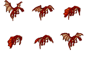
It would need quite a bit polish to fit the current style of your game, though.
It's old and poorly done but you can use it as draft if you want to.
( fun fact: this was my first sprite animation attempt)
Cheers, and happy pixel-pushing
Last edited by a moderator:
fusion_power
Advanced Member
there are much more graphic artists out there than coders, sprites shouldn't be the problem. ^^
The dragon from Wesnoth looks good but he has the wrong perspective, for Panjoust it should be more a side-view.
The dragon from Wesnoth looks good but he has the wrong perspective, for Panjoust it should be more a side-view.
I actually think quite the opposite is true (at least in this community).fusion_power said:there are much more graphic artists out there than coders, sprites shouldn't be the problem. ^^
Yeah, it is thought to be a starting point, you can draw inspiration from it or just use it as a temporary sprite, until you find a replacement.fusion_power said:The dragon from Wesnoth looks good but he has the wrong perspective, for Panjoust it should be more a side-view.
But I would love to see another sprite-artist apply for this project so that all these great ideas can be put to reality.
foxblock out
Last edited by a moderator:
fusion_power
Advanced Member
Then ask one from there: http://www.pixeljoint.com/foxblock said:I actually think quite the opposite is true (at least in this community).fusion_power said:there are much more graphic artists out there than coders, sprites shouldn't be the problem. ^^
I've seen impressive Stuff there, and the Artists all look like they just waiting to put their Art into a game. ^^ I wonder, if they know about the Pandora.
Last edited by a moderator:
Monk
Caveman Ninja
A "boss" dragon? Would a rough render of this character:
http://www.daz3d.com/i/3d-models/-/wyvern-2-0?item=4009&_m=d
being animated be of any use as a start?
Maybe with a different texture?
http://www.daz3d.com/i/3d-models/0/raw-wyvern?item=4108&cat=&_m=d
What size would you want the thing at, if a Wyvern might be good enough?
http://www.daz3d.com/i/3d-models/-/wyvern-2-0?item=4009&_m=d
being animated be of any use as a start?
Maybe with a different texture?
http://www.daz3d.com/i/3d-models/0/raw-wyvern?item=4108&cat=&_m=d
What size would you want the thing at, if a Wyvern might be good enough?
Monk
Caveman Ninja
I'm thinking of something along the lines of:
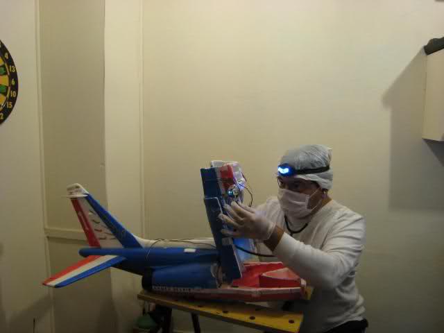
if it would help in any way?
if it would help in any way?
Trip
Sorry, but I suck at explaining stuff :P
Something like that would look ace flying around in the background. It's the small details that breath life into a game 
Masterfurbix
Member
The frame-by-frame would be good reference, just about anyone could retrace it to better fit the game art style.
Monk
Caveman Ninja
Bigger I can do, no worries. I also hope to tweak the style a bit... I imagine just going back and looking at some of the graphics from this project should help me get closer.
For just background stuff oooh, I imagine there's all sorts that could be done, if it would be worth it/fit in with the game. Let's see if I can scale it up a bit and have a look back through the thread to see what the current style is like.
For just background stuff oooh, I imagine there's all sorts that could be done, if it would be worth it/fit in with the game. Let's see if I can scale it up a bit and have a look back through the thread to see what the current style is like.
Monk
Caveman Ninja
Mmmmm, couldn't really find a handy-dandy reference to the character style QUICKLY - so I'll throw this up and hope I am magically getting closer to something that would help.
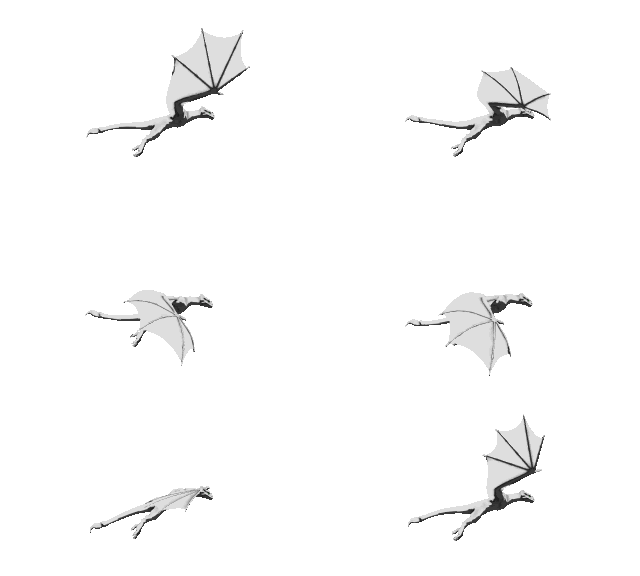
If we're talking about background animations, in addition to a slew of other characters I can also quickly and easily make this guy take off, land, or scream threateningly at a character in front of it, make this guy walk, make another (4 legged) dragon walk and/or fly... and anything much else would probably require that I put some effort in!
If we're talking about background animations, in addition to a slew of other characters I can also quickly and easily make this guy take off, land, or scream threateningly at a character in front of it, make this guy walk, make another (4 legged) dragon walk and/or fly... and anything much else would probably require that I put some effort in!
MarkoeZ
arr matey?
Monk said:I'm thinking of something along the lines of:

if it would help in any way?
Edit: ah you were fast, let me look at those last graphics /Edit
Ah, now that's a good step in the right direction!! As said by Jourdy, it should be bigger since it's currently smaller than the birdriders, and i imagine this enemy being a lot more dangerous. But if i'm understanding right, it's a 3d model so that should not be an issue. And is it possible to have an animation of it diving downward to attack an enemy? (that would be you, the player ; ) Anyway, i think that with some small colour/size/whatever adjustments it will fit the style quite nice. In the worst case, like Amigo said, it can be retraced (not by me though
Check my youtube for the tech/demo vids, think those show the current style best: My Video's
There is also a playable windows build on the google code page, but that's a bit dated by now.
As for background, as you can see in the latest video, there are currently allready clouds, and (not in the vid yet) also a scaled down enemy flying through the background, but i'll replace that with a dragon asap once it's final. And i'm completely open for more background addition suggestions
Cheers, and thanks already!
Edit2:
I think the first graphic style still fit better, but i'd have to know how a larger rendering looks. Think a lot can be achieved by just changing the colours and edges slightly
Edit3:
Another small thing: don't know what software you are working with, but is a PNG spritesheet, or individual files possible? lot easier to integrate/make into spritesheet
Last edited by a moderator:
Monk
Caveman Ninja
I actually render to .png files. I just figured that:
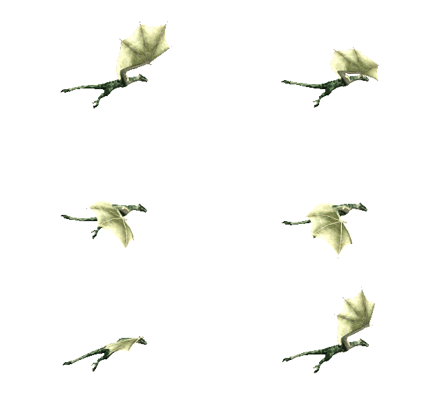
would be easier to comment on than:
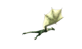
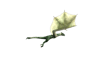
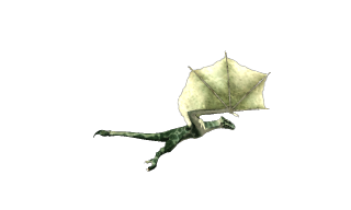
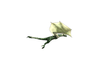
It's certainly easier to upload!
Both sets (above) are the latest render - I'ver returned the skin to a blotchy green and changed the lighting back to how it was.
Yup, it's a 3D model so size isn't an issue as the animating can be rendered and re-rendered and re-rendered until I get it right
I've an whole bestiary of creatures that could be put to use - in particular a 4 legged dragon as well as this wyvern. I could possibly also do some kind of lava creature to reach up and grab the player characters? Might be too much work.
Yes, we can make this Wyvern dive... at the moment I'm being lazy and just using animation seuqnces I have to hand. How much time I'll have for animating the characters is up in the air (I doubt I'll be doing much more today, and not much tomorrow, but the day after? I dunno!)
I figure to get the lighting and detail amount right first - if I can manage that then maybe I can work on a couple of extras. Maybe I'll knock up some static character renders for you to see if anything appeals.
I'm quite curious about the idea of creating graphic "themes" - replacement backdrops in a 3D package like Vue, for example. But then, I'm just quite curious - my main thing here is a saw a dragon being offered and rejected, and thought I'd throw another option onto the pile. Any more that I can do to help will be gravy
would be easier to comment on than:
It's certainly easier to upload!
Both sets (above) are the latest render - I'ver returned the skin to a blotchy green and changed the lighting back to how it was.
Yup, it's a 3D model so size isn't an issue as the animating can be rendered and re-rendered and re-rendered until I get it right
I've an whole bestiary of creatures that could be put to use - in particular a 4 legged dragon as well as this wyvern. I could possibly also do some kind of lava creature to reach up and grab the player characters? Might be too much work.
Yes, we can make this Wyvern dive... at the moment I'm being lazy and just using animation seuqnces I have to hand. How much time I'll have for animating the characters is up in the air (I doubt I'll be doing much more today, and not much tomorrow, but the day after? I dunno!)
I figure to get the lighting and detail amount right first - if I can manage that then maybe I can work on a couple of extras. Maybe I'll knock up some static character renders for you to see if anything appeals.
I'm quite curious about the idea of creating graphic "themes" - replacement backdrops in a 3D package like Vue, for example. But then, I'm just quite curious - my main thing here is a saw a dragon being offered and rejected, and thought I'd throw another option onto the pile. Any more that I can do to help will be gravy
Monk
Caveman Ninja
Here's the current Wyvern character, a bit larger:
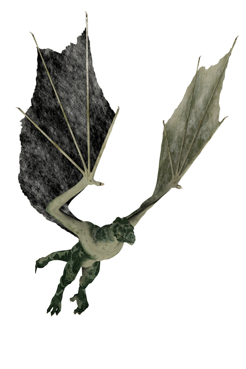
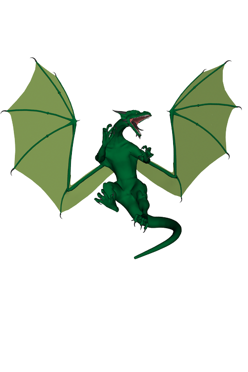
There's also a dragon I can easily skin to walk and fly:
A troll:
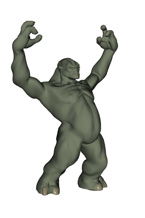
that might make a groovy lava creature:
and so on and so forth. The main things are trying to get it looking good enough for the game, and trying to find the time to not let you down once you think I've promised something (I never have, until after I have provided it. Till then it's all just 2hopes and iffs and butts").
There's also a dragon I can easily skin to walk and fly:
A troll:
that might make a groovy lava creature:
and so on and so forth. The main things are trying to get it looking good enough for the game, and trying to find the time to not let you down once you think I've promised something (I never have, until after I have provided it. Till then it's all just 2hopes and iffs and butts").
Similar threads
- Replies
- 21
- Views
- 5K
- Replies
- 11
- Views
- 3K
- Replies
- 33
- Views
- 8K
- Replies
- 4
- Views
- 2K

