Panjoust - A New Simple Platformer


Actually, it was already dithered - but to quite a high colour count (255). We should be able to get a more 8-bit "feel" to it by dithering to 63 colours:

nmc6xx.gif


or even fewer (31 looks very similar).

I'm hopeful that I can render up a (still image of a) critter or two in case they are of interest. That doesn't mean I have animations already in the can for them all, but I might be able to throw something simple together for one or two.

Ta,

Monk
 
fusion_power said:
Yes, I use Blender from time to time but I never was that into lightning. To have an nealry good effect the "cracks" use gazillions of lights and actualy fake everything. But I just want to place ONE Sun-Lamp and everything lights correctly like one sun in reality would do. Realistic Shadows, reflections, radiosity renderings... why is this not easy possible with just one Sun? I'm way to lazy to deal with 3-spot lightning and all that crap. :D

Actually, it Is possible. It just requires the computing power of a small nation (and their power grid) to produce the renders in anything like a decent time-frame. the problem is that everything in the real world acts as a light source - EVERYTHING. Because it reflects some of that sunlight. To calculate that, properly, takes a lot of "bounces2 of the light ray after it has left the sun, and the math gets awfully hard work for our poor little PCs. The crackheads who use lots of lights (I rarely use more than around 60 even with simple/poor software, often far fewer with better software) are basically trying to "imitate2 the effect of these bounced rays, but are reducing the amount of math that the computer has to do by specifying each individual source of light (more or less).

It can take ages to set up, but the resulting render takes a lot less time for good quality than a "realistic" setting would be (not to mention that the sun isn't a point of light. It's a pretty big ball rather than a point, even if it seems small from here).

Oops. I feel myself being drawn to the dark side... yup, shadows are a pain!

But I digress.

fusion_power said:
Oh, another Idea. Because the Enemies into the Game often switching from flying left to right and the nturn to fly from right to left, maybe you could do a quick "turn" animation when the Dragon changes the direction to chase the Player? :)
At the Moment, the sprites just "plop" instantly into the opposite direction. Maybe it could look better with some (small) additional Animation.


Hmmm... I must admit I'd thought that the Wyvern would probably leave one side of the screen and come back - possibly at a different height - pointing in the correct direction. After all, we're just testing at the moment. It's an interesting idea, which I'll leave open for the Devs to comment upon.

Yet another idea is to have two copies of the same character, one lit from above, as is, and one lit from above (but perhaps by less) and from below by lava. Then if there's a lava level, you could slowly move from an upper to a lower set, so the wyvern reacts to the ambient lighting conditions. Yeah, I thought that sounded too much like hard work too! Let me go render some dragons!
 
Last edited by a moderator:
OK - well, the Wyvern is my favourite largely because I already had several animations tha tI could "just throw into a render engine". However, there ARE more options. Here's some quick renders with defaultish skins (not optimised for the game in any way). I found it dragging towards the end so forgive me if the images get lifeless.

01. The Wyvern (naturally)
2506r0w.png


02. SubDragon - like the Wyvern, it's probably easy to change the proportions of this guy around and change his "look" a fair bit.
2hy9gjs.png


03. MilDragon. There are several slight variants of this figure, this specific one is the "Hatchling". Lots of options to change the look, before we even look at the myriad of colouring possibilities.
fpa7b7.png


04. The Demon NYBRAS. Well - it IS a flying creature!
20kyxc1.png


05. LHDragon - From hereon in the models are very much less...alterable. As in it would be hard work for me to do, and I shy away from too much hard work. so these are presented "as-is" aside from changing the critters surface to be toonier.
k2bvpu.png


06. Dragonocerous
17pxsp.png


07. FHDragon
mkdo5d.png


08. FTDragon
125rf48.png


09. WarCow (maybe not?)
11vtue8.png


10. HTDragon
30kr238.png


11. SnakeDragon
mmsakx.png


12. SpikeyDragon
14y7tk5.png


So - if one of those appeals more than the Wyvern, or the Devs want 2 dragons or something, let's see. I'd rather not do 12 dragons for 12 levels though, not this week.

Ta,

monk
 
It's fairly easy to change the overall colour of these critters - I've changed the Wyvern's head, body, tail and wing membrane "areas" here to suggest an Ice Wyvern. Beyond that it's down to painting (so if I want the "stinger" a different colour, I'll have to paint it. No biggie, as I only paint it once - after that the 3d software will just render it my chosen style.

k9jjbb.gif


You can also see how easy it is to make the renders larger - near instant. It's actually slightly harder to make sure jpinging animations can all fit together without messing something up and having to start over (careful planning of how much space you're going to need for all animations, or rendering way outside all your animations, would help avoid problems).

Oh yes... if there's a stablish Windows build around, my 8 yo son would love to beta test for you ;)
 
I'll take 3, 5 and 12, thanks.
Brilliant work, again! I think these need the usual toning-down treatment, but would be pretty awesome.
EDIT: I'm loving the ice wyvern, but I think it needs to look a little more... crystalized.
And I have a little sister who'd love a current stable Windows build too :D
 
Wow, i keep trying to respond, but you are updating like a madman!!! (that's a good thing indeed ; )

Anyway, this will be long, and like you said, copied and pasted together. So beware.

You keep talking about devs, well, uhm, it's just me, the artists, and the people in this topic. Sort of a democracy, but i have veto (some would call that dictatorial, but that's not up for discussion. wait... Ah whatever ;)
That being said, credits go to the main contributors ofcourse: PokeParadox has programmed the majority of the framework, and is always there to assist me with coding trouble, but is not actively involved in the game code. Then we have Amigo Bandito Cruijente who has done all the backgrounds and obstacles, as well as the complete main menu, the cute porq popping in distress, the signs, and some other things i forgot. Dragons_Slayer has drawn the hero and enemy birdsprites as well as the collectables, but is no longer actively taking part (DS if you are reading: still big thanks for getting this going graphic wise, without the proper sprites this would never have gotten the attention it did!), Last, but definately not least, Nick May has allready composed over half an hour of music for this game, with moods for each levelset, tracks with increasing tempo for the time limit levels, etc, etc..

About what graphics are final: If the general consensus is that something looks good, it's usually next step ahead. And if i really don't like something, i always try to say it as early as possible, avoiding unnecessary work. i Also value the opinion of the artists very much, i just about gave control to Amigo on the graphics department so far. He has a better eye for it than me. He draws, and if it works out slightly different than i imagined, i just make it work in the game.

Now my thoughts:

1. I've drastically simplified his colour scheme, because as this scale I don't feel the more complex texture works (and I think it looks slightly off against the toonier characters). We can easily make him brigher, or red, or... whatever - including putting the more complex skin texture back on him if the devs think he looks too naked ;)

3. I have tried to make the character more robust-looking, and increased the eye size so that it is more easily visible. This involved scaling up the chest, the head, the head/jaw/chin spikes and the eyes.

GREEN DRAGON IMAGE

I like the more rugged look of the wyvern, perspective is also better, lighting seems good enough allready but can be improved a bit maybe.
But some more colour would be nice. It does not need a full texture, but maybe a different colouring for the tail, wingtips, maybe snout or some spots here and there, i dunno. Just a bit more colour anyway.

A. Landing. Someone mentioned "diving" on the player character - were you thinking face first or feet first, like this?

Yup, that was me. For the diveflight i indeed envisioned it attacking like a hawk, feet first. But if you show me a better alternative, i'll just do that :) different programming, but as said, ill make it work somehow.

Hmmm... I must admit I'd thought that the Wyvern would probably leave one side of the screen and come back - possibly at a different height - pointing in the correct direction. After all, we're just testing at the moment. It's an interesting idea, which I'll leave open for the Devs to comment upon.

Yet another idea is to have two copies of the same character, one lit from above, as is, and one lit from above (but perhaps by less) and from below by lava. Then if there's a lava level, you could slowly move from an upper to a lower set, so the wyvern reacts to the ambient lighting conditions. Yeah, I thought that sounded too much like hard work too! Let me go render some dragons!

Fist idea: I'd like to have the graphics ready, in case you somehow don't have time anymore. But it's not a priority since it will not be in the pandora demo release i think. If i do turnaround, i need to do it for all graphics, and there is still so much other, more urgent work to be done.
While i'm on that topic, you somewhere asked if i want to be ready before pandora release. Partially. I want a large playable demo released the day i receive my pandora (last playtesting and tweaking is best done by me, so could be a day later. but hope to have it tested remotely by a devboard/prototype owner). Think 20 levels or so, enough to keep you busy for a while is the intention. Then work will continue and eventually a fully featured, one and 2 player, maybe networked Panjoust is the goal.

Second idea: errrm maybe, but not soon probably. Would be my best answer

OK - well, the Wyvern is my favourite largely because I already had several animations tha tI could "just throw into a render engine". However, there ARE more options. Here's some quick renders with defaultish skins (not optimised for the game in any way). I found it dragging towards the end so forgive me if the images get lifeless.

LOADS OF RENDERS

So - if one of those appeals more than the Wyvern, or the Devs want 2 dragons or something, let's see. I'd rather not do 12 dragons for 12 levels though, not this week.

Ta,

monk

i like the first 3, number 7, and the last spikey one. And more dragons are always better, no need for 12 though so let's first start with one ;)


Wow, that WAS long.
Already thanks for all you effort so far, i think we can make this work some way

Cheers!!
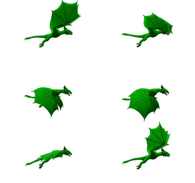
 
The bigger version of the "standard" Dragon loks very good, More like Pixel-Art than a rendering image. :)
Some Dragons could need a rider. And because we shoudln't have only Dragons and Gryfs, I think some Hot Air Ballons could be also a nice Enemy for the Game. Should fit very well in the Middle Age Phantasy setting. I Imagine a simple Ballon or Zeppelin thing, with a Platform underneeth from where the enemies shooting at the Player (Arrows, Stones, whatever)
These Ballons can be at a fixed point in the Level. They don't move much but you have to avoid the arrows and projectiles. Maybe it would be enough to "land" ontop of the ballon to destroy it. (Sharp claws of the Gryf).
 
MarkoeZ said:
Wow, i keep trying to respond, but you are updating like a madman!!! (that's a good thing indeed ; )

It's good to be crazy... :D

MarkoeZ said:
You keep talking about devs, well, uhm, it's just me, the artists, and the people in this topic. Sort of a democracy, but i have veto (some would call that dictatorial, but that's not up for discussion. wait... Ah whatever ;)

...

That being said, credits go to the main contributors ofcourse: PokeParadox has programmed the majority of the framework, and is always there to assist me with coding trouble, but is not actively involved in the game code. Then we have Amigo Bandito Cruijente who has done all the backgrounds and obstacles, as well as the complete main menu, the cute porq popping in distress, the signs, and some other things i forgot. Dragons_Slayer has drawn the hero and enemy birdsprites as well as the collectables, but is no longer actively taking part (DS if you are reading: still big thanks for getting this going graphic wise, without the proper sprites this would never have gotten the attention it did!), Last, but definately not least, Nick May has allready composed over half an hour of music for this game, with moods for each levelset, tracks with increasing tempo for the time limit levels, etc, etc..

Yeah - I kinda think of "Devs" as shortcut for "MarkoeZ and PokeParadox and Amigo Bandit Cruijente and Dragon Slayer and Nick May" (because even musicians have their graphical tastes). Partly because I haven't typed "Markoez" before and I haven't been following the project (I saw DS's initial characters somewhere onc eI think and decided you had the project "in hand" with a different style to mine, and only REALLY paid attention again when I noticed a dragon character. Oops!). I feel, at the moment, a little like an interloper. I want your dictatorial impression most of all, because if you don't like it won't fly. But until I get at least one character/animation "in the can" as it were I consider myself a "maybe" rather than "one of the crowd". Let me feel I've contributed more and I'll maybe stop treating ymself like an outsider!

MarkoeZ said:
i Also value the opinion of the artists very much, i just about gave control to Amigo on the graphics department so far. He has a better eye for it than me. He draws, and if it works out slightly different than i imagined, i just make it work in the game.

To be honest, by "Devs" I mostly meant "Amigo and that other guy. You know the one. Our programmer ;) "

Whatever graphics I throw at you, you've got to be able to include it technically as well as stylistically.

MarkoeZ said:
Now my thoughts:

ROBUST GREEN DRAGON IMAGE

I like the more rugged look of the wyvern, perspective is also better, lighting seems good enough allready but can be improved a bit maybe.
But some more colour would be nice. It does not need a full texture, but maybe a different colouring for the tail, wingtips, maybe snout or some spots here and there, i dunno. Just a bit more colour anyway.

Here I could do with some direction. Specifically:

1. "Better" lighting in what way? And I could do with some input from the thread on skin painting ideas. I tend to get very nitty-critty in, as I paint the texture of the skin very, VERY remotely from the final render - so it isn't easy for me to judge what detail will show up and what will be completely invisible at this scale (I did a couple of tests which simply failed to show up at all at this resolution :( )

Texture/Skin (not lighting) change:
2qw3hjd.gif


So if someone fancies painting up any ideas over an image, have at it! Painting on the actual texture will be a bit of effort for me. If anyone is masochistic enough to fancy painting on a "bearskin rug" of the Wyvern skin, which gets wrapped around the model, let me know and I'll try and set you up with some templates to get going. In the meantime, you could paint designs directly onto these images to give me a betetr idea, perhaps?:

35n0f2s.png


feotaf.png


MarkoeZ said:
A. Landing. Someone mentioned "diving" on the player character - were you thinking face first or feet first, like this?

Yup, that was me. For the diveflight i indeed envisioned it attacking like a hawk, feet first. But if you show me a better alternative, i'll just do that :) different programming, but as said, ill make it work somehow.

Nope! I am very much into feet-first attack. Much easier to animate than what I feared you might be after. Feet first it is! I should manage a fairly simple mod of the landing motion I suspect - just to be sure, I'm animating JUST the Wyvern for an attack-and-grab, or trying to combine a player character? Some logistics here that need considering.

MarkoeZ said:
Fist idea: I'd like to have the graphics ready, in case you somehow don't have time anymore. But it's not a priority since it will not be in the pandora demo release i think. If i do turnaround, i need to do it for all graphics, and there is still so much other, more urgent work to be done.
While i'm on that topic, you somewhere asked if i want to be ready before pandora release. Partially. I want a large playable demo released the day i receive my pandora (last playtesting and tweaking is best done by me, so could be a day later. but hope to have it tested remotely by a devboard/prototype owner). Think 20 levels or so, enough to keep you busy for a while is the intention. Then work will continue and eventually a fully featured, one and 2 player, maybe networked Panjoust is the goal.

Second idea: errrm maybe, but not soon probably. Would be my best answer

Agreed. I don't know how much you're enjoying the coding side, but that felt like a "PanJoust 2" possibility rather than an intermediate release.

I'll concentrate on attack animation, maybe texture, and maybe lighting for now with turnaround as a possibility. It doesn't hurt to animate while the texture is still being worked on, as long as I can do something useful. I might have a really easy/crude way of doing the turn, in which case - cool!

Getting DS's player characters to turn around would not be something I'd be looking to do. I'm not a sprite guy, just trying to chip in :)

My technique for doing it would be to start over with new player characters based on whatever 3D models I have to hand (like an owl or an ostrich) rather than building something new. Time :(

MarkoeZ said:
i like the first 3, number 7, and the last spikey one. And more dragons are always better, no need for 12 though so let's first start with one ;)

Already thanks for all you effort so far, i think we can make this work some way


Cool. 12 is seeing some love! We'll have to see how it turns out with simplified texture.
 
Last edited by a moderator:
Amazing! I love the animation of the wyvern when it lands. What would be cool is when it lands it tilts his head upwards and breathes fire all over the place.
 
@ Monk: most of the above: Sounds good ;)

And i think this last wyvern is pretty close to the game style! I like it anyway. Eventually a pixel artist (could be you if you want ofcourse ; )can do the last detail adjustments, but like you said, the closer it gets to the style, the less work afterwards :) i personally don't think those graphics would need a complete retrace, but again, im not an artist.

Anyway: I'll let you and others decide for yourselves (youtube vid)
Collision is not right yet, also more hits and perhaps specific attack style (from the back for example) will be added. This was just a quicky for Monk.
 
Last edited by a moderator:
Monk said:
So if someone fancies painting up any ideas over an image, have at it! Painting on the actual texture will be a bit of effort for me. If anyone is masochistic enough to fancy painting on a "bearskin rug" of the Wyvern skin, which gets wrapped around the model, let me know and I'll try and set you up with some templates to get going. In the meantime, you could paint designs directly onto these images to give me a betetr idea, perhaps?:
I think he looks fine. Maybe the Wings could be less different in the colour compared to the Body (less contrast between the 2 tones). You did a nice "transparent" effect onto the Wings even without Transparency in the gif. :)
I would leave the restas it is, maybe he could have a slightly different underside (darkeror brighter) like scalies usualy have. Slightly indication of big scales but nothing to complex.
 
Last edited by a moderator:
fusion_power said:
I think he looks fine. Maybe the Wings could be less different in the colour compared to the Body (less contrast between the 2 tones). You did a nice "transparent" effect onto the Wings even without Transparency in the gif. :)

Hmm, wing and body colours actually look pretty good, but for a different graphic set ;) And i think i would be quite easy to adjust the wing and body colour to the level set it's used in, making a couple of slightly different wyverns. Probably a couple of clicks, and: render! Monk?
 
Last edited by a moderator:
Stop posting so much stuff, I can barely keep up!
Seriously, it's great, I love it! Keep up the good work, it's only getting better :D

MarkoeZ said:
Collision is not right yet, also more hits and perhaps specific attack style (from the back for example) will be added. This was just a quicky for Monk.
About collision:
When you find the time, you might want to have a look at the CollisionRegion class I recently added to Penjin. It's really handy for easily setting up sprite<->sprite collision regions (from an image or just a mathematical defined rectangle) and test collision between sprites with just one function call.
It also supports pixel-perfect collision detection when using images (which usually is not required, but of course gives the most accurate results), so you can have very accurate and fast collision detection.
In case you are already using HitRegions for collision detection it should be a piece of cake to set-up, otherwise it might require some tinkering, but I am very willing to help (though you probably want to schedule it for the after-Pandora-release version).

I also added a state to the Penjin TestSuite, which shows all the features, can enable/disable certain features for comparison and is very well and detailed commented, so it should give you an easy start.

This may sound hypocritical, but I am just trying to help ;) also as collision will be very important in this game and can be frustrating if they are inaccurate or don't work properly.

foxblock out
 
Last edited by a moderator:
foxblock said:
Stop posting so much stuff, I can barely keep up!
Seriously, it's great, I love it! Keep up the good work, it's only getting better :D

Yeah, it's busy atm ;)

About collision:
When you find the time, you might want to have a look at the CollisionRegion class I recently added to Penjin. It's really handy for easily setting up sprite<->sprite collision regions (from an image or just a mathematical defined rectangle) and test collision between sprites with just one function call.
It also supports pixel-perfect collision detection when using images (which usually is not required, but of course gives the most accurate results), so you can have very accurate and fast collision detection.
In case you are already using HitRegions for collision detection it should be a piece of cake to set-up, otherwise it might require some tinkering, but I am very willing to help (though you probably want to schedule it for the after-Pandora-release version).

Well that's exactly the problem. Collisions are all individually assigned per object currently, changing it would take ages, and most finally feel right. But i'm certainly considering it for a future update.

About the dragon colour, since i wanted to show the dragon in a different surrounding, i had to use the level editor, and decided to make a video of me playing with it. Creating a level from the test level 1. Just messing, no plan.
Quite some small bugs still, and the level i created has some major flaws, but i do not expect to be a level to be perfect the first time i work on it ;)

So another Youtube Video, long one.

Cheers!
 
Last edited by a moderator:
Xenu said:
Amazing! I love the animation of the wyvern when it lands. What would be cool is when it lands it tilts his head upwards and breathes fire all over the place.


The thing about dragons is, they're gorgeous :D

It would be all too easy, IMHO, to turn this project into "Monk's Dragons" with too much animating and too little gameplay. I want to add a little to MarkoeZ's project, not take it over/overwhelm it! (especially considering the amount of work that would involved to do everything even jus tI have thought of). If we're all still around after version 1.0 then there is definately scope for continuing to add to the game, but right now I want to try and keep my little bit of it manageable, size-wise. Nice idea though - fire can be fun, if rather hard work to do well.

MarkoeZ said:
Collision is not right yet, also more hits and perhaps specific attack style (from the back for example) will be added. This was just a quicky for Monk.

Cool. I'm in a bit of a rush today (my time tends to ebb and flow a lot) but I'll hopefully be back in a couple of hours or so to watch that. I'm happy to leave this guy as he is at present to concentrate on the animating and getting the scenes set up so that everything works together as much as possible...

MarkoeZ said:
fusion_power said:
I think he looks fine. Maybe the Wings could be less different in the colour compared to the Body (less contrast between the 2 tones). You did a nice "transparent" effect onto the Wings even without Transparency in the gif. :)

Hmm, wing and body colours actually look pretty good, but for a different graphic set ;) And i think i would be quite easy to adjust the wing and body colour to the level set it's used in, making a couple of slightly different wyverns. Probably a couple of clicks, and: render! Monk?


Skin/body colur can be changed on a whim - it's currently set to RGB 192,128,128 IIRC but again I can check when I have more time. Wings are a little harder becuse they are actually set to "white2 with a painted bitmap applied. Still easy to modify, ish. Rendering the changes - piece of cake. I might throw up some imagery showing a range of stuff I hav einstantly available some time in the next few days (if it's already there I barely have to work). Maybe how simple colour changes can have an instant impact. Rendering is the easiest bit - once I have the dragon "materials" or "textures" right to produce one frame, the rest are a button click and a cup of tea away.

foxblock said:
Stop posting so much stuff, I can barely keep up!

I did my best, I probably haven't posted for a day or two! Hopefully I'll manage some more later, then a couple of days pause, then some more. We'll see how it goes, but there should be some natural "breathing spaces" between my posts. you just need to be good at holding your breath for a long time!

Oooh, ANOTHER YouTube video. I just got a phone that supports Youtube so I might be able to catch these on the go soon, but in the meantime it's pretty much only when I stop to put some effort in that I can watch the videos.

Ta,

Monk
 
Last edited by a moderator:
MarkoeZ said:
@ Monk: most of the above: Sounds good ;)

And i think this last wyvern is pretty close to the game style! I like it anyway. Eventually a pixel artist (could be you if you want ofcourse ; )can do the last detail adjustments, but like you said, the closer it gets to the style, the less work afterwards :) i personally don't think those graphics would need a complete retrace, but again, im not an artist.

Anyway: I'll let you and others decide for yourselves (youtube vid)
Collision is not right yet, also more hits and perhaps specific attack style (from the back for example) will be added. This was just a quicky for Monk.


Yup, I think he looks good enough to be going on with at least, though there are a couple of glitches in the test. Compared to this:

2n029me.gif


In your video there's an odd black "patch" between his head and his wings when the wings are raised, and the tail "stinger" looks a bit thin/odd, but as a "general look and feel test/demo" I think it looks smashing myself! room for improvement? Always! But I think we all pretty much agree that we should get the basics working first and move on to finer details later.

Hmmm... how big are those eggs? As in pixels wide by pixels high? Would anyone object if I tried to see if I could produce an alternate egg image?

My time on the project is affected by many things. Today is already largely shot and looking pretty bitty, so I doubt I'll get much done - if I do it'll be little bittiy things like trying to do an egg, or showing some color variations on the Wyvern or something rather than coming up with a new animation.

Ta,

Monk
 
Last edited by a moderator:
Nice Video. :)
Yupp, the green Dragon fits much better into the greenish Background. I think same for the Jungle-Set (is it finished? ) And yes, the Dragon needs a "turn around" Animation. ^^

Different Colours for the sprites shouldn't be a problem. I remember old Console Games where sprite colours are dfined by ingame-palettes so they used one sprite/tile and coloured it with various Palettes for different Levels. I don't know if the engines today work the same way, but today we don't have so limited memory like in the past, one sprite for every colour shouldn't stress the engine much. :D
 
Just some simple egg textures, inside the 18 * 18 grid that I think is the required egg size:

xaz1qe.png
5123v6.png
ezmw5f.png
20ku453.png
20b0hep.png
1196yyp.png
22c0ib.png
flily0.jpg


Of course, they all look better much larger :(

301hs48.png


I just happened, as usual, to have those to hand. I don't have these to hand:

http://www.daz3d.com/i/shop/itemdetails/?item=4166


But if I "shell out2 a couple of bucks, I easily could do.

Shell out. Gettid? Sigh. It should be fairly easy to provide... here, how about a white tempalte that just gives a background and some shading for other experiments? Mostly 18x18 is just too teeny to put intricate detailing on :(

pws9u.png


Mostly I wanted something to fiddle with that didn't require any attention from me :(
 
Back
Top