Panjoust - A New Simple Platformer


Edit: for those dropping in on this page, we are talking about the Panjoust Windows(32 bit) build

Monk said:
A countdown beep once you reach 10 seconds would be nice, as would some way of highlighting exactly what killed you (flash the dragon, gryffein, or countdown timer to say "It was this factor what did for you!") as I tend to lose sight of the timer compeltely and wonder if it was the culprit. Actually, keeping the "zero" of the countdown timer visible for longer might do instead?

We're finding actually selecting the dragon to delete him in the level editor to be tricky - may need to read up on using the level editor somewhere.

Countdown beep: good idea, and easy enough

And i might have forgotten to give the dragon a proper selection area in the editor, whoops :)

OK - my sin't gone straight to the level editor. We can't get any number or text to show up in the Ibject Tree, and nothing seems to be flashing either - so as far as we can tell, initially, it's impossible to delete the Wyvern :(

Click above and to the left of the dragon (not on the picture itself) and then click delete, that's the not so proper selection area. Fixed locally.

"CollectGoal", "KillGoal", and "Time Limit" (why does only Time Limit have a space?) all work as expected, though KillGoal has some odd text/value beneath it.

The space, those are just placeholder buttons, will be one style eventually. And the number below killgoal is a debug value that is just still there from before there was a button at that position.

Maybe that doesn't say Object Tree? We can't see what it does/get it to do anything :(

That says object type. Click on "New object" first (for instance), then a number will appear there. then use + and - to change the type. Same way you can click on an enemy, and use the button to change it into another type of enemy

Darn that wyvern makes things tough :) . Tried about 20 times, got to the second level once :p
Ouch, that Wyvern is mean! LOL.

Lol, it will be killable eventually. But it will still be more of a boss type, so still won't be easy ;)

Thanks for all the feedback everyone, and keep it coming!!

Cheers!
 
Last edited by a moderator:
Thanks for a new build! The time limit kills it for me though. I've never been a fan of games were you have to rush through just to beat the clock in the last second. I don't mind a time limit but in my mind it should be long enough for you to being able to explore and try it your way. Like in super mario for instance. You can speedrun it and get extra bonus points but you don't nececarily have to. Well thats just my opinion.

Some bugs:
First level.
1)If you land on the platform to the left with the hedgehog and press right you will glide of the platform.

2)When the dragon flies through the last platform with the hut he passes behind the hut and over the platform at the same time (looks weird).

3)The stone dropping has a weird bug. If you pick up a stone and press once to drop it it will drop only a small distance, still connected to the bird and then it will very slowly fall (still connected).
 
Xenu said:
Thanks for a new build! The time limit kills it for me though. I've never been a fan of games were you have to rush through just to beat the clock in the last second. I don't mind a time limit but in my mind it should be long enough for you to being able to explore and try it your way. Like in super mario for instance. You can speedrun it and get extra bonus points but you don't nececarily have to. Well thats just my opinion.

Ok, noted. Time limit is fully configurable though. From none till infinity, will vary per level. Time limit is currently set to make it challenging for me personally ;) Although i also find the dragon a bit of a problem.

Some bugs:
First level.
1)If you land on the platform to the left with the hedgehog and press right you will glide of the platform.

2)When the dragon flies through the last platform with the hut he passes behind the hut and over the platform at the same time (looks weird).

3)The stone dropping has a weird bug. If you pick up a stone and press once to drop it it will drop only a small distance, still connected to the bird and then it will very slowly fall (still connected).

Ah! Bugs!

1st one i know about, is on the list already Fixed!

2nd: Ah, did not notice before, will fix Fixed!

3rd: not sure, will look into that. Fixed!

Just wanted to report that it works great in WINE! :)

Cool! thanks!


Edit: New, after hearing the trouble with the levels, now also possible to place extra lives in the levels and collect those!!

Edit: Ok no more edits/updates tonight, it's saturdaynight! off to party! ;)
 
Last edited by a moderator:
Turn 2F. With a bit of luck I will get to play tomorrow, as I want to try something with the legs, but I hope the head and neck movement accompany the body turn well enough nowm and I want to keep up the "provide WIPs as I go along in case I vanish, so I leave SOMETHING!" approach.

i24n4i.gif


I'd like to see what I can do with the legs on this, and finesse the "Grab" animation if I can.

Ta,
 
OK, the workflow is a little convoluted but I think I've got the Wyvern motions done and fitting in a sprite that is 216 * 200, with the wyvern coming pretty close to all edges (I think I may have a column or two of pixels that don't get used):

2ewzg4i.gif


My workflow will be even dodgier to convert that to a single PNG, but I'll probably go for that later. I might also create a new version of the 320x200 based PNG for the current build, as a drop-in replacement.

Unless one of those motions needs tweaking, I should probably see about rendering it in some different colours and then seeing what I can do with another dragon - probably a spiky one. Should some/all of these guys have riders? I'm going to have a hard job replicating the gryffin-riding riders using my techniques :( (other more Monk-style riders would be easier).
 
I'm a little concerned that at this size/resolution the spikes on this guy:

2ih1q28.gif


are just not going to show up well enough. Does he look like a lizzard covered in hairbrushes?

Don't pay much attention to the animation "sequence" - I've just put 2 frames together fairly quickly to help me judge how to fit him inside the 200 x 200 sprite size I was aiming at.

I've made his eyes and teeth stand out a bit more than usual by brightening them, but I can't pull the same trick with the spikes. Go? No go? I may try the SubDragon as I'm more confident of it showing up well. In any case, I guess I should be looking at flight, turning, and ideally some kind of attack.
 
Which reminds me - how do we feel about mechanical things? Like helicopters, or flying cars/bikes?

Or... steam powered dragons?
bhwz1j.gif

(animation not final, only for setting scale. May need to adjust so that the rider is closer in scale to the griffin rider. May contain nuts).

Or a RoboWasp?
dczh8y.gif

(Animation even rougher - and just 2 frames! Wasp may appear larger than in final animation).

I have held back from anything sillier, like toon aliens in toon "personal UFOs" or anything like that.
 
It should be fairly easy to make this guy smaller as well as liven up the animation a bit - fewer frames, more head movement.
2lk70uu.gif
 
Wow, these models are really impressive as hell! Keep up the good work Monk, this is going to be an exciting game to play!
 
I wish I could claim to have made them all, but I didn't, they were made by my peers. I just happen to have a lot available. Sadly I don't have everything that I think could be cool, but I do have a reasonable stock of models that interest me and, of course, I have all the necessary rights to be doing this.

I've even "cheated" and used some canned animation rather than creating it all myself, but I ran out of canned animations the second we wanted something specific (like "turn around" or "attack in mid-air"). Not that I've got much canned animation, because I haven't - I tend to create that myself, bit by bit.

So far I'm only responsible for:

Scene creation (choosing/having models and putting them in a scene with lighting that I've set up and seems to work OK).
Tweaking the materials and proportions on some models (mostly the Wyvern as it's a nicely flexible model - great work, actually).
Animating.
Rendering (well, the computer does most of the work there).
Post-processing (to gather the individual images into an animation and to dither the results to produce a more "8-bit" FEEL to the images and make them feel a little less like 3D rendered art).

There's more post-processing that MarkoeZ would appreciate - splitting the animations back out into single frames and combining them together into strips, one per animation.

I'm pretty sure I have a decent helicopter somewhere, though it might take some digging to locate and IIRC it's a gunship so probably a bit large, at the current scale - it'd be oversize. Making fresh models specifically for this project is beyond the time and effort I can afford, and I'm not into buying models specifically for the project that I wouldn't already want enough to get. I'm not even slightly into grabbing pirated copies, so I'm limited to critters and objects that I already like and got/get legally. Your project warranted fresh new models because I haven't made many low resolution models and thought it might be fun, if no-one else was going to step up to the plate. I still like those designs, and if you told me you had a working .OBJ reader that could read in my .OBJ files without need for manual conversion you would probably find me knocking out more simple, fun models every now and then - and possibly even doing some texturing for them. The ability to automate steps like that would be very important to me as it gives me the freedom to go "Ah, I can do betetr than that today by tweaking it a bit" - I can do dirty WIPs and not need to worry that the model, or the uv mapping, or the texture - is right first time :)

Ta,
 
Monk said:
OK, the workflow is a little convoluted but I think I've got the Wyvern motions done and fitting in a sprite that is 216 * 200, with the wyvern coming pretty close to all edges (I think I may have a column or two of pixels that don't get used):

2ewzg4i.gif


My workflow will be even dodgier to convert that to a single PNG, but I'll probably go for that later. I might also create a new version of the 320x200 based PNG for the current build, as a drop-in replacement.

Unless one of those motions needs tweaking, I should probably see about rendering it in some different colours and then seeing what I can do with another dragon - probably a spiky one. Should some/all of these guys have riders? I'm going to have a hard job replicating the gryffin-riding riders using my techniques :( (other more Monk-style riders would be easier).

Great!! And don't worry aobut converting them into a single PNG, i found a useful little tool that does just that.

Not sure if there need to be more riders, let me think about that.

Spikey dragon: Think that's a no-go. At that resolution it does not really look well.

Mechanical: Could work, as long as it looks low-tech, if you know what i mean. Think a helicoter flying through the screen would look weird, but a steamdragon/wasp might work

Thanks once again!

Cheers!

Edit: And i don't care the slightest bit where the models come from. As long as a: it's Legal b: Nobody is offended and c: Not a direct copy of something well known. all seem to be the case, so no problem :)
 
Last edited by a moderator:
Yeah, it's a shame about spikey but he just doesn't look as impressive IMHO at low res. He'd look better if I animated him properly, but those spikes just don't look as mean/impressive as they're supposed to :(

I think the steam dragon might be fun, but I think I'll play with the wasp a bit first. I think it can go smaller and so look less like a "boss" without damaging the look too much, and I haven't a clue how I'm going to animate it's wings - which sounds like it could be a fun challenge to make it look like it's flying without being able to use motion blur (because of lack of transparency). Um!
 
I still like those designs, and if you told me you had a working .OBJ reader that could read in my .OBJ files without need for manual conversion you would probably find me knocking out more simple, fun models every now and then - and possibly even doing some texturing for them.

I have an OBJ importer to OpenGL ES 1.1/2.0 structs for use in my project! :)
 
torpor said:
I still like those designs, and if you told me you had a working .OBJ reader that could read in my .OBJ files without need for manual conversion you would probably find me knocking out more simple, fun models every now and then - and possibly even doing some texturing for them.

I have an OBJ importer to OpenGL ES 1.1/2.0 structs for use in my project! :)

Cool. I shouldn't actually be doing things like THIS:

24niipf.gif


right now to be honest, I should be doing some other stuff which I shall wander off to do right now... but I'll have to dig out my "low-res torpor designs" and see if I can remember what I'd thought to progress to - or come up with NEW new stuff. And things.

Meanwhile, I expect we can do the wasp more this size and speed:

efm153.gif


Hopefully, if I get some other stuff out the way, I might be able to upload a couple of different coloured Wyverns today.

Obviously, if the game can cope with animating the Wasp faster then it would pretty much benefit from being played at full speed - the less distinct the wings are, the better. I just wanted to play around with seeing how I'd make them move. If we were going higher resolution (like the overblown animation above) then I'd probably tinker more with the angle of the wings to the air, but I think this might just possibly do as is? Oh - with a turn and an attack.

Although the thing has guns, I've been thinking of a tail-singing attack, just like I didn't do for the Wyvern (and this figure was one reason I didn't make the Wyvern do a sting attack - I wanted to reserve it for the RoboWasp!).

Ta,
 
Last edited by a moderator:
There are a few shortcuts being taken from time to time - hopefully ones that don't show. Like, for example, critters going right->left are just flipped renders of going left->right rather than re-rendering (which would technically be "more right" and probably ever so slightly different).

33omxsg.gif


Obviously, if we want this chap bigger that's easy to do. The bigger he is the clearer he'll be, but also the harder to avoid on-screen.
 
My eyes are bleary, my body is telling me to take it upstairs, so this is the last stab I make at anything today - and I hope to resume anon. At least to double-check that this is acceptable and to produce some more colours of Wyvern.

2crrlmt.gif


Ta,
 
MarkoeZ said:
{...}
And don't worry aobut converting them into a single PNG, i found a useful little tool that does just that.

Not sure if there need to be more riders, let me think about that.

Excellent! Here's the current roundup of Wyvern sets then:

current "Default" Wyvern:
2hia0yo.gif


current "Ice" Wyvern:
2r4ljs5.gif


current "Jungle" Wyvern:
2i0r9tz.gif


It should be fairly easy to spot that I'm paying a lot more attention to the animating than to the colour scheme - come on folks, tell me how to do better if I'm missing the target anywhere. Maybe the "default" and "Jungle" Wyverns could do with swapping the wing membrane textures over? I'm reasonably up for some constructive crit/assistance :)


I've put a quick simple skin-tone rider on the steam Dragon because the SD has a seat and handlebars, but it shouldn't be too much hassle to tweak the model to remove those if required. I'd prefer no riders as it'd be less work - and as I've probably said, I'm lazy. Great you've got a tool to reduce the effort I'd have to put in!
 
Last edited by a moderator:
I think this is probably closer, in both size and speed, to useful? I've enlarged the eye and made it brighter to help discern the "face" of the creature...though making it black might be just as good/more evil!

2e5vbj7.gif


I picture a turn sequence and a beak-opening dive/attack as possibilities, time permitting.

MarkoeZ - this creatures' current WIP and the more "finished"wasp both have a gap in front of the head. For this is because I'm not done, but for the wasp it's to make room for the wings. If I limit the forward movement of the wings we could enlarge the wasp within the sprite, if that would be desireable (I'm TRYING to make critters smaller than my naturaly leaning, which is generally bigger and clearer than is suitable for a game. Well, bigger anyway).
 
Nice Animations. For the Colours I would wait untill we have all Graphic Sets to test the Dragons in their natural Environment. :)
The Wasp looks to modern I think. Maybe it should be more a "magic-powerd" Wood-Wasp or something like this. I guess Panjoust is still in a middle-age phantasy setting. ^^

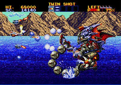
Oh, because you seem to render tings within minutes, is it possible to try some simple animated Water-Surfaces with glittering/reflections? I guess the game could use this somehow in the background graphics or in the Menus. Maybe some levels in the style of this:
thunderforce-4.jpg


Just an Idea. ^^
 
Back
Top