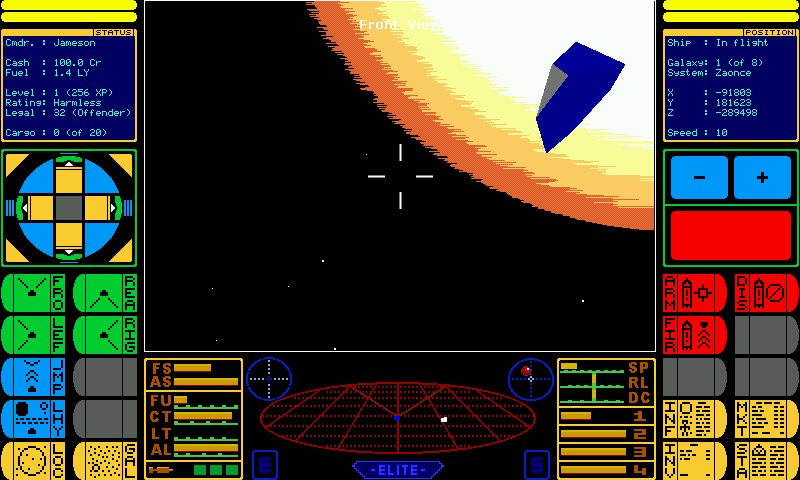
Release Pandora elite - Beta


hideki

Member
Joined
Apr 21, 2007
Messages
82
Hihi


There will be no updates for some time as now my Pandora has not only a dodgy battery but also a dodgy LCD cable, it's therefore going back to be fixed so don't expect anything for a few weeks. (Also, no, I'm not willing to attempt the repair myself as I hear one person has already broken an LCD attempting that and I'm just not going to risk it) -- Hideki 20110802


preview.png


Download pandelite.pnd


Updated to 1.1.0.4


Changes:


Fixed hyperspace messages to use new more readable text


Added Velocity locked limitation for Torus Jump (must be max speed as C64)


Corrected two swapped keys on help page (Space & / for speed, Oops...)


Changed main display panel to a more logical layout


Changed music playback for higher quality and no loading delay


Updated to 1.1.0.3


Changes:


Added touchscreen support to local and galactic charts


Changed scanner so asteroid 'lollipops' appear as orange


Fixed bug in the status/position panel text display routine


Added basic destination planet info in right pane when moving around charts while docked


Updated to 1.1.0.2


Changes:


Fixed pandora game category (Games/Strategy and Simulation now)


Fixed planet capitalisation in charts


Fixed F to find planet in charts


Fixed frequency of "Docking computers online" message to match original


Fixed Sun (it didn't previously exist after launching from station)


Added A, B, Y when docked for short, long range chart and planet info


Added help page when paused (P)


Added new style roll/dive/climb indicator at top/left of scanner


Improved readability of in-flight messages


Start to bring up load/save/quit menu once past the first couple of screens


Let me know if it works okay


I used pndtools for windows to create this .pnd and for some reason don't seem to have an icon, no idea why...


Thoughts etc.


help.gif


newkind19.png


Watch out for the coppers if you're trading things you shouldn't or engaging in piracy.
 
Last edited by a moderator:
Just downloaded.


From an initial session plays well and looks good. Oh dear could end up investing quite a lot of time rediscovering Elite yet again. I do love this game.


Thanks for all your work on this.
 
Hi hideki,


Great work, been playing trying this out and it works great.


Only issue I have come across is the pause key. If you press P the games pauses, but then you can't restart. On my Pandora the only way to then exit is undertake a reset of the system. I don't suppose the P key is needed anyway, but it is bit of pain if you hit it accidentally.


Hope that helps
R restarts after P used to pause


Also, Start will get you out once you're past the first couple of screens
 
This is...well. I have absolutely no idea how many nightly hours I've spent secretly in front of the good old speccy, playing Elite. I never quite made Elite - I got the rank right under that - but it was weeks and weeks of gaming time. I used to dream wireframe dreams. That is to say that I might be a bit positively biased towards anything that smells even remotely like the divine goodness that is Elite. And this, a...Port? Rewrite? is therefore, of course, almost perfect. Great. Best thing since bread of the non-sliced variety.


I don't mind the interface at all (that is, the touch buttons on both sides of the main screen). I like it, actually, and find I use them and the keyboard 50/50, particularily for stuff like switching info screens.


My small quibbles:


* It feels a bit strange that you can use the touchscreen for selecting all sorts of stuff, but you can't use it for selecting planets on the scanner screens. That might be a too big rewrite to allow, but it threw me at first.


* The file dialog for saving and loading your commander feels a bit outside the rest. Sometimes a mouse cursor appears here (but never anywhere else), and generally it feels like something that pops up from another system.


* I can't find out how to rename my commander! My Elite commander should be R. Daneel, not Jamison!!! :)


As far as I can gather so far, everything works (I.e. I've encountered no obvious bugs). The most irritating thing so far (apart from my inability to dock safely, but that is not an error of the game) is the gymnastics required to bop between planet selection in the short range scanner (where one needs to use the d-pad) and the info screen (which is needed to find out whether the planet is useful). The number keys are rather cramped to reach whilst holding the pandora, and using the touch screen means letting go of the d-pad. My humble suggestions:


1) If you can be bothered to make a compile flag for pandora-only code: Remove the touchscreen D-pad, fire button and throttle (I can't imagine anyone using them on the pandora) and replace them with another info screen like the ones already showing status and position, but this time showing a summary of system data.


2) The quick one: While docked, rebind the XYB buttons to Shortrange scanner, Longrange scanner and Info. Noone will fire missiles inside the station anyways.


Now, excuse me, but I'll have to earn money for a docking computer.
 
About the pause-mode: Would it be much effort to implement that a message is shown? Something like "Paused. Press R to continue.".


Without it, I can imagine that quite some people will think that the game hangs and reset their Pandora. Btw: Is there code-wise a reason that "r" resumes? I would find "p" (or maybe both "r" and "p") more natural. Another solution would be to simply make any button resume the game. Then a pause-message wouldn't be as important - but still better feedback.
 
This is...well. I have absolutely no idea how many nightly hours I've spent secretly in front of the good old speccy, playing Elite. I never quite made Elite - I got the rank right under that - but it was weeks and weeks of gaming time. I used to dream wireframe dreams. That is to say that I might be a bit positively biased towards anything that smells even remotely like the divine goodness that is Elite. And this, a...Port? Rewrite? is therefore, of course, almost perfect. Great. Best thing since bread of the non-sliced variety.
It's based on the new kind source for PC but rather rewritten and extended a bit


Aye, I only ever made deadly myself and that involved a whole summer playing on my +3 (and saving to tape, thanks a lot Firebird)

I don't mind the interface at all (that is, the touch buttons on both sides of the main screen). I like it, actually, and find I use them and the keyboard 50/50, particularily for stuff like switching info screens.
Ah, good stuff

My small quibbles:


* It feels a bit strange that you can use the touchscreen for selecting all sorts of stuff, but you can't use it for selecting planets on the scanner screens. That might be a too big rewrite to allow, but it threw me at first.
I probably can do that, I just didn't think about it as I'm used to the older versions where you used the directional controls for that but I'll certainly give it a go

* The file dialog for saving and loading your commander feels a bit outside the rest. Sometimes a mouse cursor appears here (but never anywhere else), and generally it feels like something that pops up from another system.
Yes, always a mouse pointer on those screens, it's part of liballegro but I do intend to change it and the config page to match the rest of the system

* I can't find out how to rename my commander! My Elite commander should be R. Daneel, not Jamison!!! :)
Robot eh? how's that zeroth law working for you?


(you can change the name at the top of the file selector that appears when you go to save)

As far as I can gather so far, everything works (I.e. I've encountered no obvious bugs). The most irritating thing so far (apart from my inability to dock safely, but that is not an error of the game) is the gymnastics required to bop between planet selection in the short range scanner (where one needs to use the d-pad) and the info screen (which is needed to find out whether the planet is useful). The number keys are rather cramped to reach whilst holding the pandora, and using the touch screen means letting go of the d-pad. My humble suggestions:


1) If you can be bothered to make a compile flag for pandora-only code: Remove the touchscreen D-pad, fire button and throttle (I can't imagine anyone using them on the pandora) and replace them with another info screen like the ones already showing status and position, but this time showing a summary of system data.
I could do that but I prefer not to... you can check information on the systems before visiting them by selecting them in a chart then viewing the system information... even adding the extra displays I have is departing from the formula somewhat, lol, I'm not sure which information you want on screen though, could you give me more details on that?

2) The quick one: While docked, rebind the XYB buttons to Shortrange scanner, Longrange scanner and Info. Noone will fire missiles inside the station anyways.
Well, you'd hope, lol, but yes, can do that easily enough

Now, excuse me, but I'll have to earn money for a docking computer.
eheh, I'm pondering adding a few things: (probably to a distinct version so the original is still available)


fixed a bug with docking music and added V to turn off docking computers prior to docking


Autopilot - will pilot you to planet unless attacked using the fastest available methods (torus jump etc.)


Advanced scanner - Show ship type / bounty on viewscreen


Stargates - four or five per galaxy, allowing travel to any other gate in same galaxy


Shipyard - the obvious really


Mission board - frontier style, take package from a to b and get paid etc.


Thanks for your feedback!
 
Last edited by a moderator:
About the pause-mode: Would it be much effort to implement that a message is shown? Something like "Paused. Press R to continue.".


Without it, I can imagine that quite some people will think that the game hangs and reset their Pandora. Btw: Is there code-wise a reason that "r" resumes? I would find "p" (or maybe both "r" and "p") more natural. Another solution would be to simply make any button resume the game. Then a pause-message wouldn't be as important - but still better feedback.
there is a code reason for it, it'd pause and unpause very quickly if I set it to the same key with the keyboard handling as it is now...


I am pondering adding a control help screen for the pause screen so I can make it quite clear what resumes on there, seems the easiest way
 
Thanks hideki,


I think a control help screen would be a really good idea.


Autopilot - will pilot you to planet unless attacked using the fastest available methods (torus jump etc.)


Advanced scanner - Show ship type / bounty on viewscreen


Stargates - four or five per galaxy, allowing travel to any other gate in same galaxy


Shipyard - the obvious really


Mission board - frontier style, take package from a to b and get paid etc.


I think these features that you mention above would be great, these are some of the best features in Frontier. I never found the combat in Frontier as good as the orginal Elite, so this would be like having the best of both games in one!
 
Hihi


Updated now to 1.0.1.2


I've added some of the requested features:


Fixed pandora game category


Fixed planet capitalisation in charts


Fixed F to find planet in charts


Fixed frequency of "Docking computers online" message to match original


Fixed Sun (it didn't previously exist after launching from station)


Added A, B, Y when docked for short, long range chart and planet info


Added help page when paused (P)


Added new style roll/dive/climb indicator at top/left of scanner


Improved readability of in-flight messages


I've not yet updated the charts to allow mouse use but do intend to, haven't updated the right hand status display as moxie hasn't replied yet -.o;

I think these features that you mention above would be great, these are some of the best features in Frontier. I never found the combat in Frontier as good as the orginal Elite, so this would be like having the best of both games in one!
Indeed!


I hated the combat in Frontier, always wanted an Elite style game but with Frontier additions so that's what I will ultimately end up with :>


Those changes will be released as Elite enhanced or something though, I will also keep the original as a seperate package for the purists.
 
This is all music to my ears, you know - new docked controls, plans for little enhancements (I particularily like the mission board). Shipyard? Not having played Frontier - would that mean being able to fly other ships? *salivates slightly*

I could do that but I prefer not to... you can check information on the systems before visiting them by selecting them in a chart then viewing the system information... even adding the extra displays I have is departing from the formula somewhat, lol, I'm not sure which information you want on screen though, could you give me more details on that?

Now, being able to swiltch between scanner and info quickly makes it less important, but the idea is to get a quick inkling of which systems are worth checking out at all. Usually, when I run goods (and we all do, most of the time), the dealbreaking info is tech level and type (industrial/agricultural). If I'm at a TL 12 industrial system, any other industrials are usuall not interesting at all. Being able to sweep over th scanner with the cursor and get instant info on those two would be real smooth :)


Come to think of it, target system data would probably be more useful to me in play than the position/ speed now in the upper right. I could think of a situation (say, a dogfight that has gotten a bit out of hand) where it would be quite useful to be able to tell with a quick glance that yes, the hyperspace cursor is still locked on that confederation world 2.1 light years away, so a quick 'h' means I'm just a countdown from safety.


Anyways, again, this is just my suggestions, and even if they're never implemented I'm quite happy as is :)
 
Last edited by a moderator:
Oh my god! My life is now complete as I can properly play Elite anywhere - it looked promising on the GP32 but was abandoned and the emulated versions are not quite right!


Wow!!! Took 30 seconds to get use to the controls.


Cannot believe I am going to have to play to Elite status again - that takes some patience - the memories.
 
This is all music to my ears, you know - new docked controls, plans for little enhancements (I particularily like the mission board). Shipyard? Not having played Frontier - would that mean being able to fly other ships? *salivates slightly*
Yes, that is exactly what it would mean ;p Don't expect to see any Thargoids available to fly though (and am I the only person who thinks they're related to the buggers in Ender's game?)

Now, being able to swiltch between scanner and info quickly makes it less important, but the idea is to get a quick inkling of which systems are worth checking out at all. Usually, when I run goods (and we all do, most of the time), the dealbreaking info is tech level and type (industrial/agricultural). If I'm at a TL 12 industrial system, any other industrials are usuall not interesting at all. Being able to sweep over th scanner with the cursor and get instant info on those two would be real smooth :)


Come to think of it, target system data would probably be more useful to me in play than the position/ speed now in the upper right. I could think of a situation (say, a dogfight that has gotten a bit out of hand) where it would be quite useful to be able to tell with a quick glance that yes, the hyperspace cursor is still locked on that confederation world 2.1 light years away, so a quick 'h' means I'm just a countdown from safety.


Anyways, again, this is just my suggestions, and even if they're never implemented I'm quite happy as is :)
Aye, the X/Y/Z co-ordinates don't work anyway, probably will fix them at some point, they're just for effect really but there's no reason why that display can't change to basic planetary info when you're moving about in the local/galactic charts, perhaps change XYZS to Target, Tech Level, Economy, Government, Productivity when docked?


Something like this perhaps:


chart.png
 
Last edited by a moderator:
Hideki, that looks awesome.


A slightly cheeky question, and possibly not able, but could it be made to accept the community created missions and add ons from oolite?


Just a thought.
 
Hideki, that looks awesome.


A slightly cheeky question, and possibly not able, but could it be made to accept the community created missions and add ons from oolite?


Just a thought.

AFAIK, Oolite isn't based on the TNK source (which this is) and as such it would take some major hacking to get it in - you'd be better off porting Oolite :)


Looking at it, Oolite makes heavy use of Javascript, so Pandora performance would likely be quite poor.


D.
 
Last edited by a moderator:
Back
Top