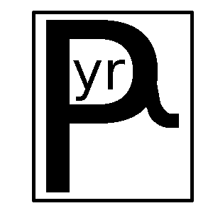
Finding a proper name and logo :)


I like this. But maybe the box doesn't have to be a cube? Can the box be shaped more like a handheld? Maybe slightly opened to make a "mouth"?

Also I think it needs more contrast, dark grey on grey is not enough.
How about a logo image that is just the shape of the new handheld itself, or a general Pandora handheld shape, but open slightly and with teeth and a tongue, as if the clam shell were a dragon mouth?  I think the teeth are more important of a feature than wings, I also think that a simple cube is boring and there's no reason to use that.
The concept of the console opening being the mouth is quite a good idea I think.

Think might want to add wings or tail or something though, aside from just teeth, to make it recognisable as a dragon. Not sure if just teeth alone will give that image.

The cube has relevance as the name is "dragonBOX" - It's the 'box' part of the name that box/cube type logos were done I'd say
 
t19m.png


That's quite cool
Agreed.  It's the best one yet.
 
I like this. But maybe the box doesn't have to be a cube? Can the box be shaped more like a handheld? Maybe slightly opened to make a "mouth"?

Also I think it needs more contrast, dark grey on grey is not enough.
How about a logo image that is just the shape of the new handheld itself, or a general Pandora handheld shape, but open slightly and with teeth and a tongue, as if the clam shell were a dragon mouth?  I think the teeth are more important of a feature than wings, I also think that a simple cube is boring and there's no reason to use that.
The concept of the console opening being the mouth is quite a good idea I think.

Think might want to add wings or tail or something though, aside from just teeth, to make it recognisable as a dragon. Not sure if just teeth alone will give that image.

The cube has relevance as the name is "dragonBOX" - It's the 'box' part of the name that box/cube type logos were done I'd say
Boxes aren't necessarily square.  Thinking about Dragonbox for a moment, what the heck is a Dragonbox?  As it's being discussed currently, it is a poor square dragon creature, but maybe that's a little too quick to literal.  It could also be the dragon's box, don't you think?  A box, perhaps a treasure chest, or perhaps a Pandora-looking thing, which belongs to a dragon.  This sounds like it could make a lot more sense.  And it could be drawn as an ornate pretty box or chest which is held in a dragon's claws.

The thought that leads people to jumping on "It's a box dragon" is actually pretty similar to the thought that held everyone to a naming tree sprouting from Pandora herself, like her daughters or relatives, instead of you know, the box. (The full name of the Pandora is OpenPandora right?  As in the box which is open.)
 
I like this. But maybe the box doesn't have to be a cube? Can the box be shaped more like a handheld? Maybe slightly opened to make a "mouth"?

Also I think it needs more contrast, dark grey on grey is not enough.
How about a logo image that is just the shape of the new handheld itself, or a general Pandora handheld shape, but open slightly and with teeth and a tongue, as if the clam shell were a dragon mouth?  I think the teeth are more important of a feature than wings, I also think that a simple cube is boring and there's no reason to use that.
The concept of the console opening being the mouth is quite a good idea I think.

Think might want to add wings or tail or something though, aside from just teeth, to make it recognisable as a dragon. Not sure if just teeth alone will give that image.

The cube has relevance as the name is "dragonBOX" - It's the 'box' part of the name that box/cube type logos were done I'd say
Boxes aren't necessarily square.  Thinking about Dragonbox for a moment, what the heck is a Dragonbox?  As it's being discussed currently, it is a poor square dragon creature, but maybe that's a little too quick to literal.  It could also be the dragon's box, don't you think?  A box, perhaps a treasure chest, or perhaps a Pandora-looking thing, which belongs to a dragon.  This sounds like it could make a lot more sense.  And it could be drawn as an ornate pretty box or chest which is held in a dragon's claws.

The thought that leads people to jumping on "It's a box dragon" is actually pretty similar to the thought that held everyone to a naming tree sprouting from Pandora herself, like her daughters or relatives, instead of you know, the box. (The full name of the Pandora is OpenPandora right?  As in the box which is open.)
Yep, it could be anything like that.

Any stuff I've done is just messing about with ideas, for others to add/build on, or not.

'Dragonbox' could just be the device even, with ED being the dragon and the box being his device [Pyra].

An ornate box clasped in dragon claws could also be good, though might be tricky to make something look good and keep it doable as single colour, embossed, small scale etc.

Perhaps if the box ornate detail was kept very minimal
 
Yeah :)  You know that's a much better name than PYRA or PYRRH or PYRRHEA or whatever it is :)  
 
Last edited by a moderator:
It had better support Python!

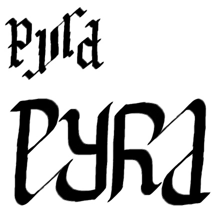
Binky: might be going into art critic mode a little here - I see what you're trying to do with the tail on the P, because it helps define the A (without, it would look like a d), but it's an ornamental stroke that doesn't suit the style of the rest of the typeface. You can get away with ornamental strokes on some letter forms like blackletter and some forms of calligraphy, but I'm not sure it fits there. If you're trying to emulate a calligraphic style, look at the angle of the strokes in calligraphic letters, and how it affects the stroke width on lines of different slope.

Edit: yes, ambigrams that read well and don't appear to have extra lines are really hard to make.
 
Last edited by a moderator:
Edit: yes, ambigrams that read well and don't appear to have extra lines are really hard to make.

Definitely, creating ambigrams is a good skill, some of the ones I seen are amazing really how someone even thought of it.

Nothing wrong with a bit of abstract though is there? 

10qyniw.png


10qyniw.png


Great work Fzero this latest effort is definitely my favourite by far, it strikes the right balance between angles and curves, top version is the best on IMO. maybe if the straight vertical parts of the "p" and "a" were angled inward slightly then the "a" would look a lot less like a "d".
 
Last edited by a moderator:
I like the look, unfortunately I think it suffers from Pyhd syndrome - the letterforms are quite far from what we're used to, and reading the last two letters as "RA" is quite forced.

Here's another rough and quick attempt at a more blackletter-style (still quite tiny) and a very quick, more calligraphic approach to Binky's connected letters:

PyraVersion3.jpg


While blackletter may be nice looking for ambigrams (and very German), I'm not sure it's appropriate for the logo for this particular thing.
 
@Monkfish, I tried it, but didn't get it looking nice with a curve line.

This I think looks ok though and defines the [A] without destroying the [P] too much...

s6sxuw.png
 
I like the look, unfortunately I think it suffers from Pyhd syndrome - the letterforms are quite far from what we're used to, and reading the last two letters as "RA" is quite forced.

Here's another rough and quick attempt at a more blackletter-style (still quite tiny) and a very quick, more calligraphic approach to Binky's connected letters:

PyraVersion3.jpg


While blackletter may be nice looking for ambigrams (and very German), I'm not sure it's appropriate for the logo for this particular thing.
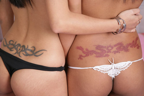
Blackletter looks too much like a tattoo. I like the bottom one. Do the P and Y need to be fully connected? I think it would also work unconnected, and that would improve readability (it still needs a big serif to maintain the A, but 1/2 of the thin part of the stroke would be enough imo).

The important thing is to avoid Pyhd and be very readable as Pyra (also if you don't know what it is supposed to say), while looking as normal, "non-tattoo-like" as possible.
 
Back
Top